William Grant & Sons: META
Aligning Glenfiddich, The Balvenie & the House of Hazelwood.
Redefining what 'luxury' means within the spirits sector; a full brand identity for META, William Grant & Sons’ new ‘post luxury’ platform. A philosophy, framework and culture — a new source of luxury informed by soul, substance and storytelling.

Brief—
META represents the top 5% of William Grant & Sons' fine spirits portfolio and therefore necessitated a brand that reflected this high-end offering. Our challenge was to create a name, strategy and a look and feel for this new ‘post luxury’ platform.
Approach—
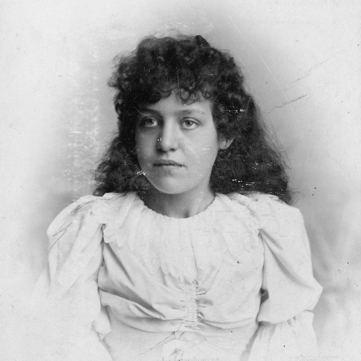
Having spent some time at WG&S’s Dufftown Distillery we concluded that META’s ‘new luxury’ platform should be based on a timeless yet contemporary aesthetic formed by time, craft and character. The name is inspired by Meta (short for Margaret) Grant; William Grant's only daughter, who played a pivotal role in the shaping of WG&S’s business empire. 'Meta' also nods to the term 'meta-luxury', coined in 2014 to describe 'luxury beyond luxury'. We worked with Face37 to create a bespoke typeface and established photography guidelines that eschewed traditional imagery of luxury and opulence. Instead we reflected the lives and travels of curious souls who embrace the world that we live in through their voyages of discovery.
Result—
To be seen...

Inspiration
The name is inspired by Meta (short for Margaret) Grant who was William Grant's only daughter, and who played a pivotal role in the shaping of WG&S’s business empire. Coincidentally 'Meta' also nods to the term 'meta-luxury', coined in 2014 to describe 'luxury beyond luxury'.


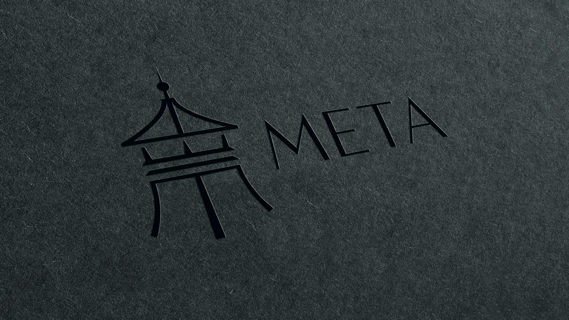
The META marque is informed by the copper cowls that famously crown the Glenfiddich Distillery near Dufftown, Scotland.
Art direction
‘A life of modern luxury’ defines the META photographic style.


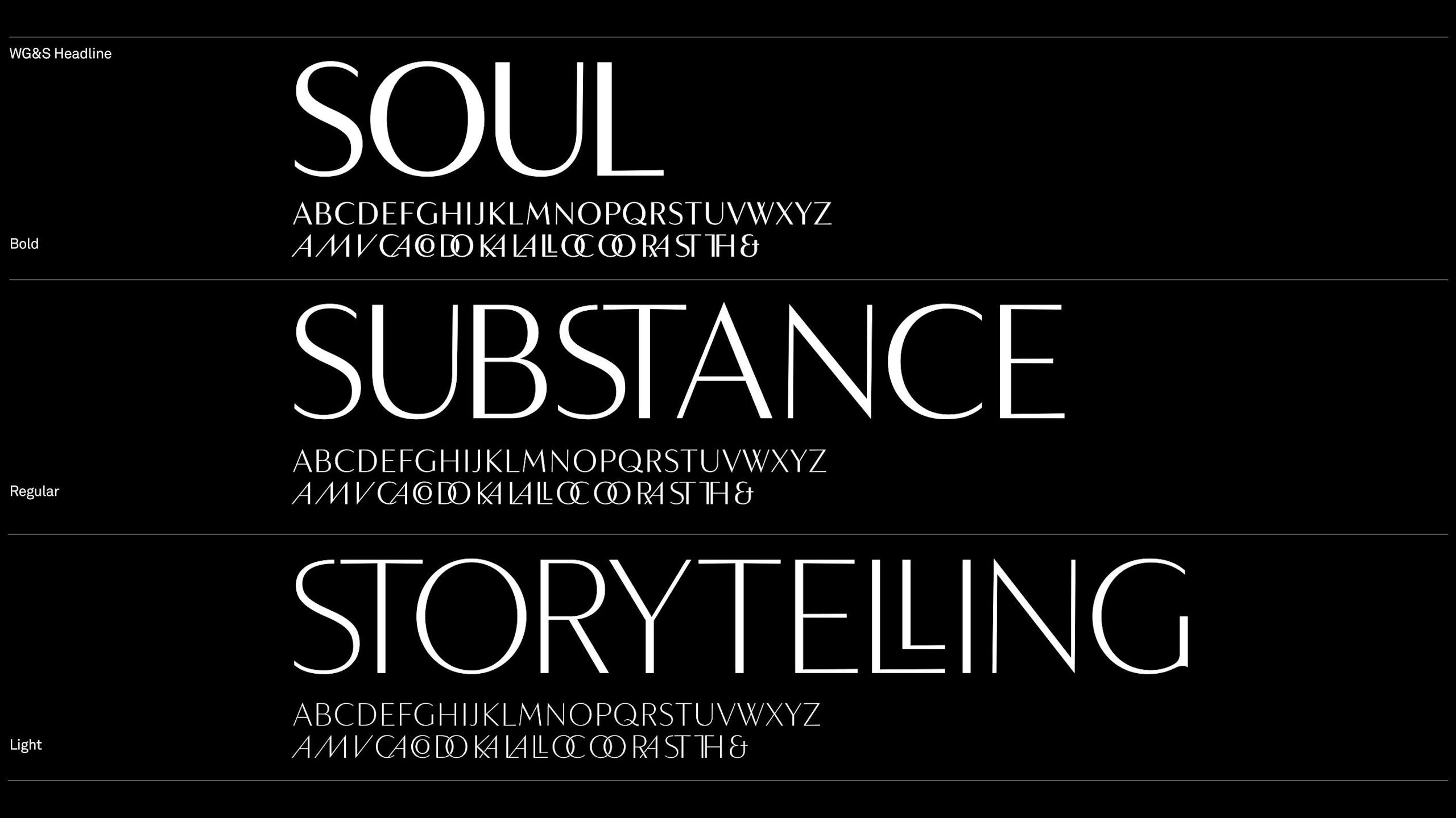
Custom typeface
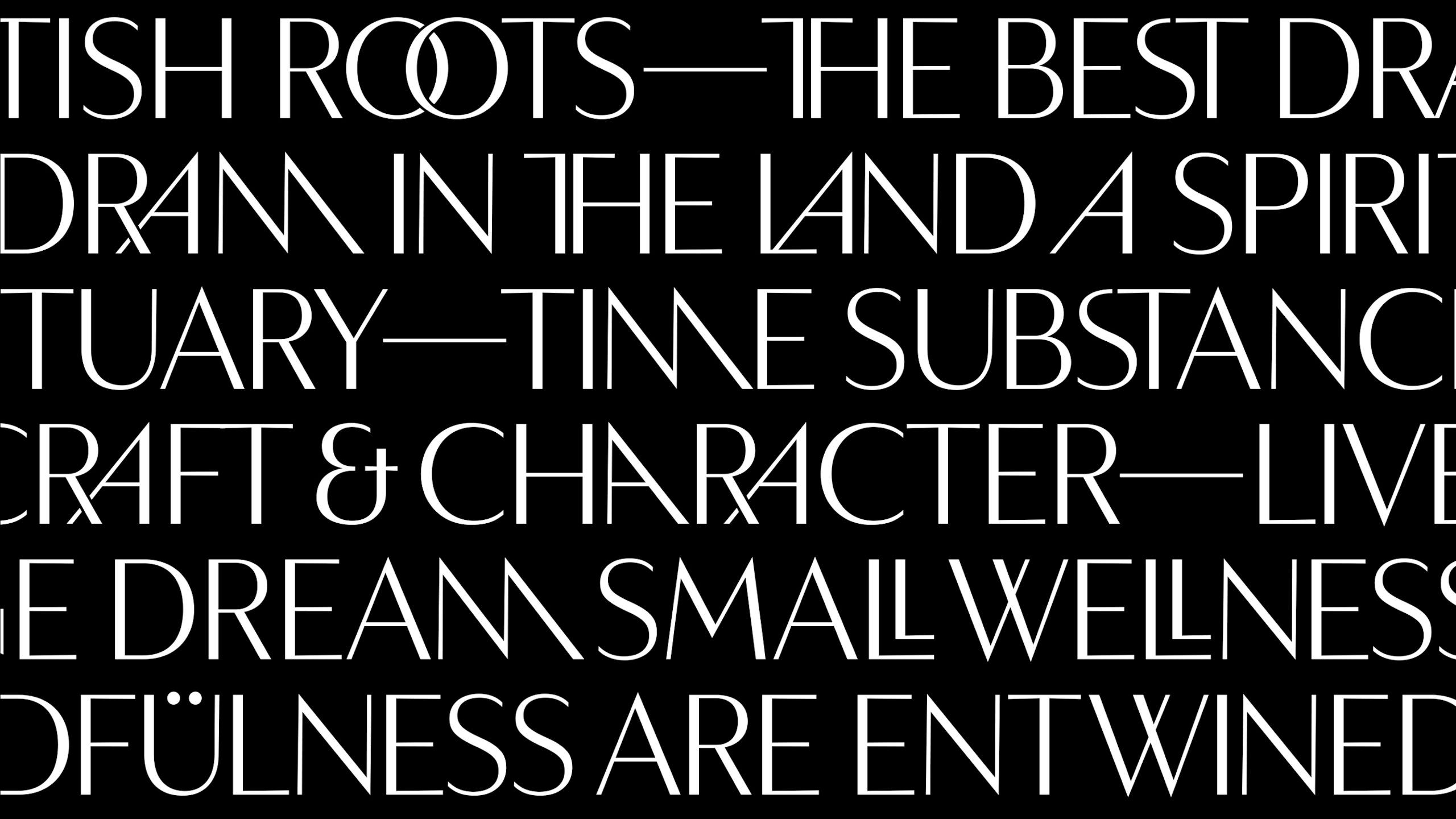
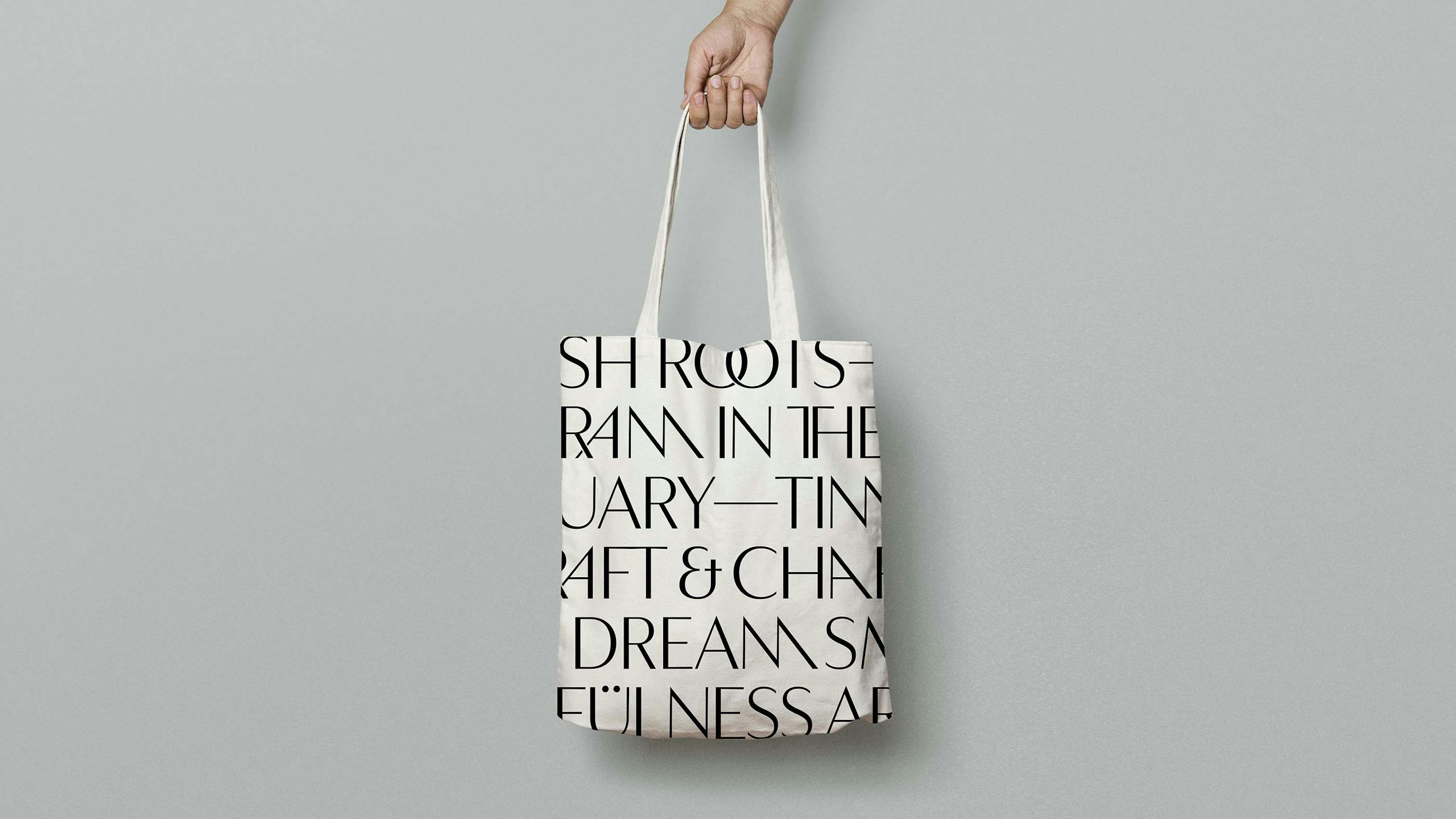
WG&S Headline
Created especially for META by Smörgåsbord and Face37 WG&S Headline is as an all capital typeface boasting a selection of iconic, elegant and highly 'ownable' glyphs. With its elegant tapering stems and geometric thick/thin lines, it’s perfect to convey META’s principles.

GTR
—
Global Travel Retail (otherwise known as 'Duty Free') design elements are designed to stop people in their tracks...


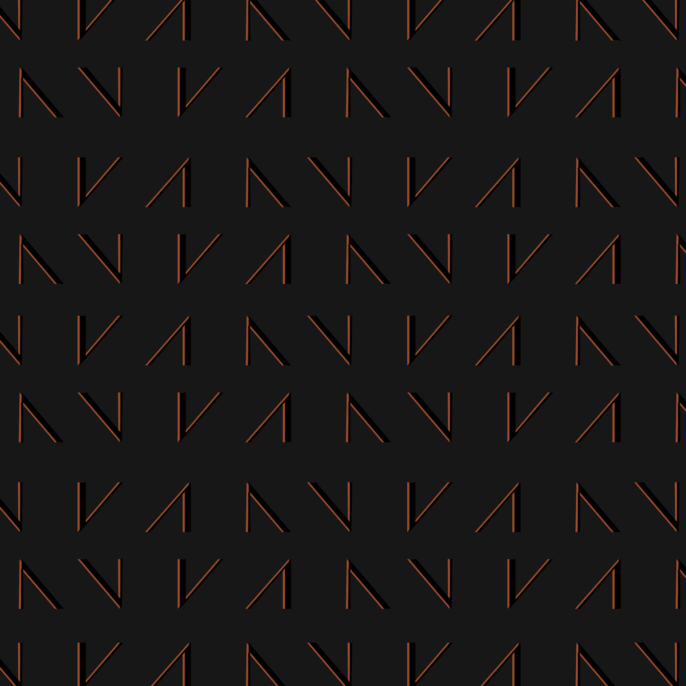
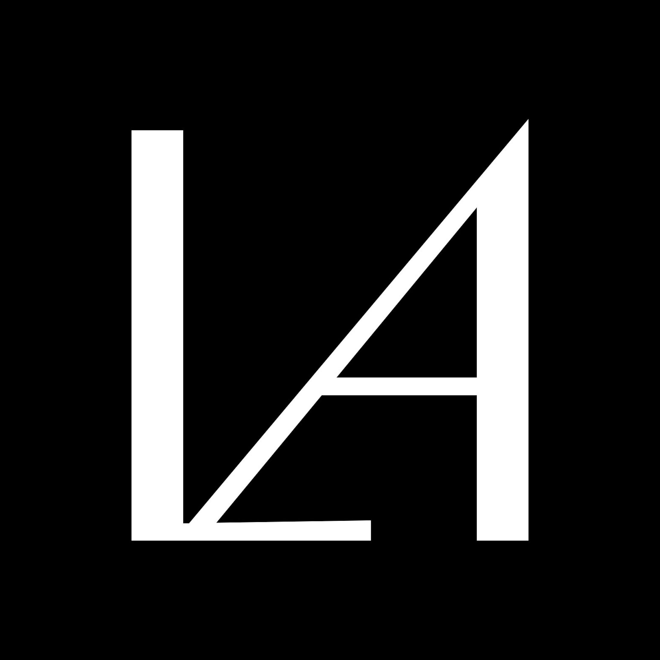
Glyphs
—


Disciplines
Strategy,
Brand Identity,
Typeface Design,
Naming,
Creative Direction,
Copywriting,