MTV
No pressure boys and girls...
The first ever MTV International rebrand created in 2011 that has since been consumed by an audience of 578 million households worldwide. “MTV recreates itself for each generation — our audience is constantly changing and we always change with them”.

Brief—
Triggered by the new MTV logo, the focus of the brand refresh was to build on the standout characteristics of the provisional MTV international rebrand that were developed in close collaboration with Universal Everything in 2009. At the core of the brief was the need for a closer alignment of the brand to the channel’s show content, as well as a design evolution across all media. Essentially a flexible brand tool kit — smart and adaptable whilst still full of personality and relevant to an extremely diverse audience.
Approach—
The logo was a case of evolution not revolution as we created a widescreen crop of the original — resulting in a bolder and cleaner marque that anchors all graphic elements whether on air, in print or online. When onscreen the logo occupies the top left hand corner, orchestrating all around it and letting the viewer know at all times where they are in MTV time — indicating what’s on now, next and later, as well as housing a progress bar that indicates music video and show duration. For the idents we collaborated with the cream of international directors, motion studios and music talent to create work that had instant emotional appeal and resonance with the audience.
Result—
An international audience of 578 million households across 162 countries has since consumed the rebrand, whilst the work featured in the 2012 D&AD Annual and still provides the basis of MTV’s onscreen architecture.
Onscreen
The logo occupies the top left hand corner, orchestrating all around it and letting the viewer know at all times where they are in MTV time — indicating what’s on now, next and later, as well as housing a progress bar that indicates music video and show duration.

Typography
Pharma Bold Condensed
The chosen typeface is Pharma by Swiss type foundry Optimo. It is inspired by the interconnection of organic and technological aesthetics and when set in capitals in the bold condensed weight it makes for a highly legible typeface which is spatially efficient.

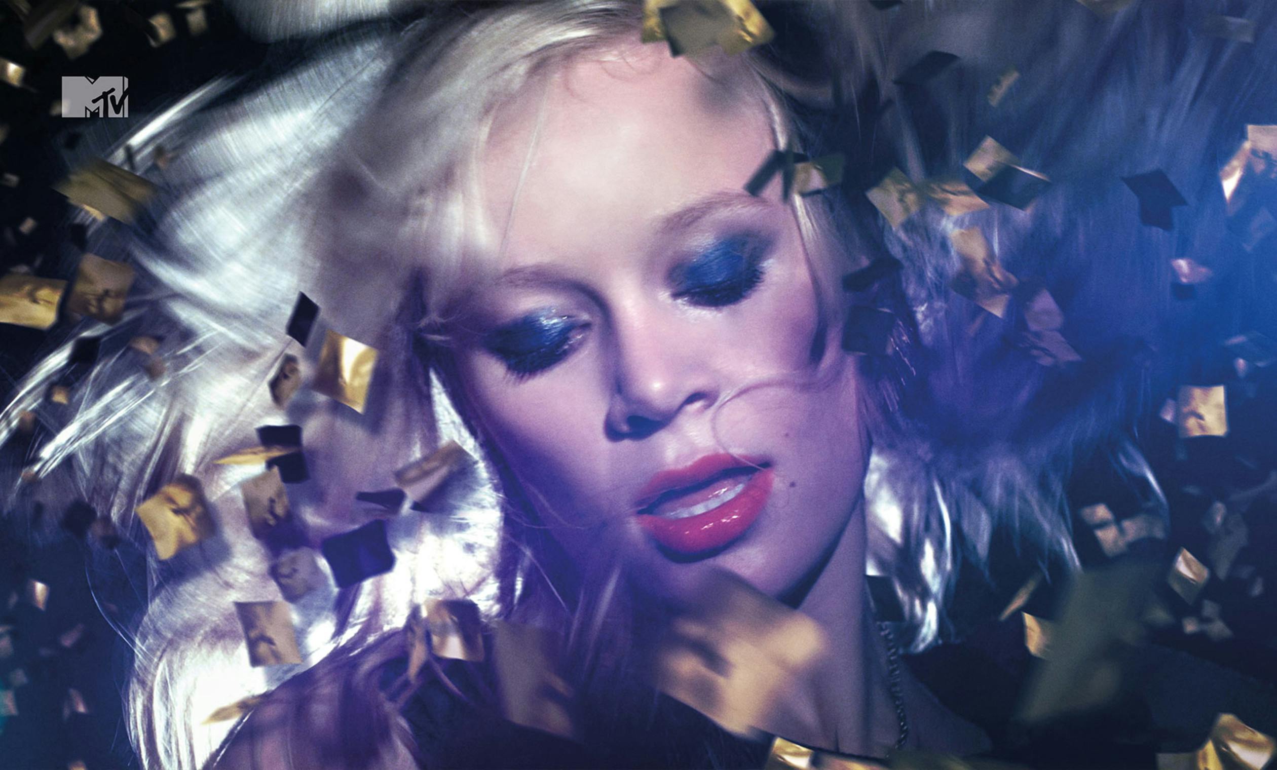
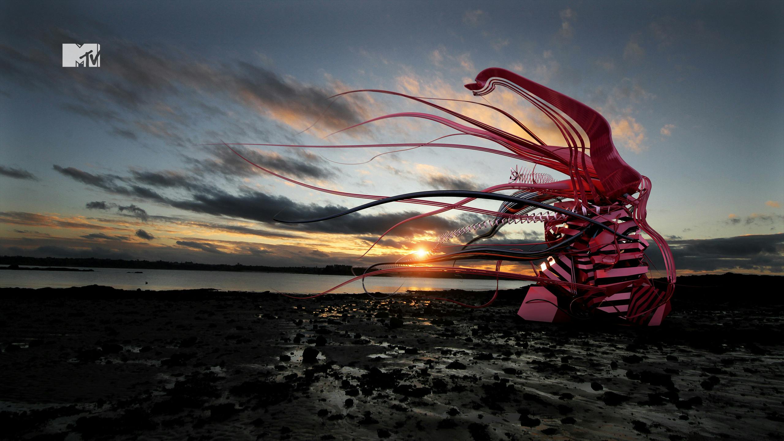
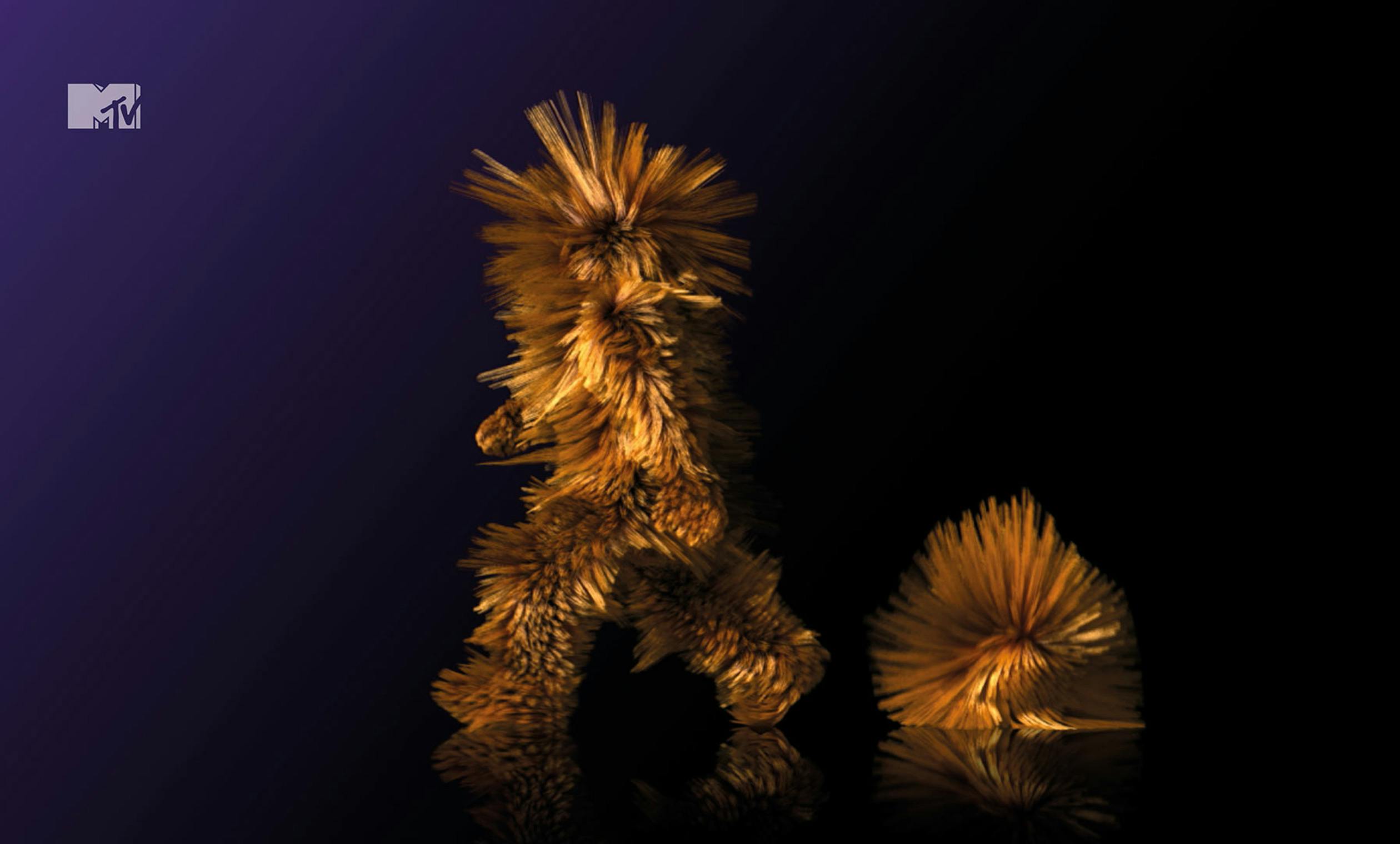
Idents
8 studios, 32 idents
We collaborated with the cream of international directors, motion studios and music talent to create work that had instant emotional appeal with the audience.
Disciplines
Brand Identity,
Creative Direction,
Content Creation,
Strategy,
Motion Design,
Production,
Production,
Art Direction,