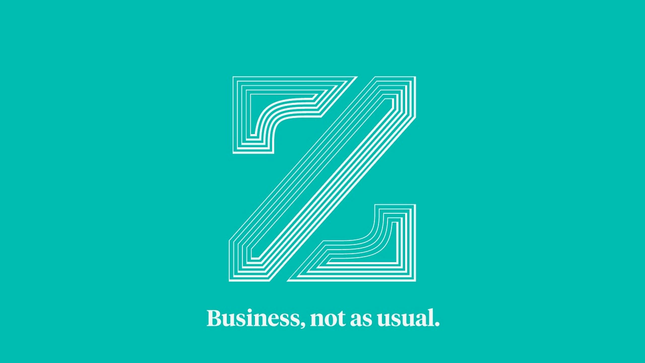
RTLZ
Business, not as usual.
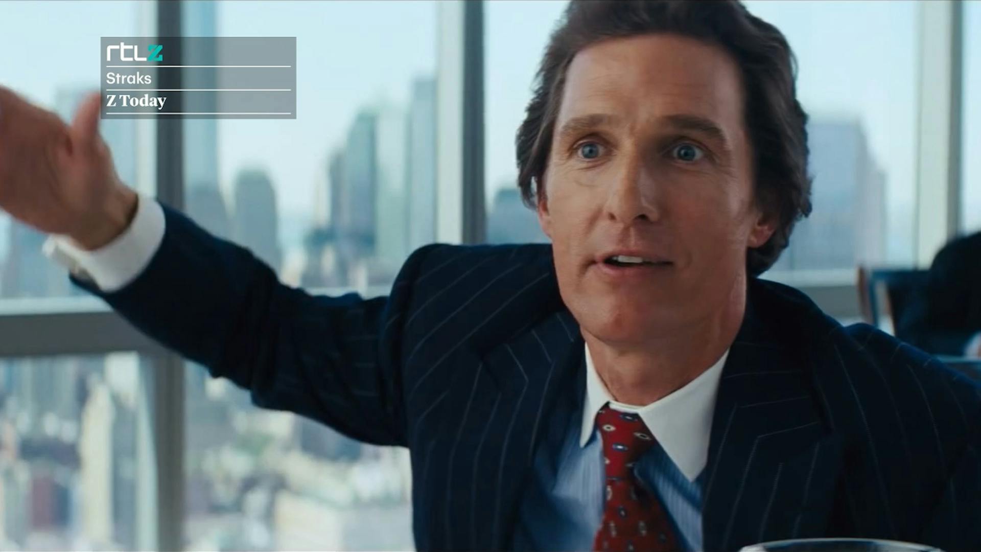
Established in 2001 RTLZ is a Dutch business and financial news television channel — the sister channel to RTL Nieuws. Its daytime offering focuses on business and capital marketing programming and its omnipresent ‘ticker’ reflects the latest movements from the worlds trading floors. In the evenings the programming consists of documentaries on entrepreneurship and innovation.

Brief—
To celebrate the channel ‘going 24/7’ we, together with Mark Porter Associates, were asked to oversee a complete brand overhaul which would additionally bring RTLZ in line both strategically and creatively with RTL Nieuws. We were also charged with creating a launch strategy and film.
Approach—
We chose to focus on a core idea — ‘inspiring personal progress’. We translated this into a visual system based on continual forward motion combined with a Kubrick inspired single-point perspective. This meticulous approach to camera movements, shot framing and typographical animation meant that all moving elements shared a cohesive look that was unmistakably RTLZ — where it’s business, not as usual.
Result—
The rebrand helped cement RTLZ’s reputation as the Netherlands’ leading, most popular and credible business and financial news television platform.
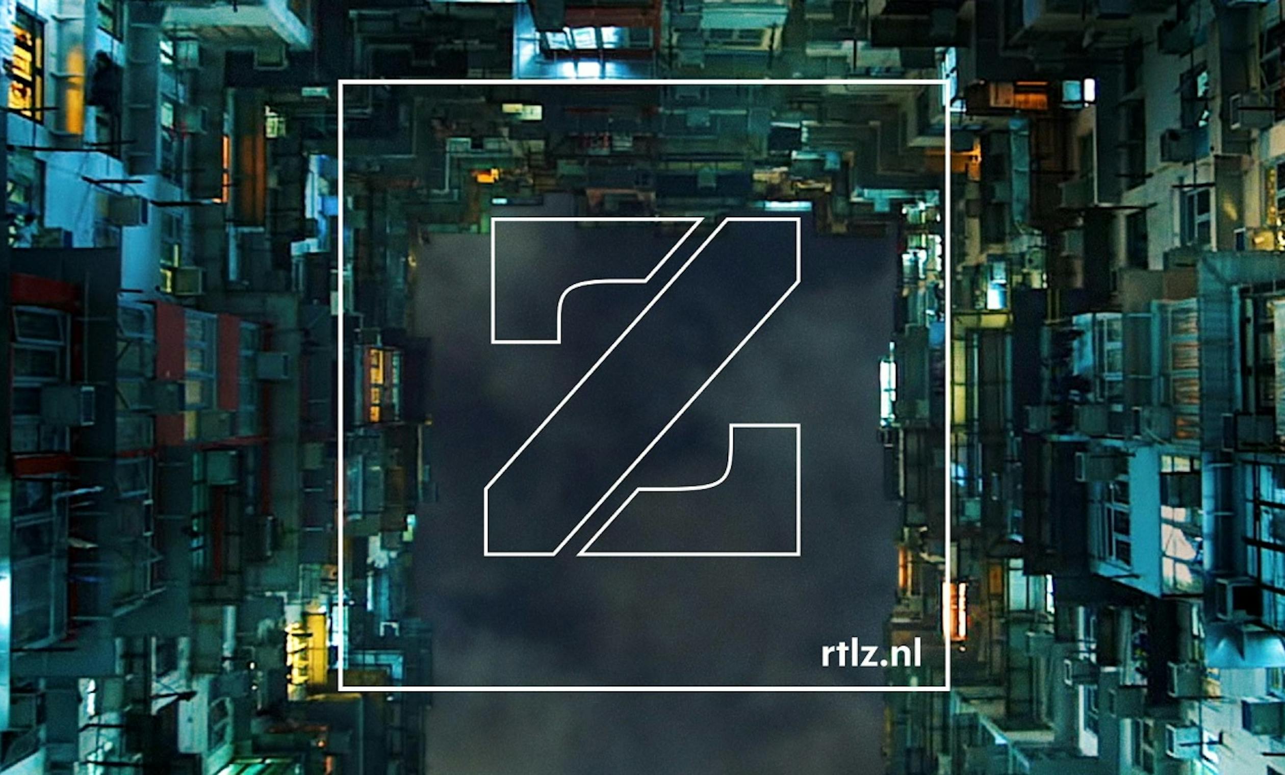
RTLZ logotype
The new ‘Z’ logo has evolved from the original marque into a more graphic stencil form, with variants for different contexts.

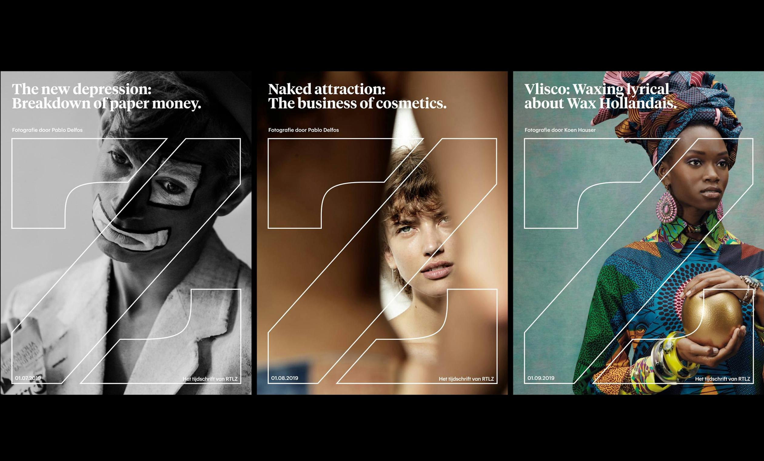
Z logo
An outline 'Z' logo was created for extra large use over photography and live action, and an extruded version inspired by security printing on credit cards and bank notes for use against flat graphic backgrounds.

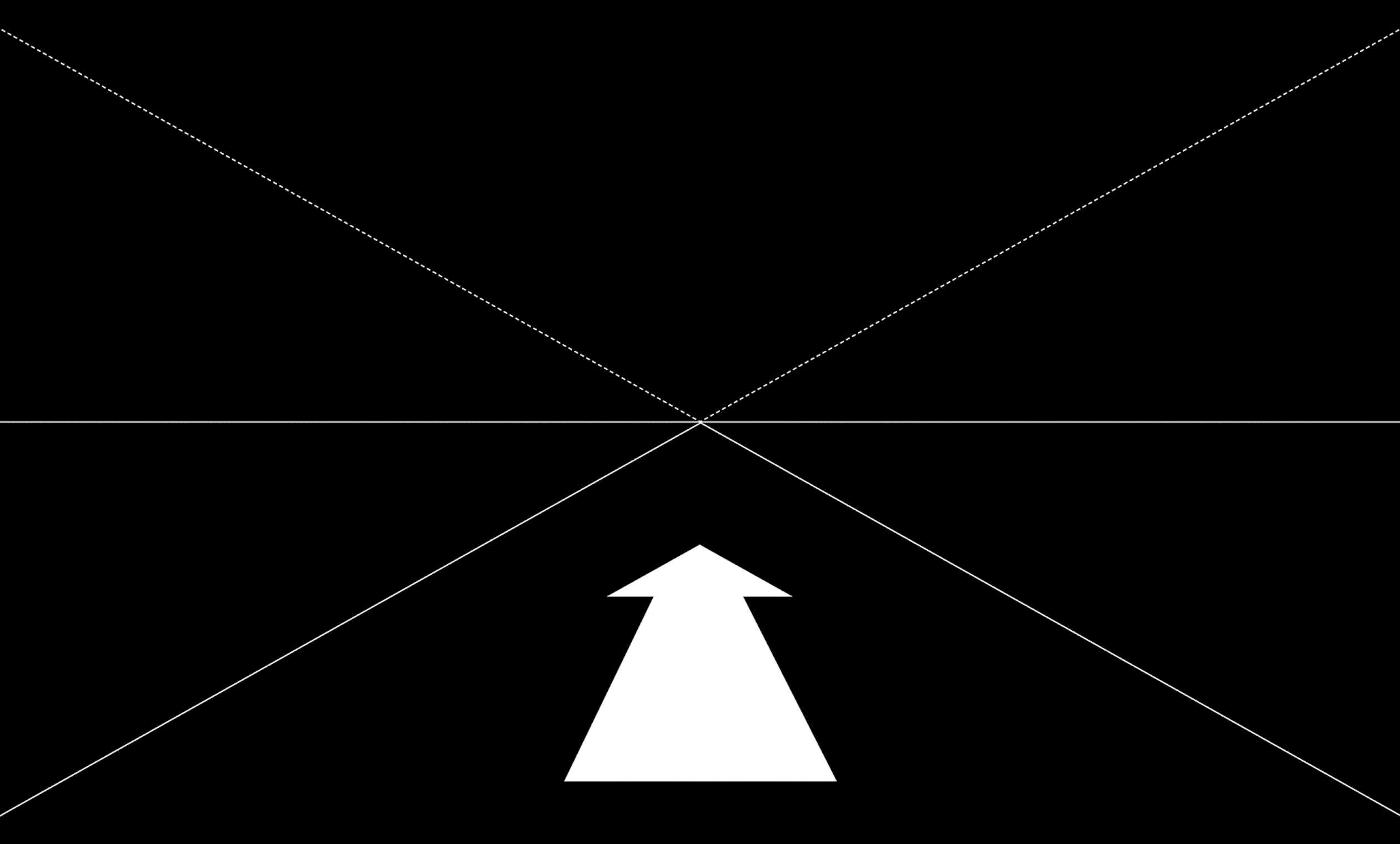
Core idea
Inspiring personal progress
We chose to focus on a core idea — ‘inspiring personal progress’. We translated this into a visual system based on continual forward motion combined with a Kubrick inspired single-point perspective. This meticulous approach to camera movements, shot framing and typographical animation meant that all moving elements shared a cohesive look that was unmistakably RTLZ — where it’s business, not as usual.
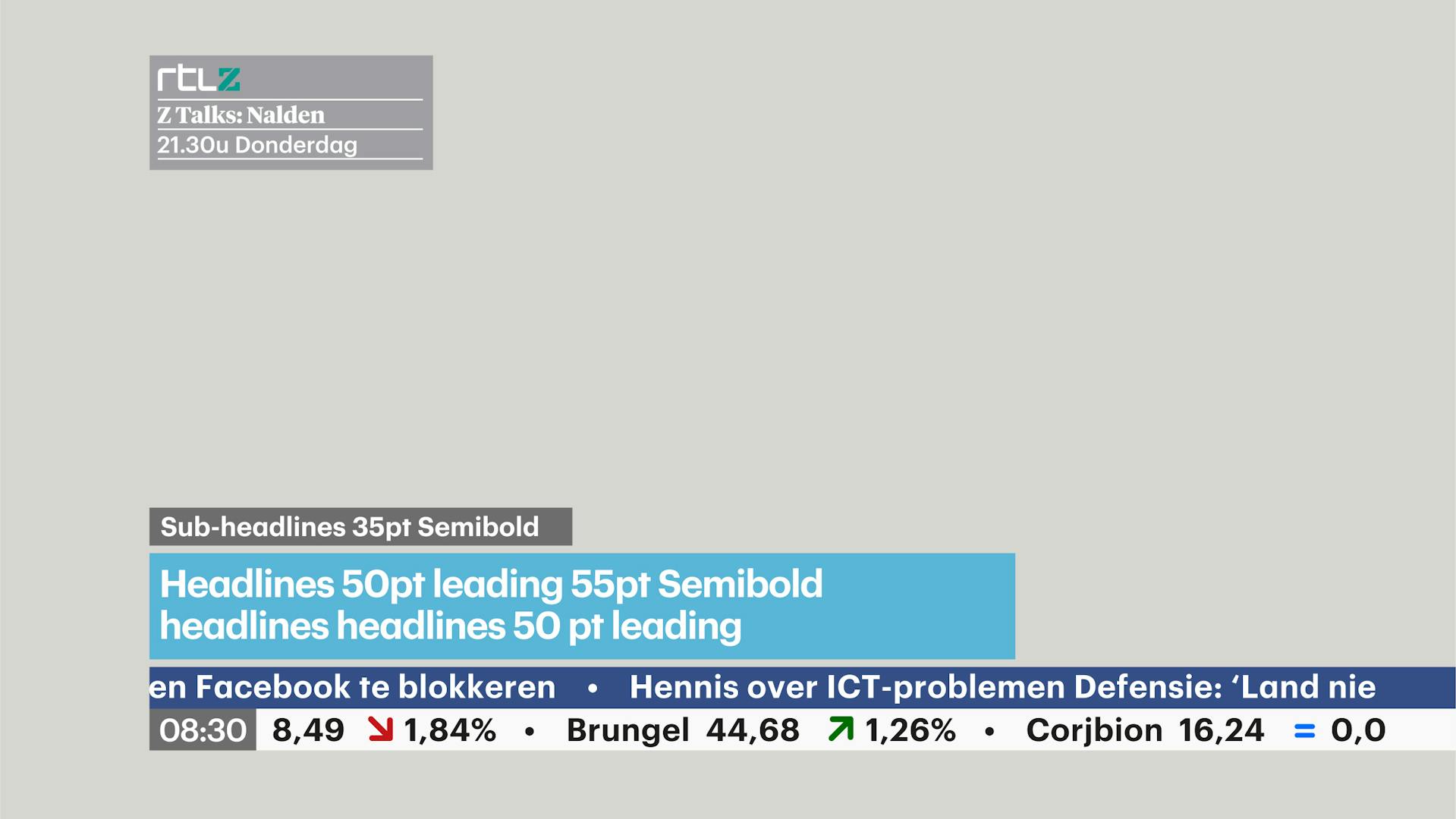
Typography
Graphik, RTL’s hard-working house typeface, is partnered with Tiempos, an elegant but gutsy serif font with its roots in print. TV design has traditionally shunned serif type, but on today’s high resolution screens, the old rules no longer apply.
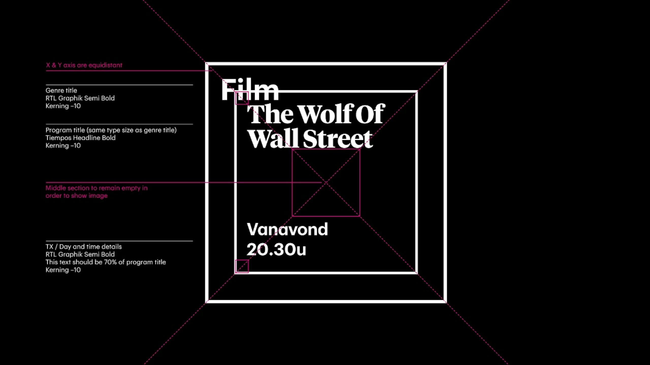

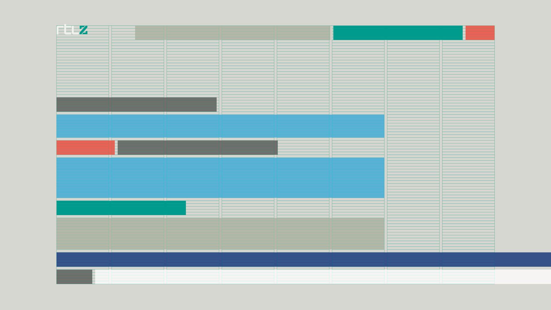
Screen graphics
Responding to the growing importance of data journalism we created a comprehensive range of map, chart and diagram styles which prioritise simplicity and clarity. Colour-coded containers support the onscreen information, with sizes and colours determined by the editorial hierarchy.
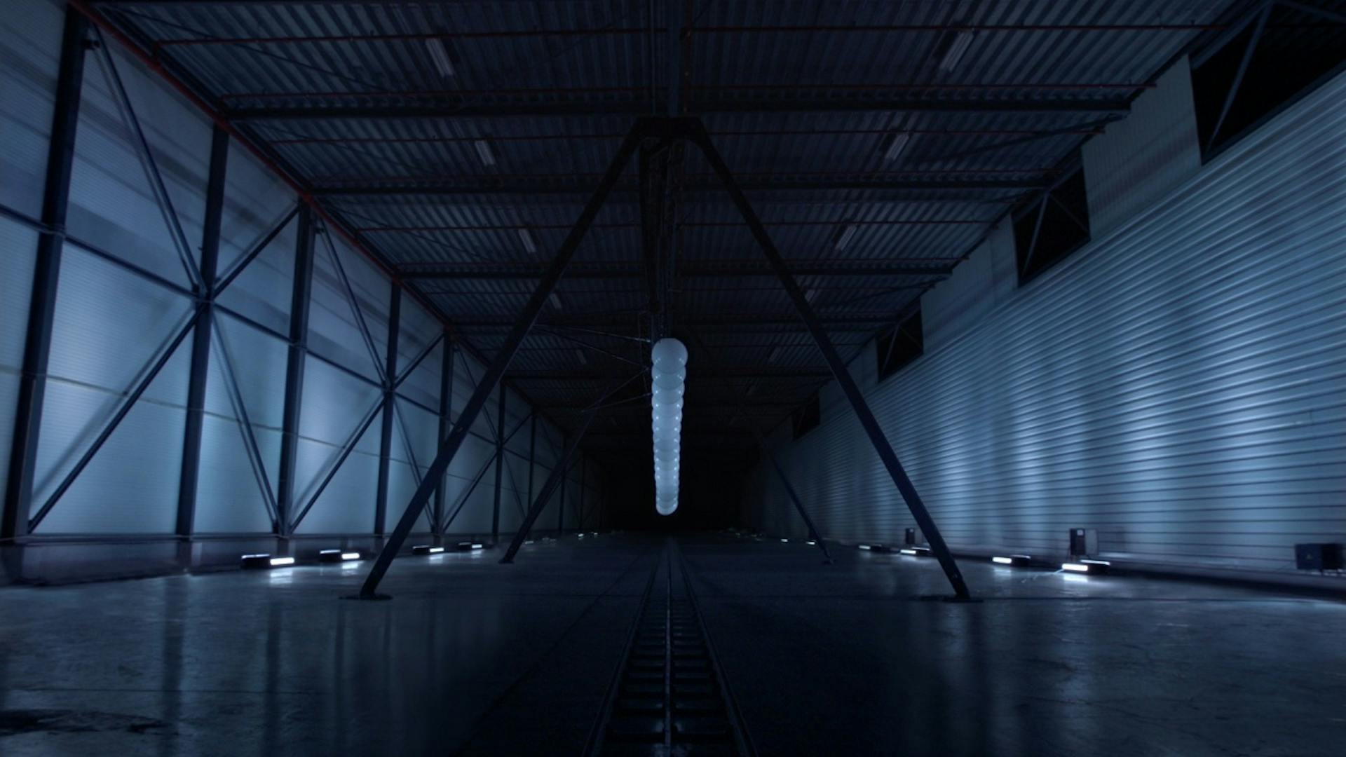
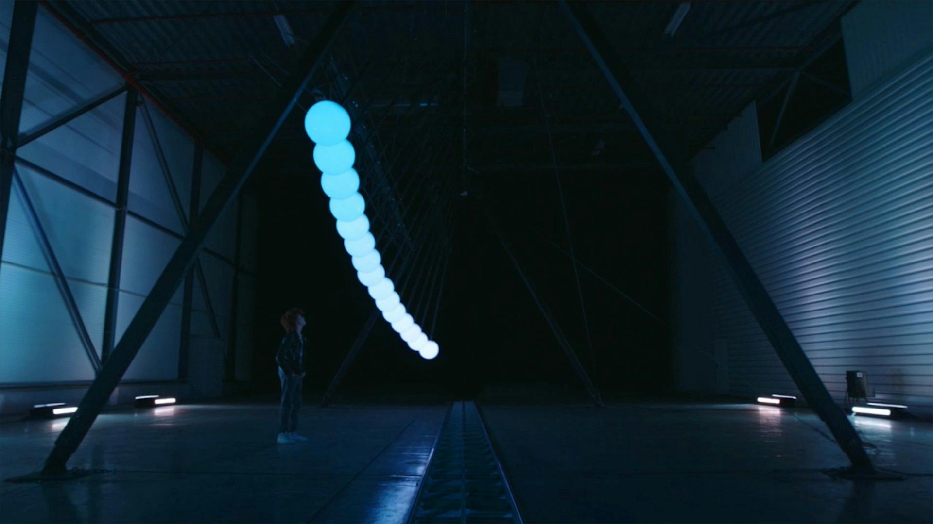
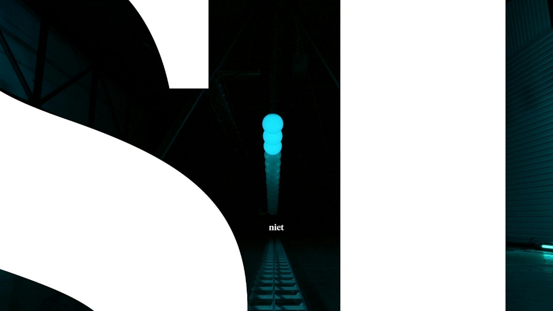
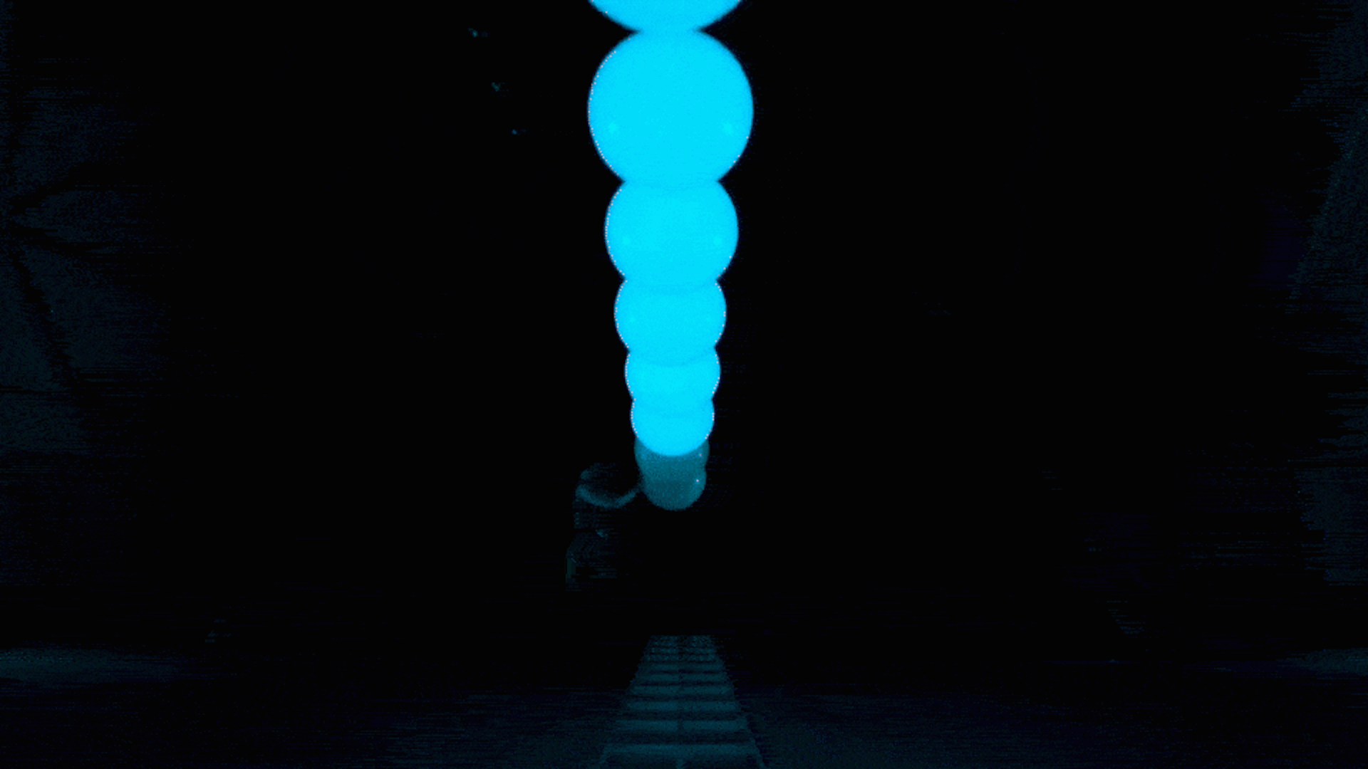
Launch campaign
For the channel launch we called on Amsterdam based ideas agency We Are Pi, who collaborated with Dutch kinetic artist Ivo Schoofs on a bespoke version of his colossal light sculpture ‘Pendulum Wave’, and applied our forward motion principle in a mesmerising short film.
Disciplines
Creative Direction,
Production,
Motion Design,
Concept Creation,
Installation,
Art Direction,
Broadcast Design,
Brand Identity,
