LOT61
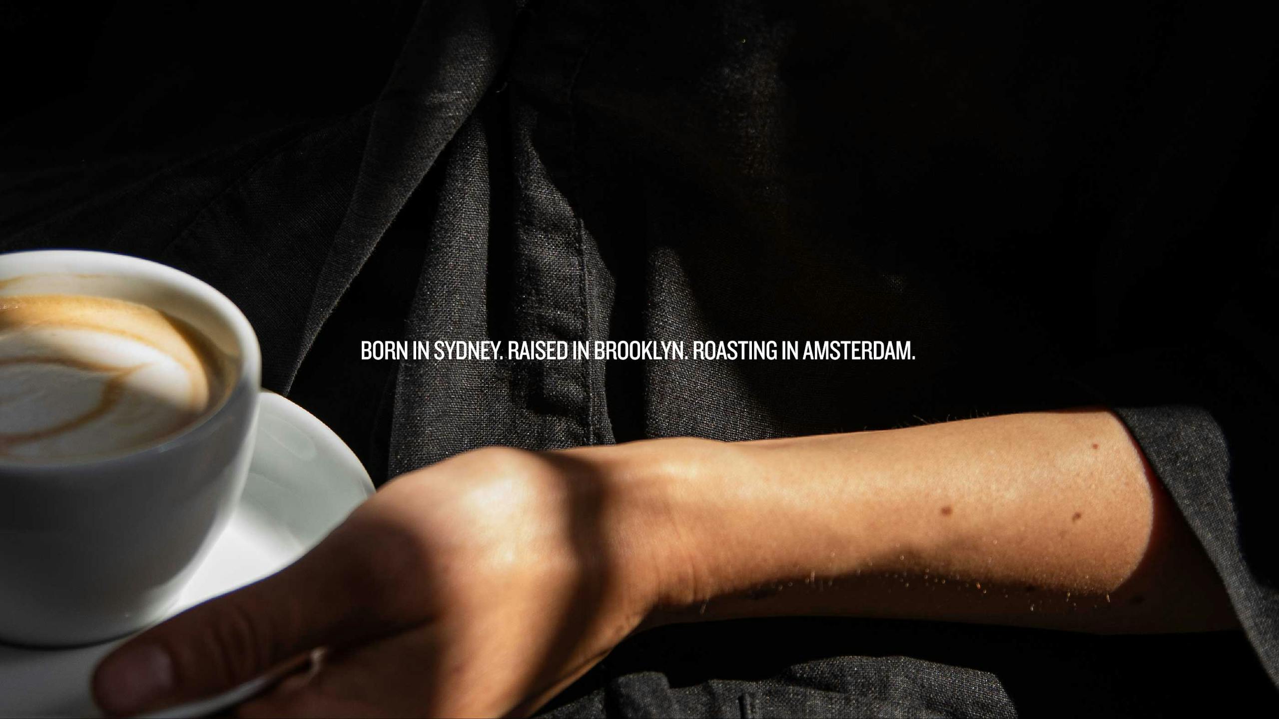
Born in Sydney. Raised in Brooklyn. Roasting in Amsterdam.
Amsterdam based LOT61 Coffee Roasters pioneered the third wave of coffee back in the day. But time does not stand still and they could feel the competition nipping at their heels in an increasingly crowded marketplace. They invited us on board to redefine the brand and to tool it up for their ten year plan.

Brief—
LOT61 had been going through somewhat of an ‘identity crisis’ adopting two or three brands in as many years. In business terms being too busy roasting and selling coffee to focus on future brand strategy and positioning is not such a bad thing but the owners deemed 2020 the time to align and elevate the brand. Our brief was to create a contemporary brand with longevity and a baked-in ‘sense of place’.
Approach—
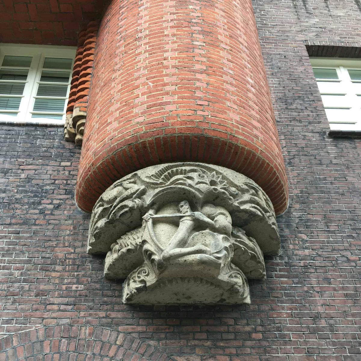
It’s no secret that the coffee sector is well served with thoughtfully designed brands so we set about making LOT61 stand out from the crowd. We started by doing an inventory of the world’s leading coffee brands, placing them into one of four (aesthetic) categories: Minimal/Hipster; Traditional/Established; Source/Origin; and Mainstream. We sought to position LOT61 at the intersection of the first two categories which led us to look at the Amsterdam School of Architecture for inspiration.
Result—
If success is measured by a product being bought as much for the packaging as what’s inside it, then the rebrand is already a success. Furthermore, the Probats are cranking out more beans than ever, all five outlets are aligned, new accounts are up by 30% and LOT61 have recently secured B-corp status.
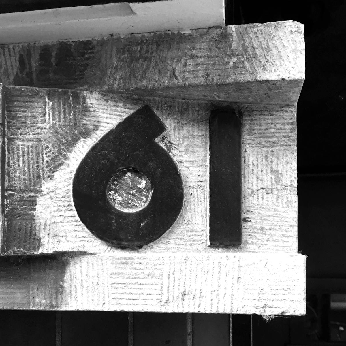
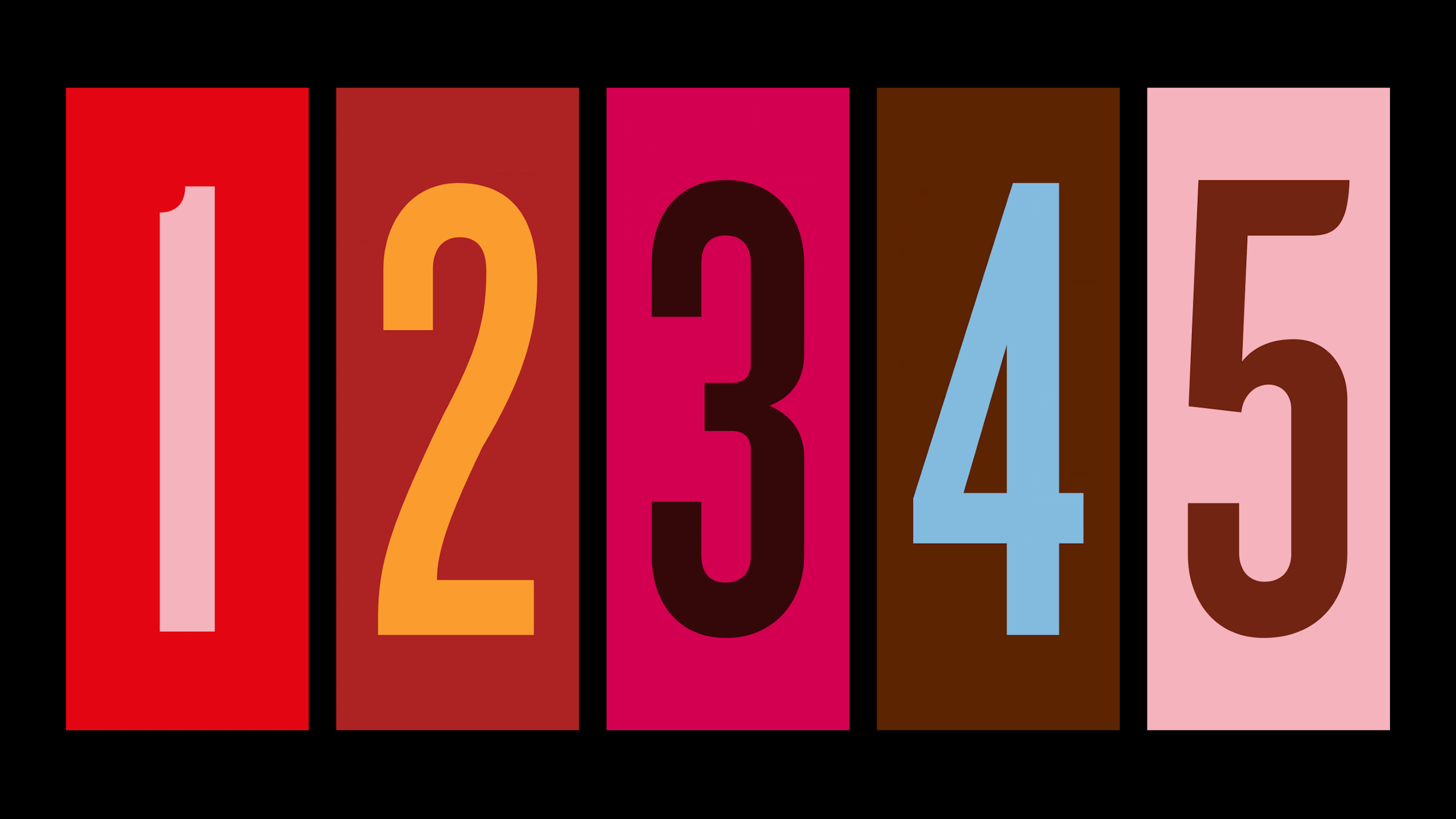
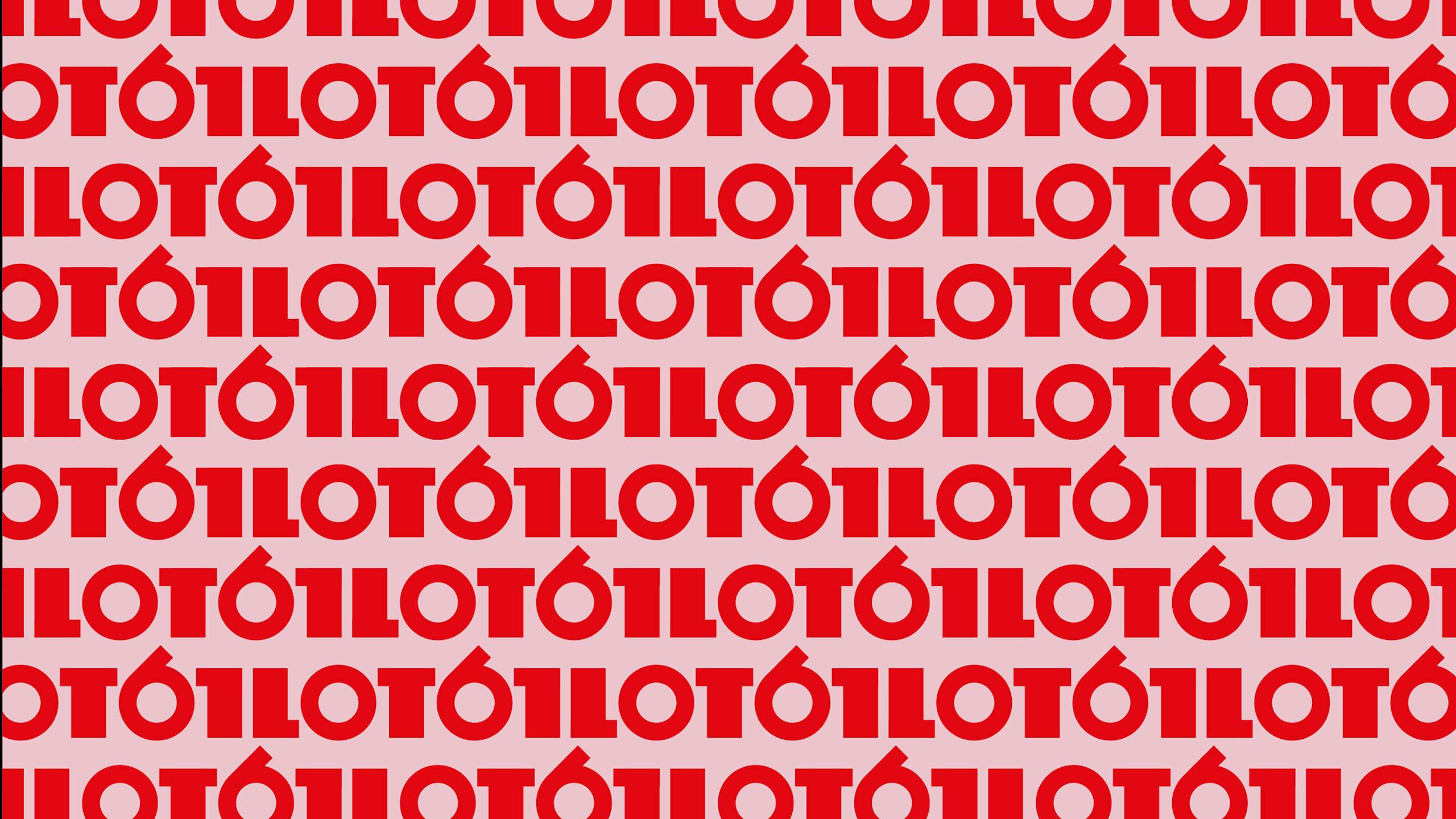
Logotype inspiration
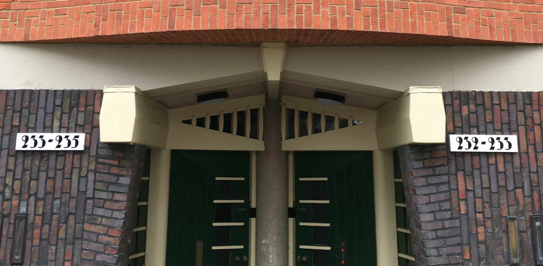
The new logotype is informed by the Amsterdam School — a style of architecture that arose in the city between 1910 and 1930. Whilst dialled up with some contemporary touches it retains its 'sense of place'. The hand drawn characters’ ‘thicks’ and ‘thins’ are all 2:1.
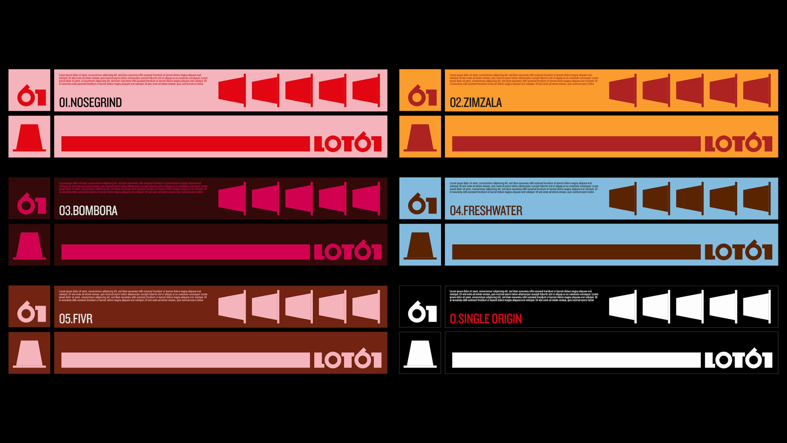
Colour palette
= flavour
The Coffee Tasters Flavour Wheel was created using the sensory lexicon developed by World Coffee Research. The wheel is beautiful, like the greatest coffees can be, and is an intuitive tool for the coffee taster. It represents a comprehensive and kaleidoscopic picture of coffee flavour but has never been used as the basis for a coffee brand's colour palette — until now.

Packaging
—
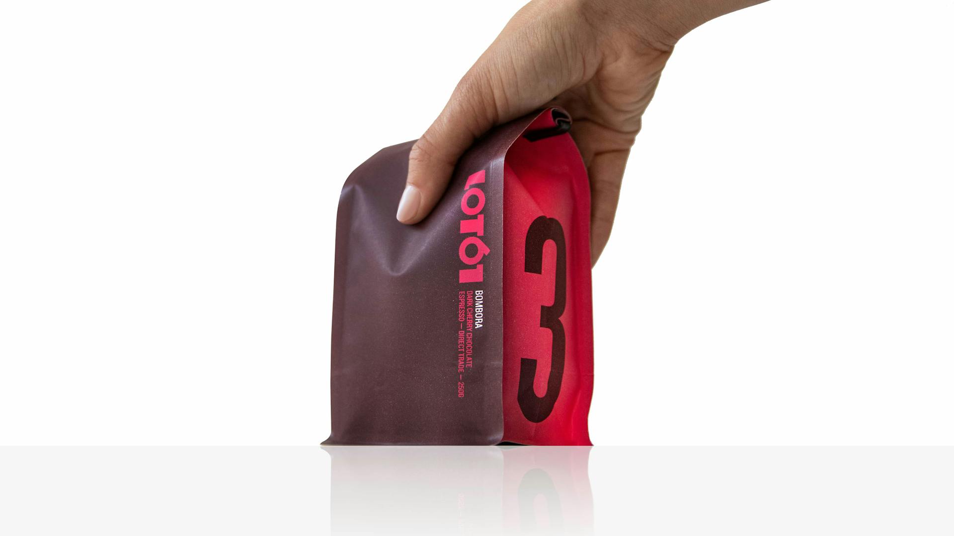
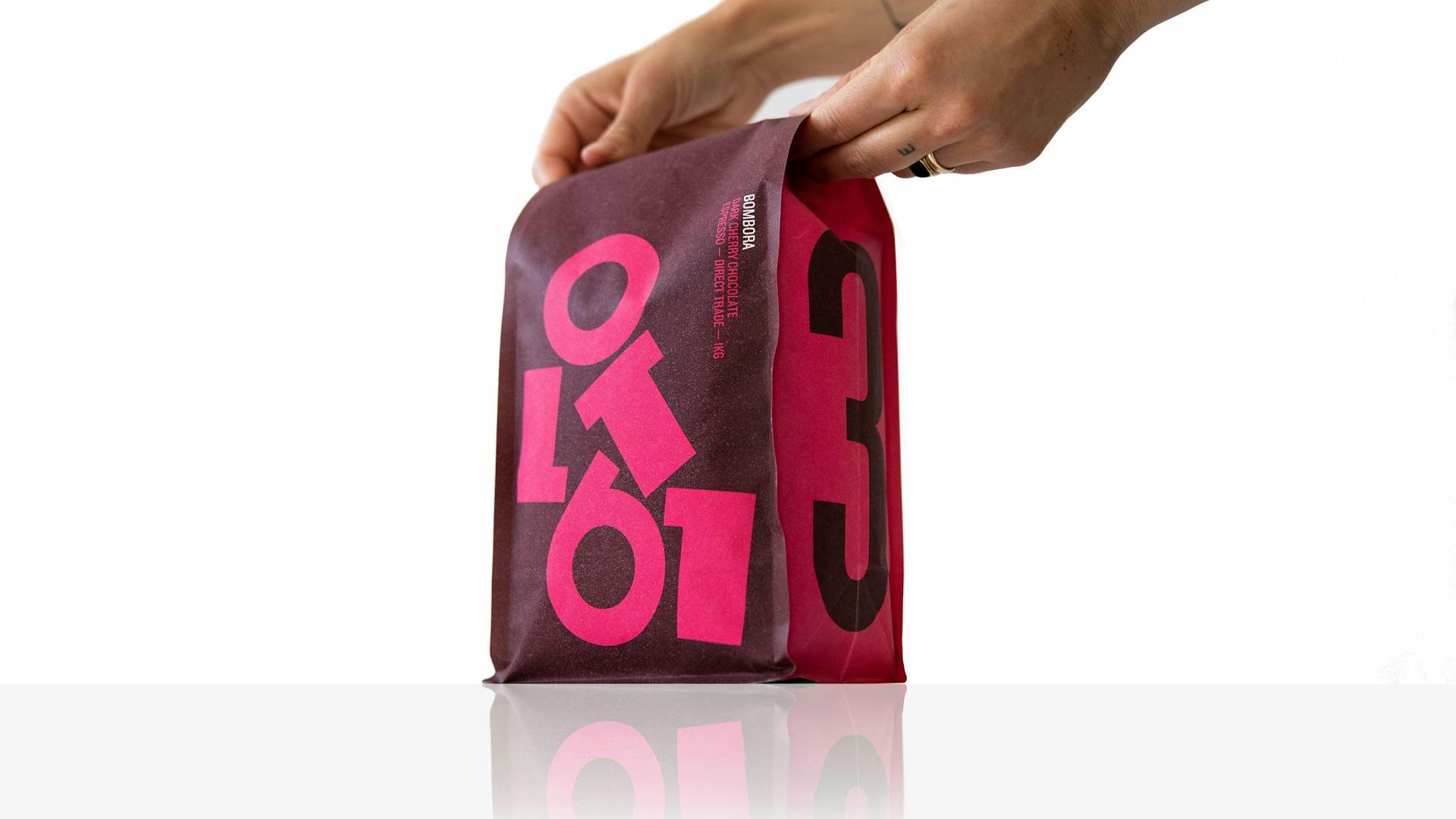
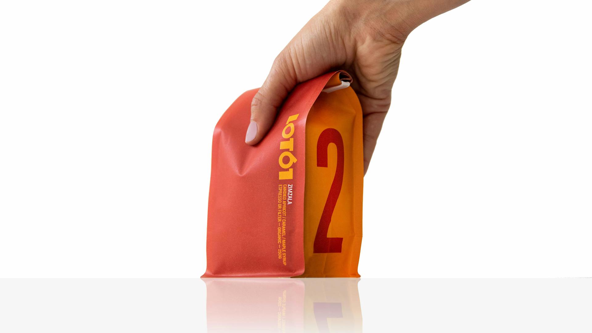
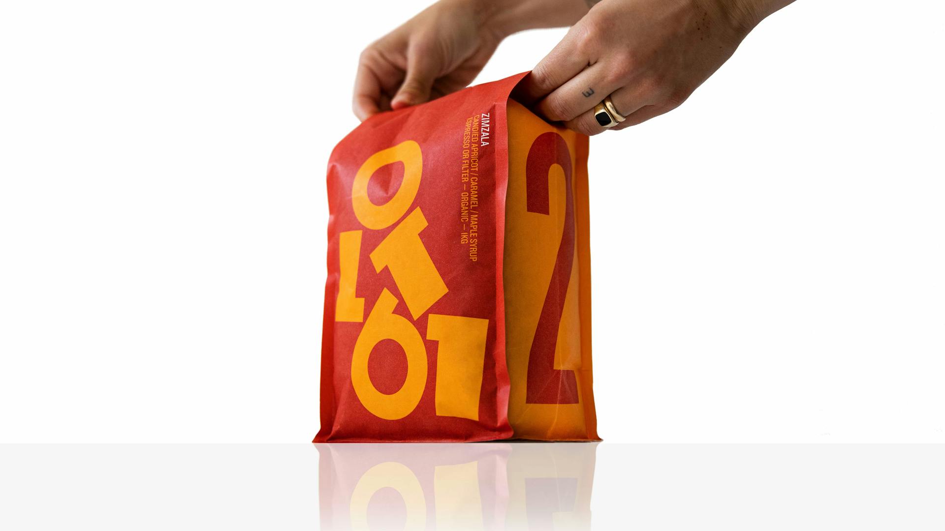
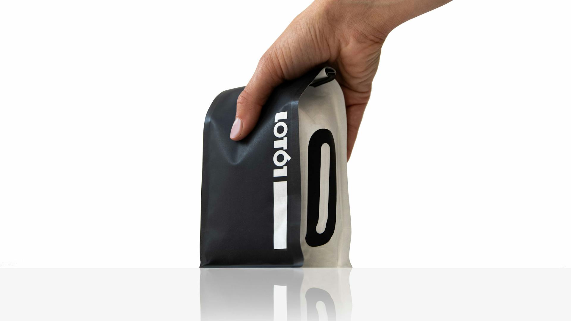
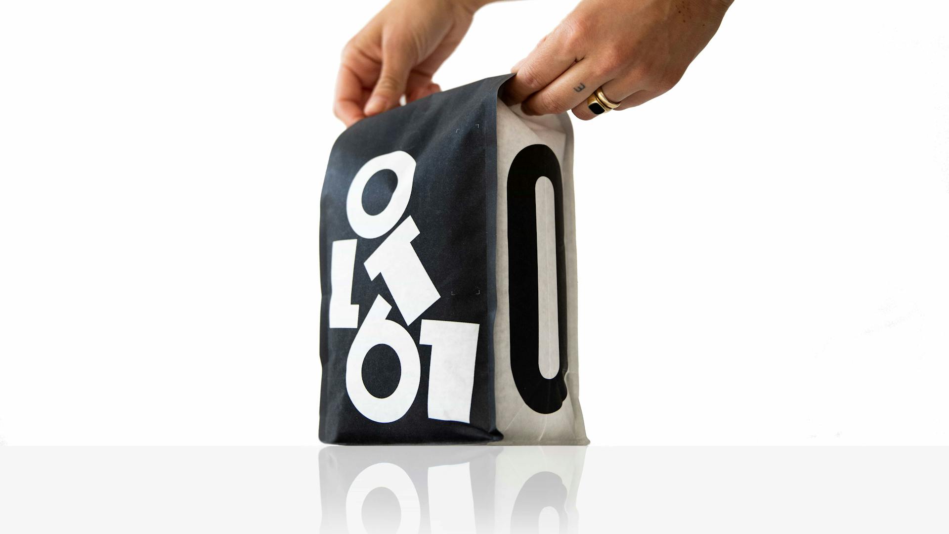
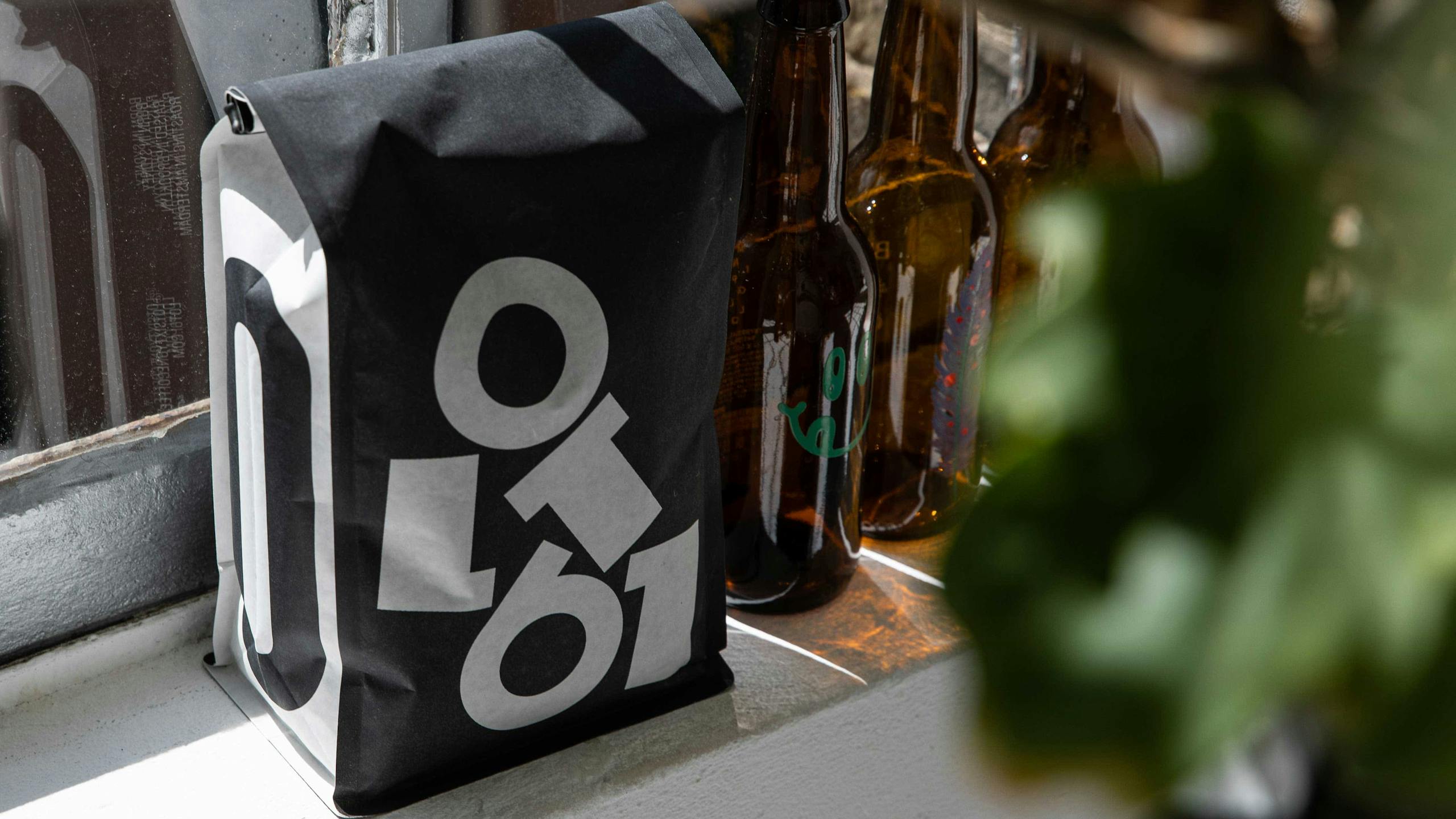
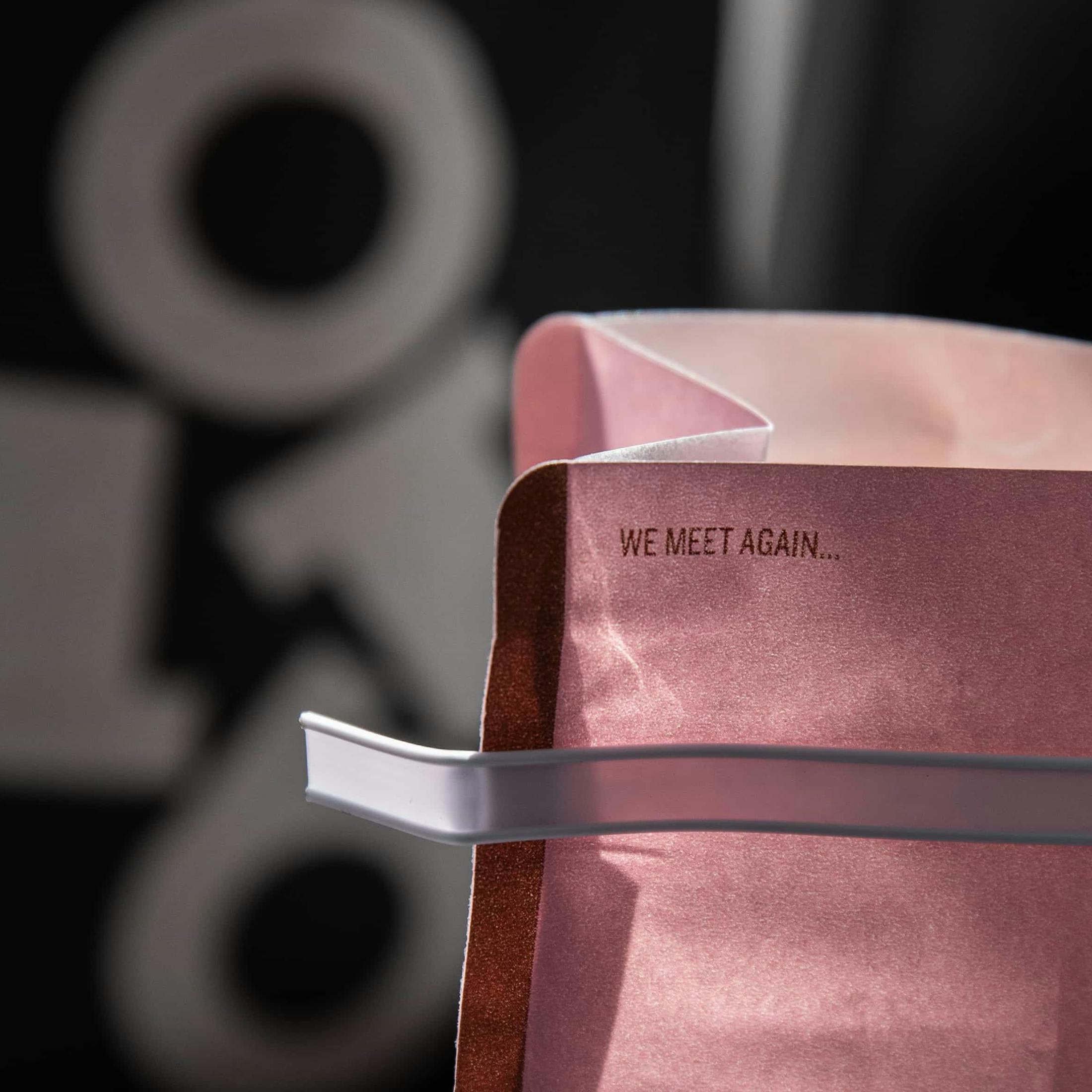
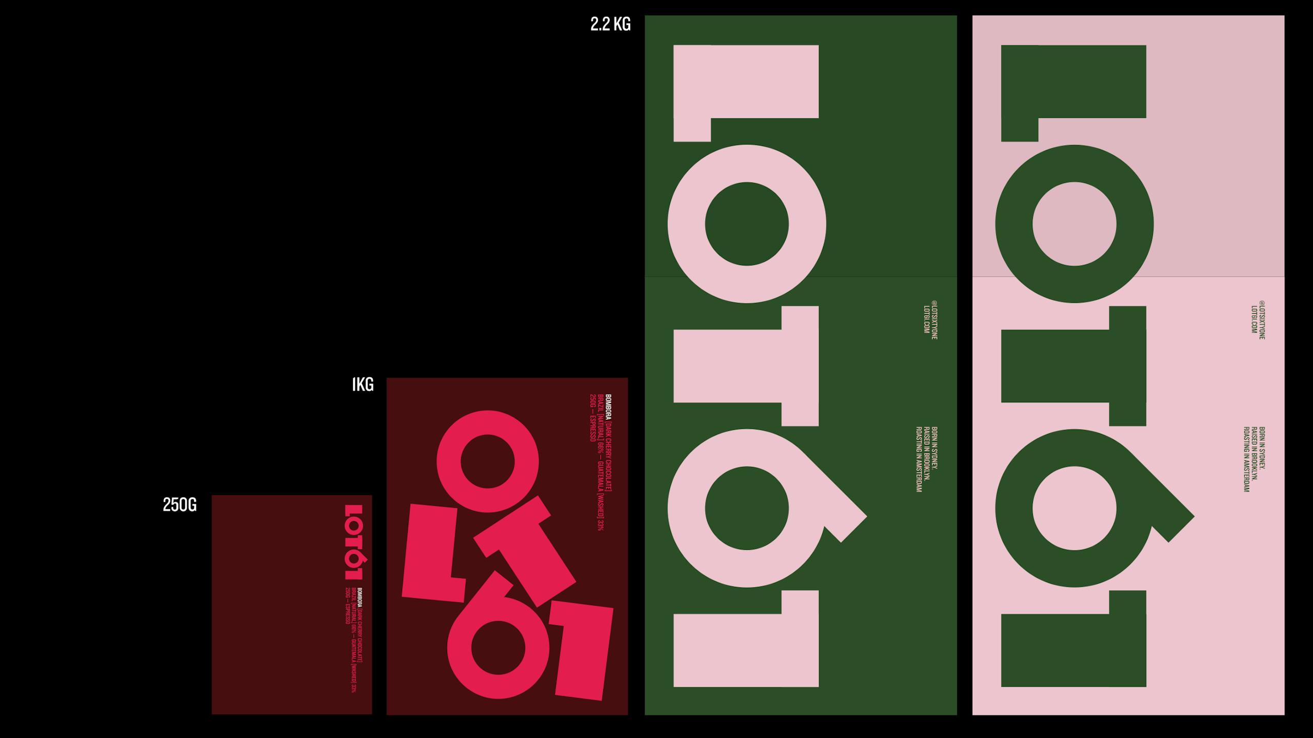
Many coffee roasters are currently opting for plasticised pouches that would look more at home stuffed with muesli. Our client was keen to use bags that he used to buy in grocery stores in NYC — bags that felt substantial and ‘brick like’. The 250g and 2.2kg bags feature the standard logotype whilst the 1kg features a playful, disrupted version.
Icons
—
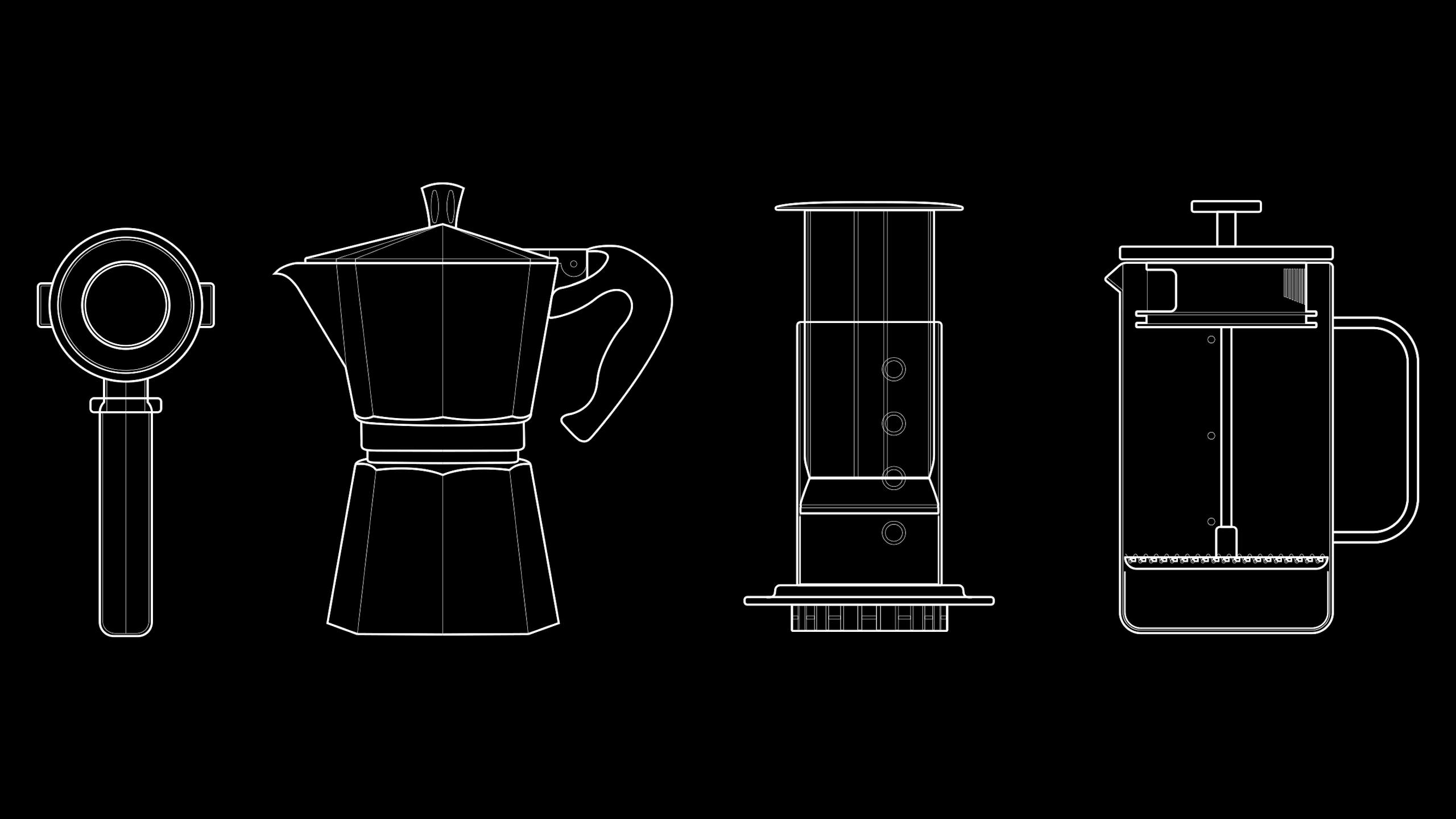
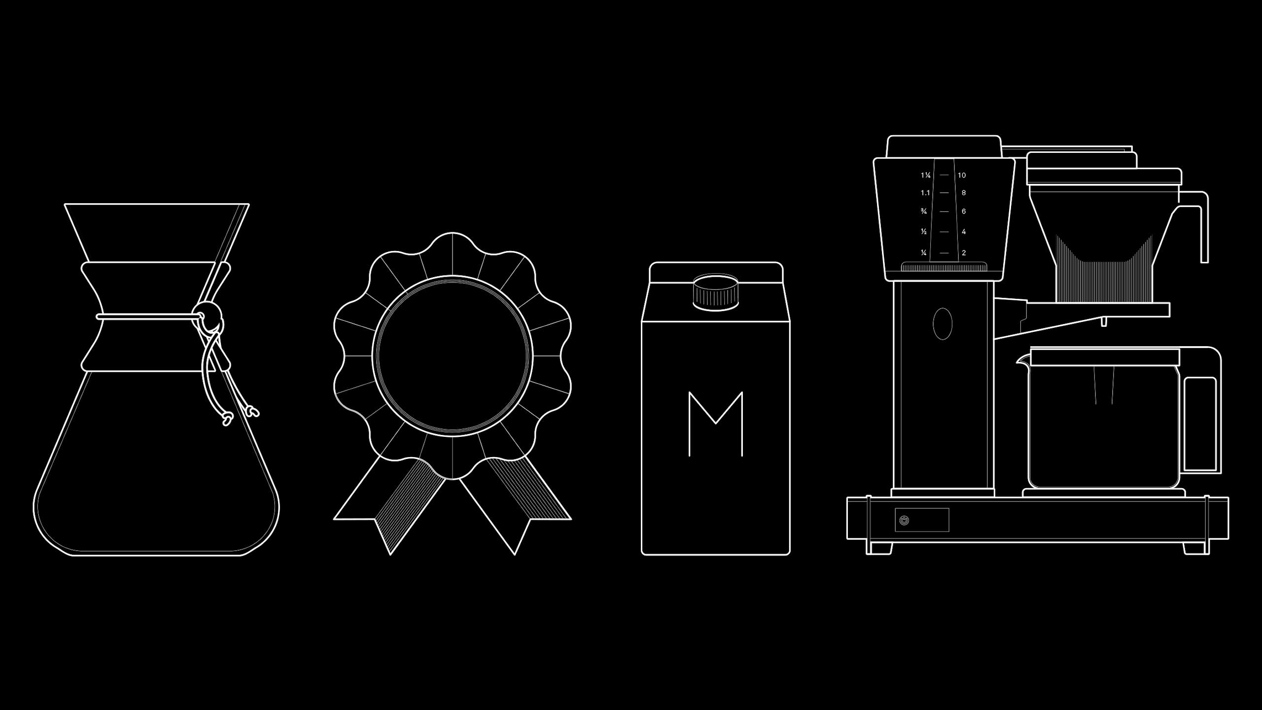
We’ve drawn a set of eight bespoke icons that serve to visually distinguish between the coffee brewing methods. All icons are drawn with three levels of detail dependent on the scale that they’re used.
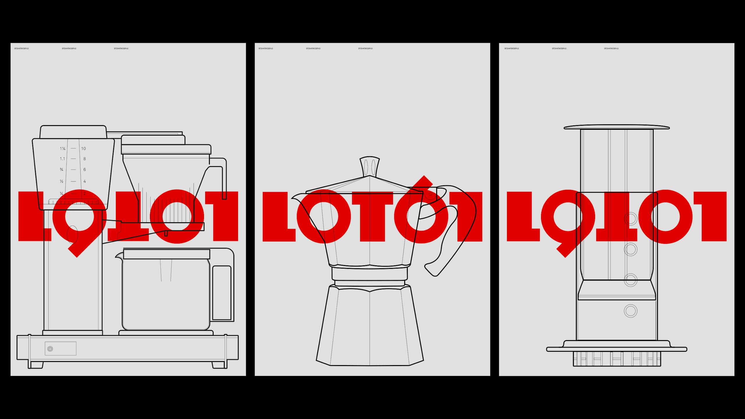
Posters
A1 screen printed posters that further subvert the logotype.
Strapline
—
It sometimes feels like every second person in Amsterdam is a Coffee Roaster, but crucially no one can boast the pedigree and knowledge of LOT61. We wanted to put this front and centre and penned: Born in Sydney, Raised in Brooklyn, Roasting in Amsterdam.
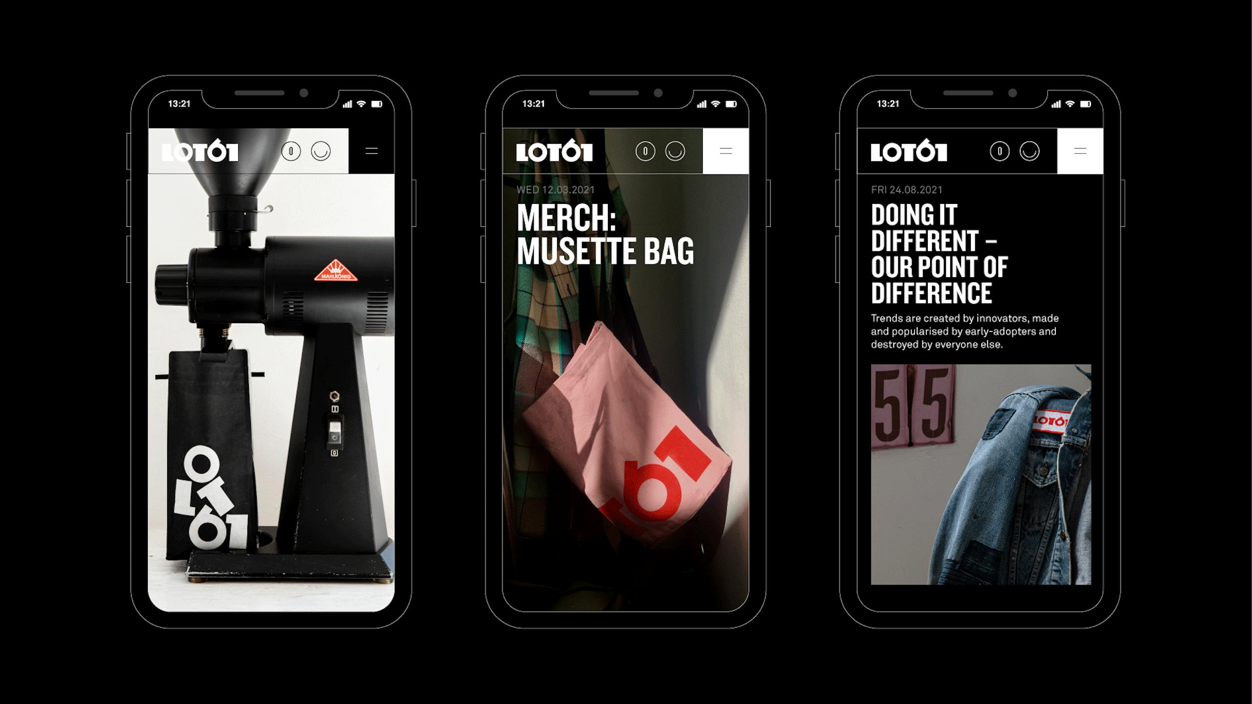
Website
Mobile first...
The digital platforms were developed by our long term collaborators Mike Sullivan and Christian Laufenböck.
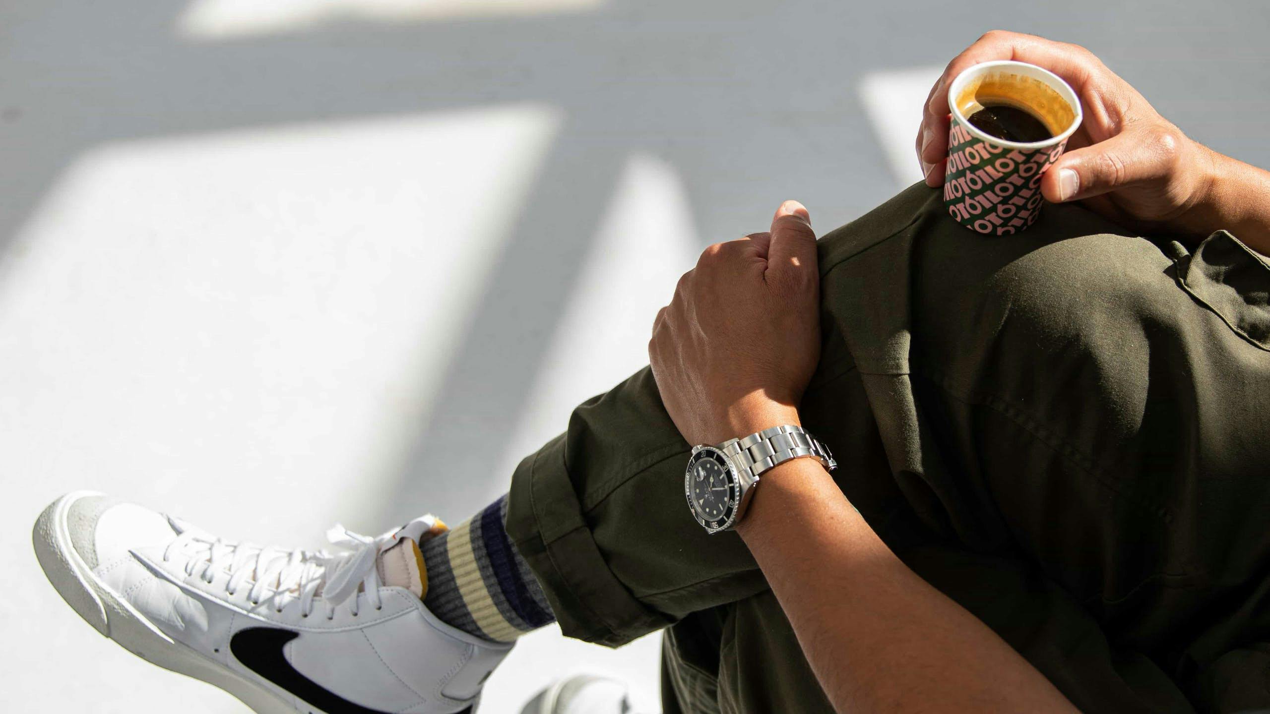
Espresso Pods
Showcasing the flavour/colour palettes
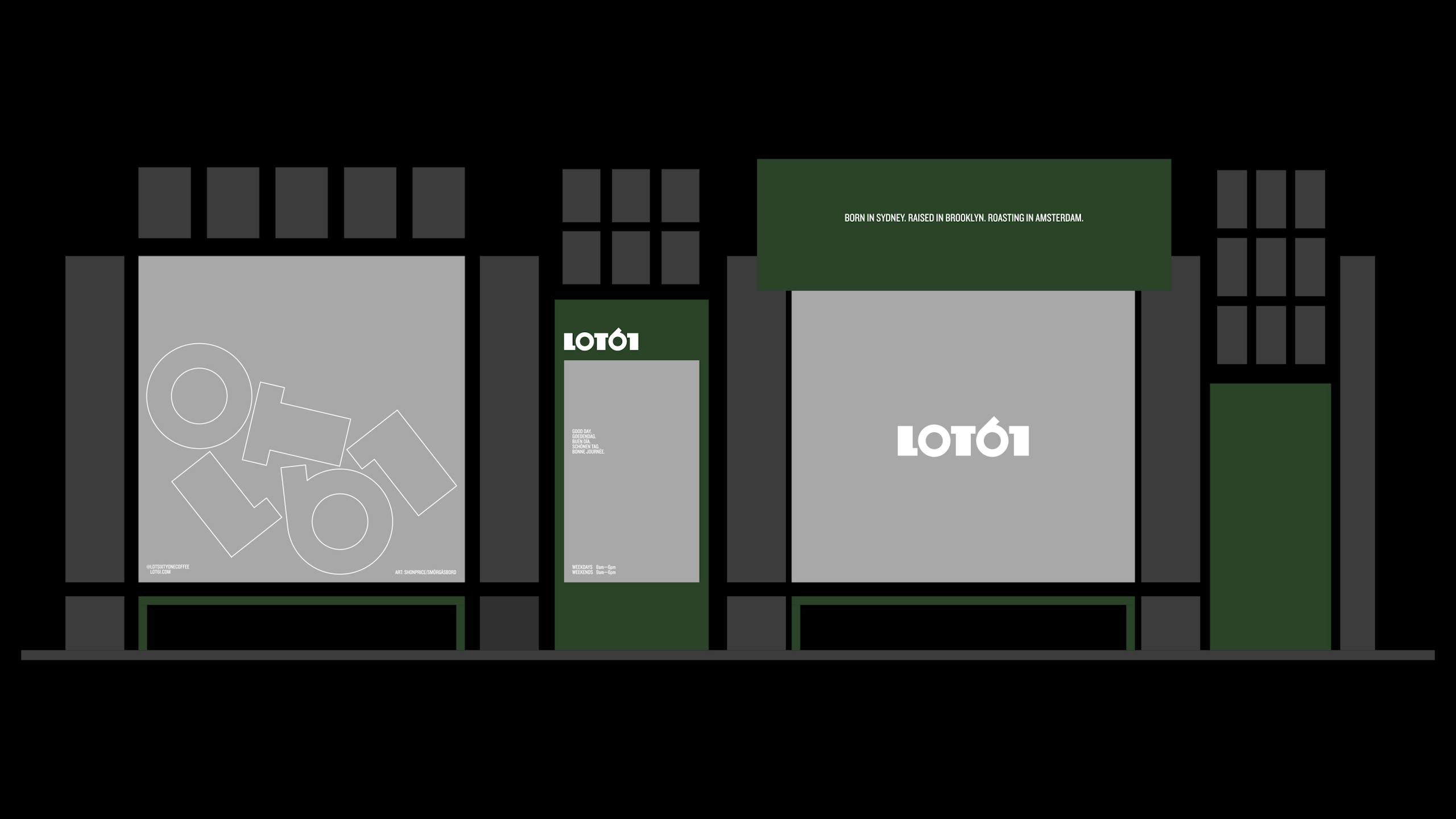
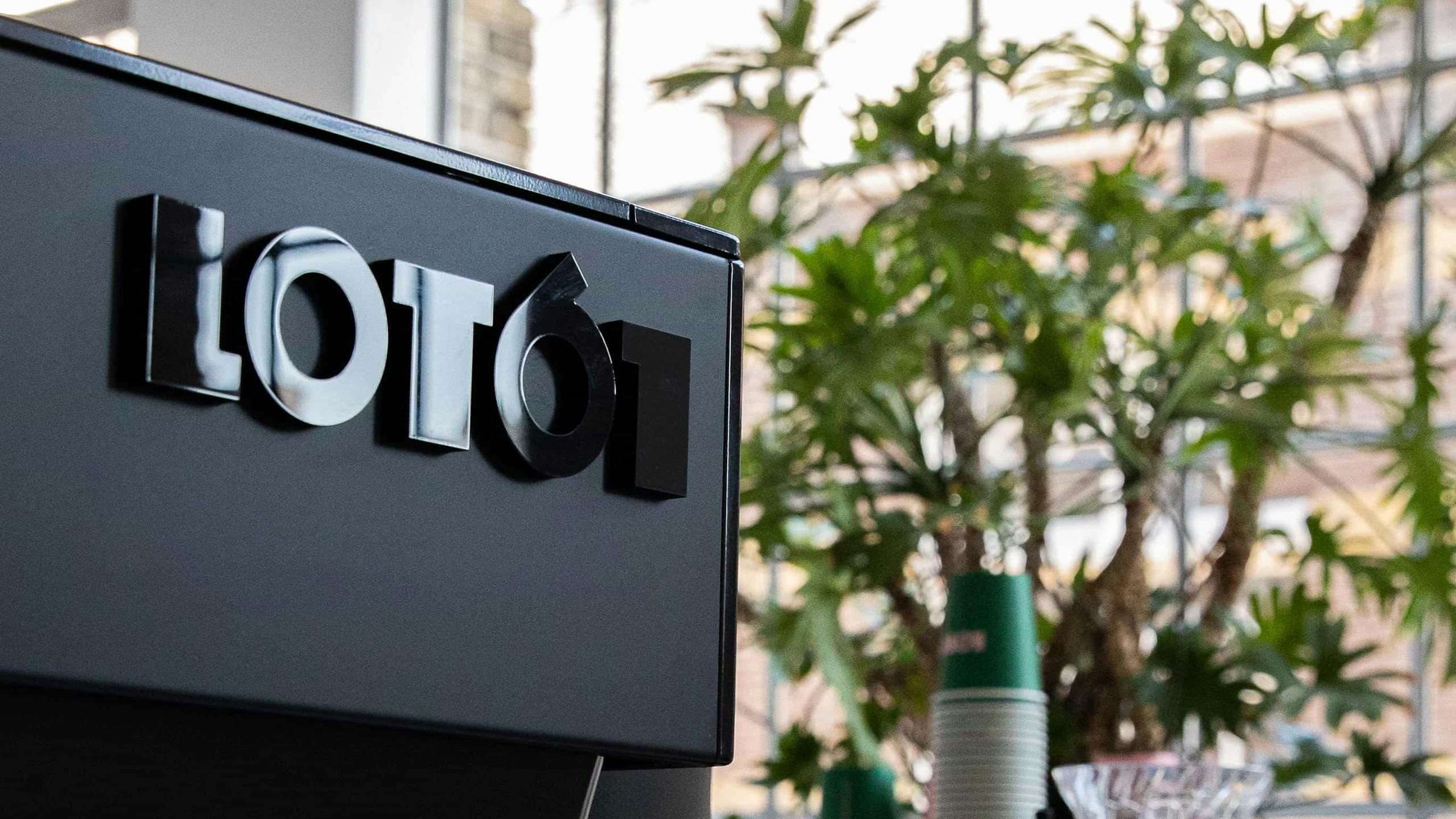
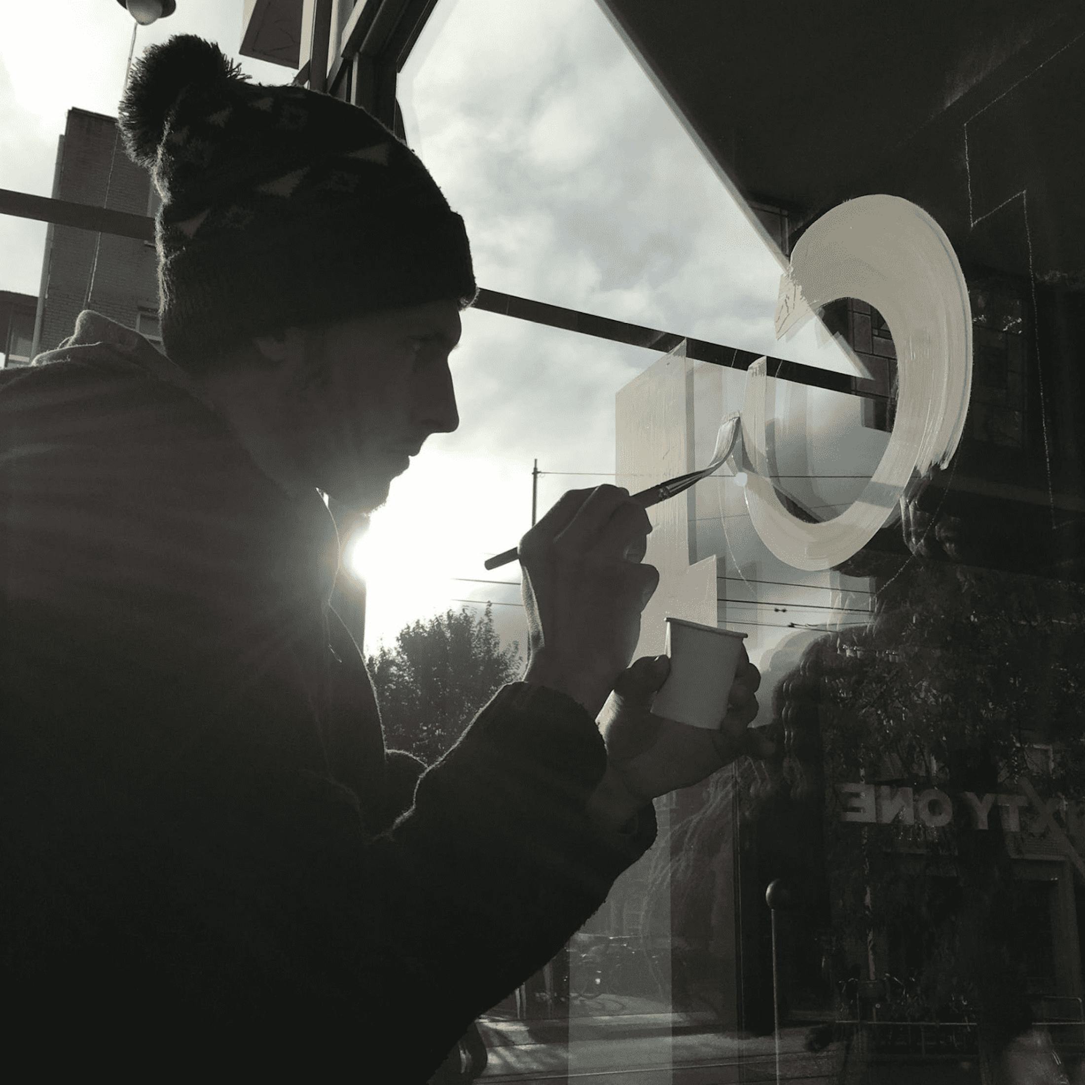
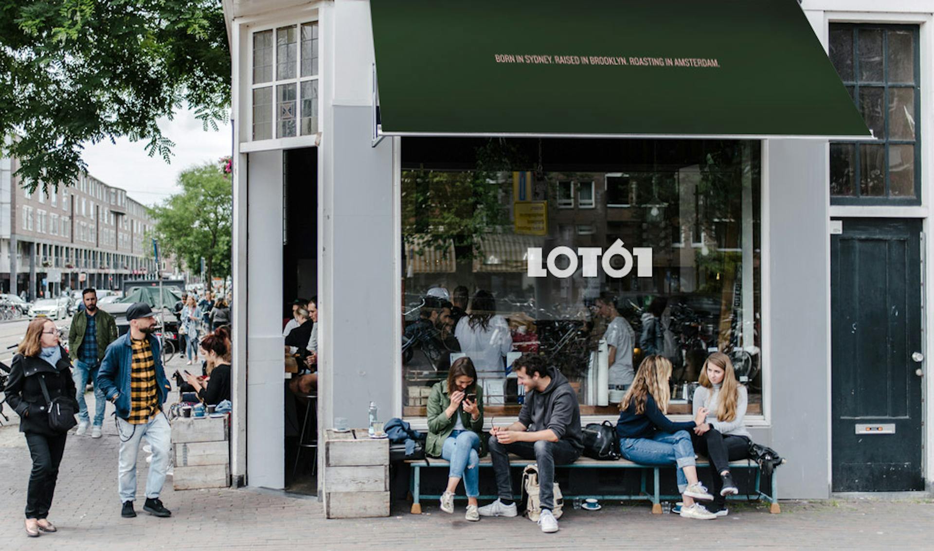
Exterior
Signage and awning
We brought Amsterdam sign-writer, artist and designer Shon Price on board to apply the logotype to the flagship store’s exterior and to design the first ‘artists window’, which will feature new artwork every quarter by local artists/designers.

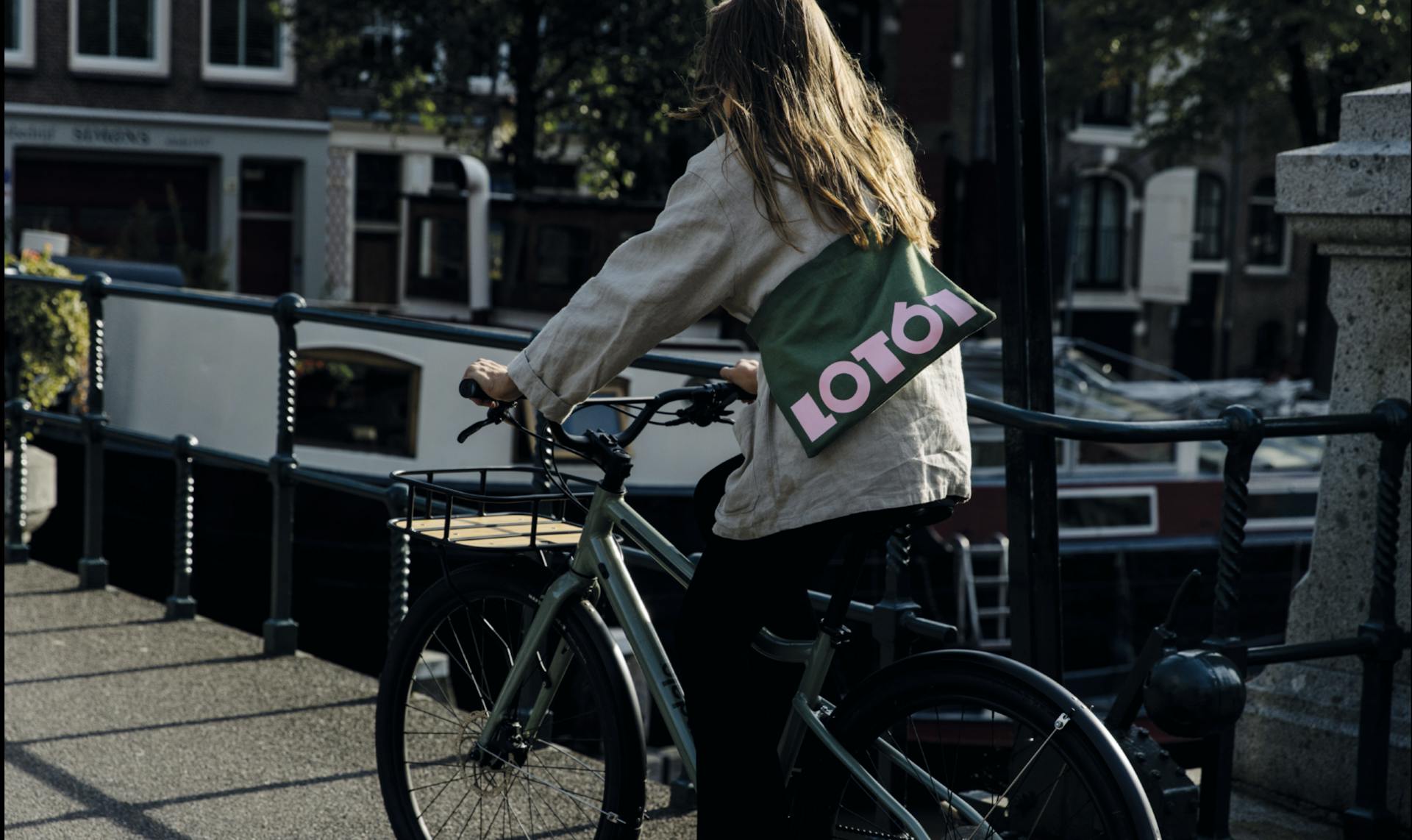
Cycling musettes
The cycling musettes are inspired by the best banana bread in Amsterdam.
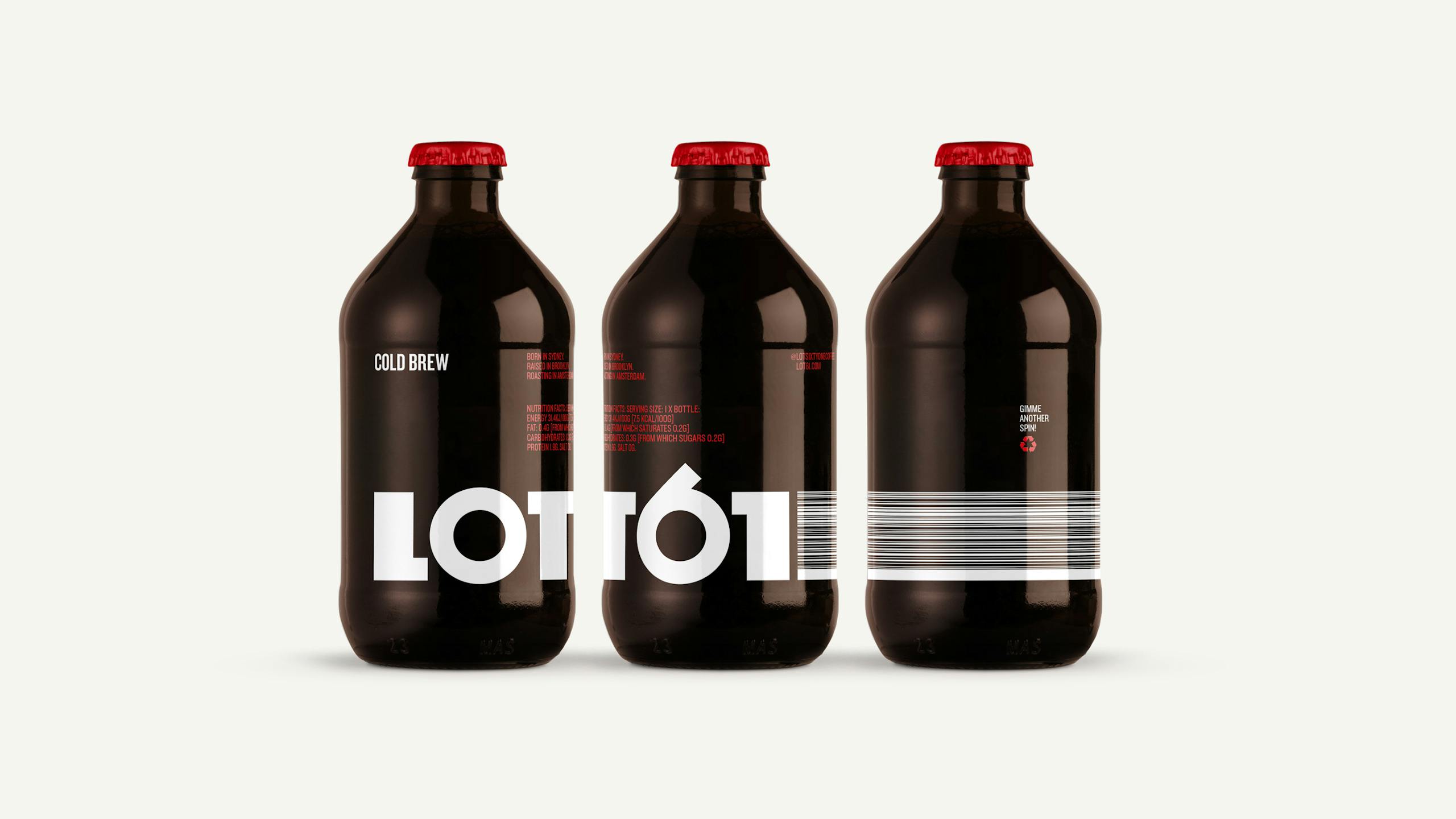
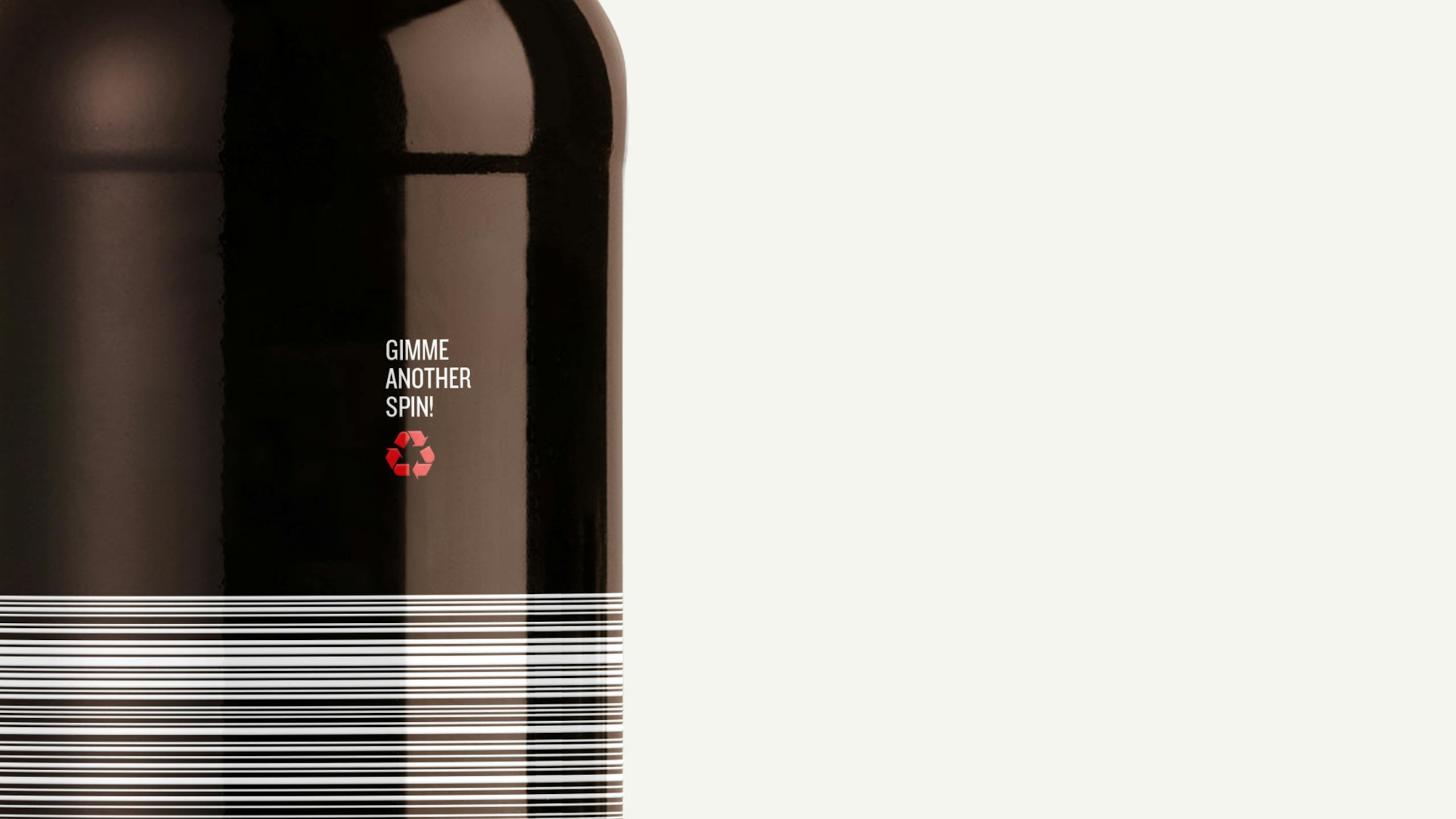
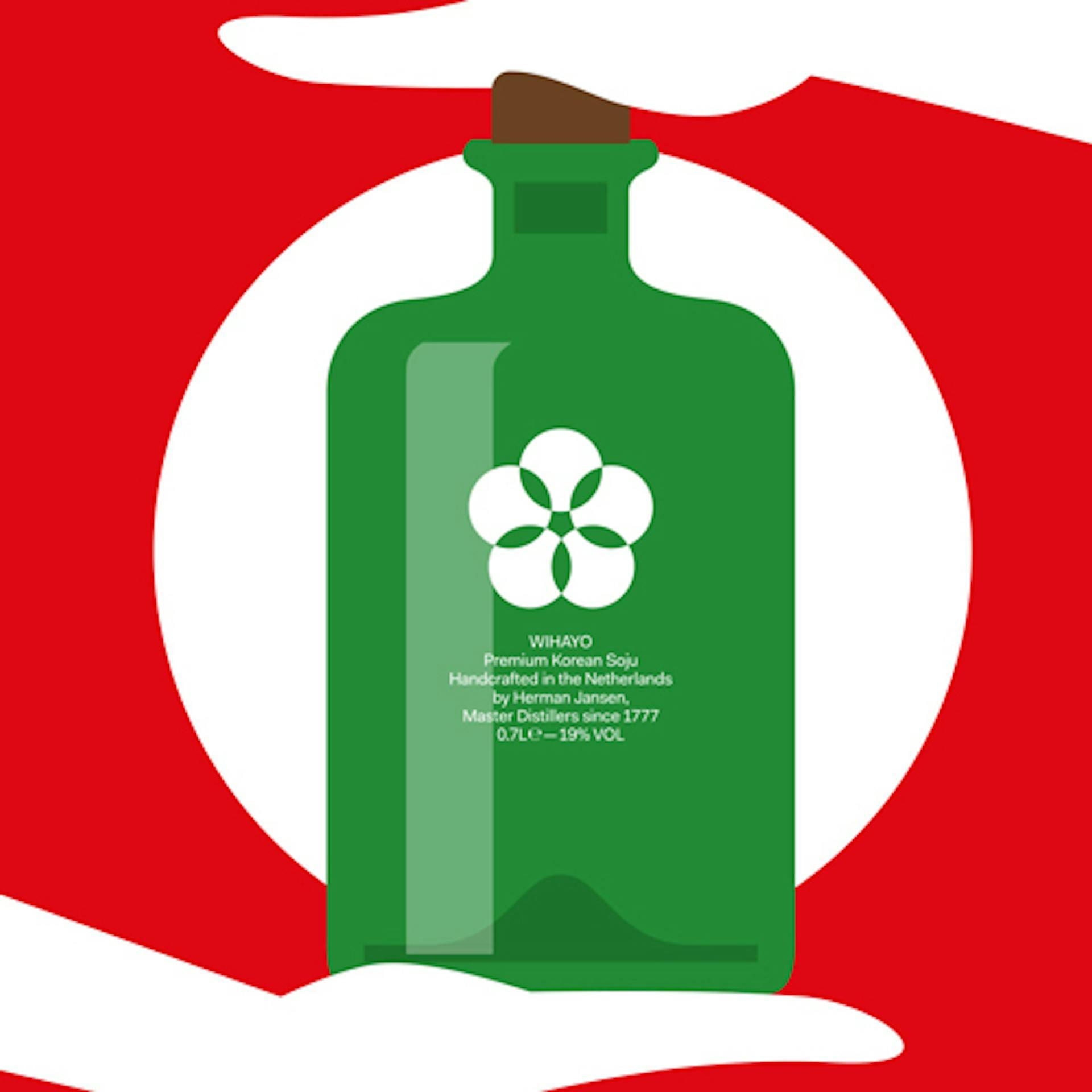
Cold Brew Bottles
—
Two colour, screen printed 250ml bottles filled with love. The barcode extends around the circumference of the bottle to link up each end of the logotype.
Disciplines
Creative Direction,
Art Direction,
Brand Identity,
Packaging,
Photography,