BBC Football
They think it's all over... but we're just getting started.
We're honoured to have had the opportunity to work alongside BBC Sport to devise a concept and advise on subsequent Creative Direction for the BBC Football brand, a sub-brand that sits within BBC Sport. As BBC Football reaches way beyond 'Match of the Day' (MOTD) to include 'MOTD2', 'Football Focus', 'Final Score', 'MOTDX' and 'Kickabout' it was decided that it warranted its own brand.

Brief—
To create a brand concept for BBC Football that sits alongside the BBC Sport brand and unites six programmes/platforms that all need to retain their subtly different voice, personality and audience.
Approach—
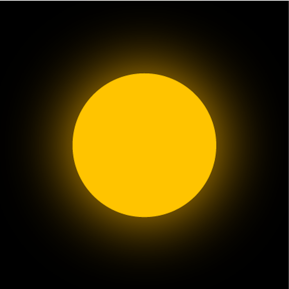
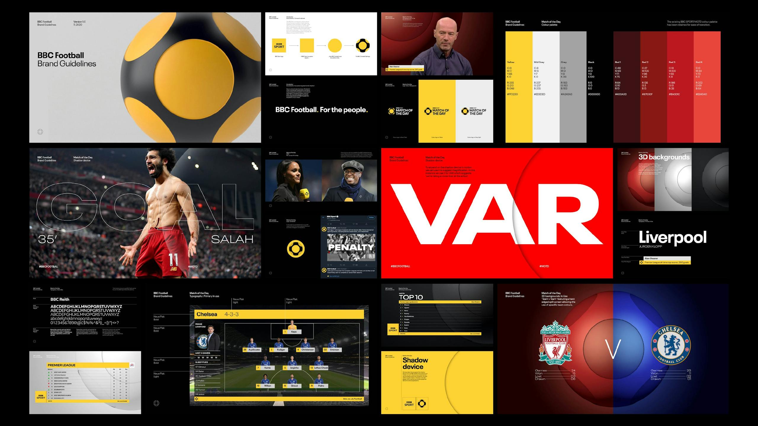
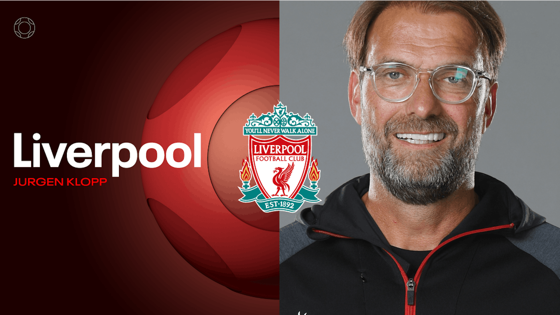
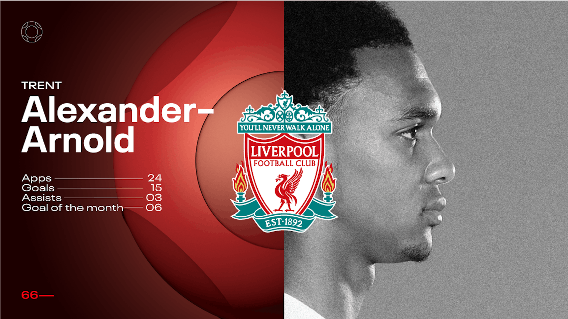
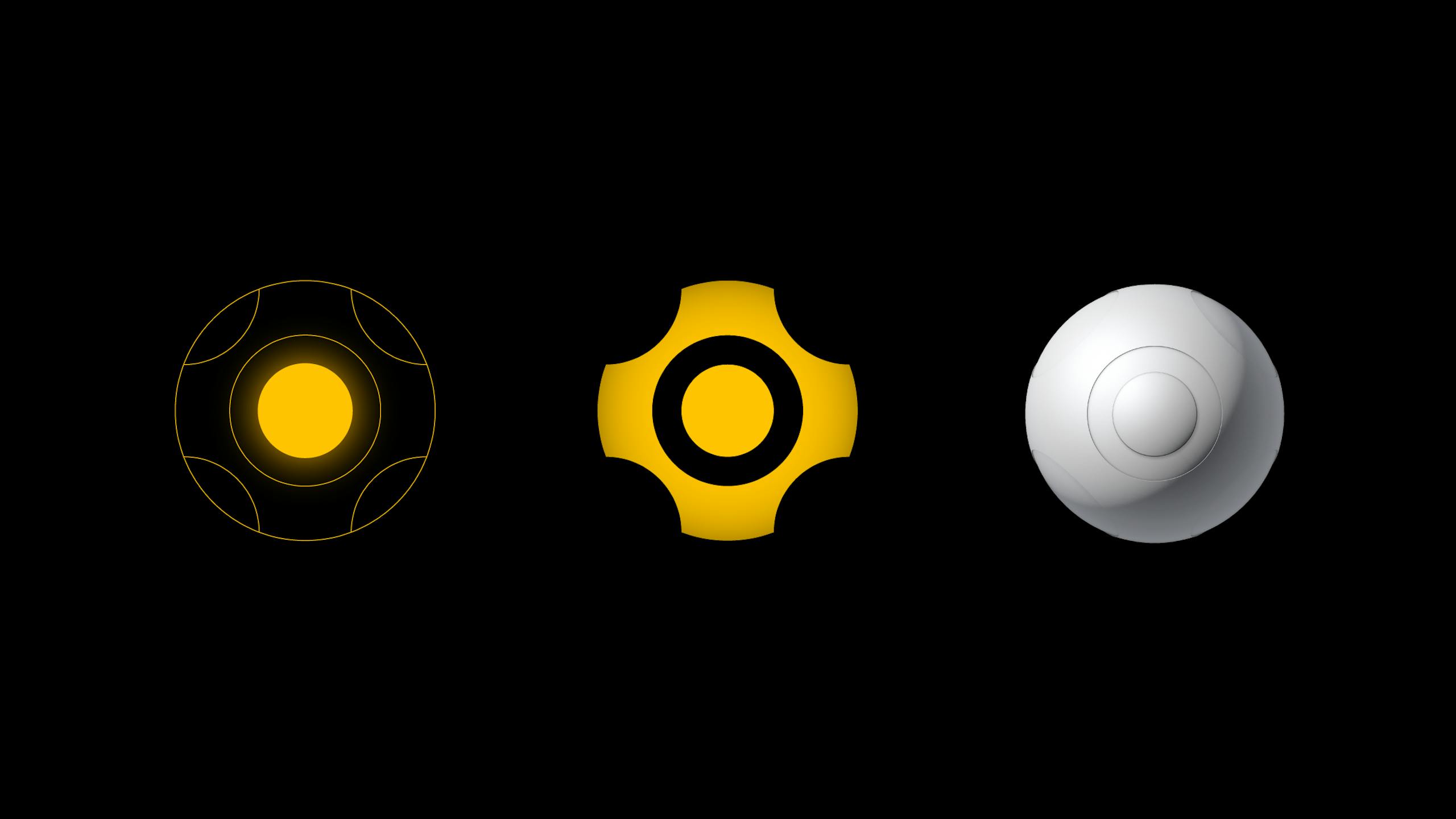
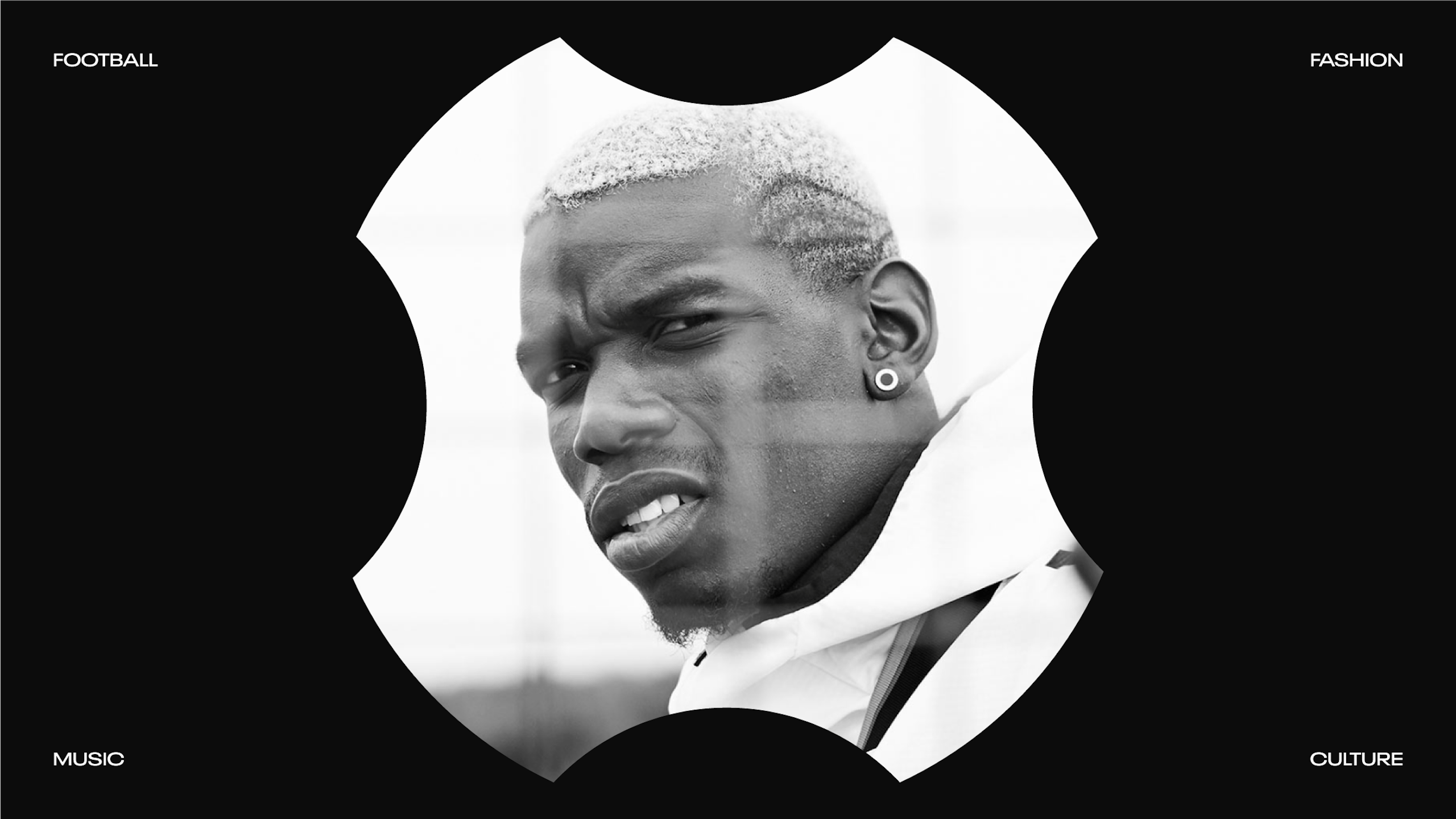
Poised with the question 'If BBC Sport is represented by a yellow square' what should BBC Football look like? We gingerly offered up 'a circle?' and that was the beginning of a highly enjoyable collaboration. The circle, or sphere, was subtly redrawn for each programme and provided the basis for the onscreen grid as well as the set design.
Result—
The new design – with its strong editorial bent – has been rolled out across BBC Football's onscreen and online broadcast graphics as well as BBC Football's studio sets. As well as the six core programmes the concept and the graphical kit-of-parts features across BBC's coverage of the FA Cup, Euros and most recently at the World Cup in Qatar.
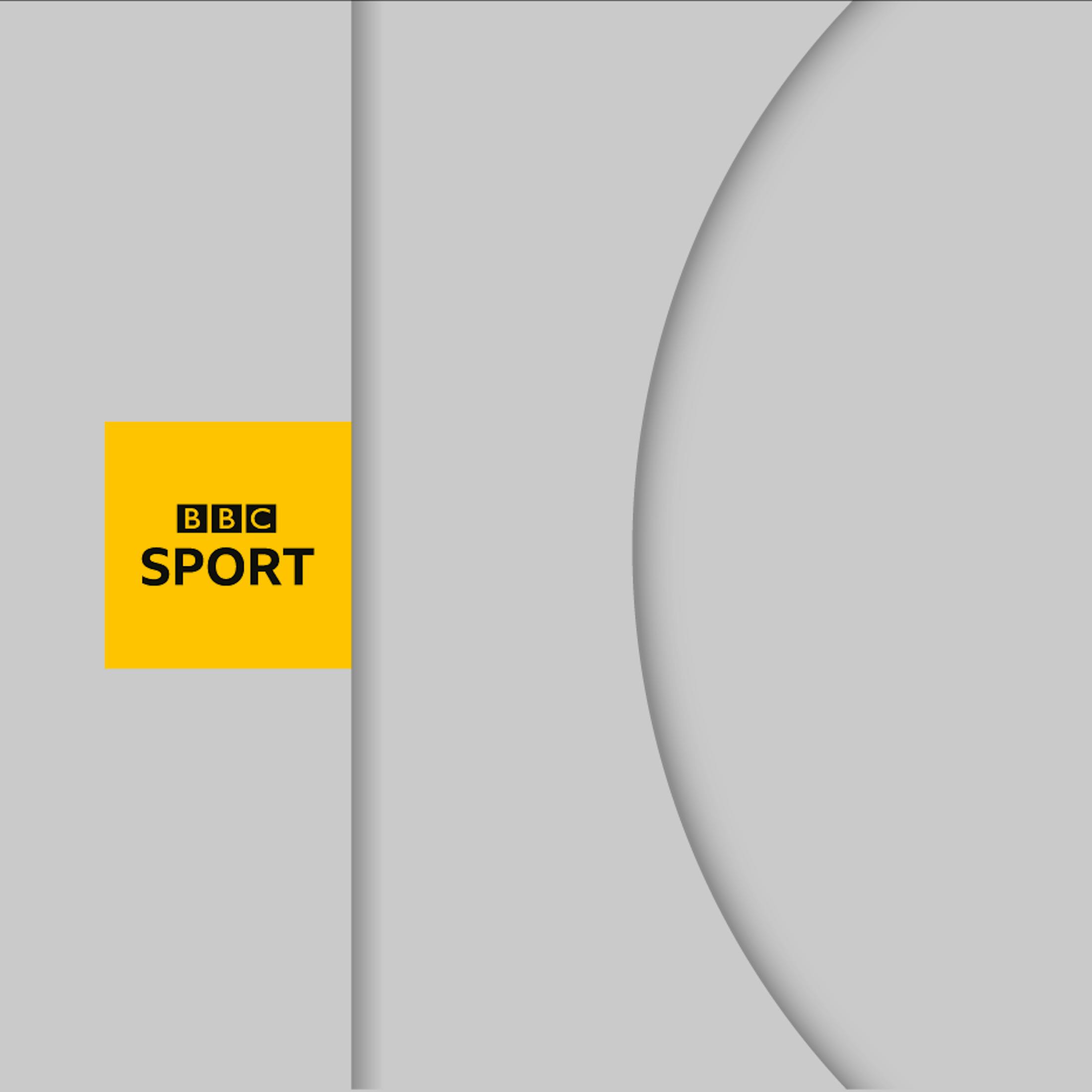
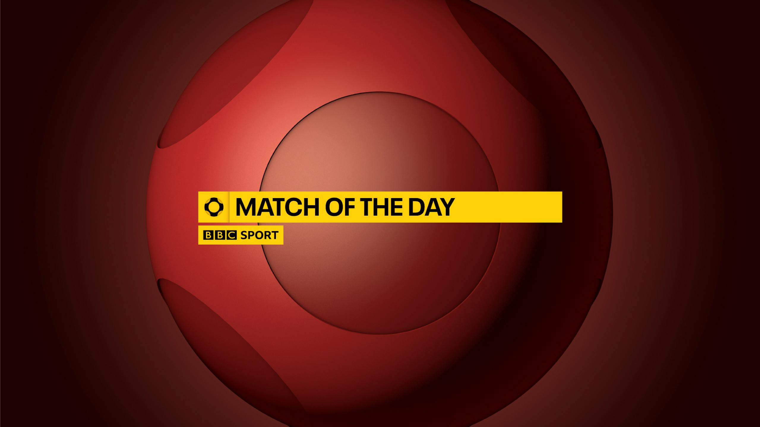
Yellow Square = Yellow Circle
The challenge was to create a marque which could represent football on the BBC Sport platform. We also had to make it work within the already established BBC Sport graphic language as the yellow and black colour palette has established brand equity.
The Challenge
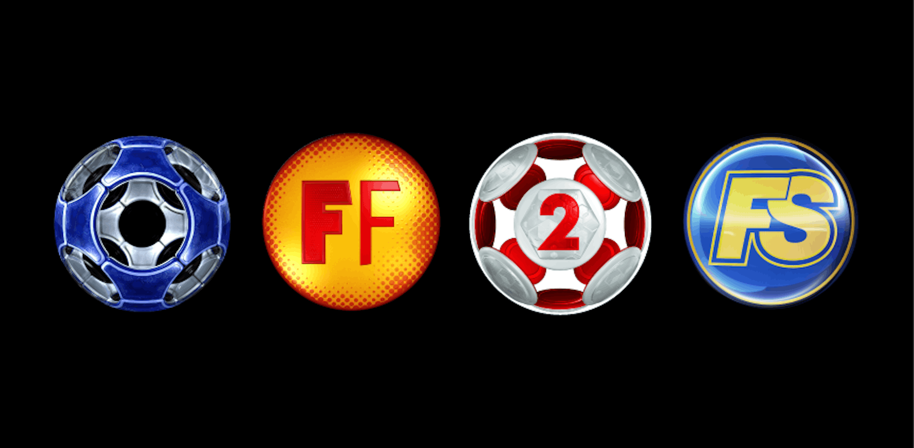
Unification/Consistency
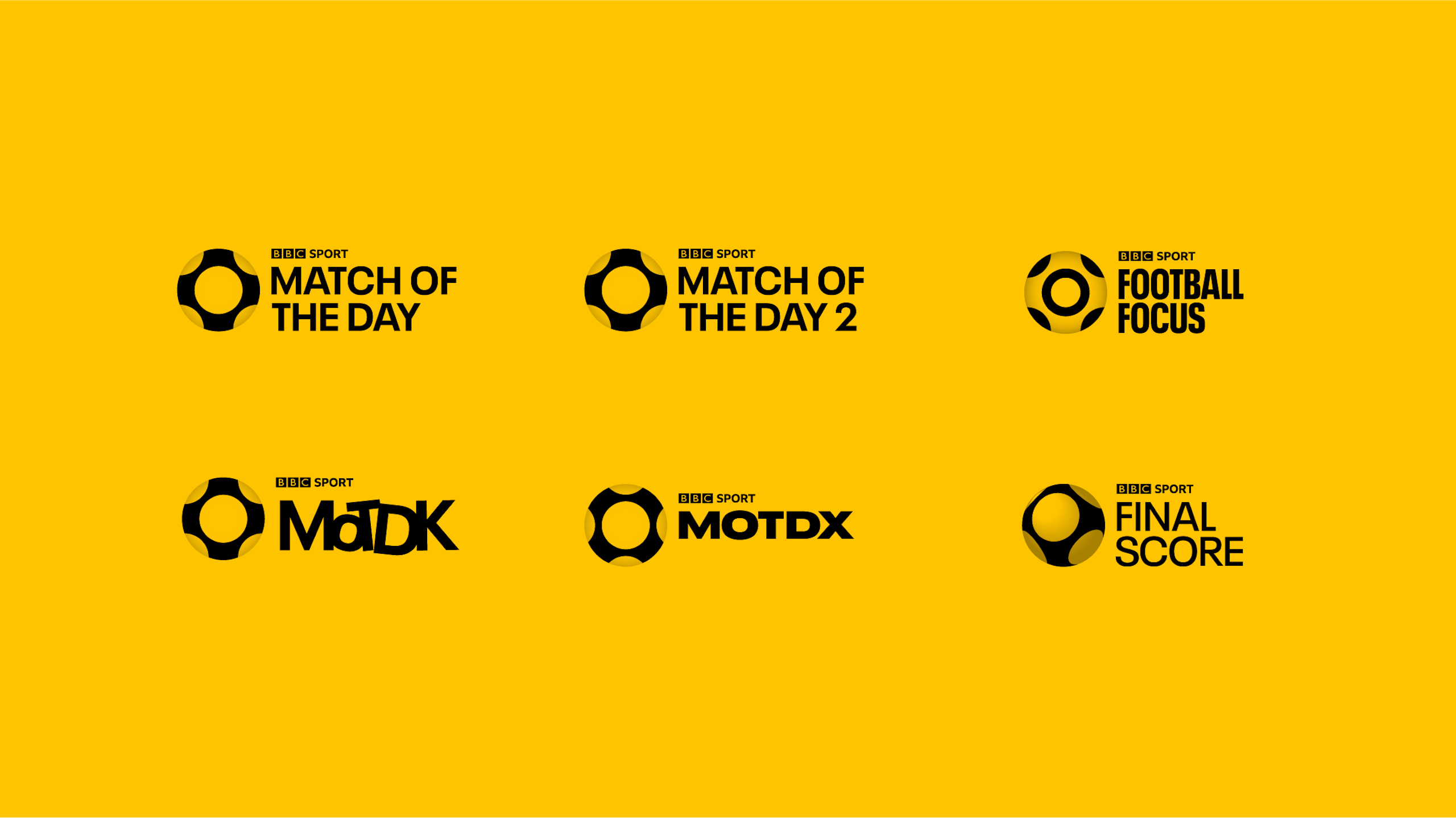
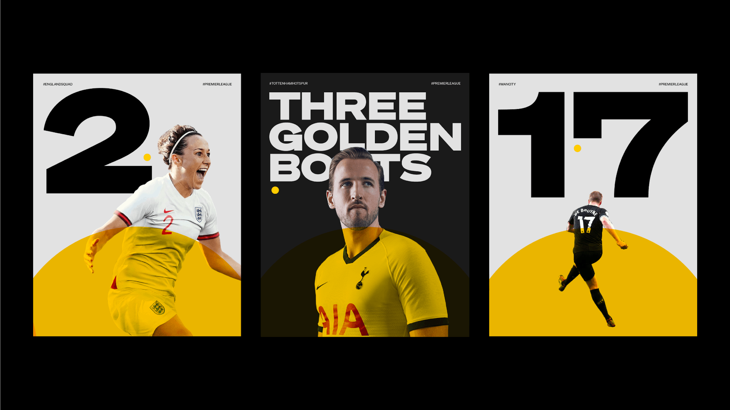
To visually align all programmes (old logos above) whilst retaining their subtly different voice, personality and audience. The Yellow ball – or sphere – proved to be the answer. Being the focal point of everything across all platforms and mediums whilst allowing flexibility for each of the strands to own their 'extended' graphic language.
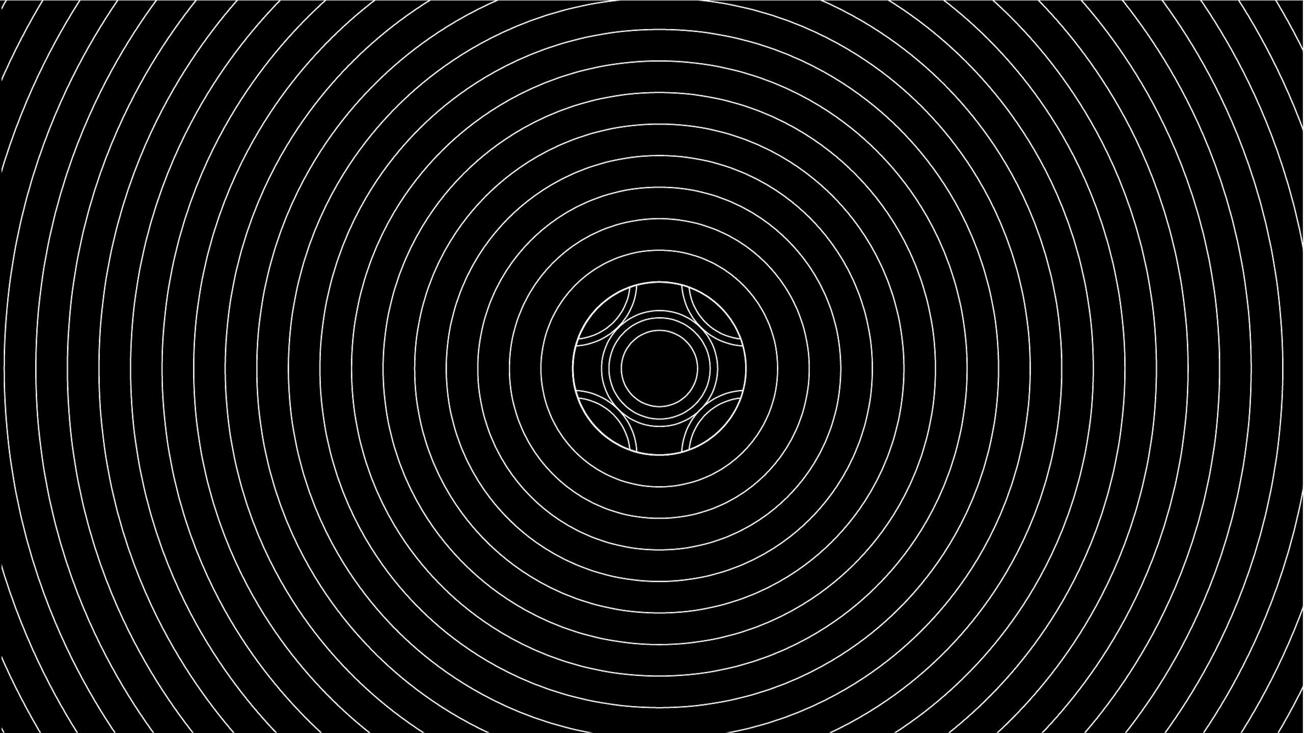
The Grid
Everything comes from the ball
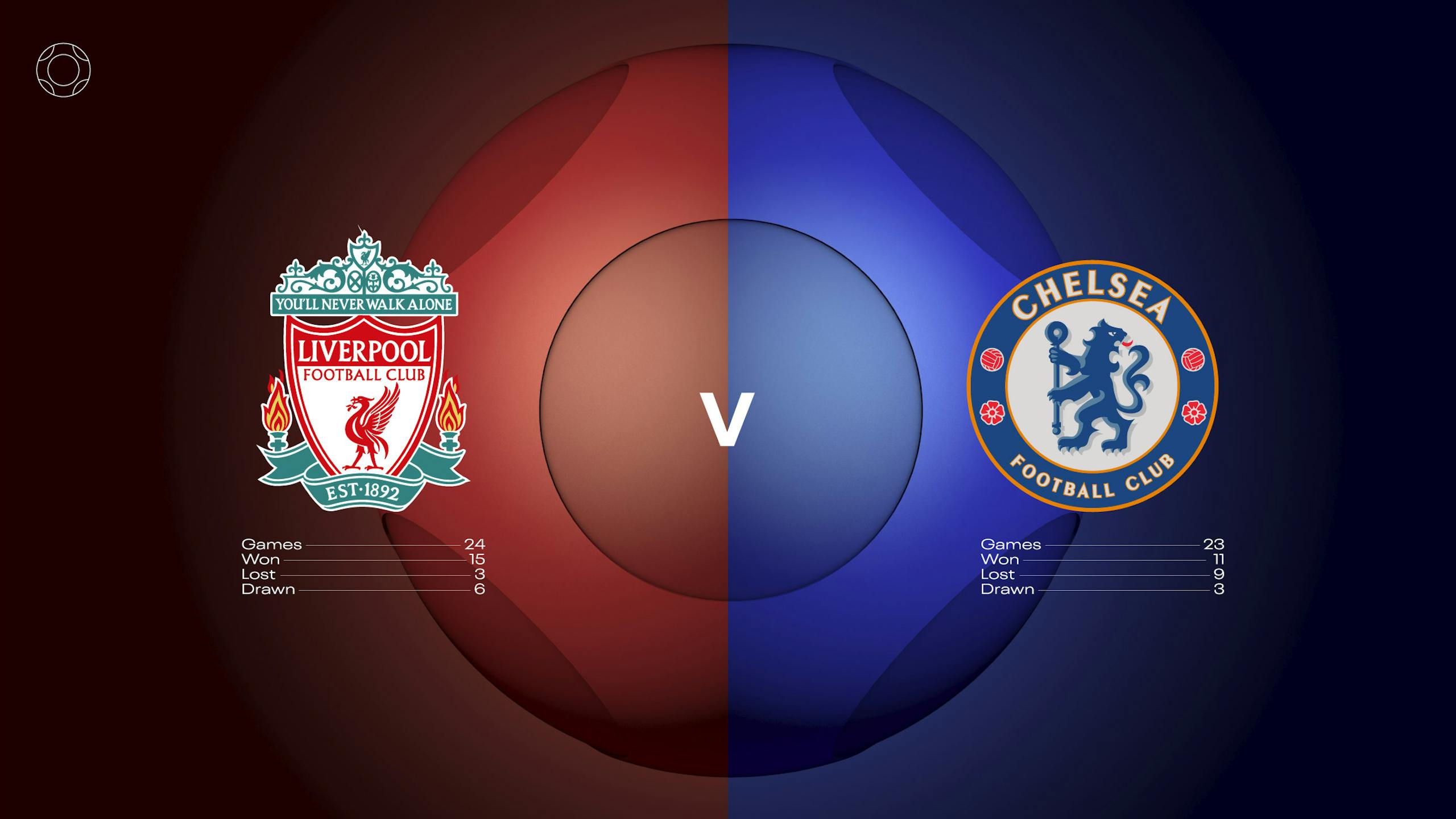
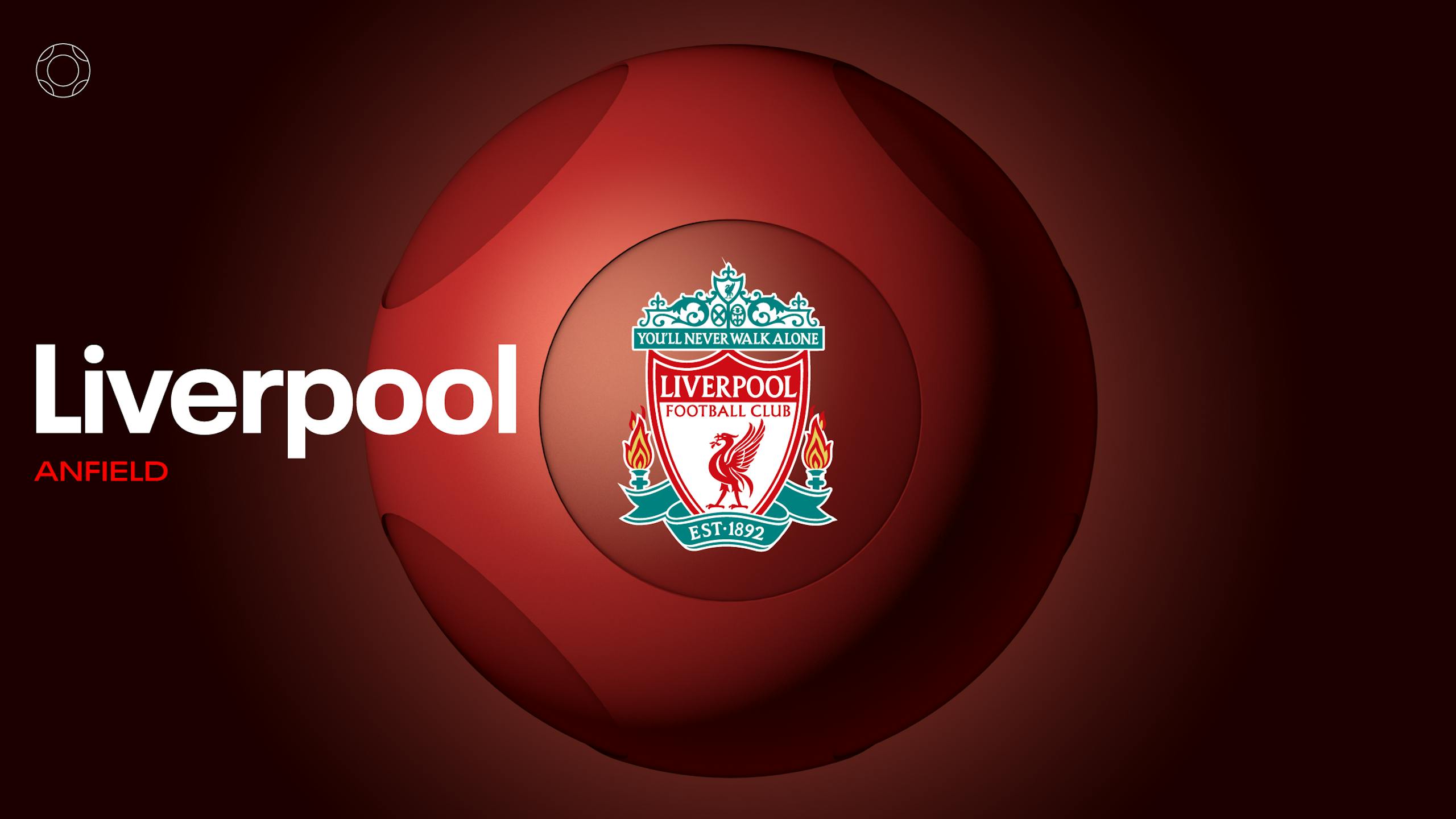
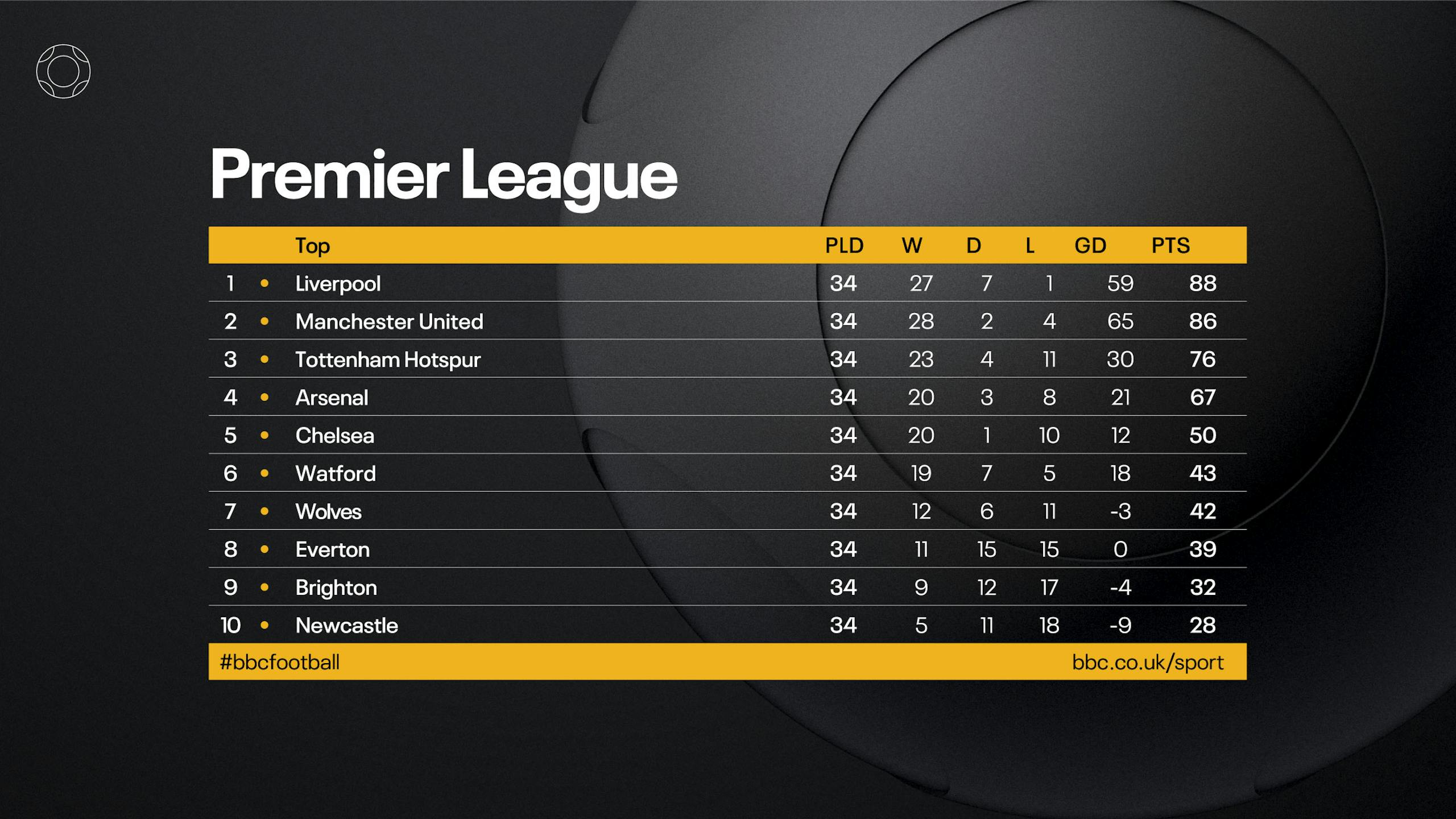
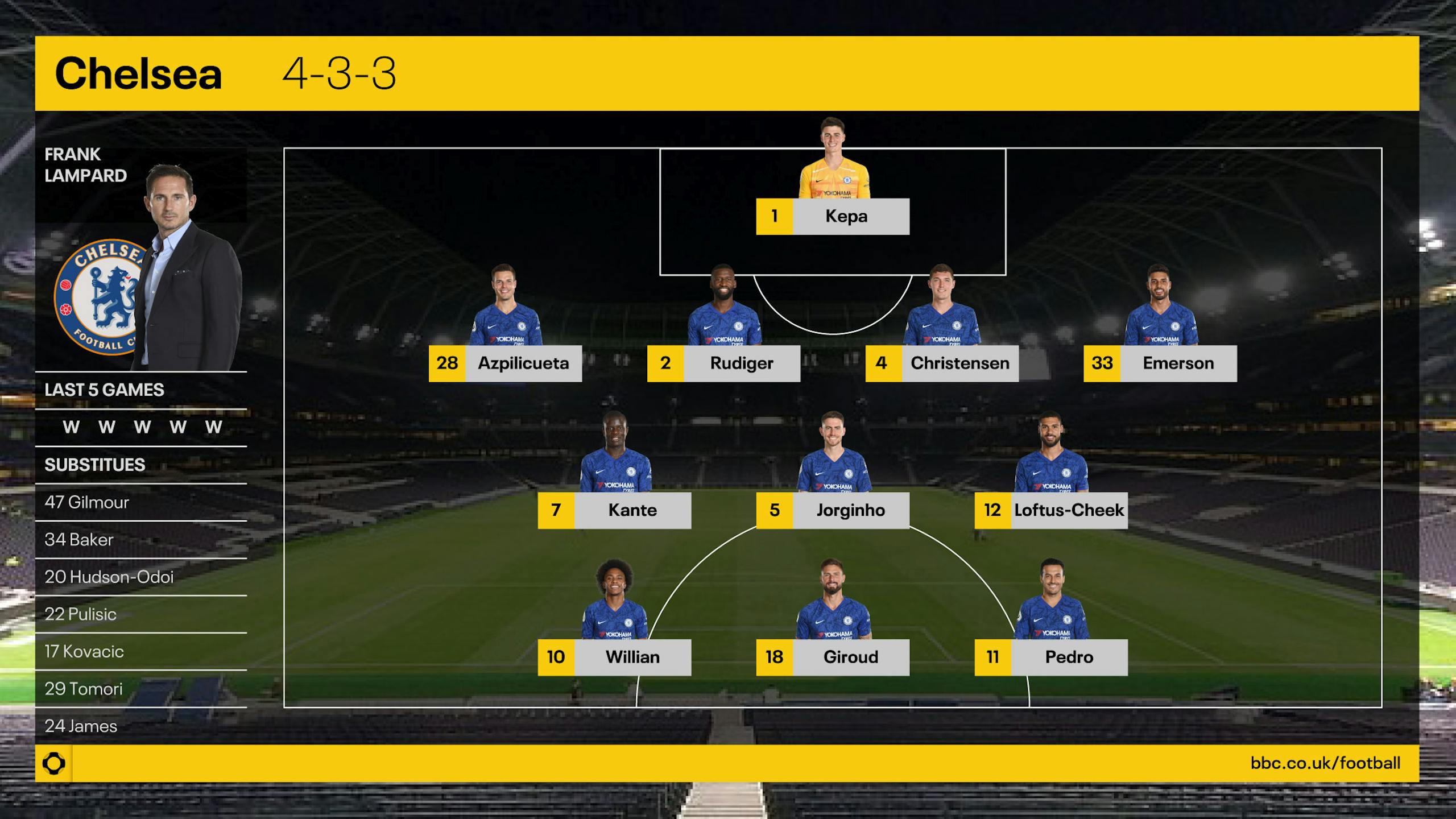
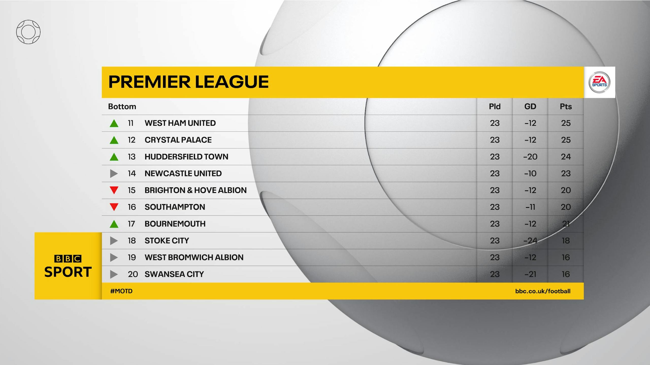
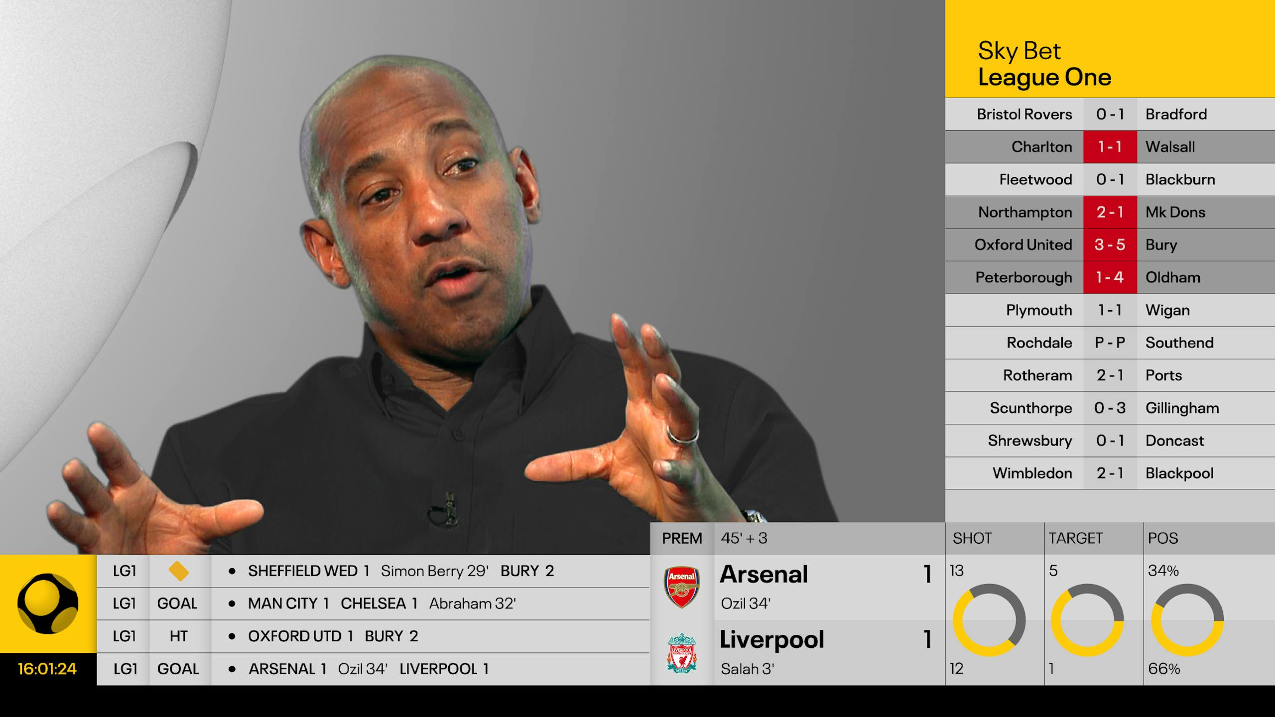
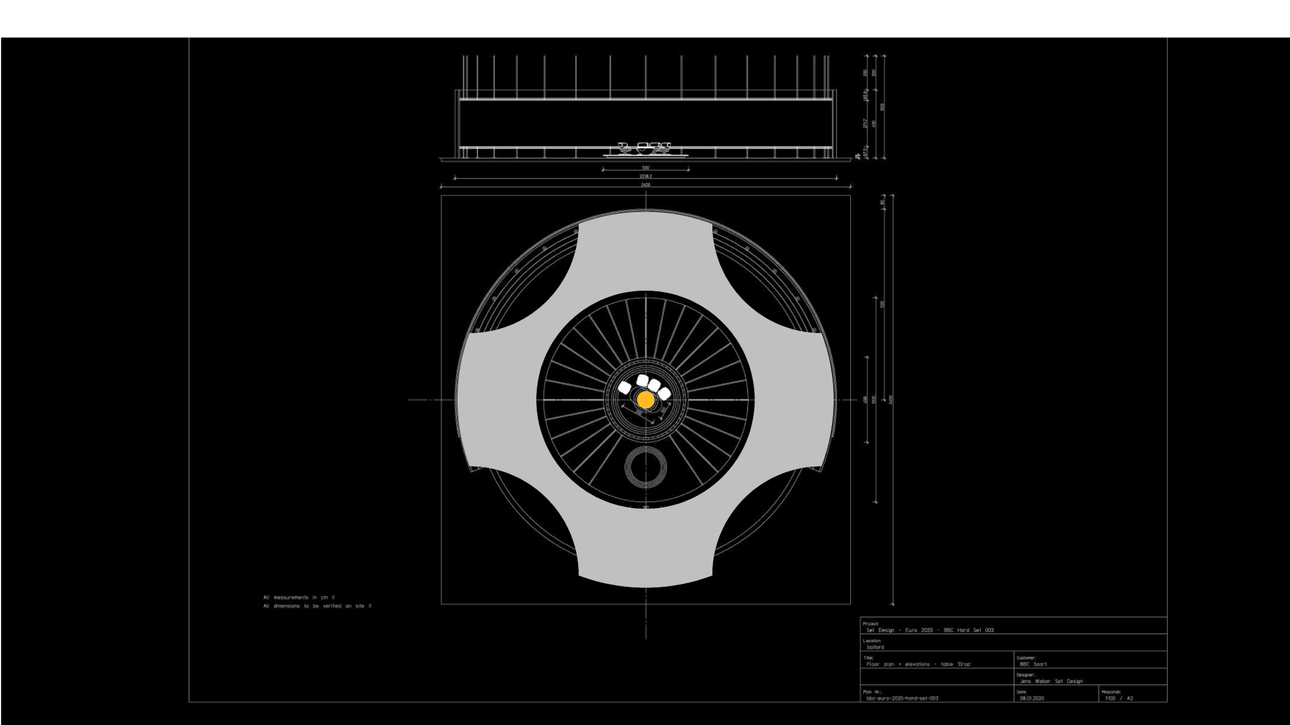
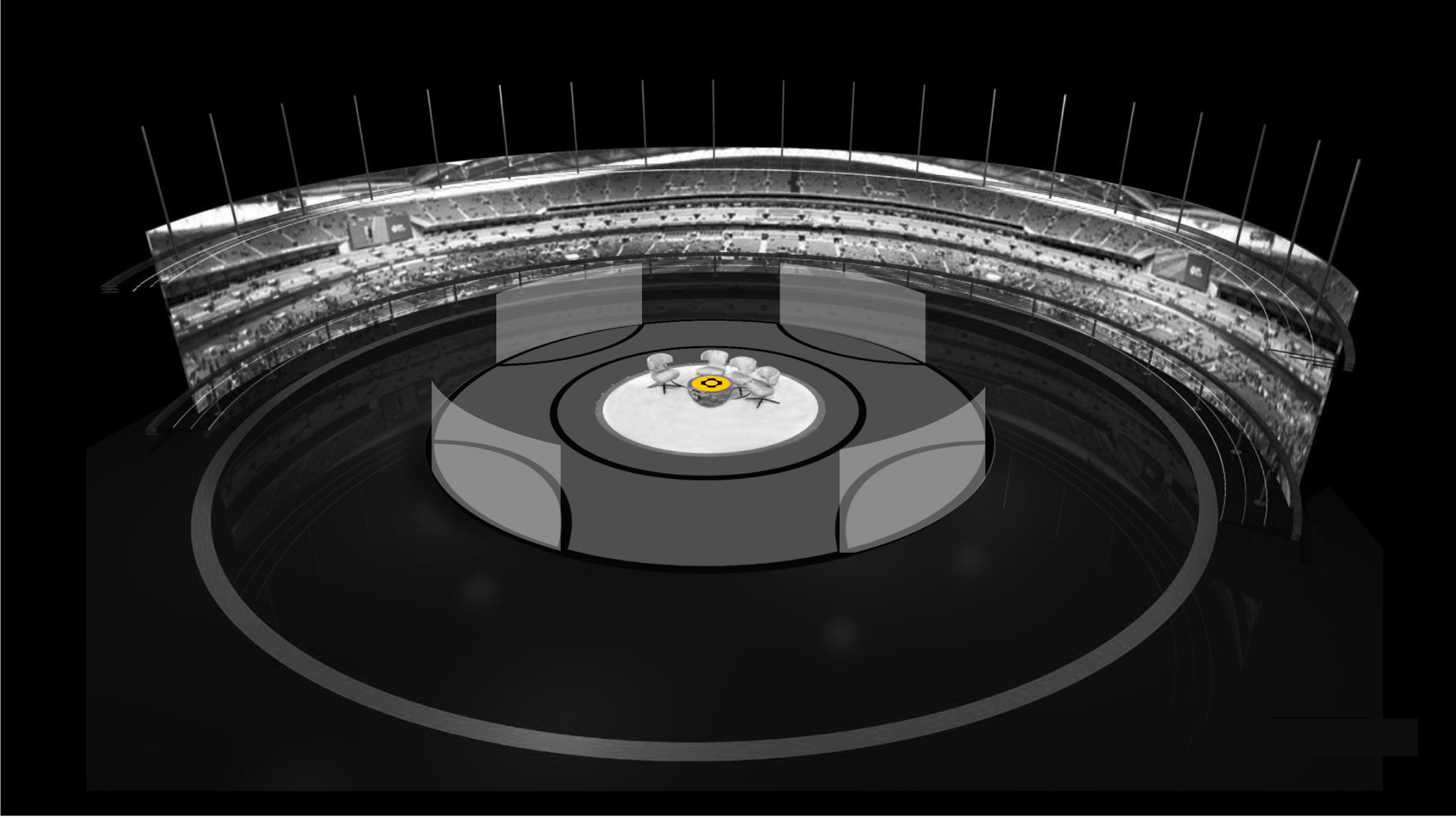
Establishing a tight underlying grid is critical for crafted and seemingly effortless broadcast graphics. As a further utilisation of the 'ball' we used it to provide our grid in order to bring further unity and consistency to proceedings. It provides the scale and positioning for all supporting graphics such as name supers, latest tweets, score lines, ambient background graphics as well as a fully aligned set design.
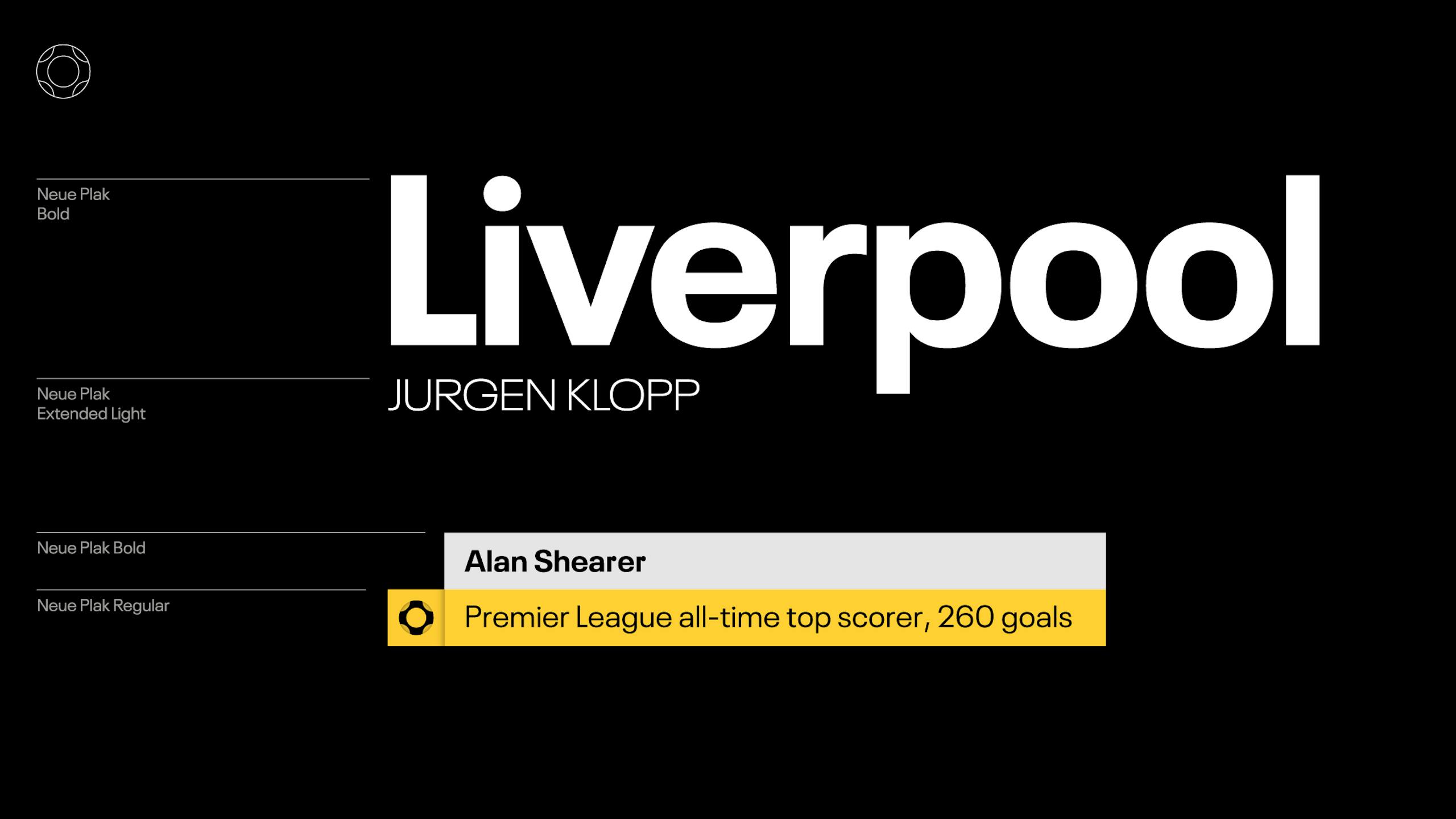
Typography
Consistency across all programmes became the aim and to help us achieve this we introduced Monotype's 'New Plek' family of typefaces – a highly flexible 'sans' with a wide range of both condensed and expanded options across an impressive range of weights.

Colour
—
Whilst BBC Sport's palette of yellow and black was retained at high level we introduced bespoke colour palettes for each programme or strand. Colour within the set design was toned down, rather focusing on silver, and warm & cool greys, allowing team colours to shine.
Shadow device
The shadow device was an existing graphical device utilised by BBC Sport (left of frame). In order to further align the two brands graphically (BBC Sport & BBC Football), we introduced a spherical shadow device which gave us an additional graphic to play with across different applications. This was not only an aesthetic device as it added more of a 3D element and depth to applications. It also presented the 'VAR' with a subconscious identity as the shadow device subtly suggests a magnifying glass – exactly what VAR should be.
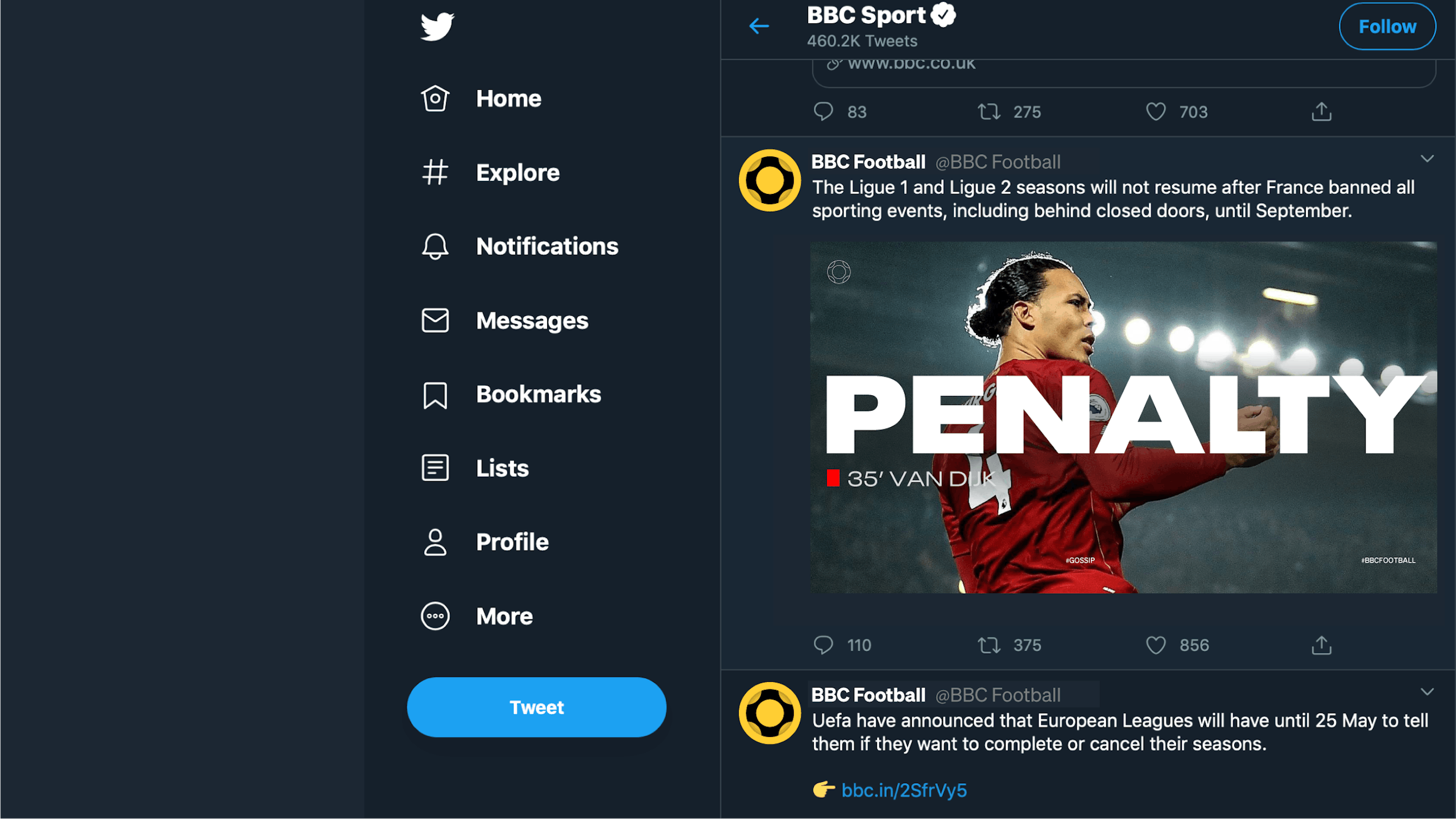
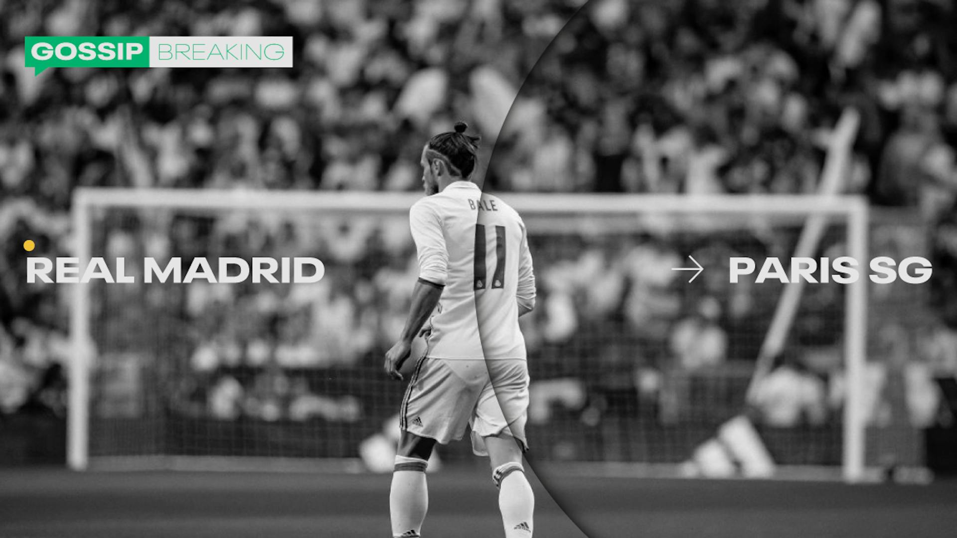
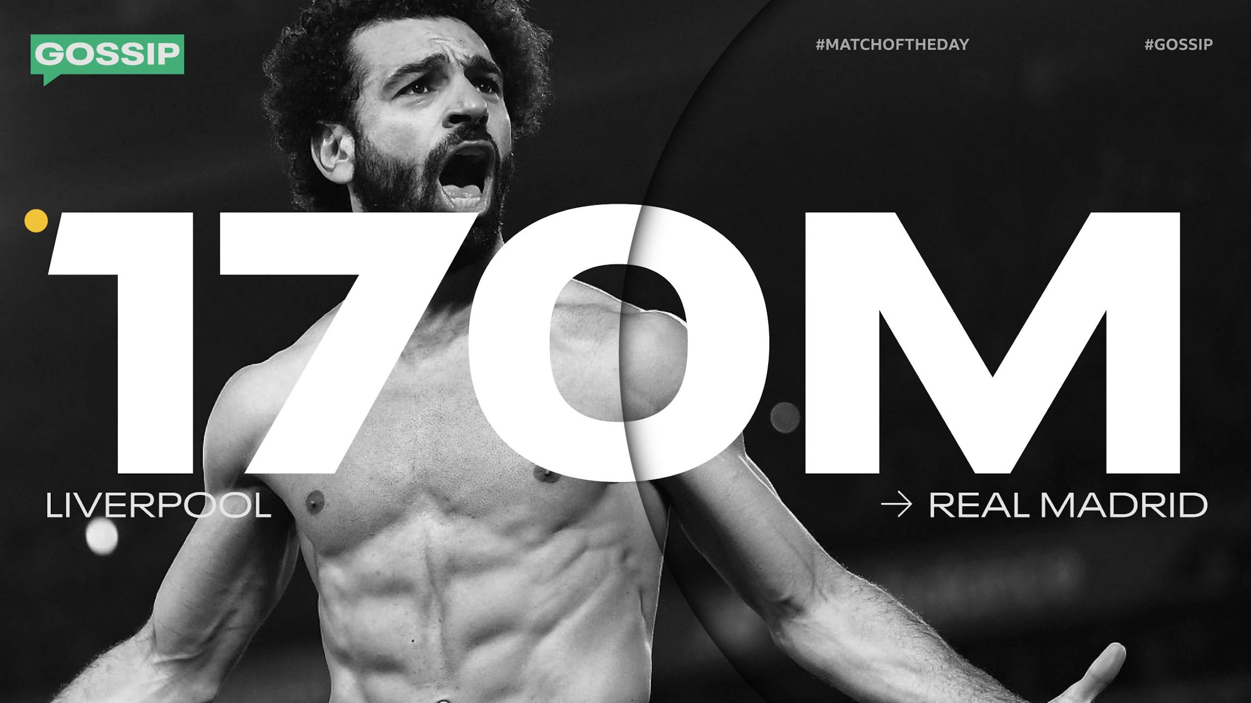
Gossip
AKA Social Media
As we all know, gossip is a huge part of football off the pitch. Whether it be transfer news, who is being hired or fired, or which footballer is dating such and such a person. It's all relevant to the world of football, after all 'football = life' for many. So naturally we made this a part of the overall package by bringing it in line and up to standard with the rest of the brand.

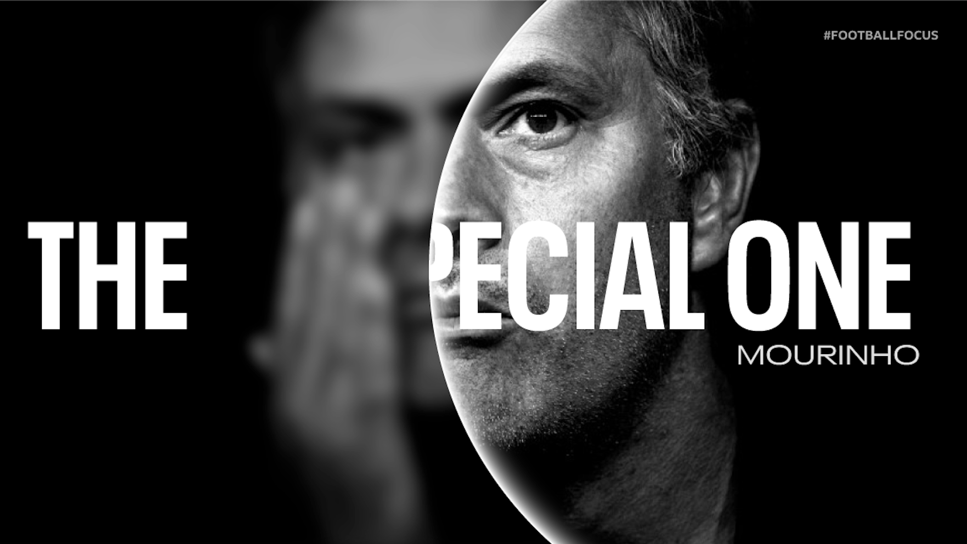
Football Focus
Adding to the ball...
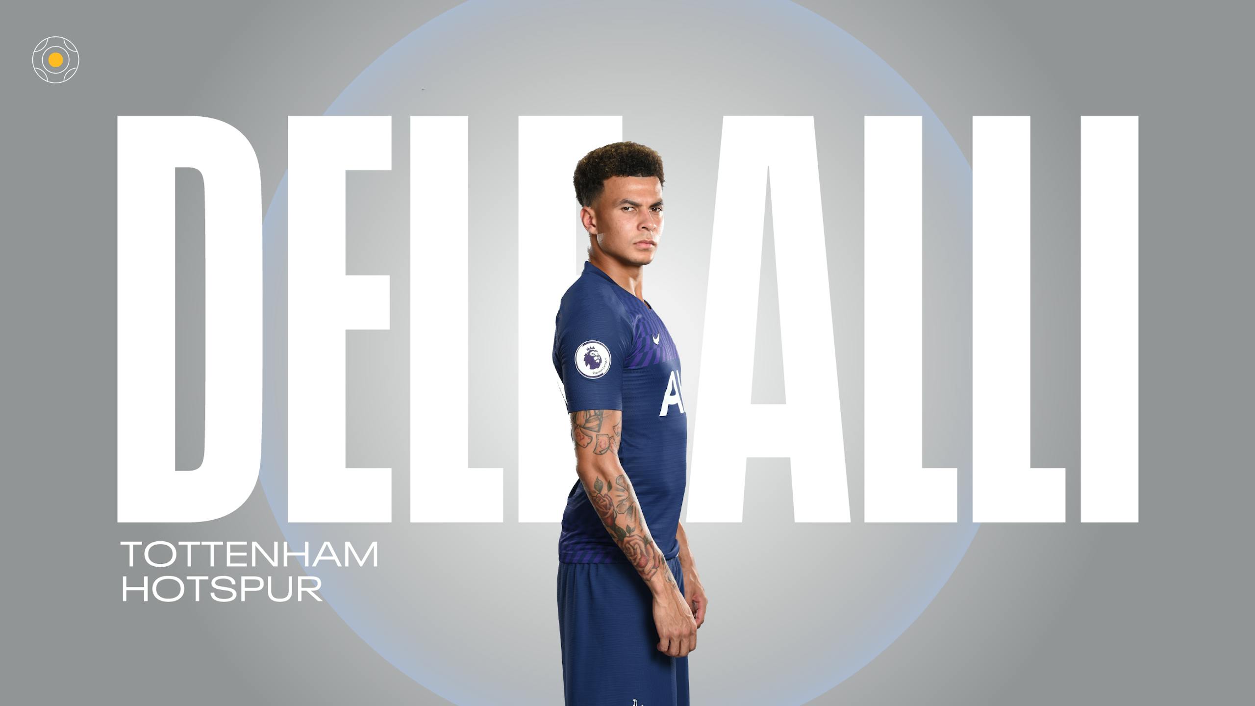
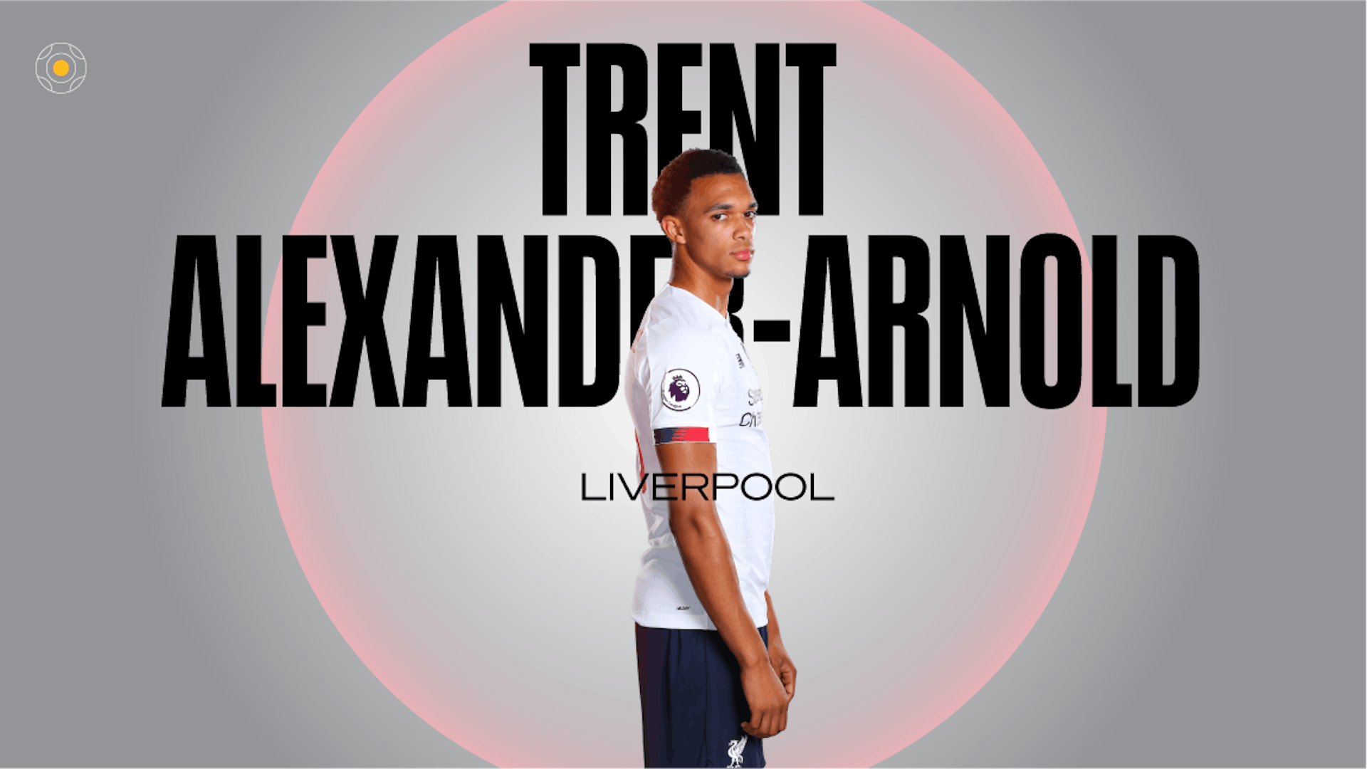
To give 'Football Focus' an own-able logo we introduced another sphere in the centre of the MOTD ball logo which is suggestive of 'focus'. To add to this concept we designed graphics and typographical messaging that come in and out of focus – and adopted a 'lens flare' language which gives 'FF' a distinct graphical voice.


Final Score
Always moving...
'Final Score' is in perpetual motion during its hour long slot – bringing its viewers minute-by-minute information. Naturally the logo warranted a 'live' feel, therefore we decided to animate the ball slowly – never settling and always 'active'.
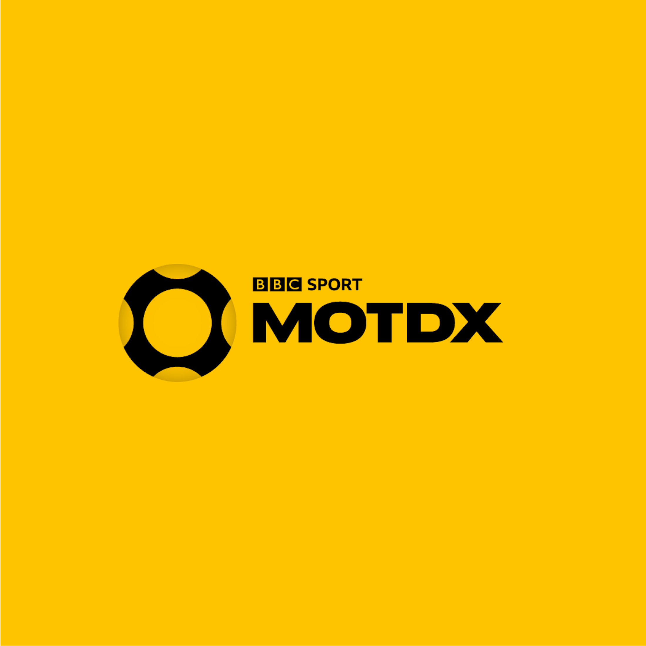
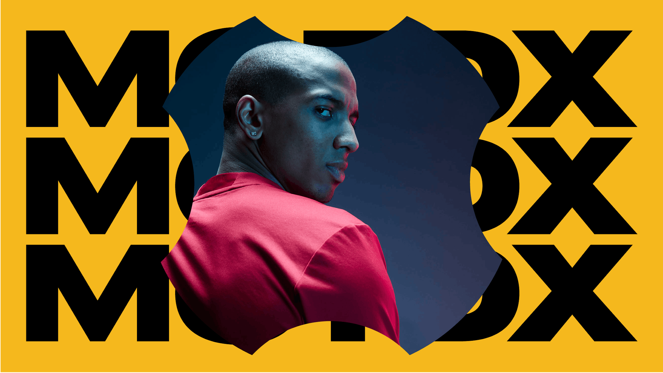
MOTDX
—
A platform for young adults needed to be culturally relevant and 'down with the kids' without being the embarrassing uncle at parties. Rotating the logo gave us our 'X' and in turn an extended graphic language which feels current, relevant and dynamic.


MOTD Live
—
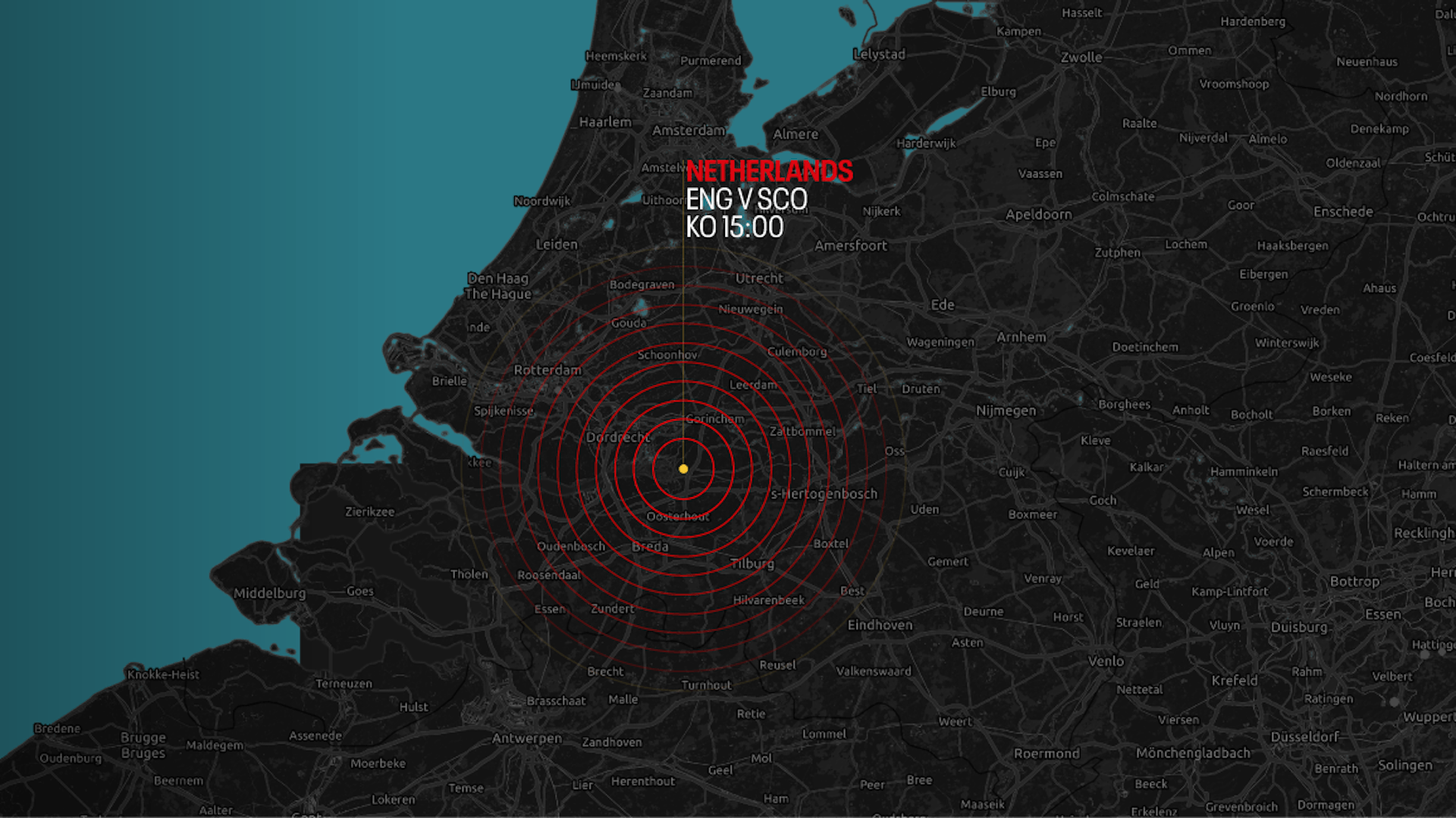
Not only does the BBC Football brand need to work across all six standalone programmes it also needs to adapt to the latest tournament or competition – in turn flexing to accommodate the World Cup, Euros or FA Cup without losing its own brand identity.


Set design
Top elevation
Disciplines
Brand Identity,
Concept Creation,
Creative Direction,
Motion Design,
Broadcast Design,