Cymru Wales
A unique family of fonts created to represent Wales to the world...
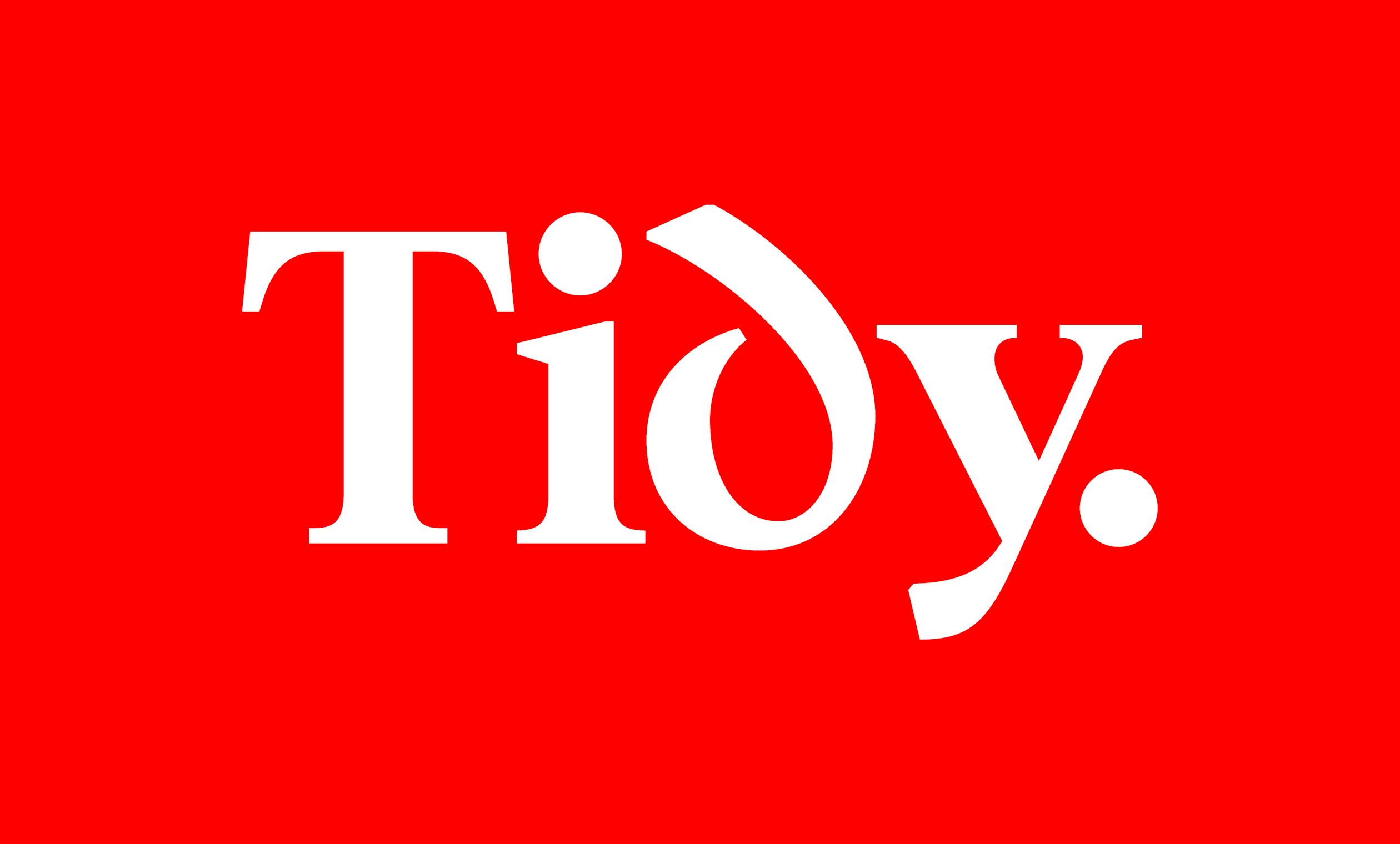
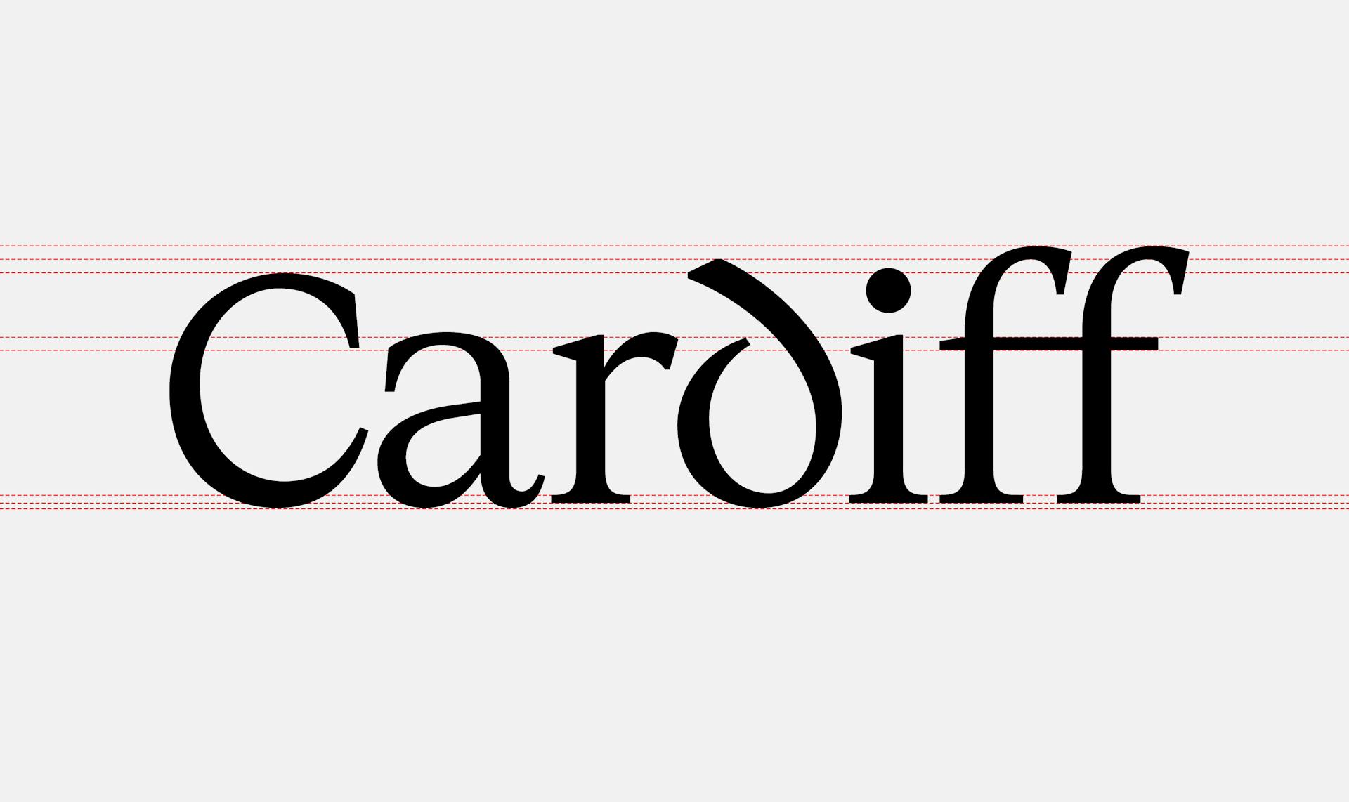
A contemporary font family designed to represent Wales to the world in an authentic and creative way, putting the provenance and unique linguistic traits of the Welsh language front and centre. Whilst the bespoke typefaces take cues from the Welsh typographical heritage, special care was taken not to wander into the territory of pastiche or parody. All three commissions were developed in close collaboration with the Colophon Foundry with additional consultancy from Joseph Burrin.
Brief—
Initially to create a single typeface that embodies the Welsh spirit and has the ability to communicate a ‘sense of place’ without the support of the extended (graphic) kit of parts. This resulted in the creation of Cymru Wales Sans but it soon became obvious that a broader and richer offering in terms of typographical hierarchy was needed. This lead to the commissioning of Cymru Wales Serif. A third, linked commission was the creation of Cymru Sans Transport for the Welsh Government’s ‘Transport for Wales’ organisation, which shares many aspects of the core Wales nation brand.
Approach—
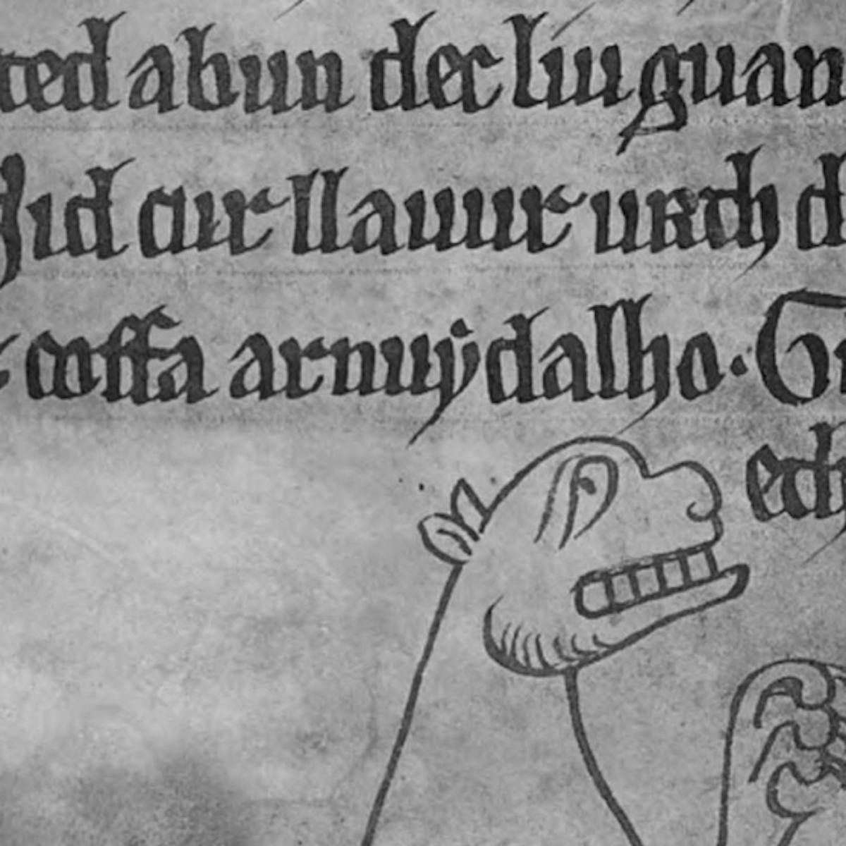
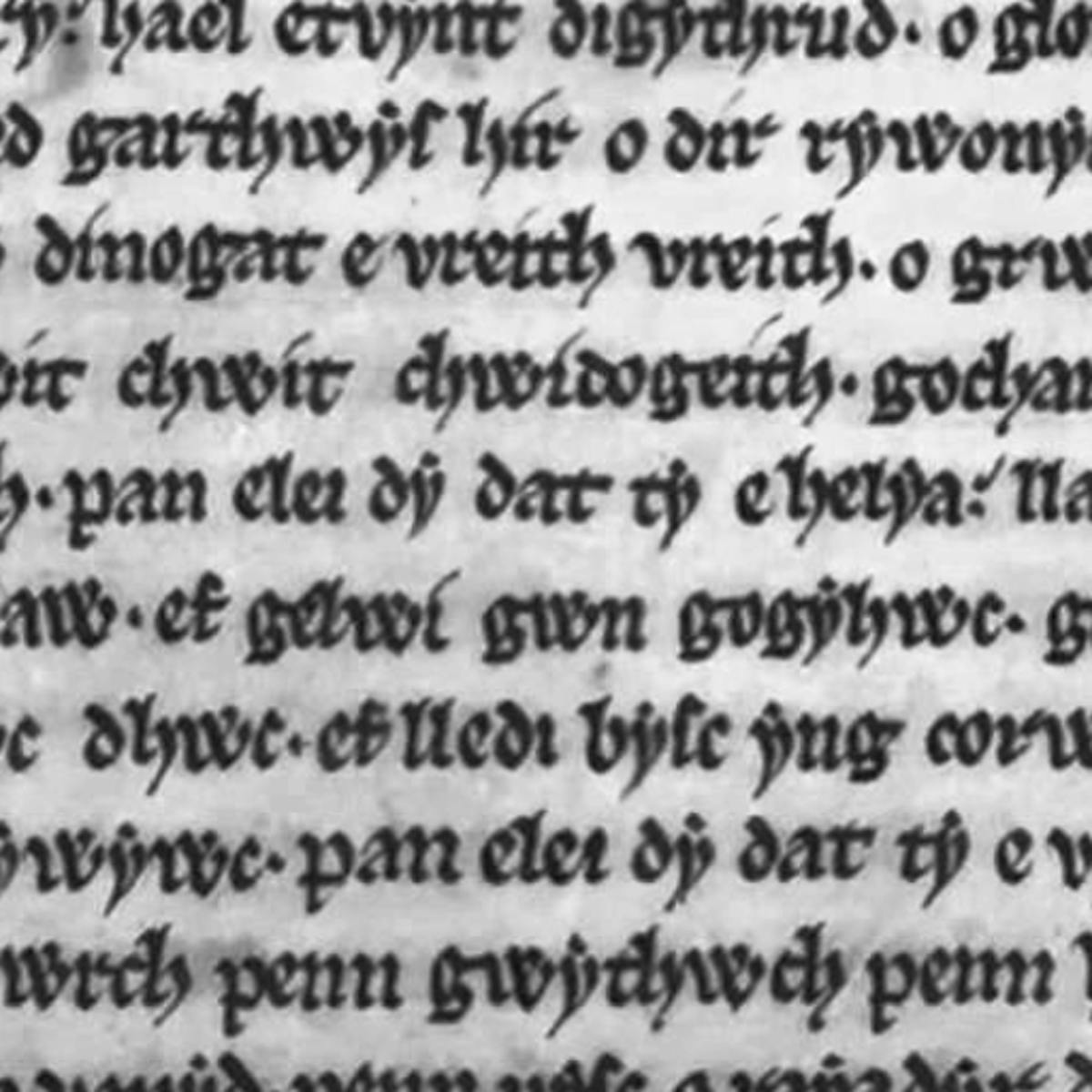
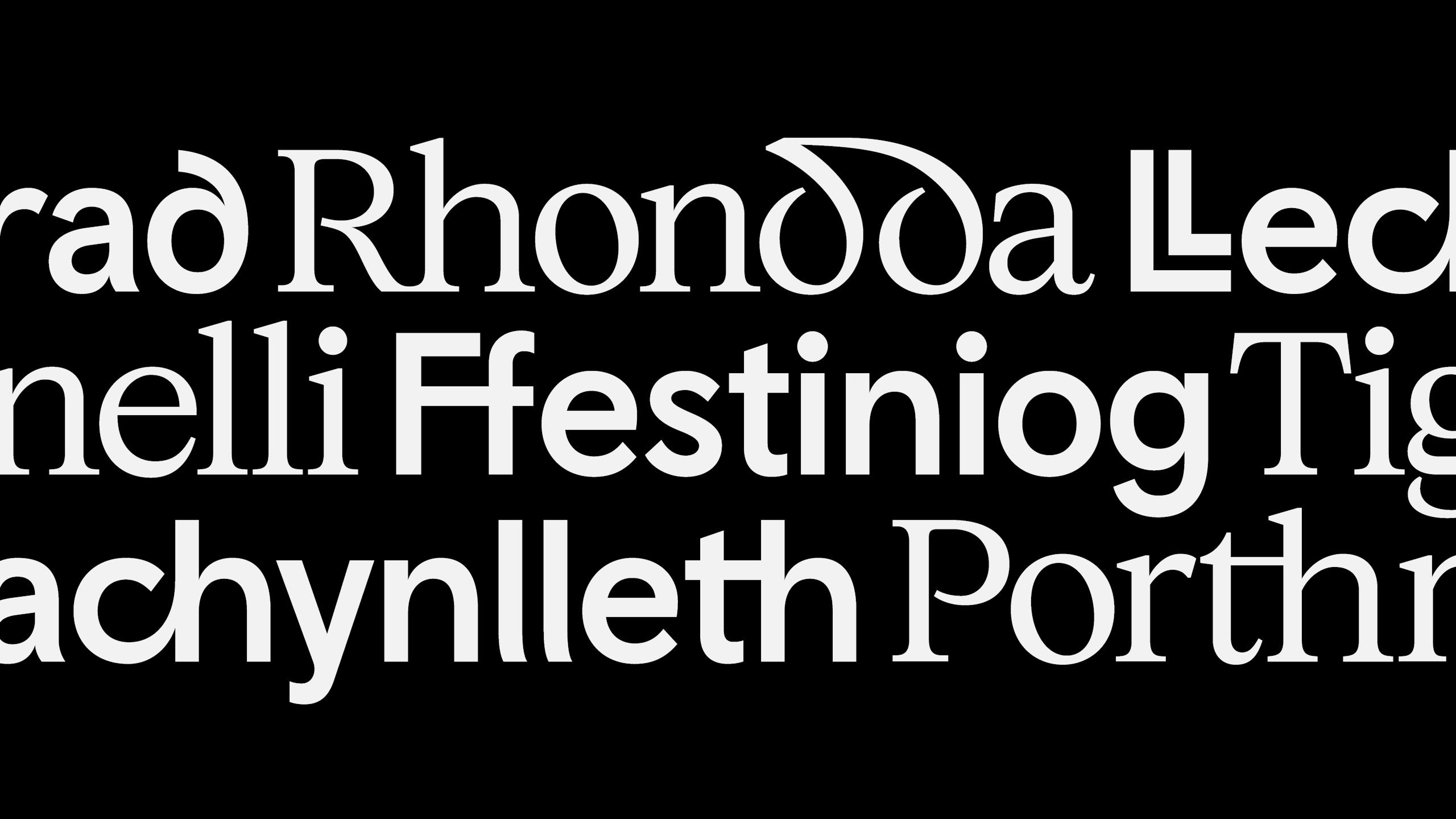
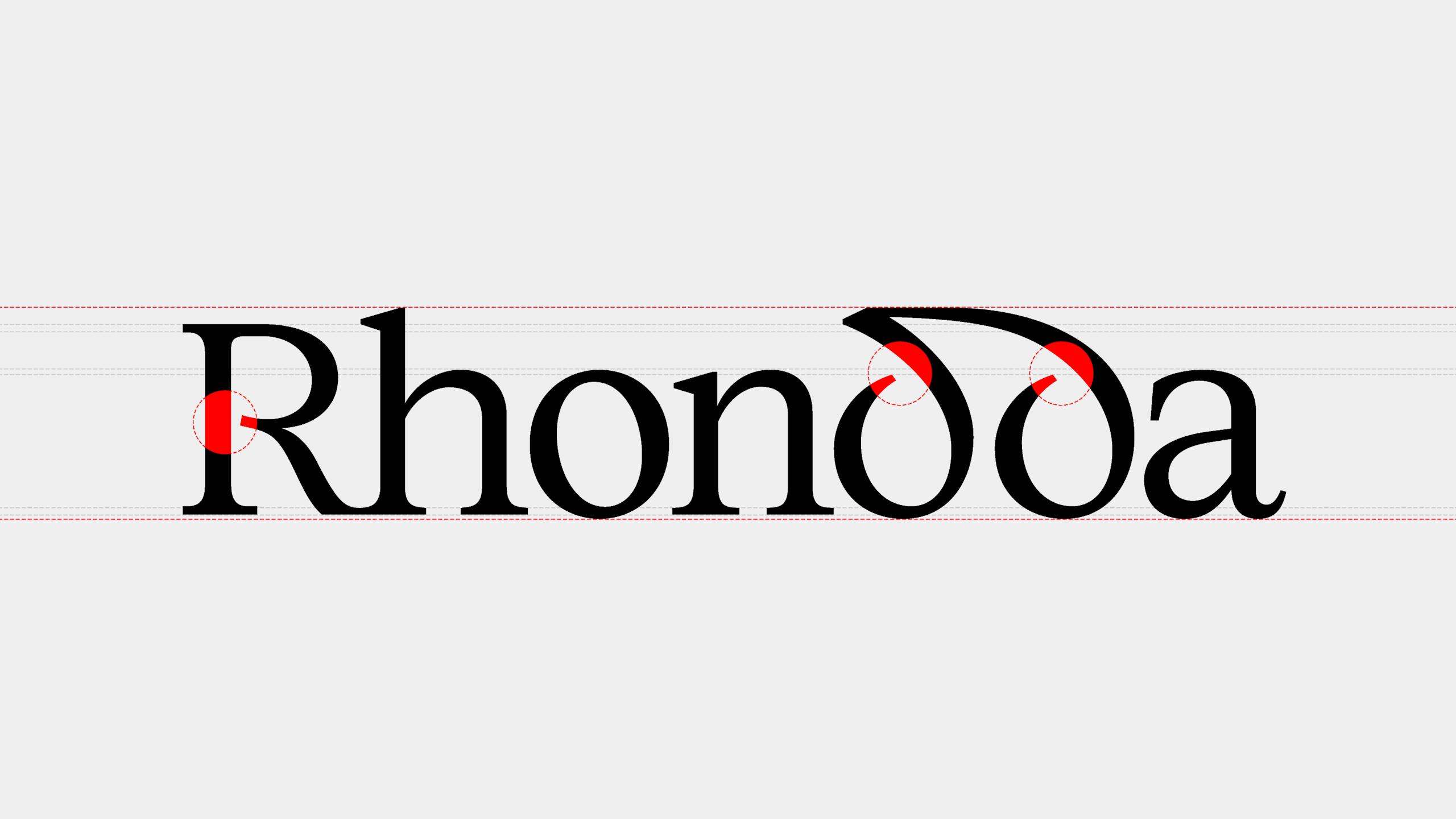
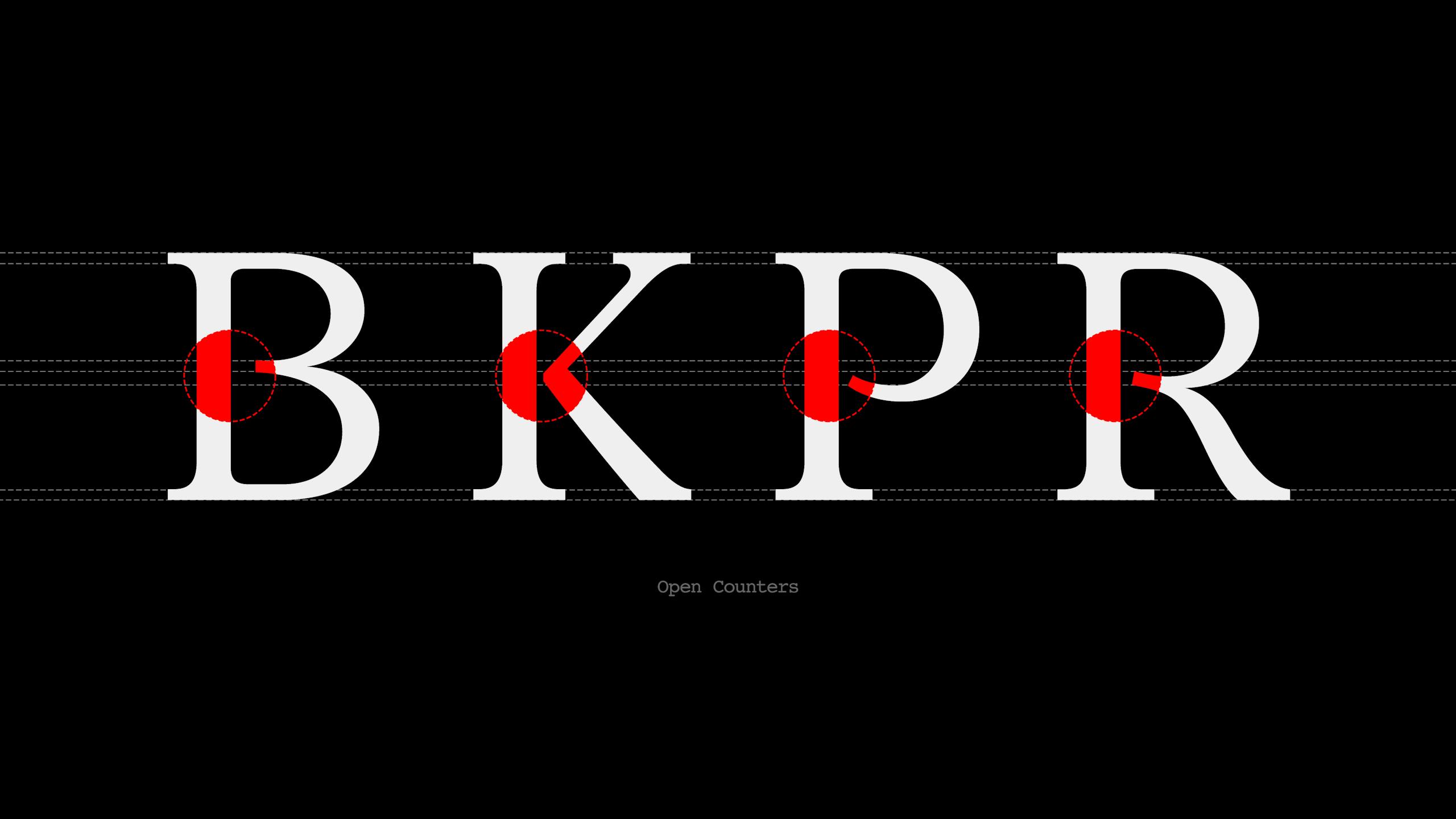
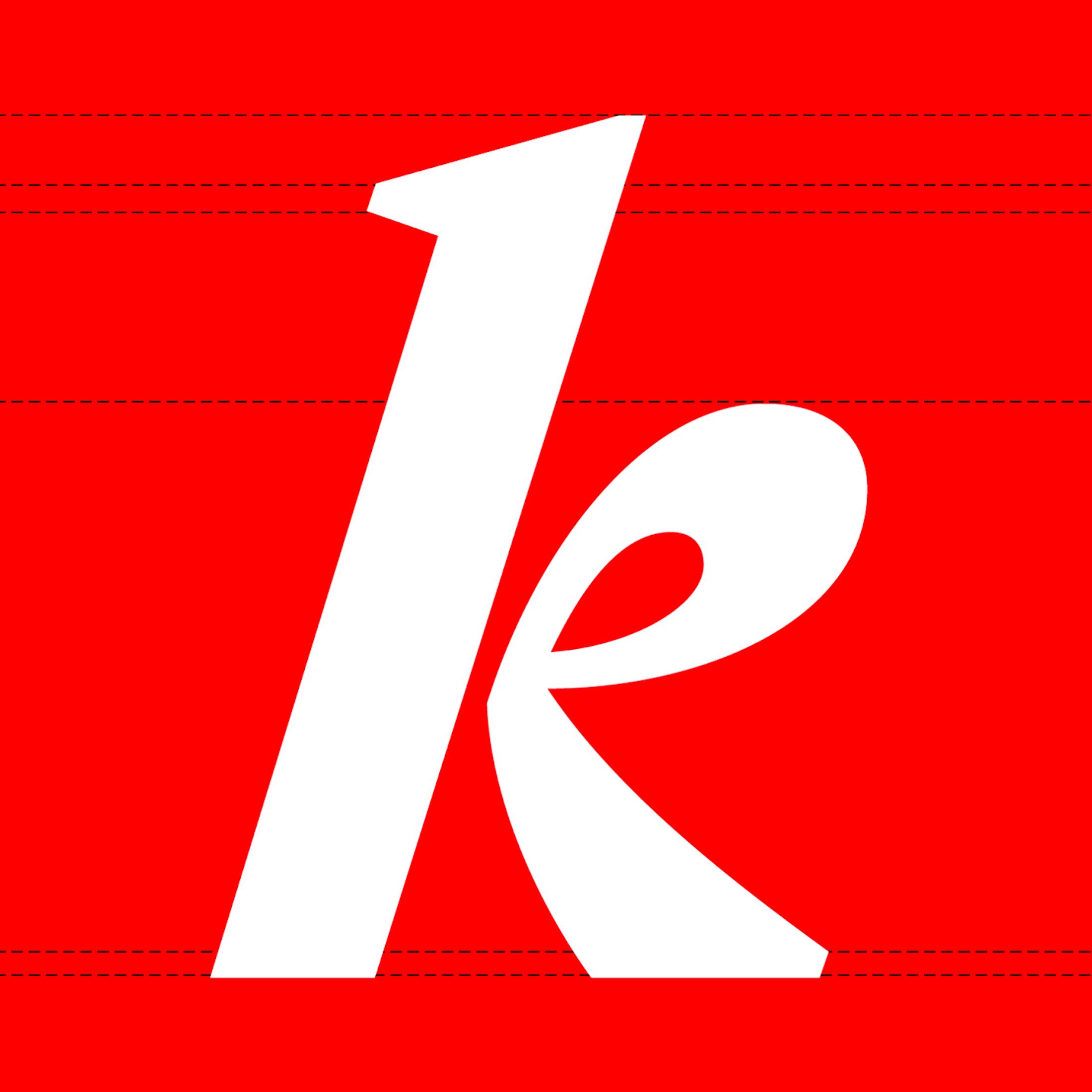
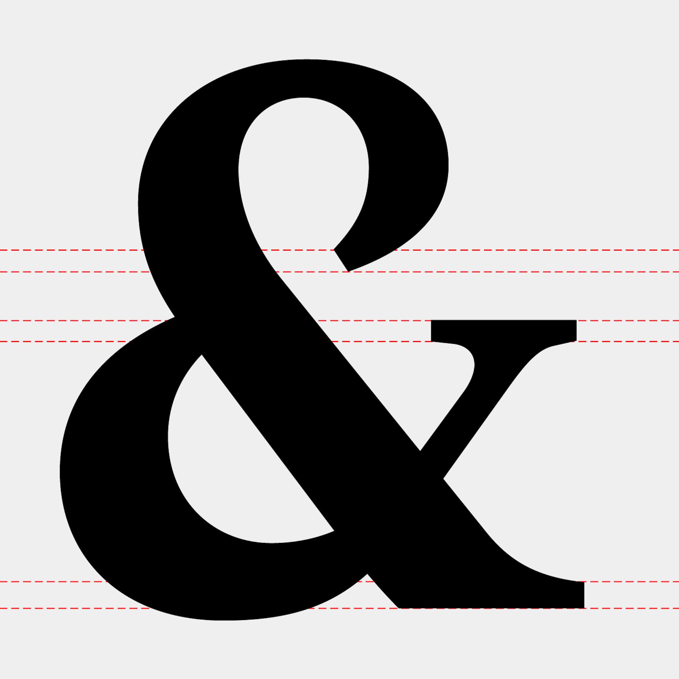
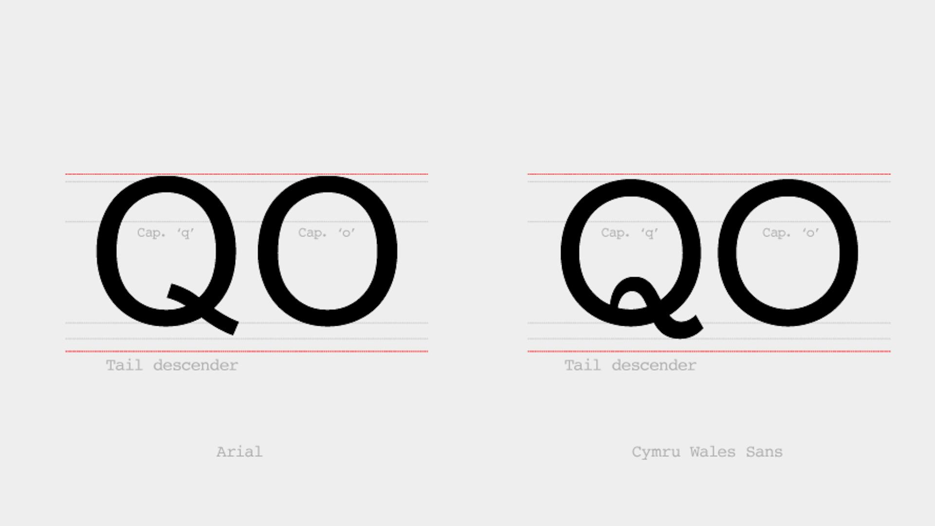
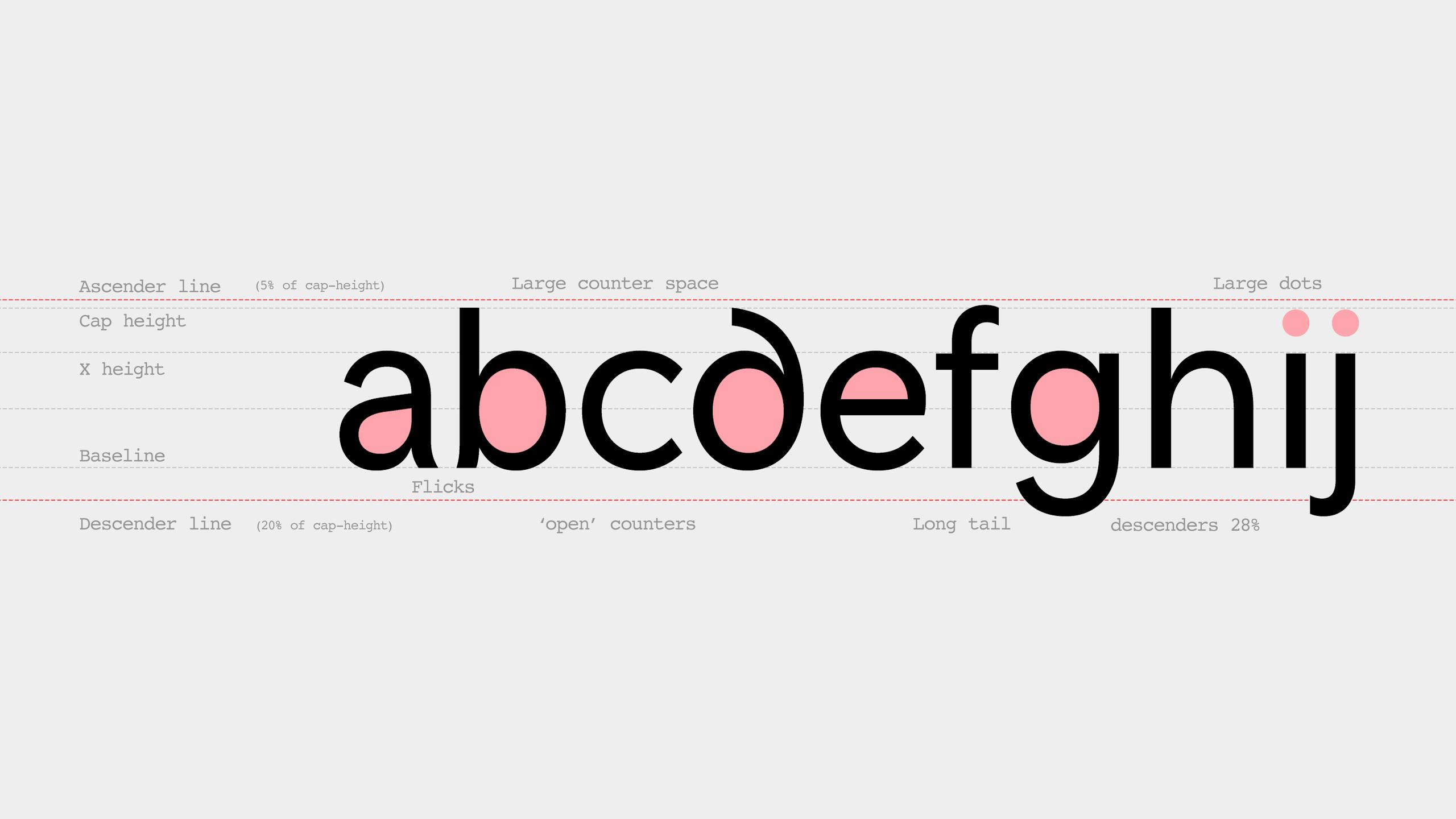
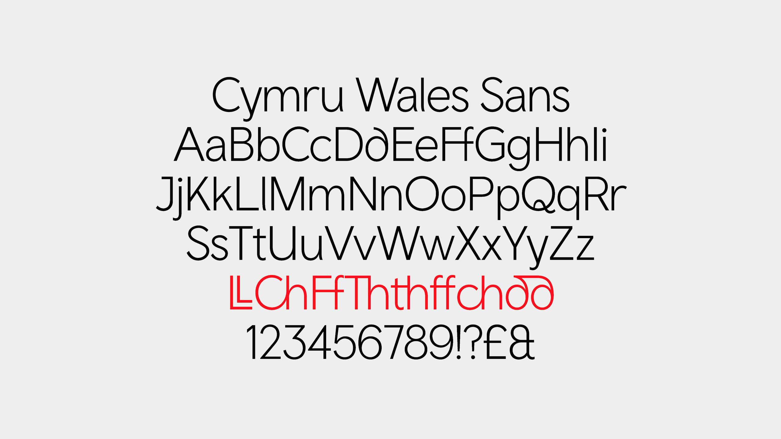
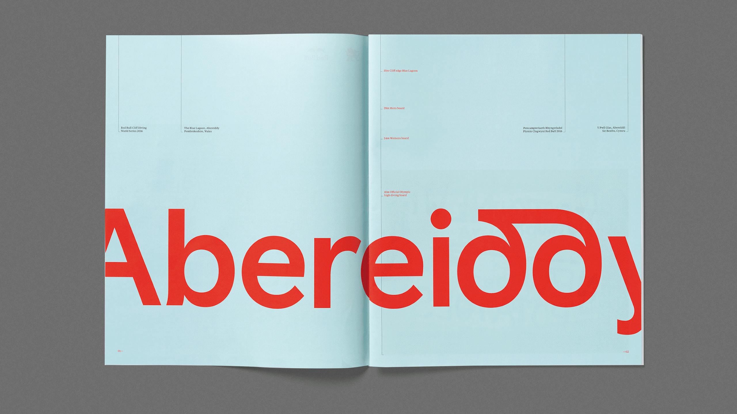
As well as taking cues from the Welsh typographical heritage — such as Llyfr Du Caerfyrddin, (the Black Book of Carmarthen) and Llyfr Coch Hergest, (Red Book of Hergest) — we sought inspiration from other languages such as Icelandic and also Arabic script for its exuberant and cursive character forms. Our aim with Cymru Wales Sans was to create a contemporary European ‘Sans with a unique 'sense of place' baked in — a trait that its ‘Serif’ equivalent would share — but given its more flowing single-line gestures and cursive forms it displays additional character defining traits such as the open bowls that feature in the B, d, dd, g, P, R and &.
All three commissions were developed with the Colophon Type Foundry with additional consultancy from Joseph Burrin.
Result—
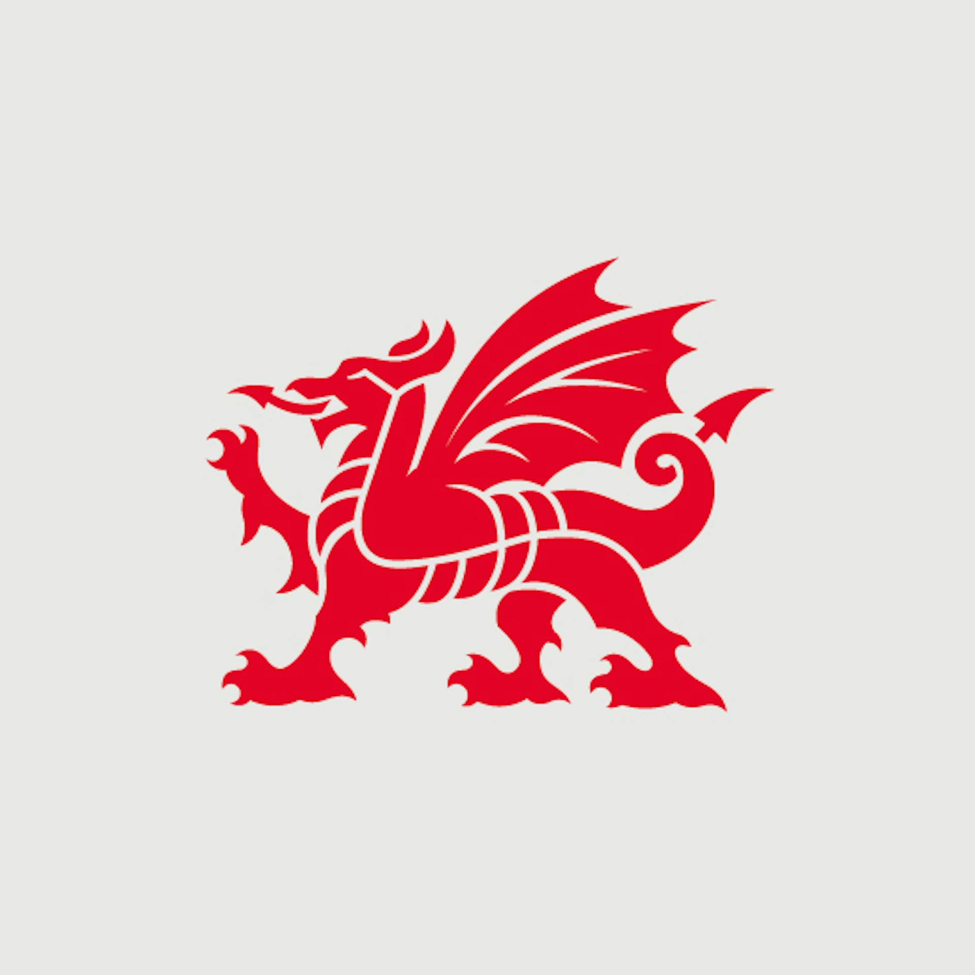
As is so often the case with a high profile rebrand the core logo or marque becomes the ‘hero’ element. However, with the Cymru Wales brand the bespoke font family quickly assumed this position, overtaking the Ddraig Goch (or Welsh Dragon).
“The Cymru Wales font family is an outstanding fusion of historic Welsh and contemporary, accessible typography. The trailblazing placement of disabled people at the heart of the Cymru Wales typeface design contributes directly to its high degree of legibility. The creation of unique Welsh digraphs provide a visual highlight to the phonic which is elegant, educational and quite simply genius. Once introduced into the public domain Cymru Wales has huge potential to promote 'a sense of place' and 'identity', making Wales and the Welsh language very relevant in the 21st century.”
David Burdus, Director / Burdus Access
Cymru Wales Typeface Family Won Gold at The European Design Awards 2020
Research
As well as taking cues from the Welsh typographical heritage – such as the Black Book of Carmarthen and the Red Book of Hergest – we sought inspiration from other languages such as Icelandic and also Arabic script for its exuberant and cursive character forms.
Aim
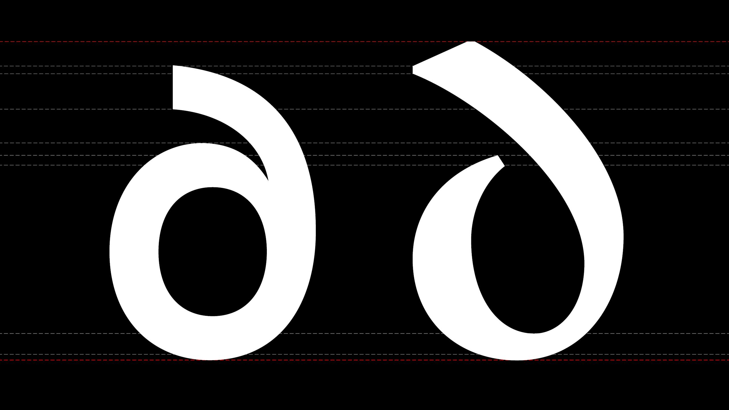
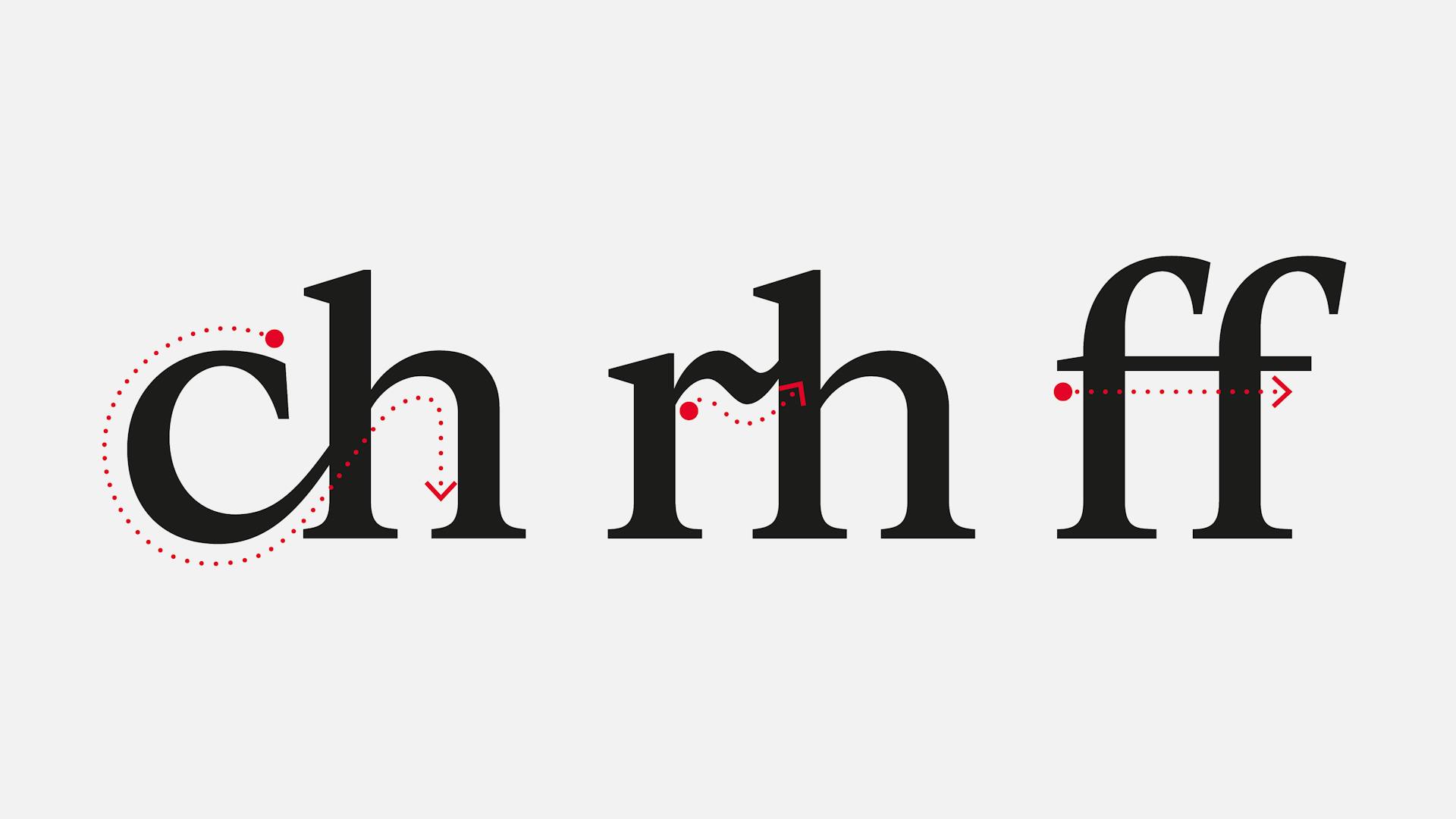
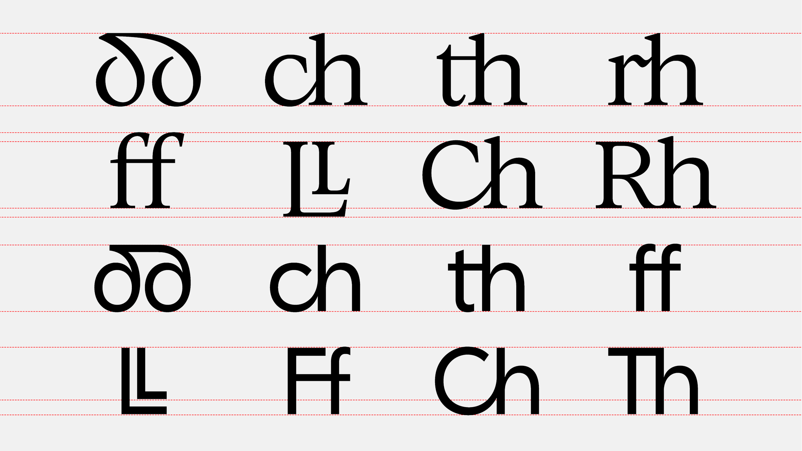
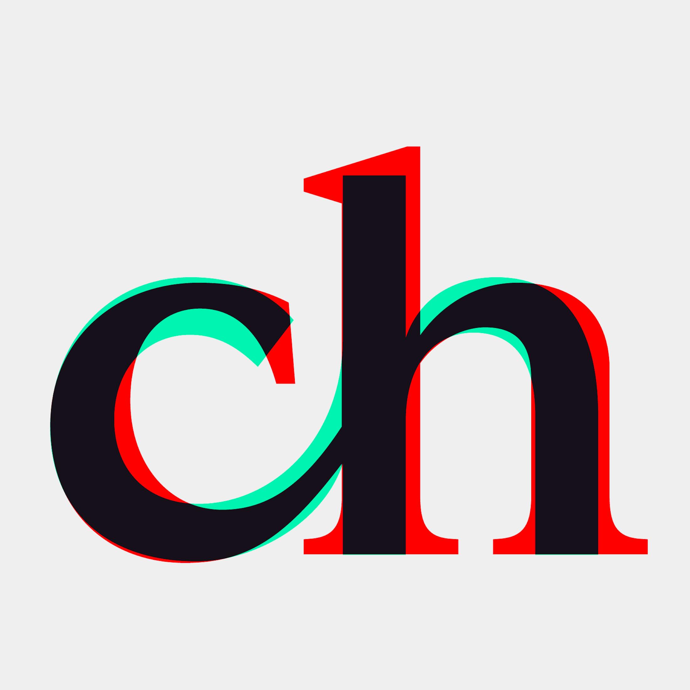
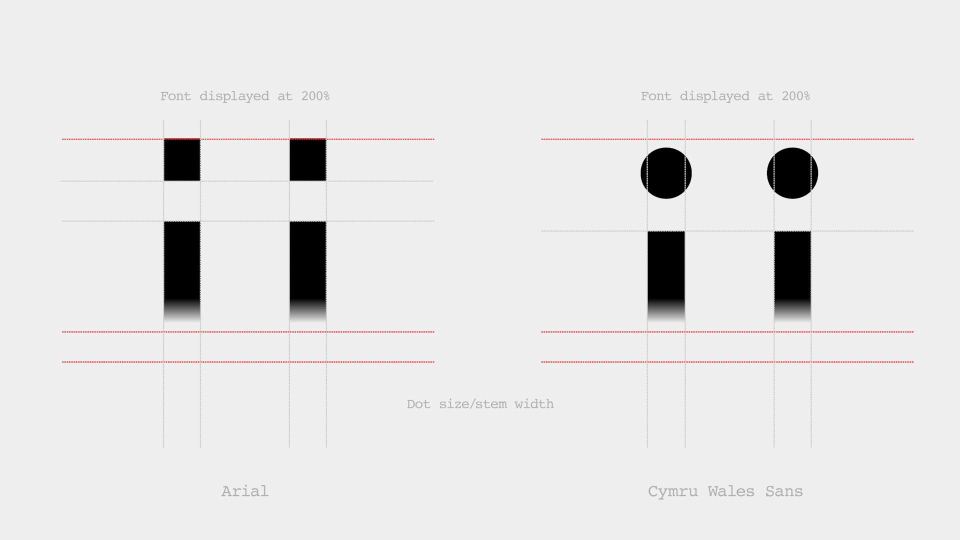
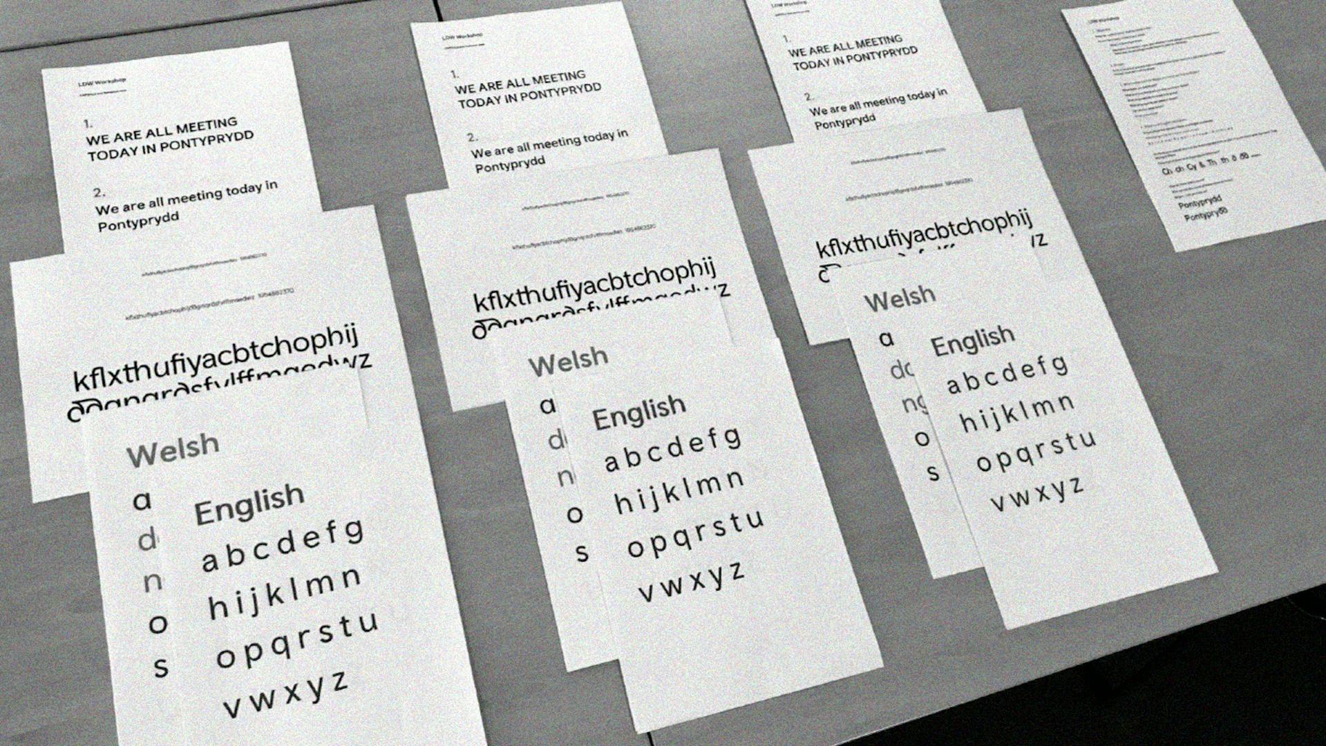
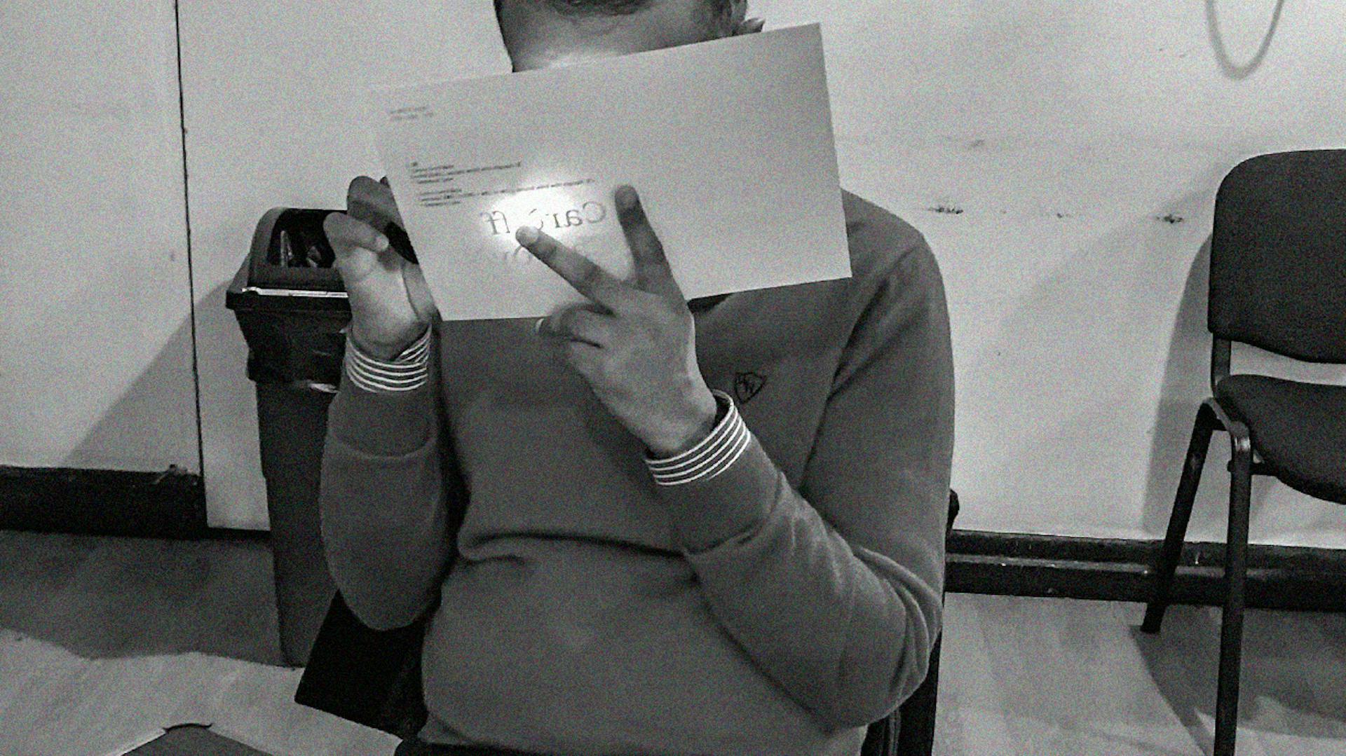
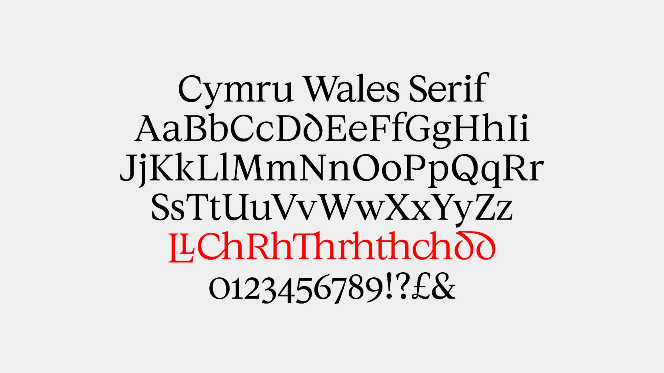
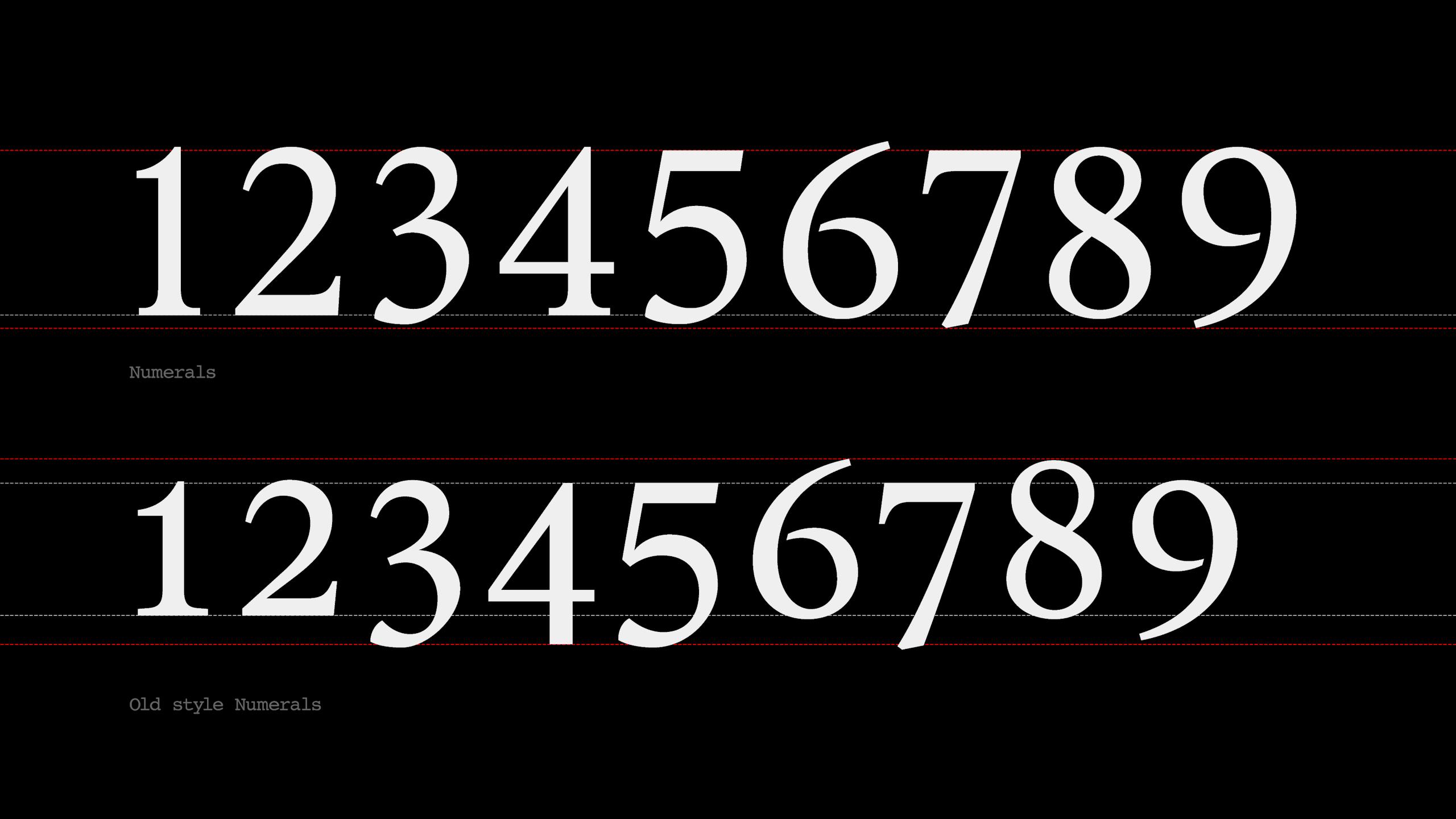
Our aim with the Cymru Wales font family was to create contemporary European typefaces with a unique personality and a 'sense of place' baked in. The key to the latter were the eight digraphs (unique letter combinations) that feature in the Welsh alphabet as well as the curved 'd' character that has quickly become the cornerstone of both the Sans and Serif.
Other defining characteristics
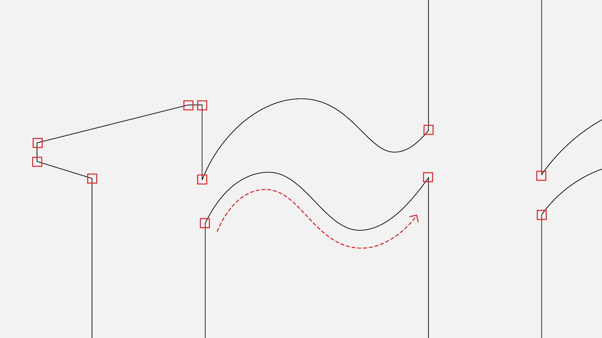
The subtle chamfered edges of the serif’s terminals reference the rich stone letter carving tradition in Wales.
David Burdus
Director / Burdus Access
"The creation of unique Welsh digraphs provide a visual highlight to the phonic which is elegant, educational and quite simply genius."
Further stylistic elements
Given a serif typeface’s flowing single-line gestures and cursive forms, Cymru Wales Serif displays additional character defining traits such as the open bowls that feature in the B, d, dd, g, P, R and &.
Informal and informal in tandem…
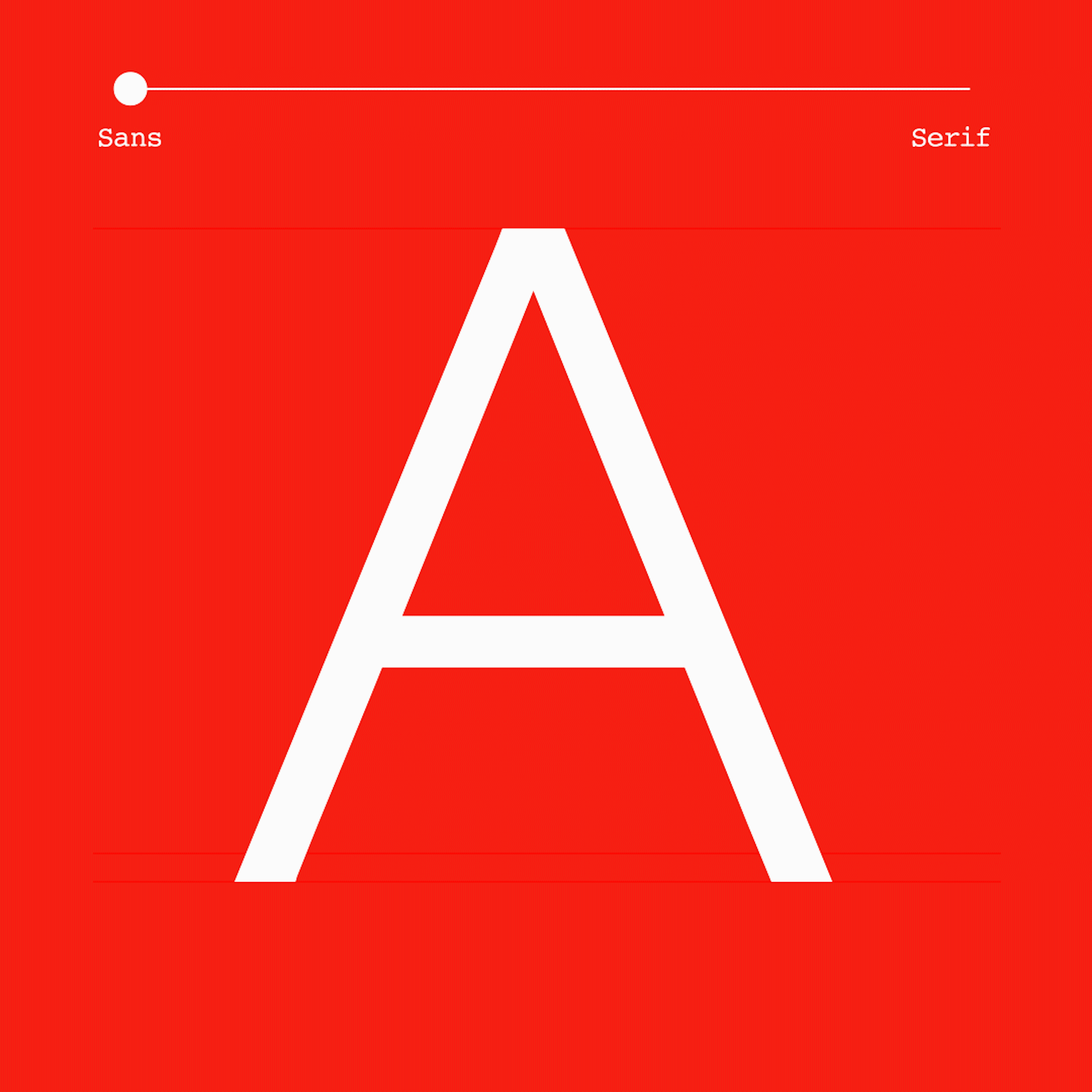
Two years after the creation of CW Sans it became obvious that a broader and richer offering in terms of typographical hierarchy was needed. Cymru Wales Serif is designed for longer, editorial reads. Using both typefaces together offer designers an extensive and layered ‘kit of parts’.
Accessibility
Independent accessibility research has proven that the core characters of ‘Cymru Wales Sans’ are more legible than ‘Arial’ whilst those of ‘Cymru Wales Serif’ are more legible than ‘Times New Roman’. And crucially, rather than being deemed as ‘linguistic obstacles’, the digraphs were perceived as valuable educational legibility assets — highlighting the fact they are actually different characters, that in turn are pronounced differently.
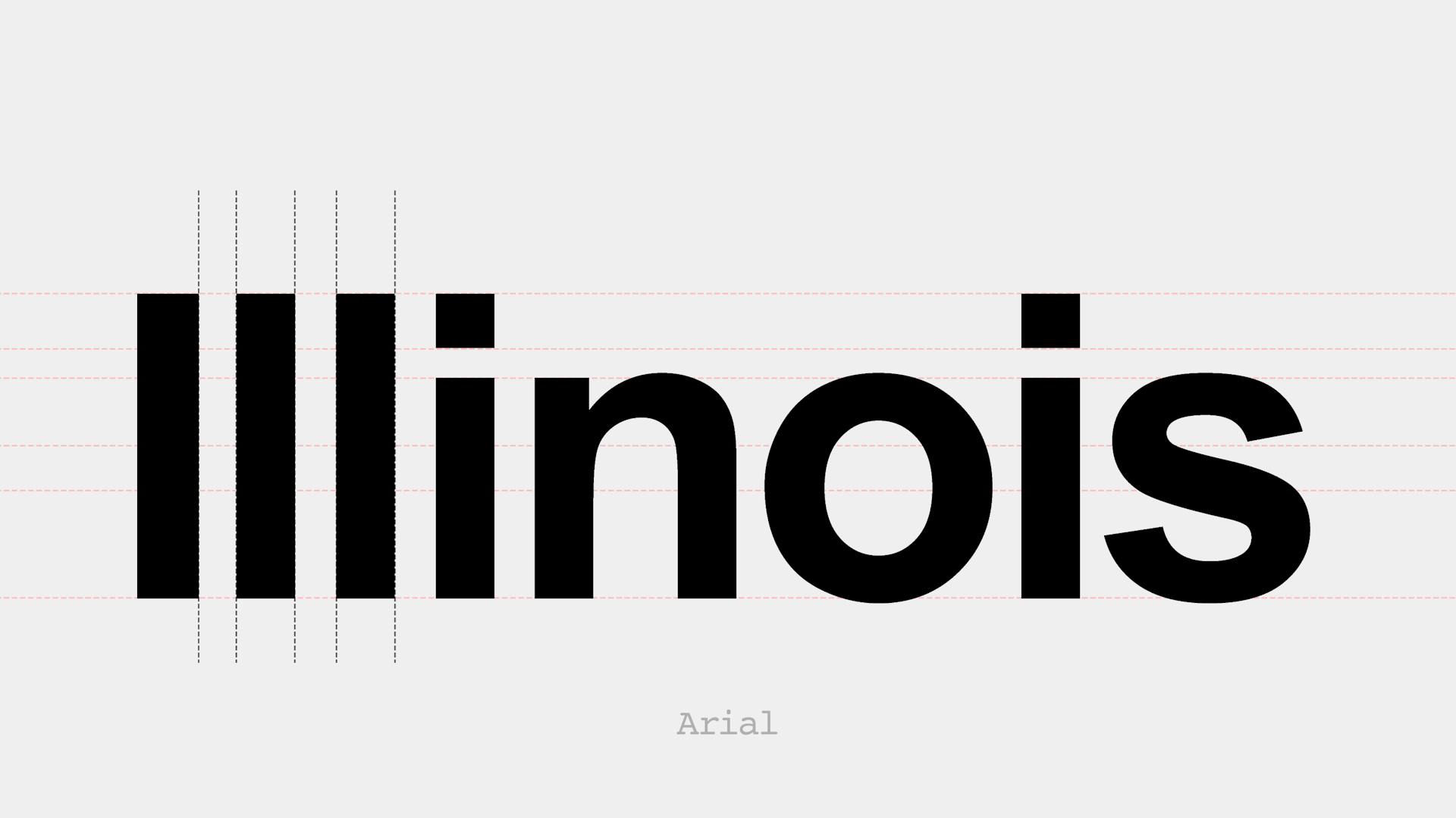
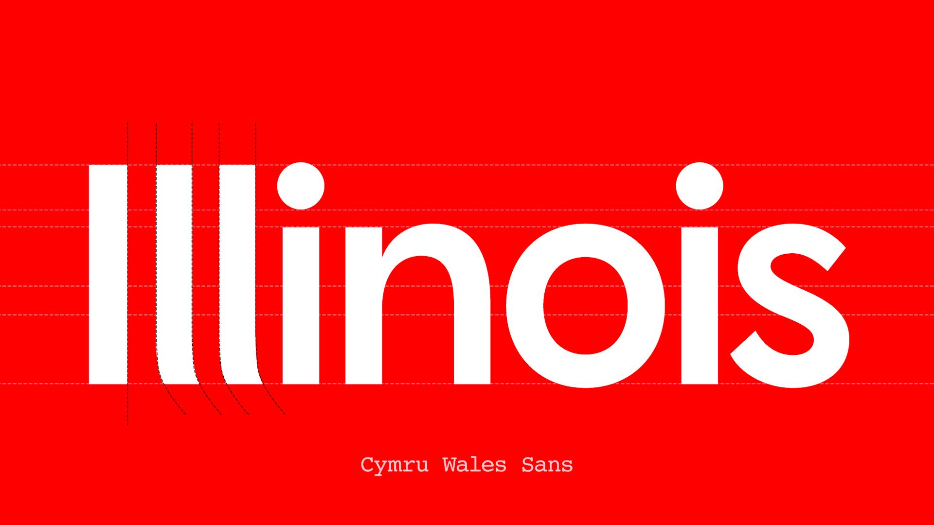
Cymru Wales Sans v Arial:
Comprehensive accessibility studies were conducted by Burdus Access in collaboration with Applied Wayfinding and Smörgåsbord.
Different strokes for different folks
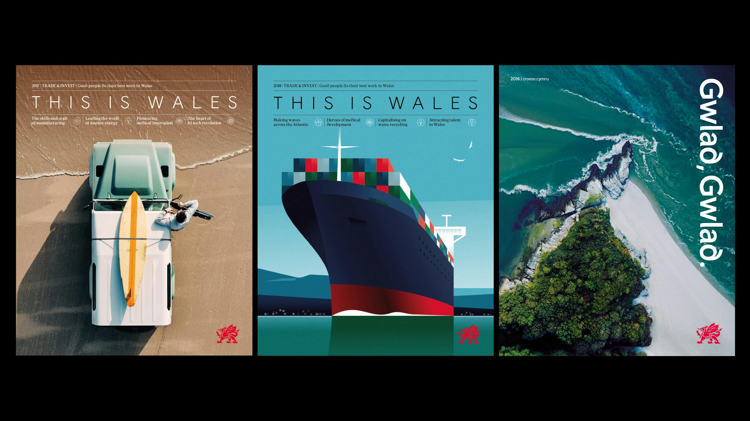
5 sectors. 1 font family.
Each pillar of the Welsh Government needed a distinct graphic language as they target very different markets and therefore need to present a unique and ownable personality whilst also being firmly rooted in the overarching ‘mother brand’. We assigned different weights and cuts of the font family to each of the sectors. To illustrate this ‘Trade & Invest’ (being business orientated) uses CW Sans uppercase, whereas ‘Tourism’ requires a more approachable and informal graphic language and so uses CW Sans Medium, set in sentence case.
Creative Wales
Breaking things up
‘Creative Wales’ required a looser and more spirited ‘language’ and so we created a customised, slithered version of CW Serif which naturally lends itself to animation.
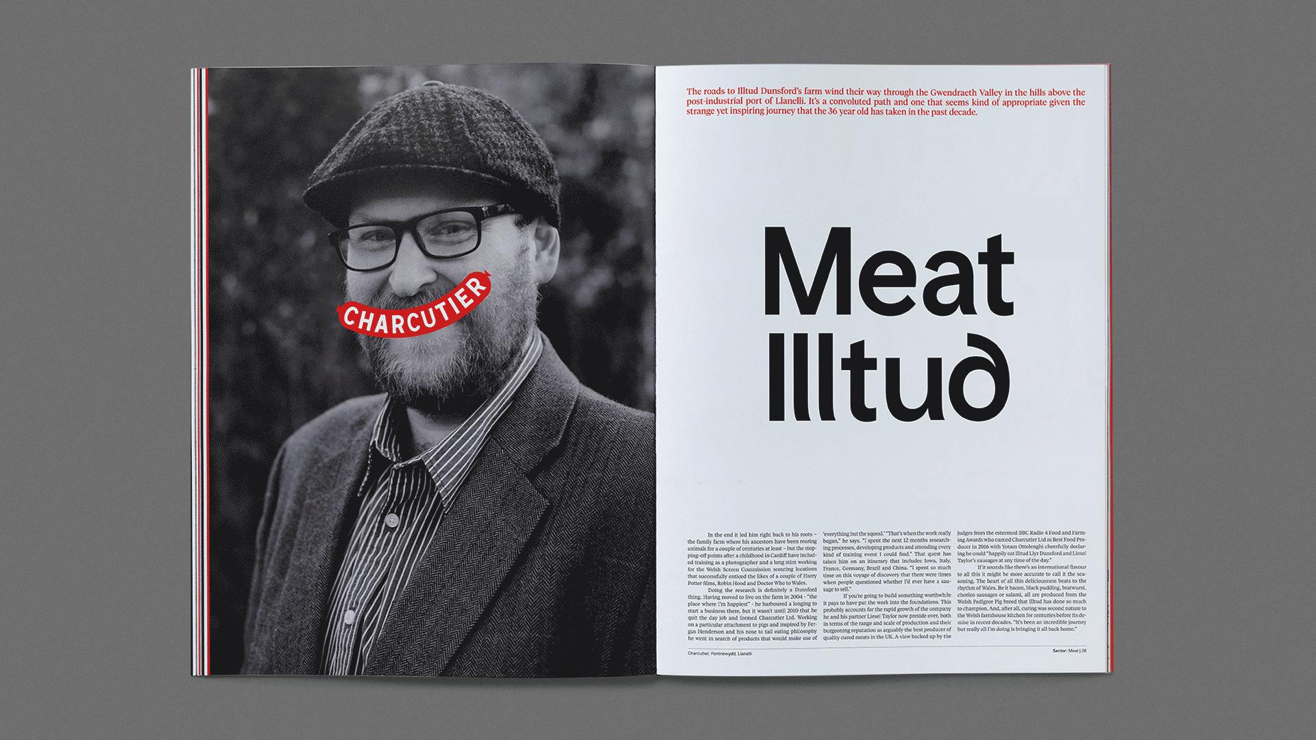
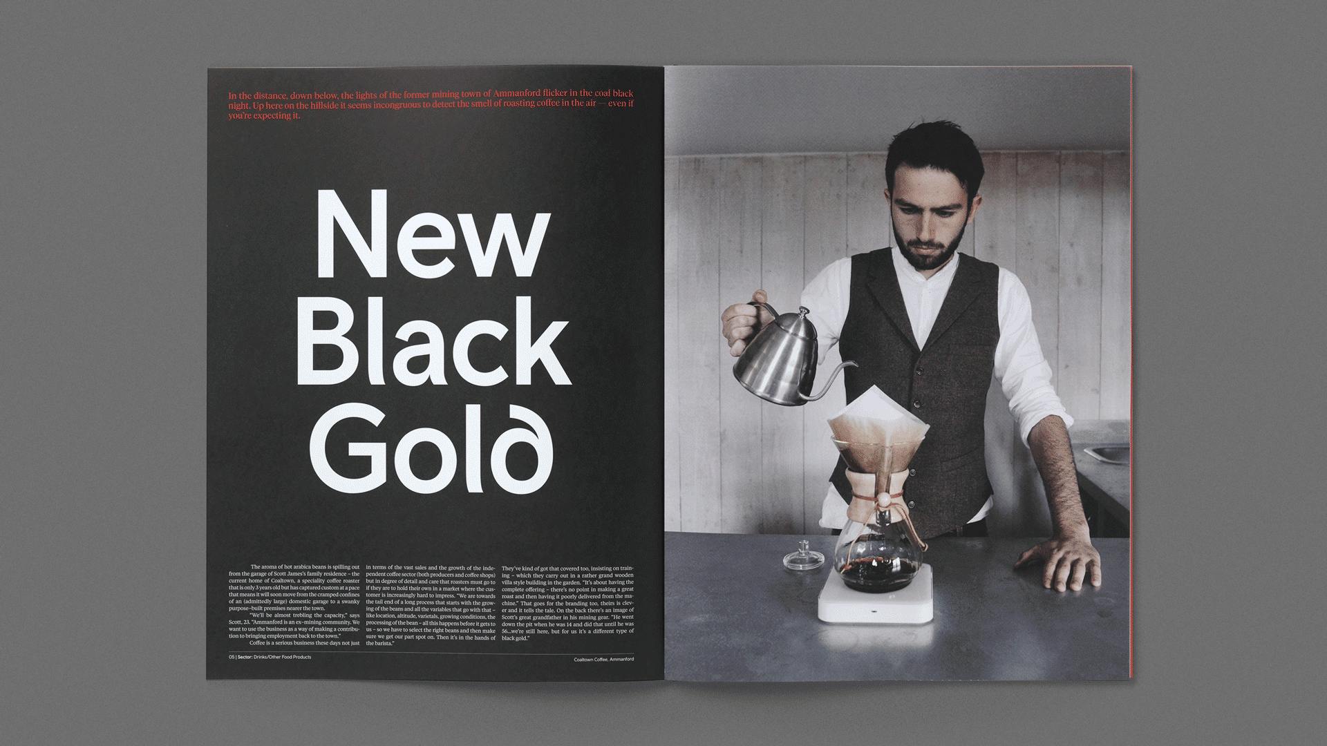
The ‘Food & Drink’ sector
TFW Cymru Transport
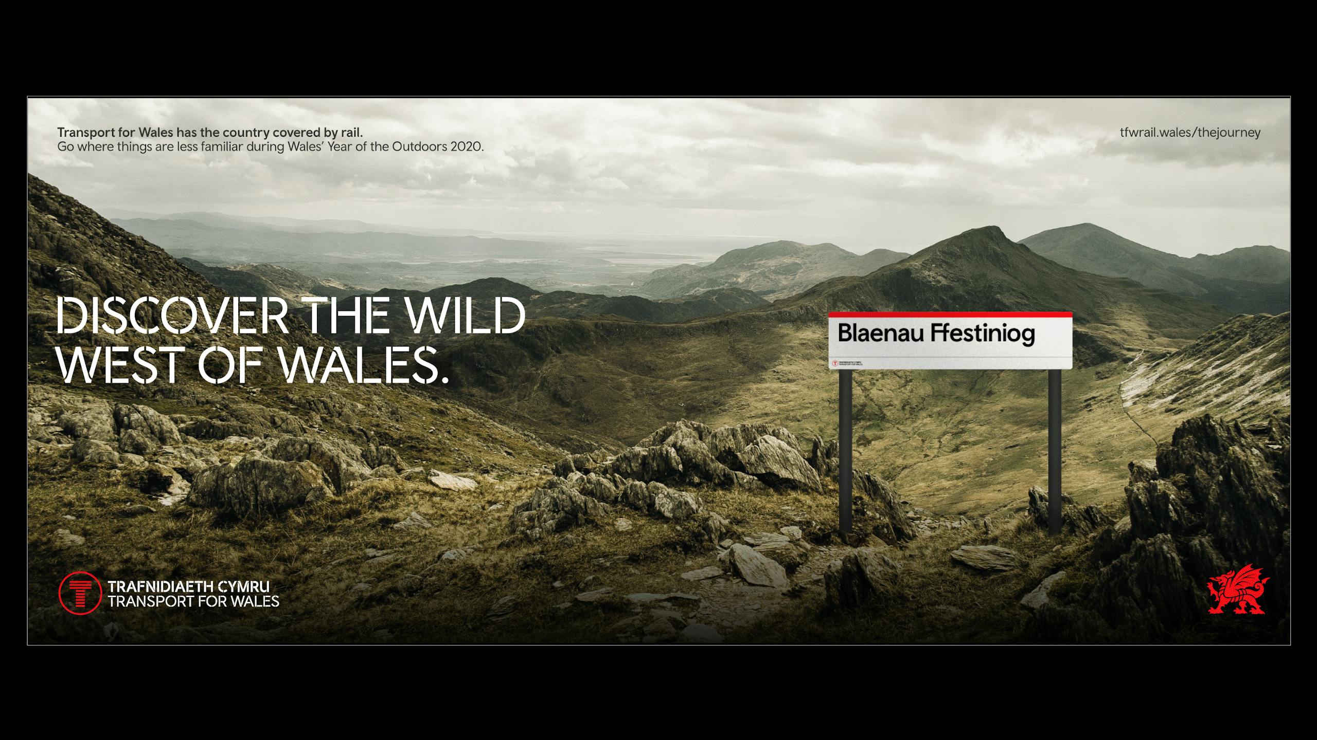
Created exclusively for Transport for Wales, 'Cymru Sans Transport' is an all-caps affair based on 'Cymru Wales Sans' and sees the letters stencilled in a utilitarian manner which also references TfW’s core 'T' roundel.
Cymru Sans Transport and Cymru Wales Sans working in tandem in a TfW campaign promoting the use of its services during Visit Wales' ‘Year of the Outdoors 2020’.
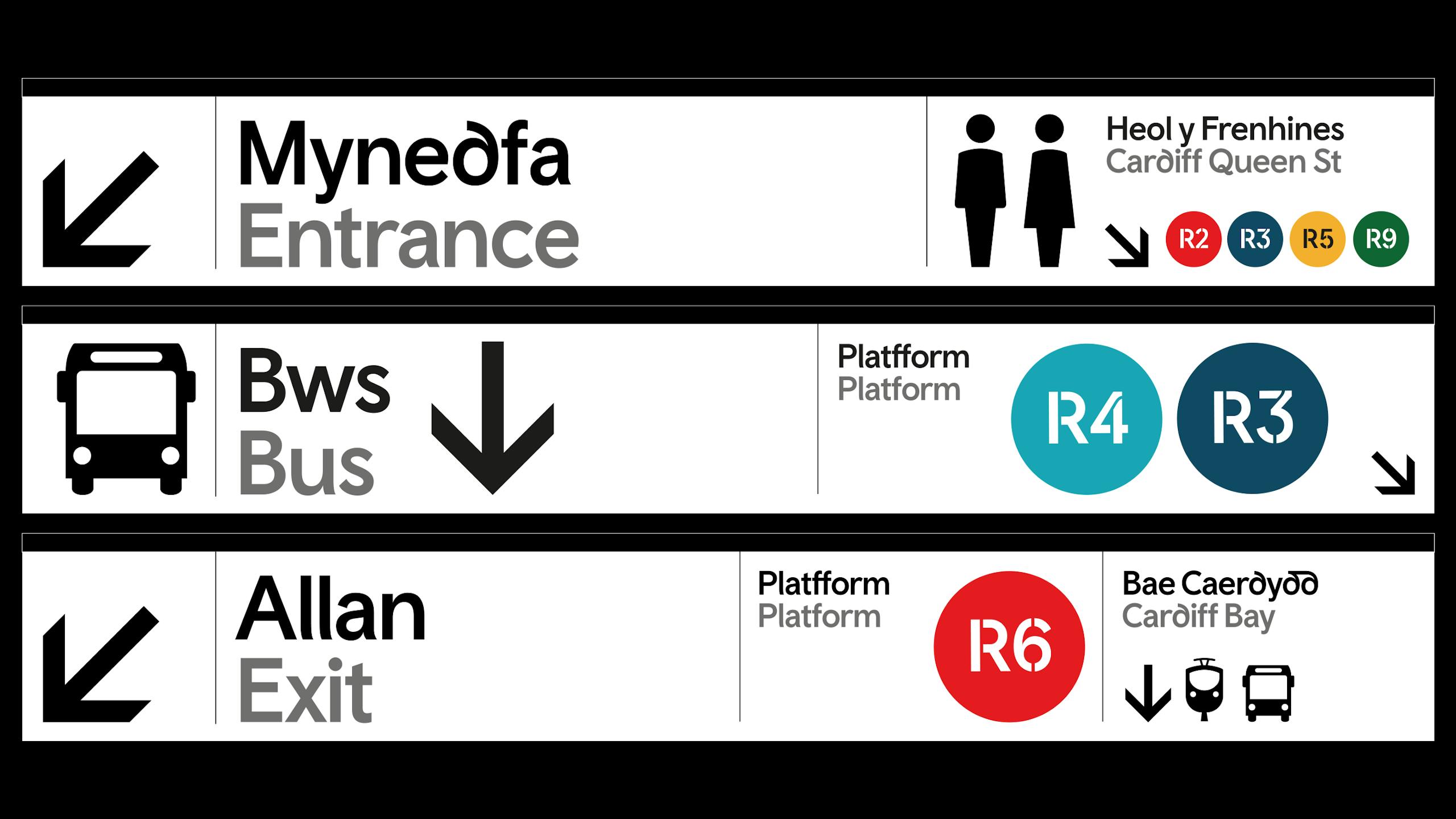
Both typefaces working in harmony across TfW Rail Services station wayfinding…
Moving forward
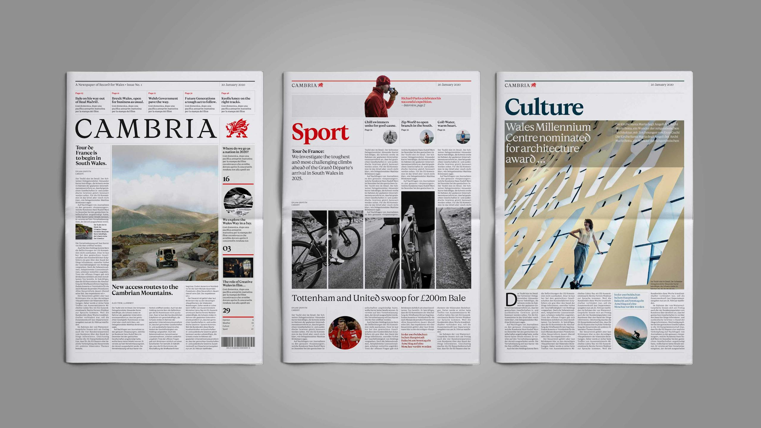
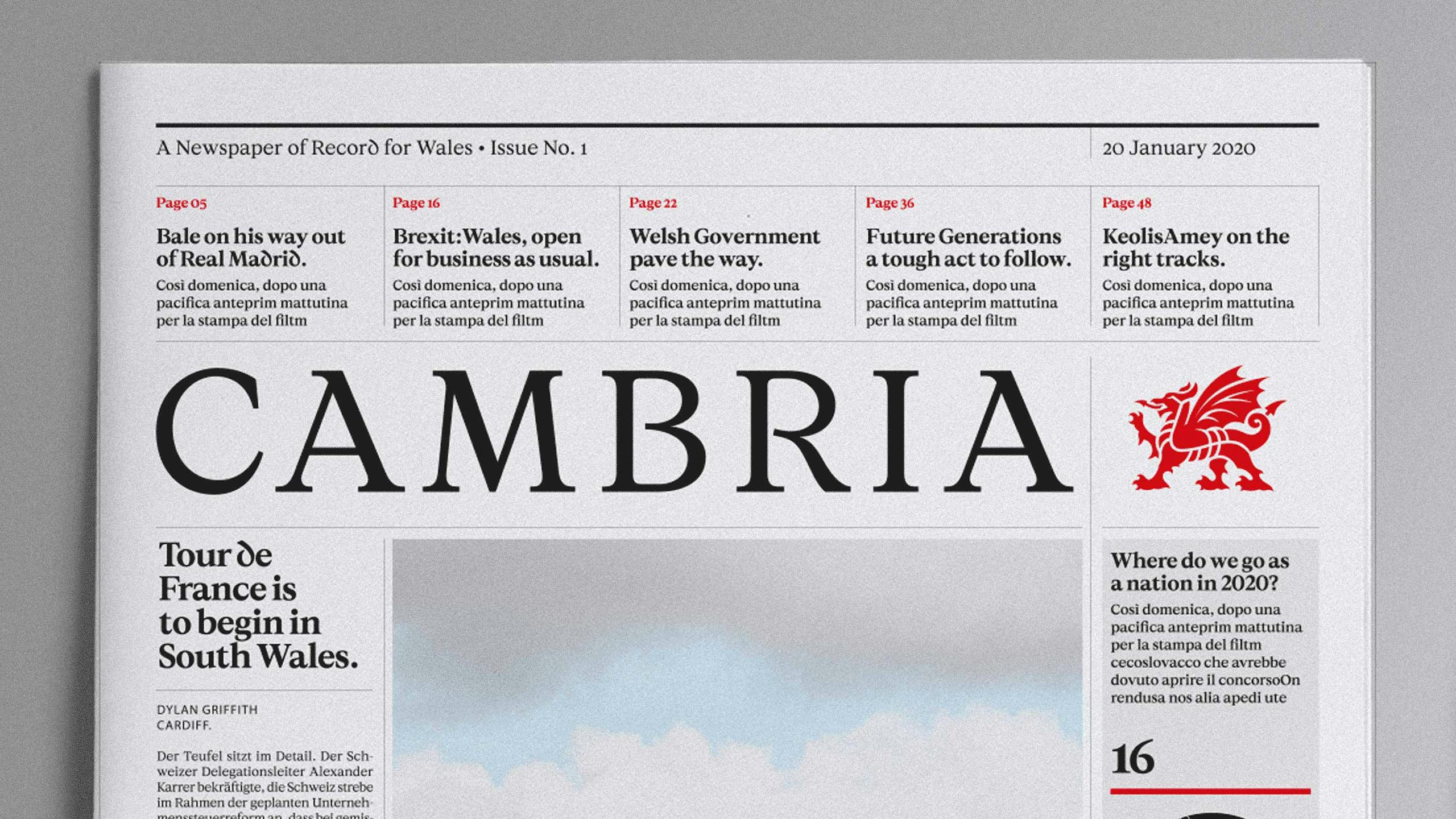
Whilst first and foremost our aim was to create a font family for the Cymru Wales Brand, that would represent Wales in an authentic and creative way externally, we also aimed to educate people on the characteristics and sounds of our unique language. With careful application these typefaces can help evolve our identity as a nation. With these foundations now in place, we're looking at further ways to introduce the typefaces into ‘the everyday’. One (currently speculative) project is 'CAMBRIA' — ‘A Journal of Record for Wales’.
David Burdus
Director / Burdus Access
"The Cymru Wales font family has huge potential to promote 'a sense of place' and 'identity', making Wales and the Welsh language very relevant in the 21st century.”
Disciplines
Typeface Design,
Creative Direction,