Capital Law
Challenging perceptions with a big dose of personality.
Based in Cardiff and London, Capital Law are a leading provider of commercial legal services to businesses throughout the UK, Europe and beyond. Capital are bright, dynamic and real — delivering excellent solutions and transparent costings presented by down to earth people. We looked at how Capital’s peers were positioning themselves, and put simply, ran in the opposite direction. We challenged the negative perception of a ‘lawyer’ or ‘consultant’ being expensive, corporate and slow and placed a smartly executed illustration style, front and centre of the rebrand.

Brief—
Our brief was to reflect Capital’s personality and approachability, without compromising their professionalism.
Approach—
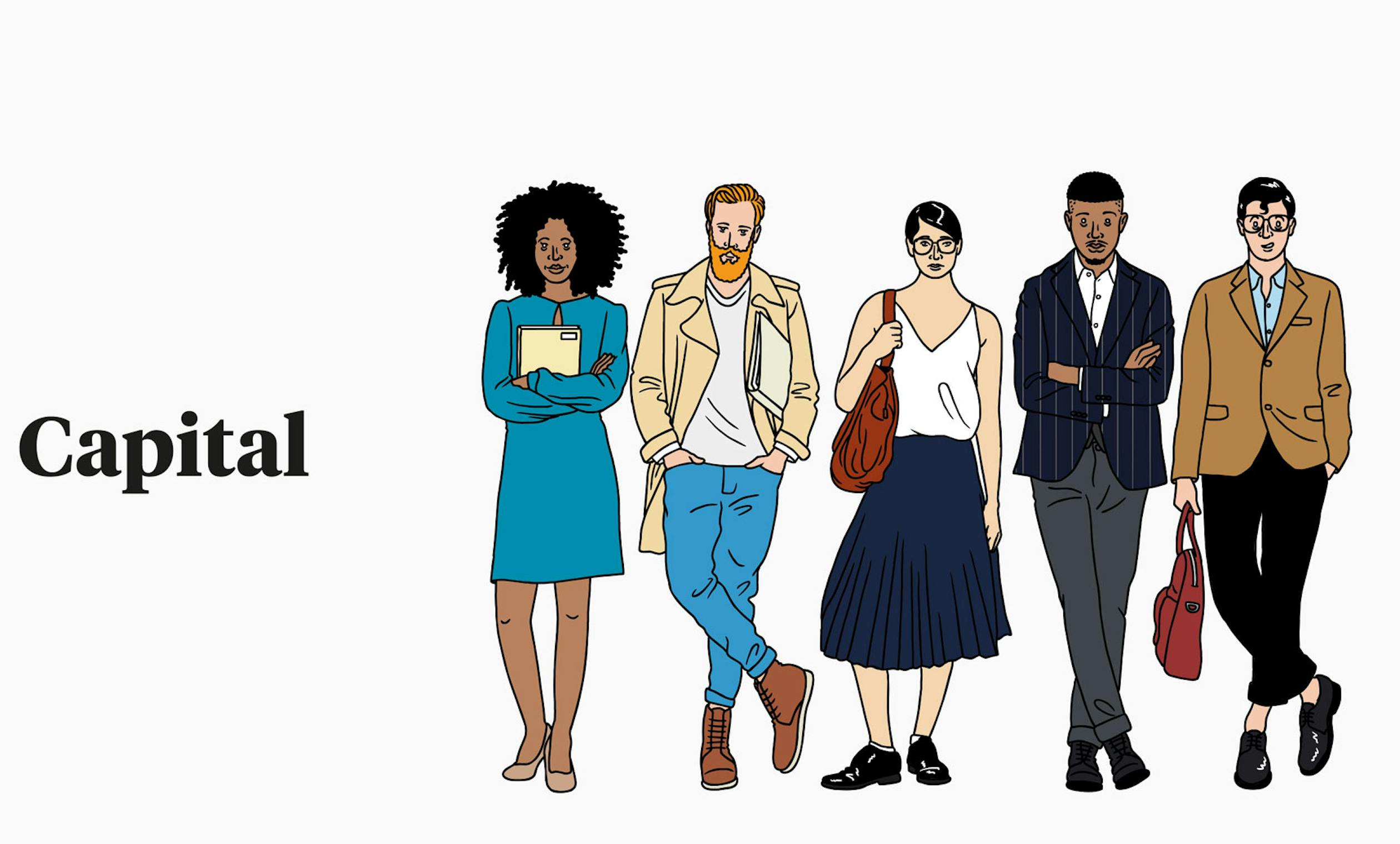
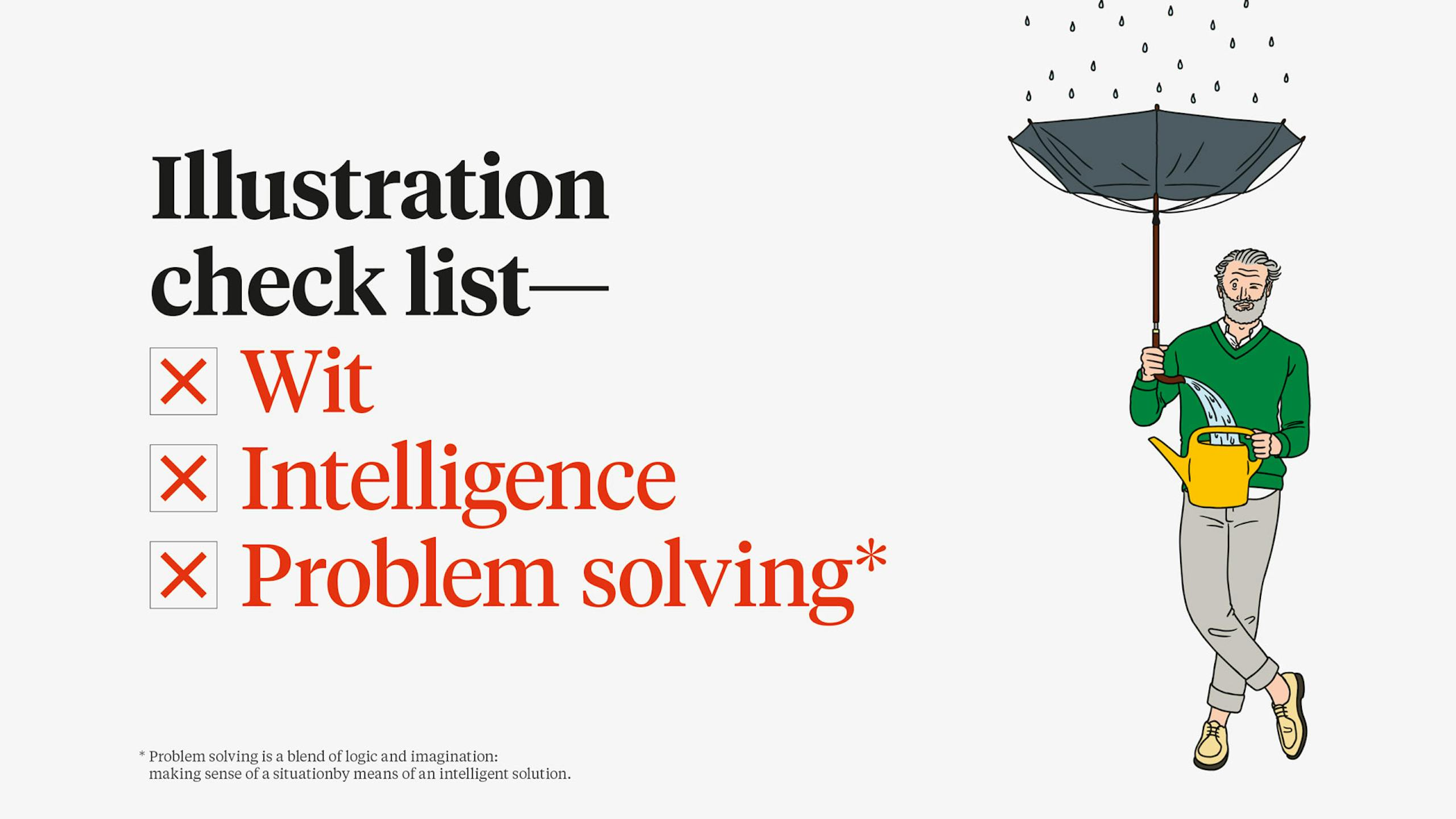
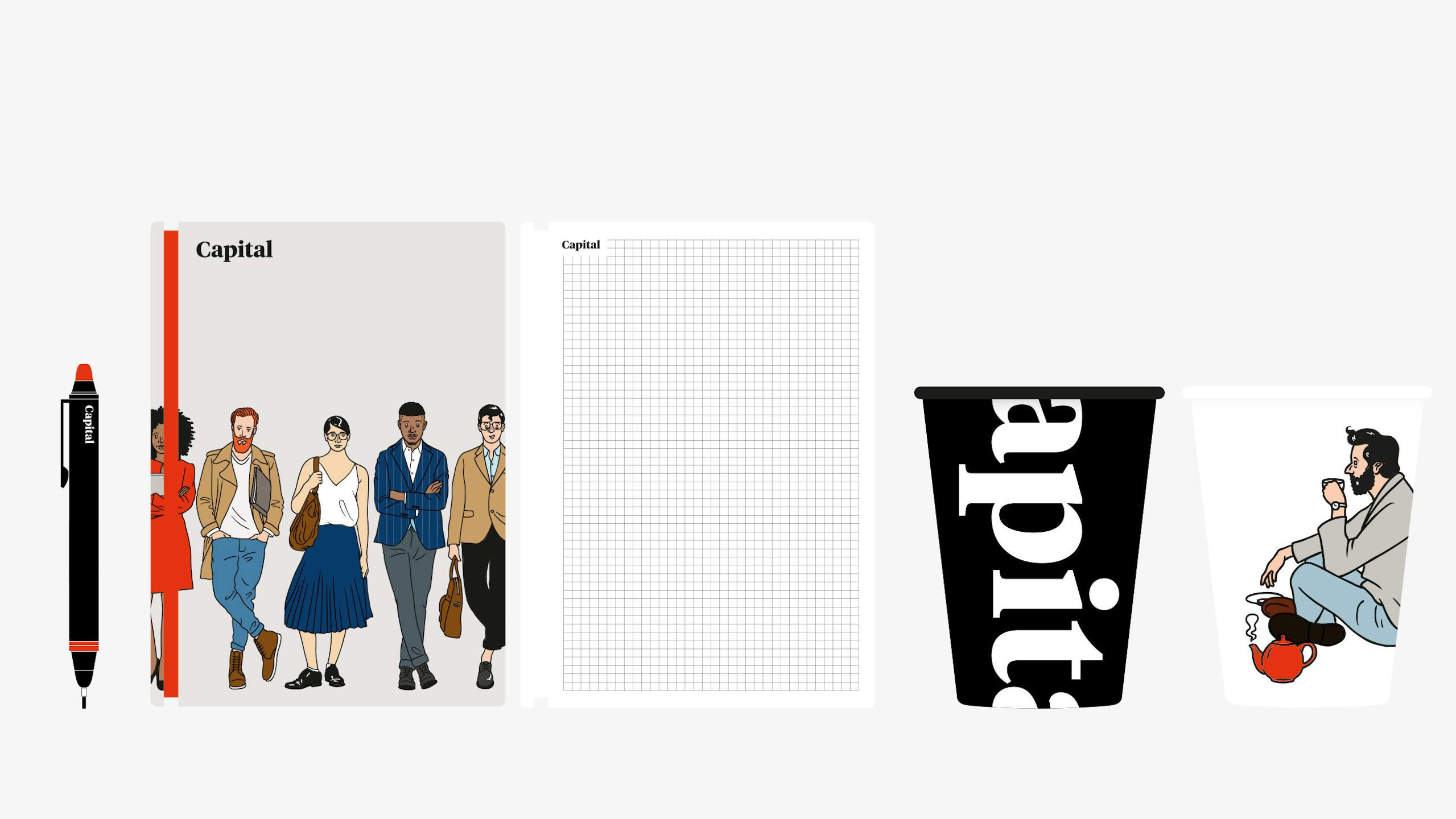
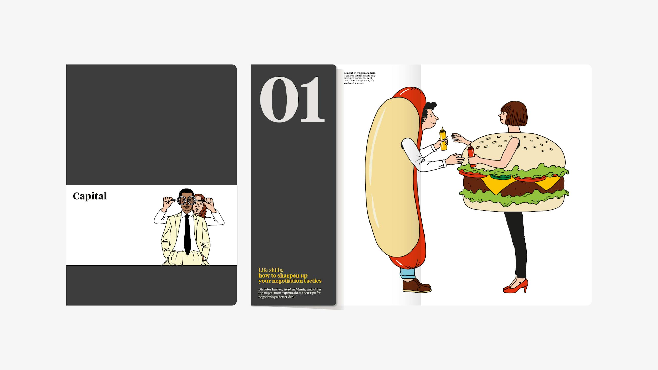
We viewed the legal system essentially as problem solving — a blend of logic and imagination: making sense of a situation by means of an intelligent solution. With this, and the idea of approachability and relevance in mind, we commissioned Paris based illustrator J.M. Tixier to visualise many facets of the legal system, with his engaging 'ligne claire' style reminiscent of the works of Hergé. In tandem with a fresh, ‘human’ and memorable illustration style, we adopted a warm and resonant tone of voice for the copywriting. In addition, we established 'Tiempos' as the house font to bring an editorial slant to proceedings.
Result—
A consistent, fresh and memorable brand identity for the Capital Group.
Approach
Running in the opposite direction. Again.
We looked at Capital’s peers and how they were positioning themselves, and put simply, ran in the opposite direction. We challenged the negative perception of a ‘lawyer’ or ‘consultant’ being expensive, dull and slow. Capital are bright, dynamic and real — delivering excellent solutions and transparent costings presented by down to earth people.
Illustration style
—
Capital are in the business of intelligent problem solving. We demonstrate this with a series of disarming and memorable illustrations, demonstrating their personality and wit that set them apart.
Tone of voice
—
Capital offer clear, insightful, sharp solutions in a relevant and accessible manner. We reflected this with a warm and resonant tone of voice.

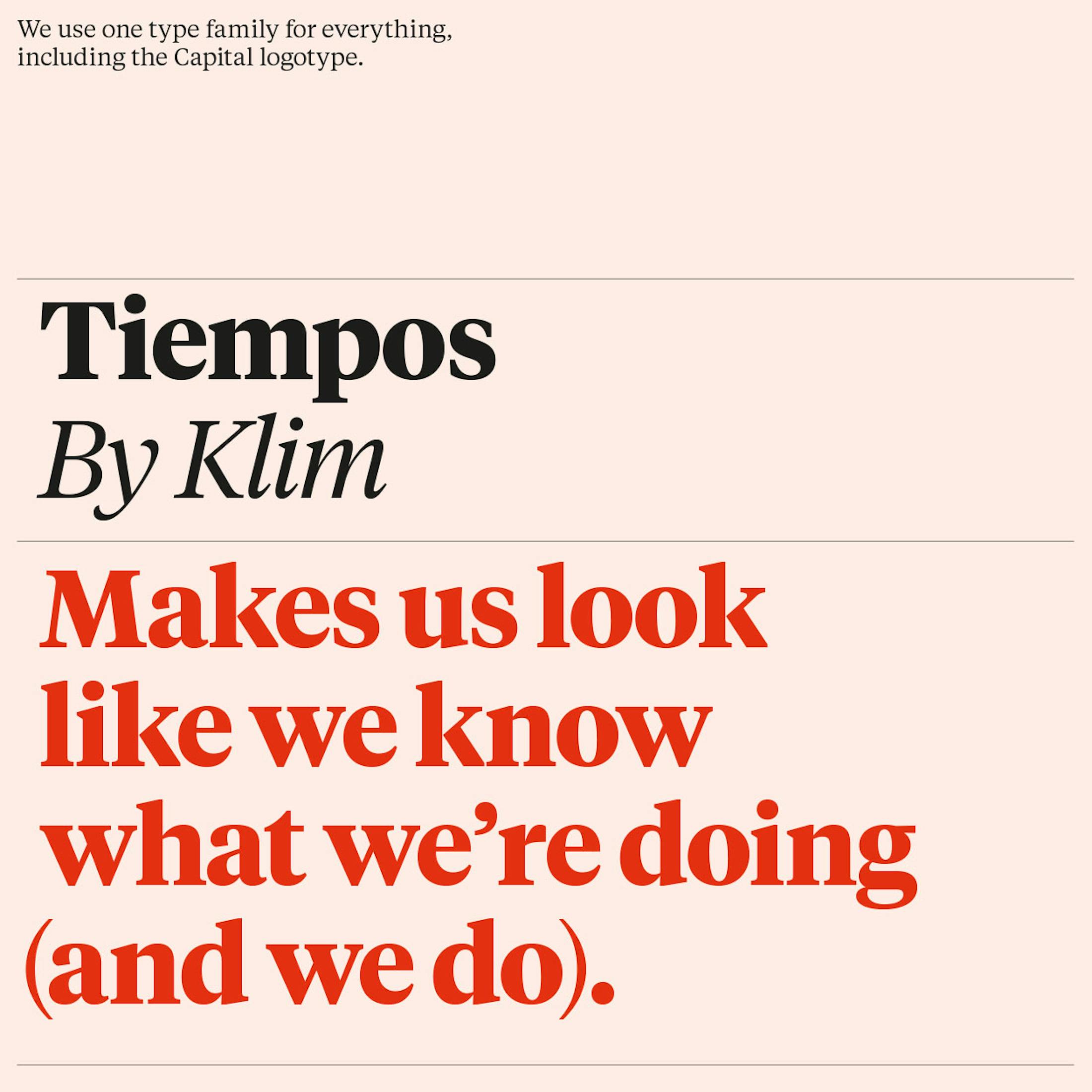
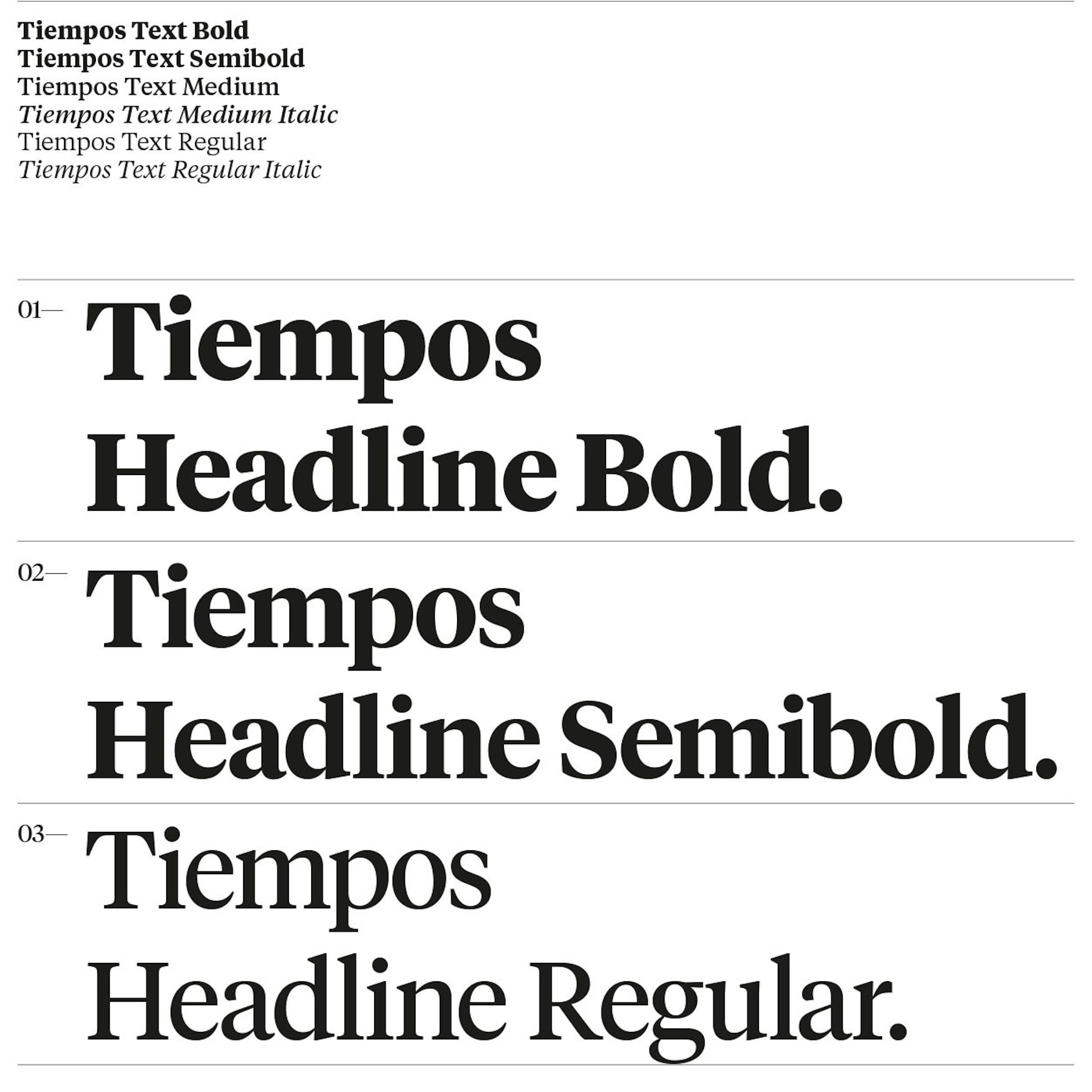
Typography
—
In addition to the warm and resonant tone of voice, we established 'Tiempos' as the house font to bring an editorial slant to proceedings.

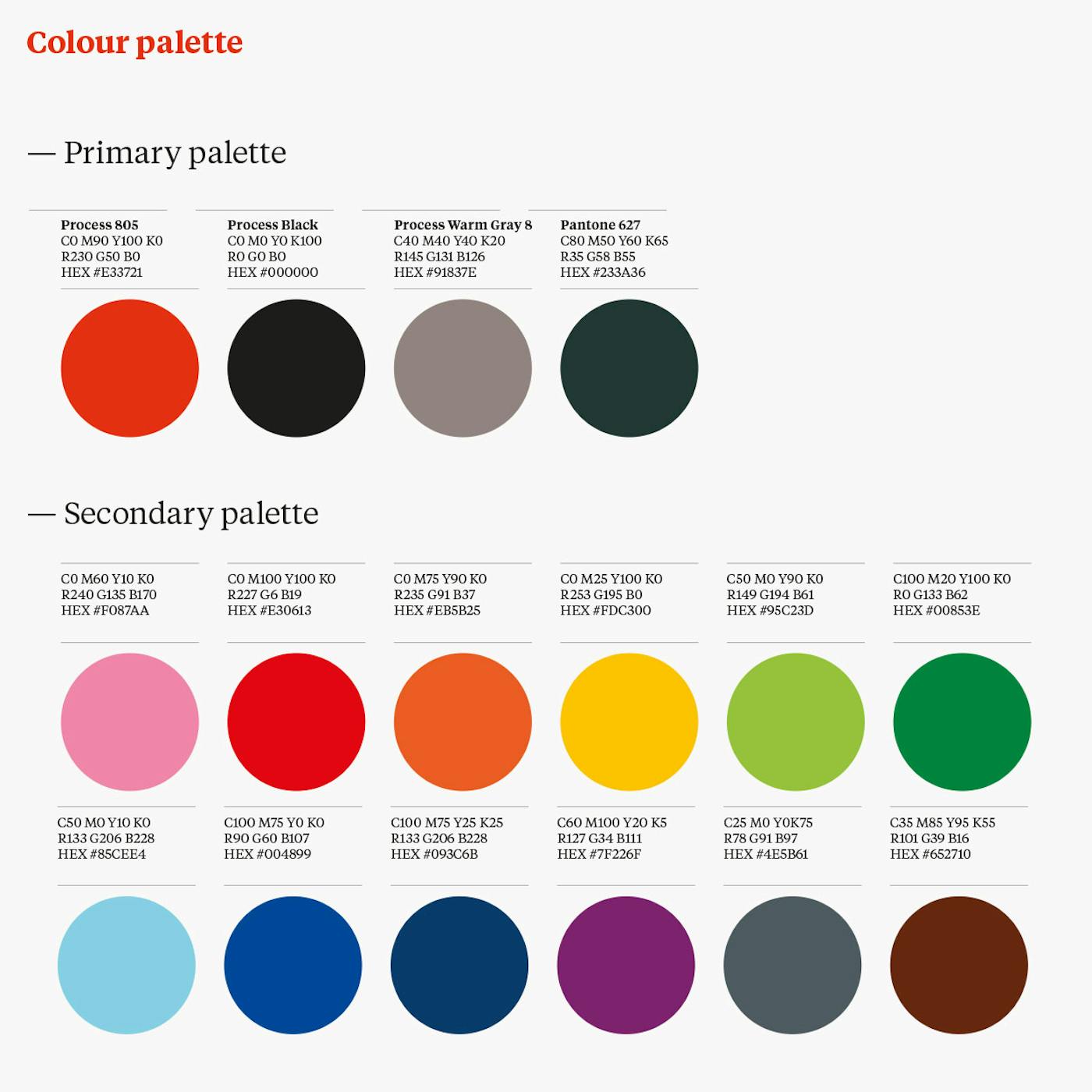
Colour palette
—
No grey pin-stripe here, thank you very much...

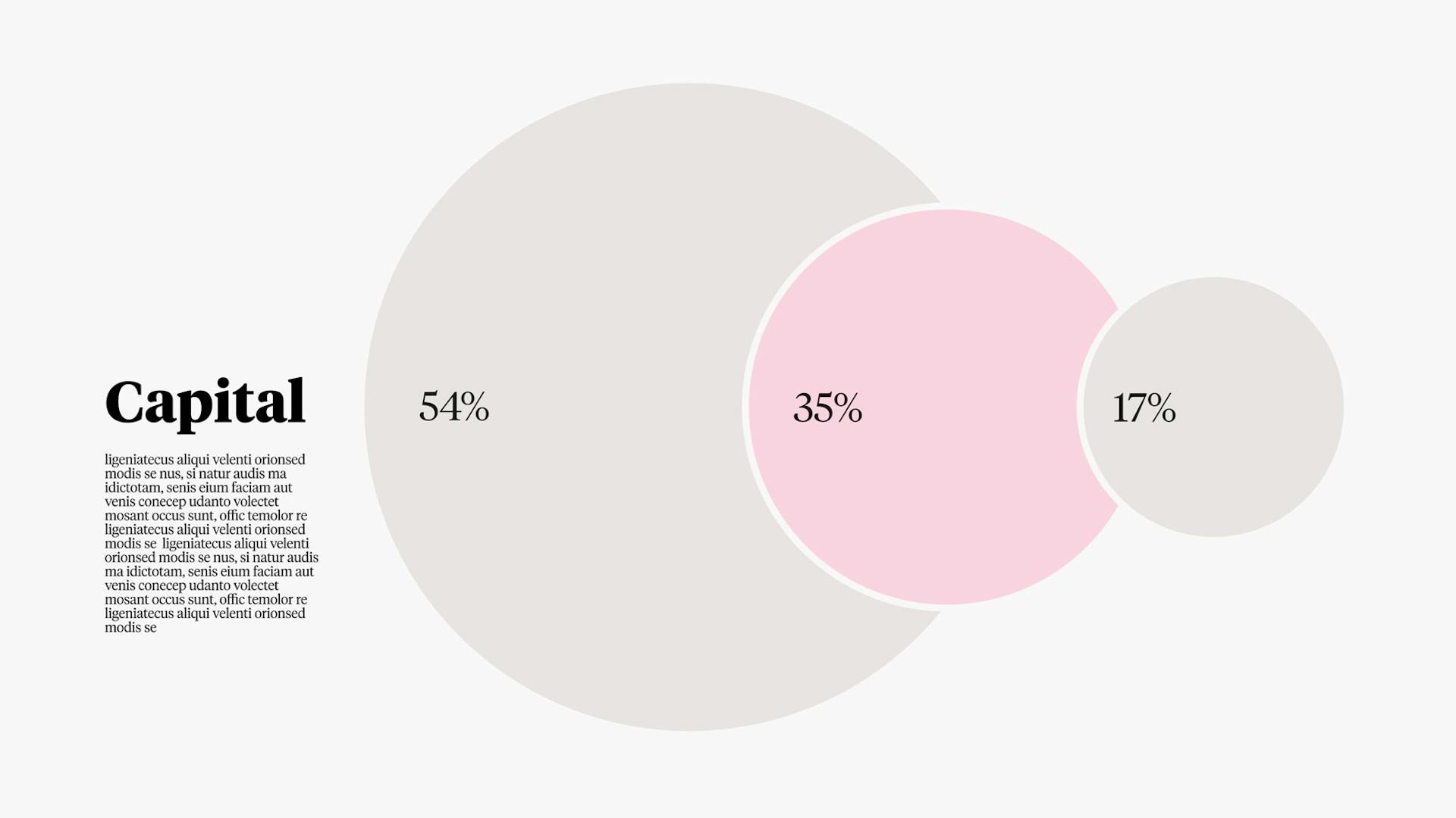
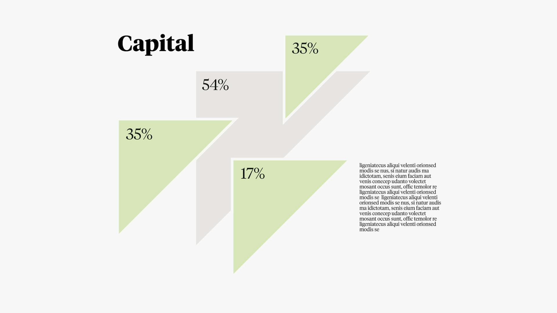
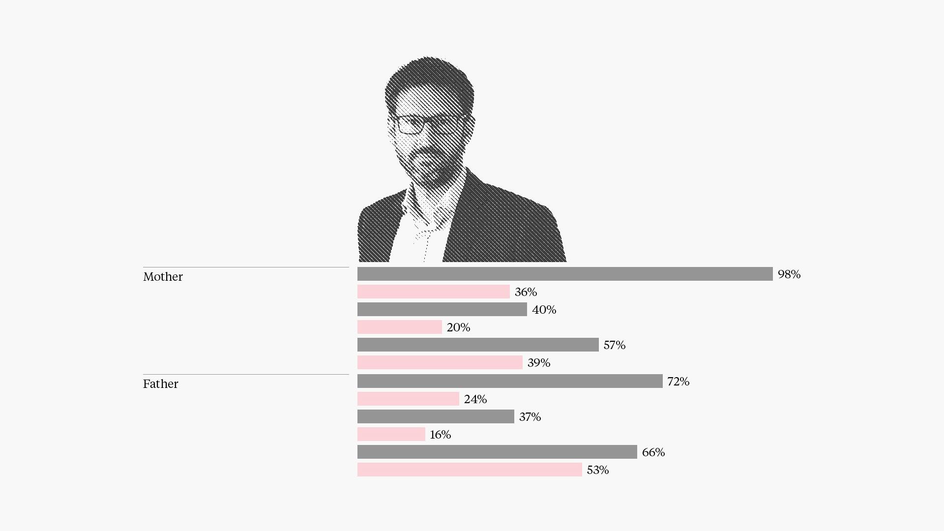
Infographics
—
A muted version of the colour palette is deployed for the infographics.
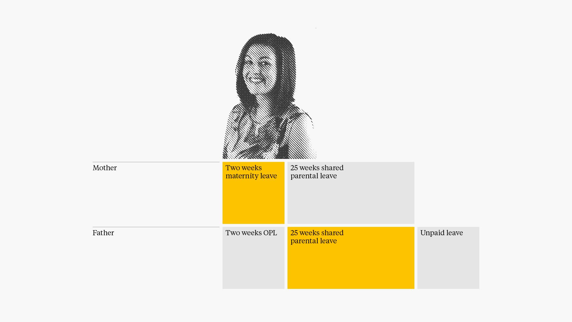
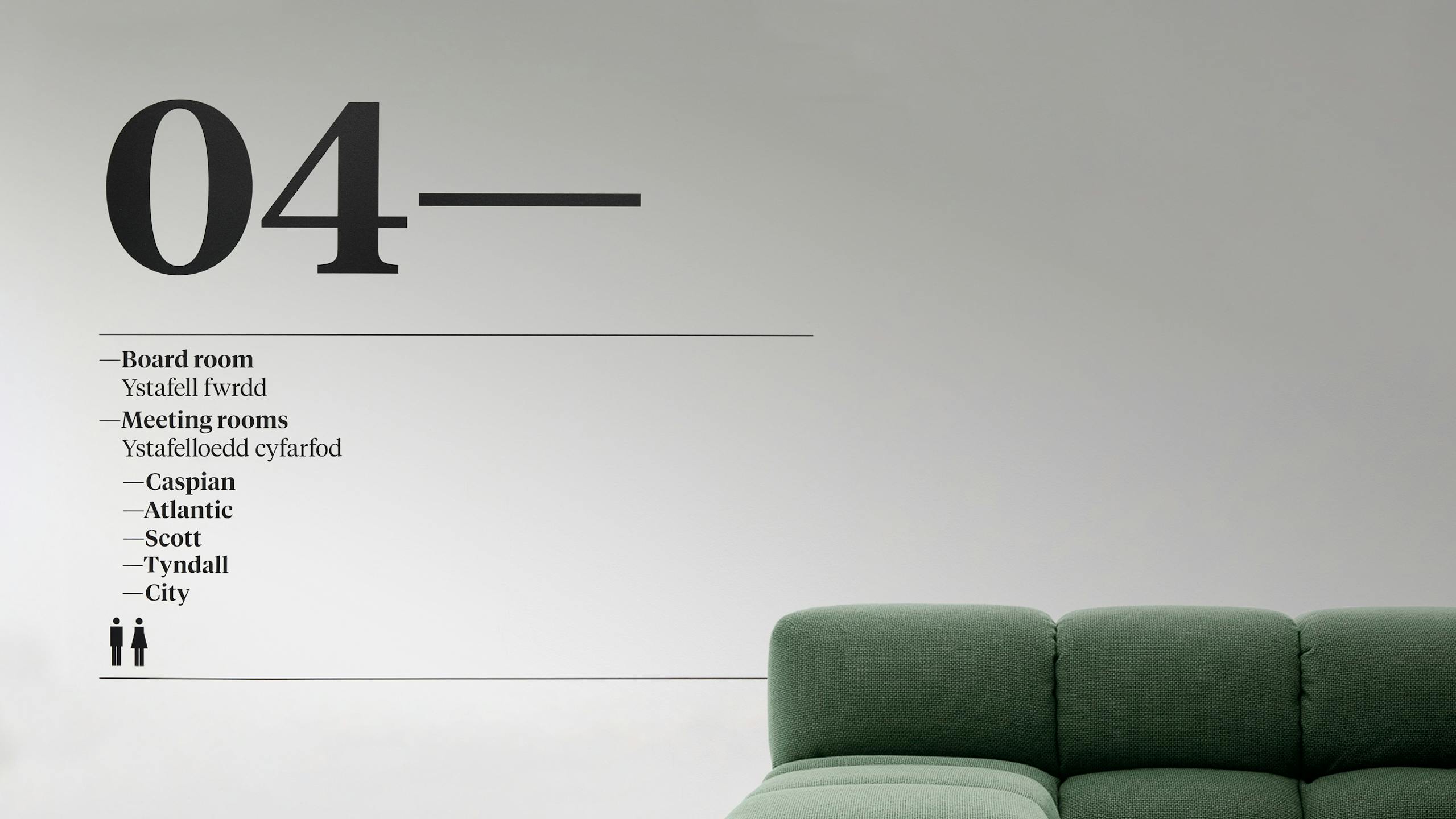
Wayfinding & signage
—
Chris Nott
Co-founder & Senior Partner
"Smörgåsbord‘s brilliant move was to refocus, first, how our written work was presented and to use that as the foundation on which to develop the brand identity, followed by design templates for our website and presentational material, all of which has been transformational".
Disciplines
Brand Identity,
Illustration,
Digital,
Creative Direction,