Bols
Redefining 'The World's First Cocktail Brand'.
Established in 1575, Amsterdam based Lucas Bols is the world’s oldest distilled spirits brand. To coincide with the launch of their 'Ready to Enjoy Cocktails' range (RTE's) and in time for the celebrations surrounding their upcoming 450th birthday in 2025, 'The World's First Cocktail Brand' asked Smörgåsbord to consolidate and hone their brand identity.

Brief—
We were tasked with re-evaluating the Bols brand – recreating its core logotype and honing its extended brand kit-of-parts so that it could be applied consistently across all of the company's products and brand pillars. In parallel we were also asked to establish a look & feel for Bols' new premium 'Ready to Enjoy' cocktails – building upon Bols' existing reputation in the world of cocktails. Furthermore we created a 'one brand communication strategy' that not only aligns Bols' future packaging across different drink categories but also defines the company's communication above and below the line.
Approach—
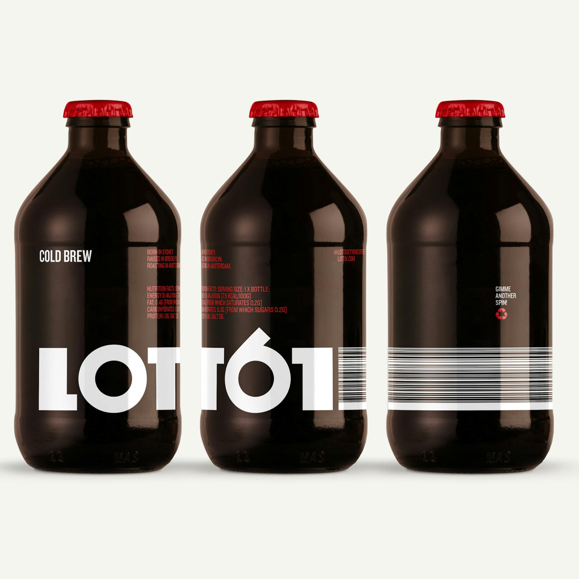
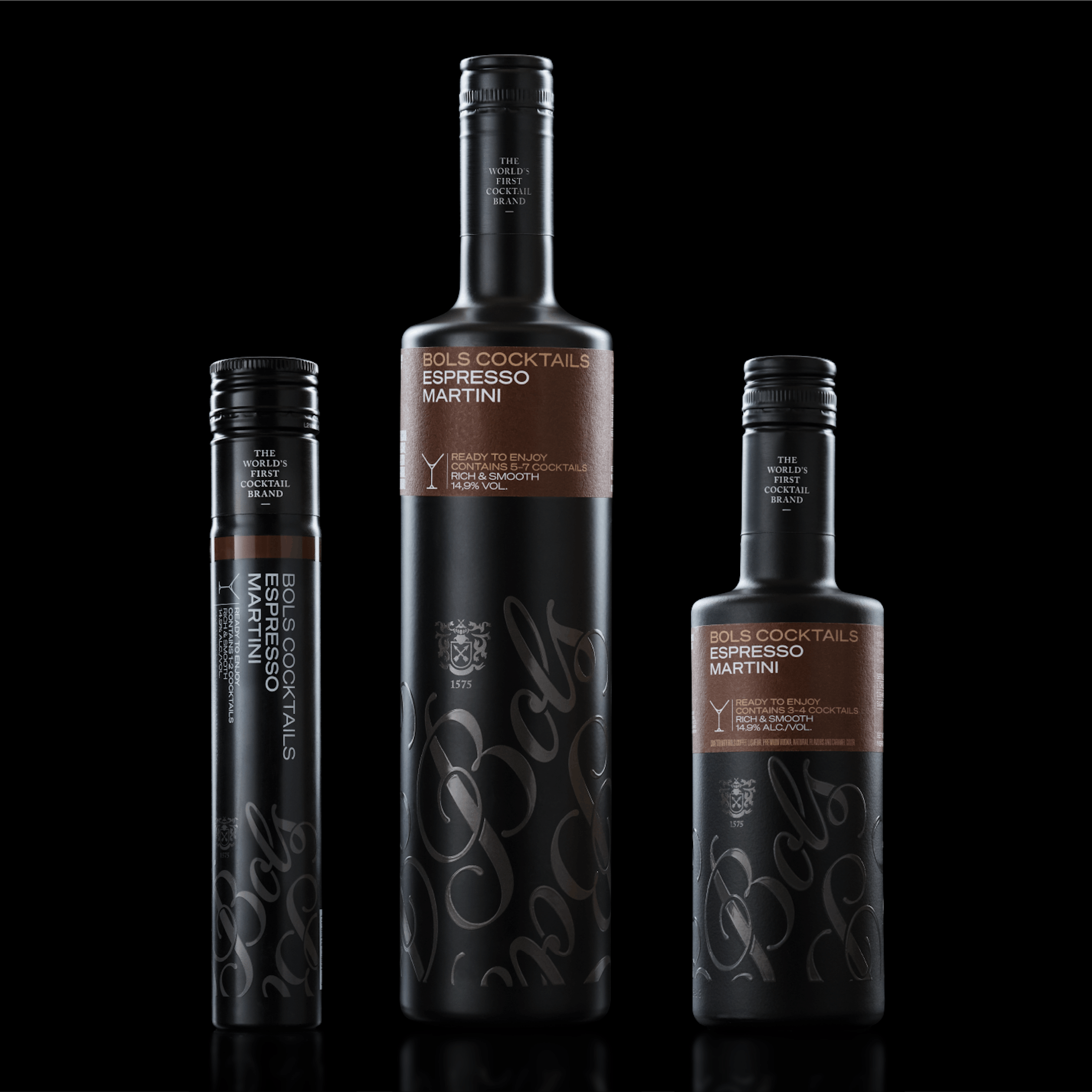
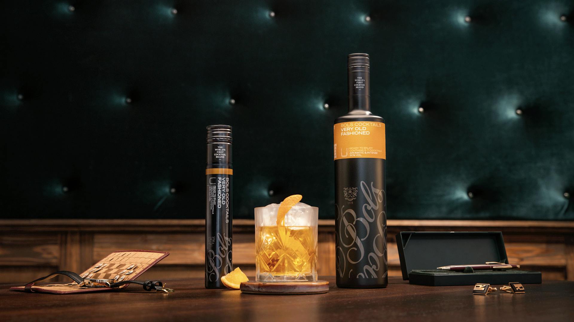
There have been a fair few iterations of Bols' core logotype over the last 30 years. As well as drawing on the the best parts of these we sought inspiration from Amsterdam's traditional sign writing style that adorns many bar windows nearby our studio in the Jordaan area of the City. With regards to the look & feel of the new RTE range the aim was to challenge peoples' perceptions of a pre-mixed cocktail – especially as one of the SKU's saw a RTE cocktail in an innovative 200ml PET tube. We sought to elevate this perception by designing opaque matt black bottles and tubes featuring a repeat pattern of the Bols logotype screen printed in a gunmetal grey. The names and colour of each of the 5 x cocktails feature on a 'bellyband' that envelops the shoulder area of each of the vessels.
Result—
Whilst still early days the benefits of applying a rigorous, consistent design language across all brand communications and packaging is already reaping rewards. With regards to the RTE sector it's a challenging task for two reasons; firstly the RTE sector was in an embryonic stage when we were briefed – put simply people were not aware of the sector; secondly the very fact that a pre-mixed cocktail can be perceived as a premium product is debatable. However as the cocktails were introduced in desirable packaging from the outset – and were supported by a launch campaign that crossed into the fashion realm Bols' RTE sector is growing steadily.
Logotype
—
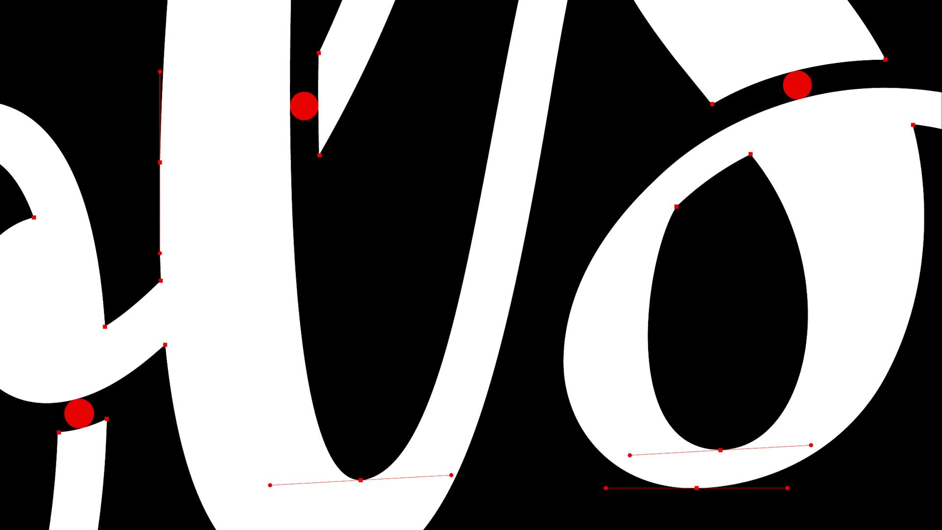
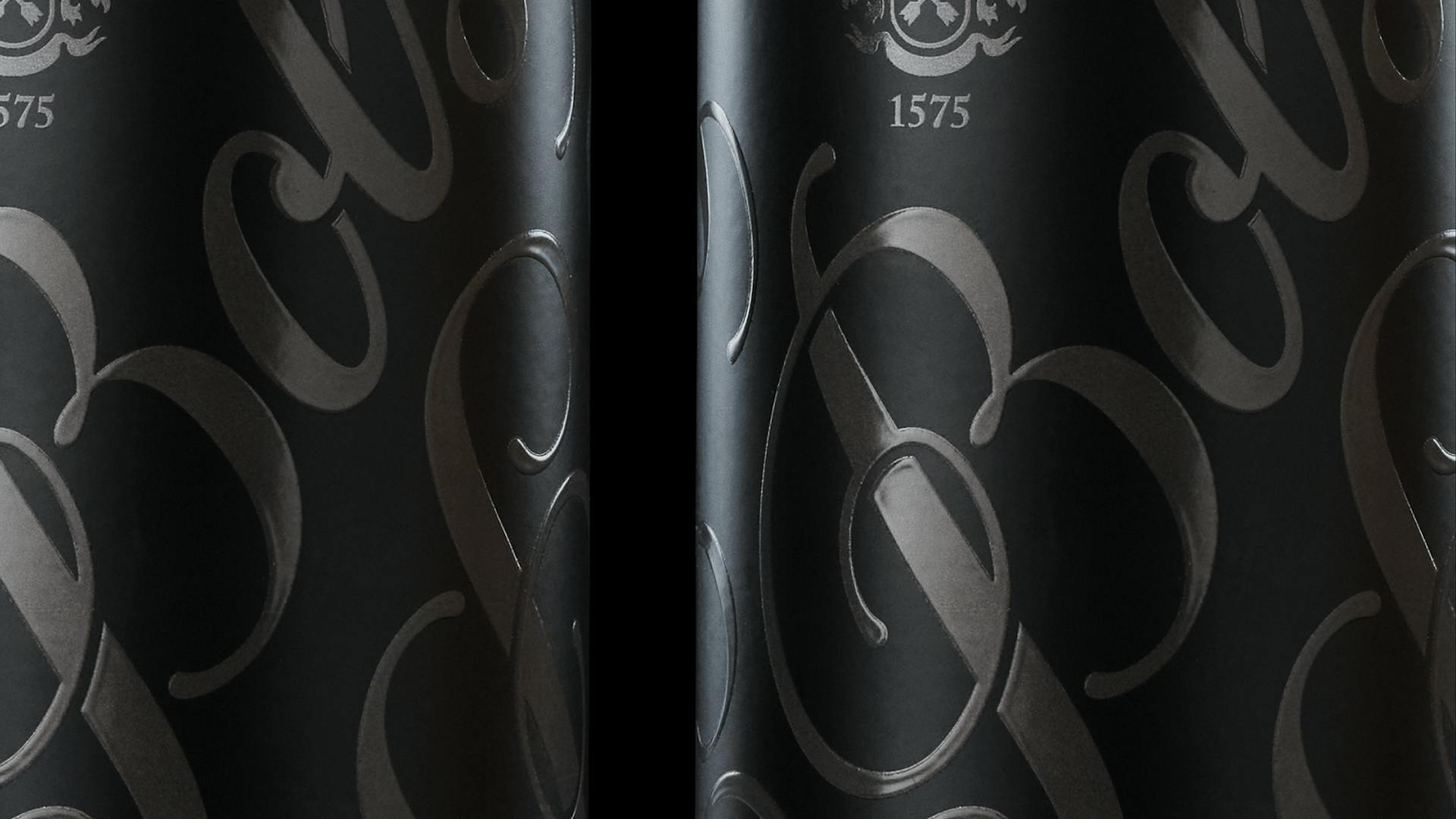
Whilst respecting its inherent and rich heritage we simplified the logotype ensuring that it can be used effectively at all scales across all print and digital applications. By creating channels where strokes 'intersect' and by enhancing the ball terminals on ascenders and descenders, we were able to inject more ‘craft’ which is representative of what's inside the bottle. This also introduced a new level of detail and made for a more rigorous and memorable logo.

Product Alignment
—
We needed a logotype which would work across multiple products and sub-brands. Our thinking was inspired by the ‘high shoulder’ heritage of the traditional Bols Jenever earthenware bottle. Regardless of the shape of a vessel (bottle, can or new RTE tube) the consistent (high) placement of the Bols logotype (at a consistent angle) can be used as a tool to unify and align the packaging across the brand's drink sectors. The descender of the 'S' also made for a natural device allowing us to 'hook-in' and integrate sub brands where appropriate, namely the 'Cocktail Academy' and 'Cocktail Experience'.


Crest
—
The crest represents Bols' long heritage and is an integral brand asset. As with the logotype we were asked to create a reductive and contemporary version suitable for digital uses. It is used primarily as a 'sign-off' or endorsement – having kudos and credibility in spades.


Graphic language
—
As there would be a great deal of packaging and advertising required, we naturally developed repeat patterns as part of the 'graphical toolkit'. The 'floral' nature of these textures further associate the brand with botanical ingredients and the cocktail industry.

Ready to Enjoy (RTE)
—
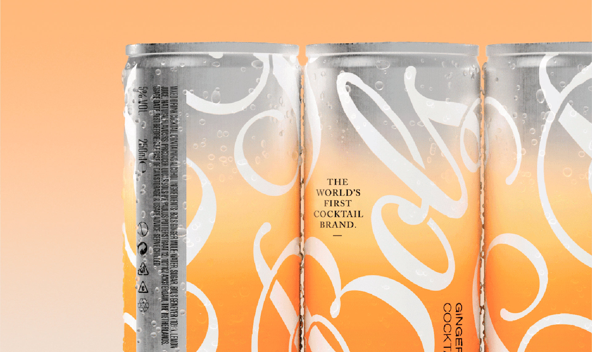
In parallel to honing the Bols 'mother-brand', we were tasked with establishing a distinctive look and feel for the RTE range. The aim was to challenge peoples' perceptions of a pre-mixed cocktail – especially as one of the SKU's saw a RTE cocktail in an innovative 200ml PET tube. We sought to elevate this perception by designing opaque matt black bottles and tubes featuring a repeat pattern of the Bols logotype screen printed in a gunmetal grey.


Type/Colour
—
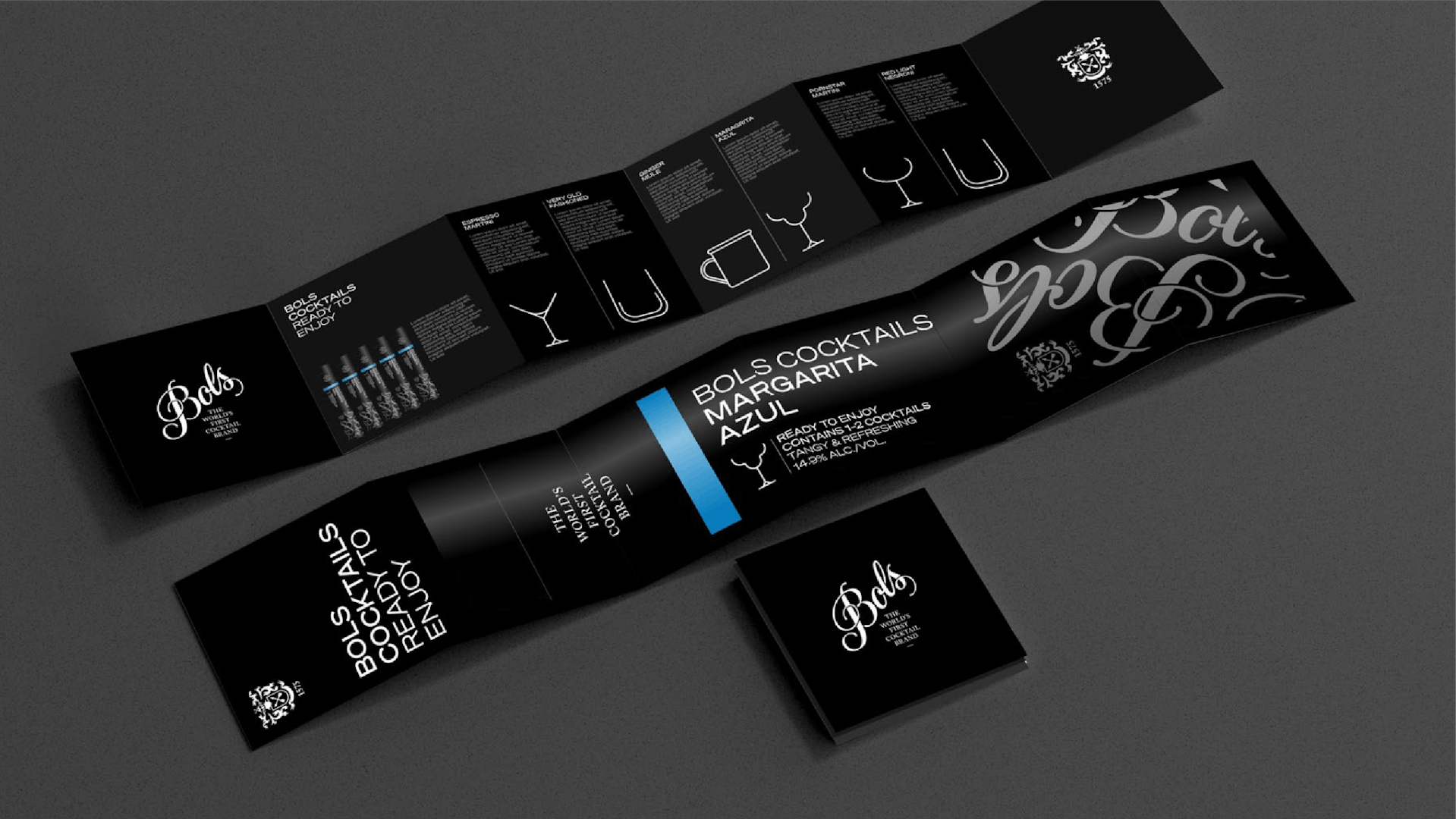
The names and colours of each of the 5 cocktails feature on a 'bellyband' that envelops the shoulder area of each of the vessels. 'Caslon' was retained for its historical relevance and kudos and is used to typeset our strapline/positioning statement. To contrast this classical serif typeface we introduced 'Söhne' to the mix. This contemporary yet timeless font family from the Klim Foundry was originally introduced to represent the Bols 'Ready to Enjoy' cocktail world, but it has now been adopted as the primary font that underpins the over arching brand identity.

Campaign
—
In close collaboration with HERC Agency, we created digital ad layouts that brought the concept of 'magically simple' to life. The primary aim of HERC's campaign was to demonstrate the simplicity, convenience and 'magic' of the Bols Ready to Enjoy range in 3 easy steps.

One Brand Communication
—
To strategically and creatively consolidate all of the above we created a 'OBC' platform that not only aligns Bols' future packaging across different drink categories but also defines Bols' communication above and below the line. Through a consistent 'framing device', layout, colour, type hierarchy and product photography, Bols are now able to communicate very different products across various sectors without compromising on the quality of their new overarching brand look and feel.

Details that count...
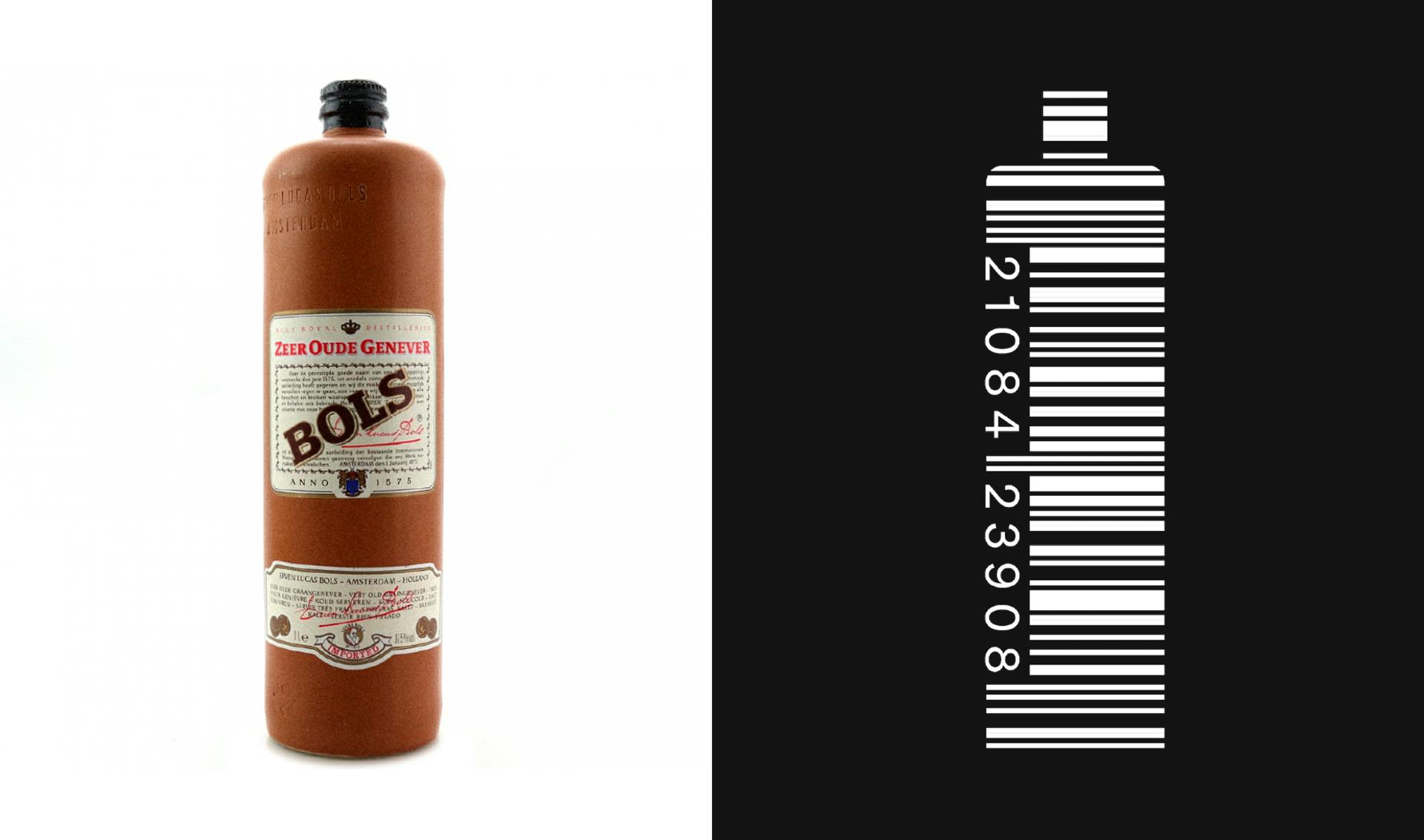
It would be a missed opportunity not to utilise (and reinforce) Bols’ strengths, foundations and brand equity which has been building for close to 450 years. Another way of referencing the traditional Bols Jenever bottle was to create a bespoke barcode that emulates its shape and profile. This allows us to make a direct link back to it even when we're dealing with a different shaped bottle, can or tube.
Disciplines
Brand Identity,
Packaging,
Strategy,
Art Direction,
Creative Direction,