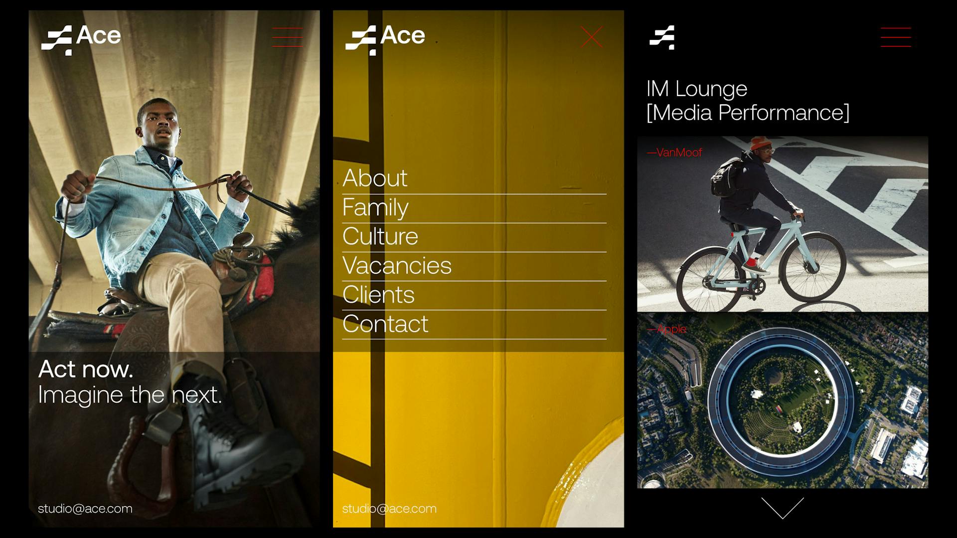
Ace
Authentic. Creative. Energising.
ACE is a family of creative agencies on a mission to trigger positive change for people, brands and society. ACE stands for 'Authentic', 'Cultural' and 'Energising' and is set to make waves for a brighter future, and that is exactly what we did whilst creating the brand identity. Smörgåsbord were tasked with establishing ACE's strategy before creating a multi platform brand identity that would, within the space of 7 months, roll-out from the digital to the physical realm.

Brief—
To create a timeless yet contemporary multi-platform brand identity to excite, inspire and unify the 12 agencies that have united under the ACE moniker. Furthermore to establish a ‘design system’ that is ‘alive’ and that can evolve and flex with the growth of ACE; a system that can harness new technologies and new thinking as they emerge.
Approach—
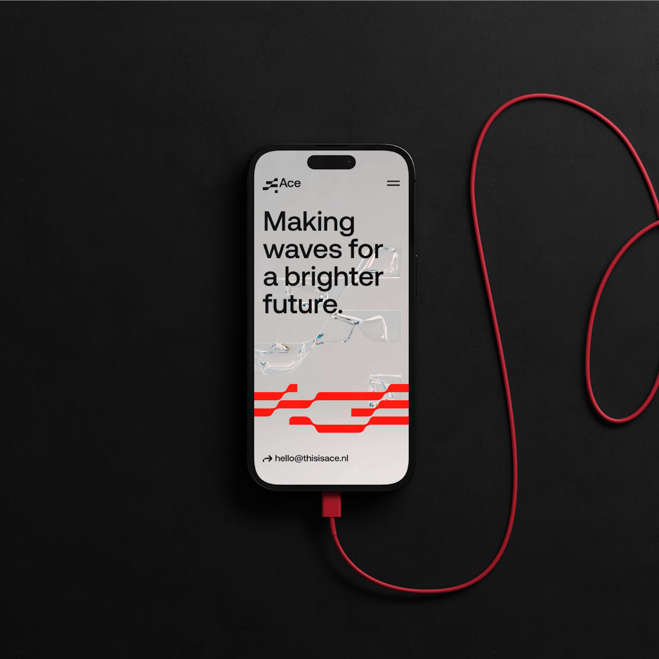
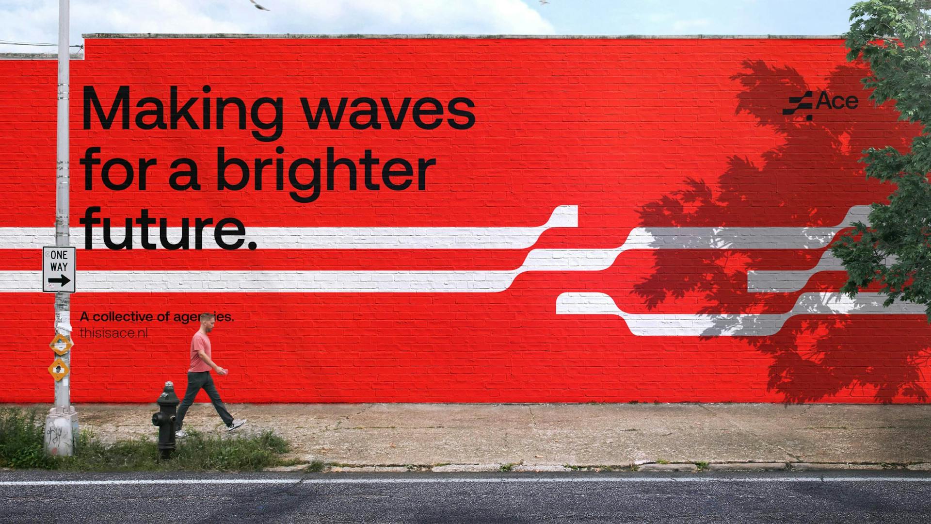
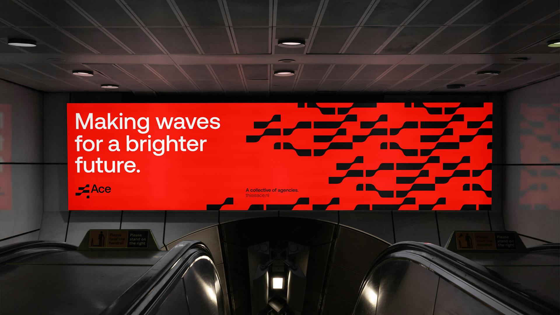
We strove to create an all encompassing, spirited identity that engages the senses across all digital and physical platforms. The concept of 'making waves' was our starting point for all things aesthetic. The three stories that make up ACE's new waterside HQ also informed our fluid 'ribbon' like treatment of the logotype. Our aim was to create a progressive 2D logotype (initially) that had the feeling of perpetual motion and fluidity baked-in – forever curious and in flux, thus linking one generation to another and one idea to the next.
Result—
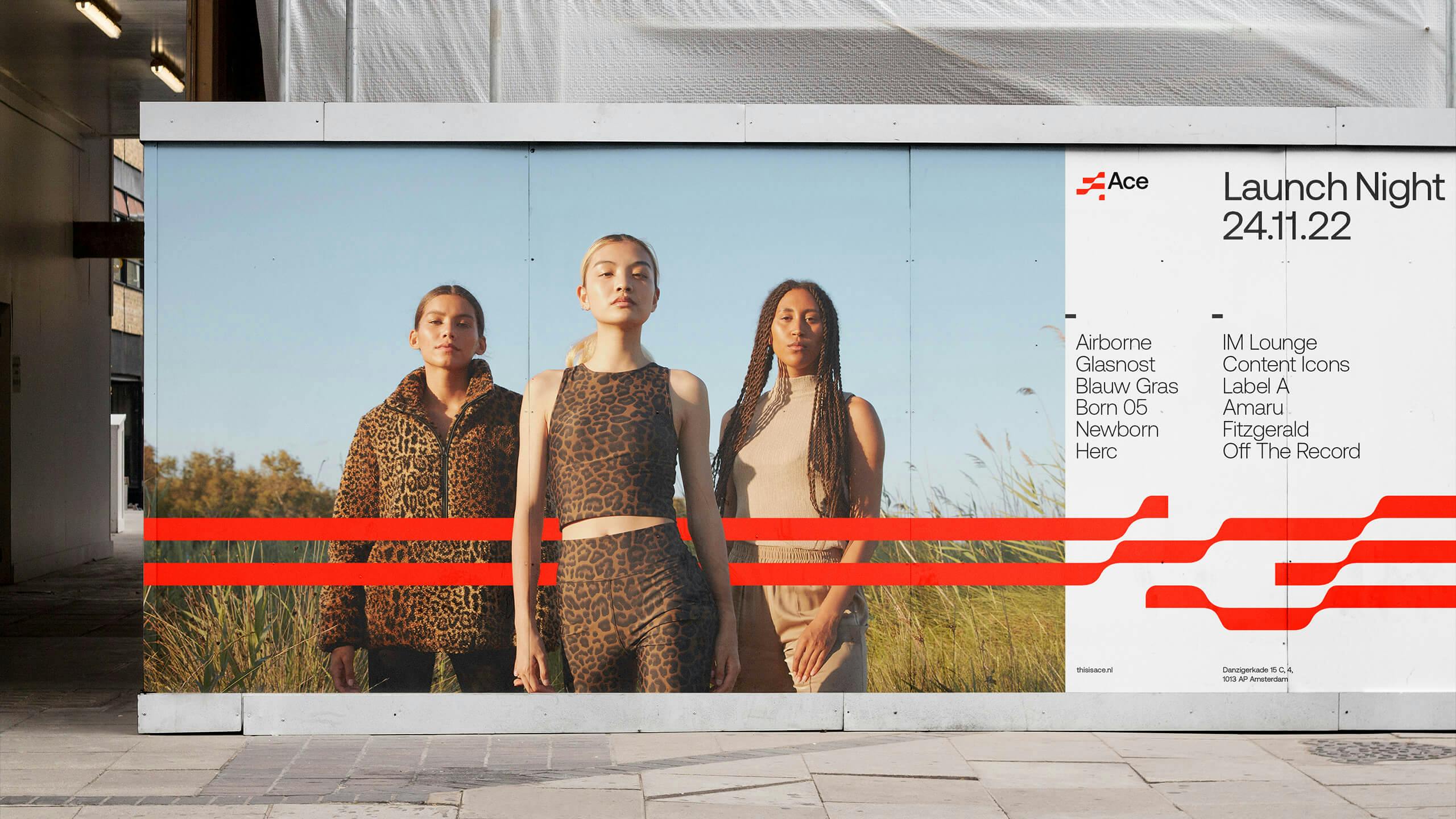
The project had to be completed in 7 months and we're proud to say that we honoured the launch date of November 2022. Whilst having only launched the ACE HQ has already earned the 'talkability factor' and with the aid of this identity and positioning ACE is being perceived as an institute for progression and a creative force to be reckoned with on both a national and international stage.
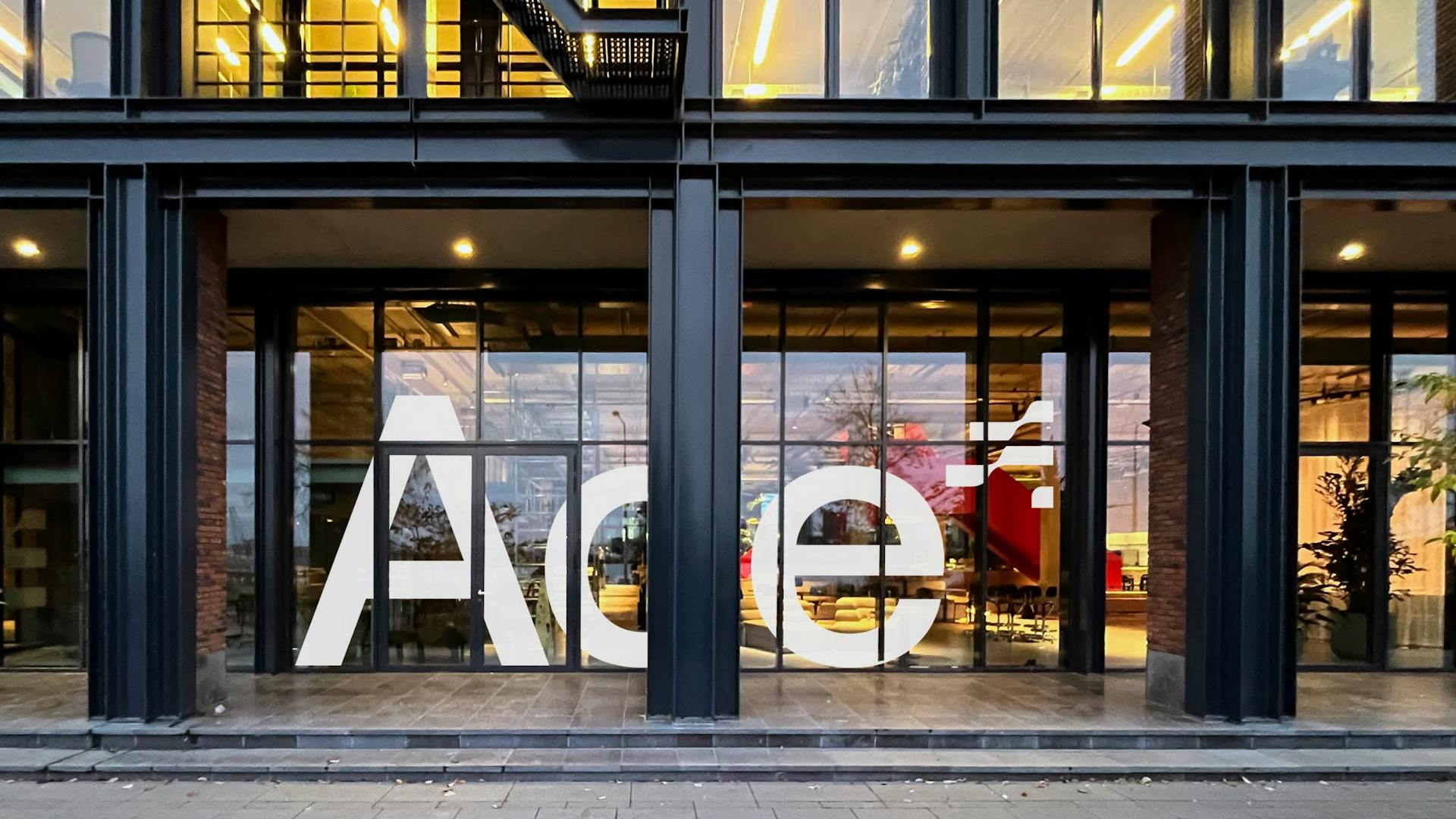
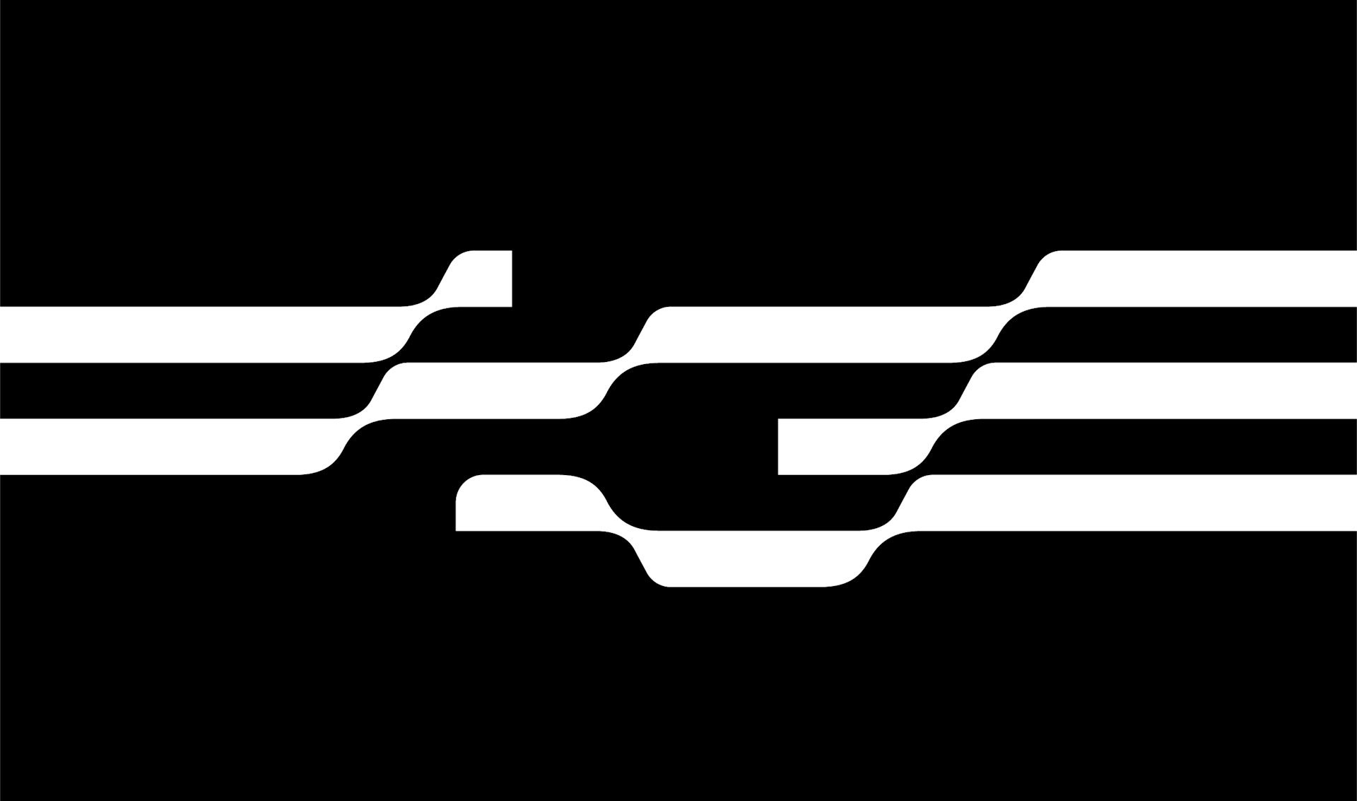
Concept
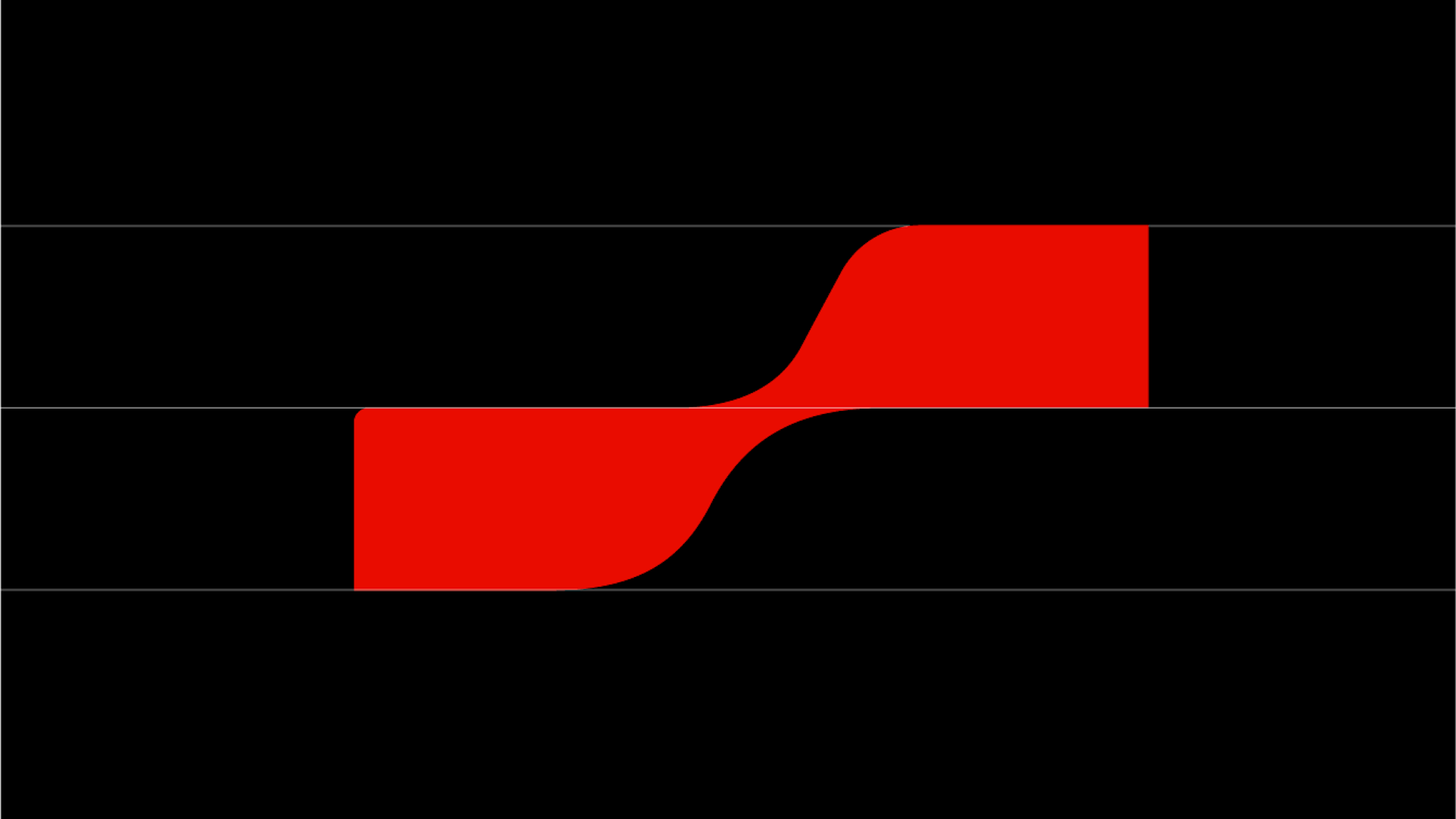
The concept of 'making waves' was our starting point for ACE's wordmark. The three stories that make up ACE's new waterside HQ also informed our fluid 'ribbon' like treatment of the logotype.
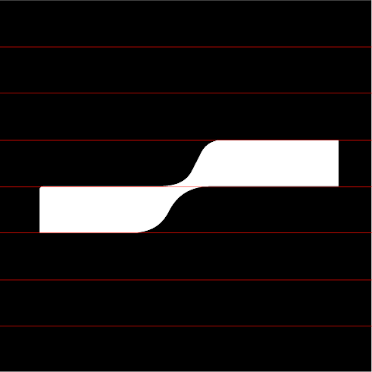
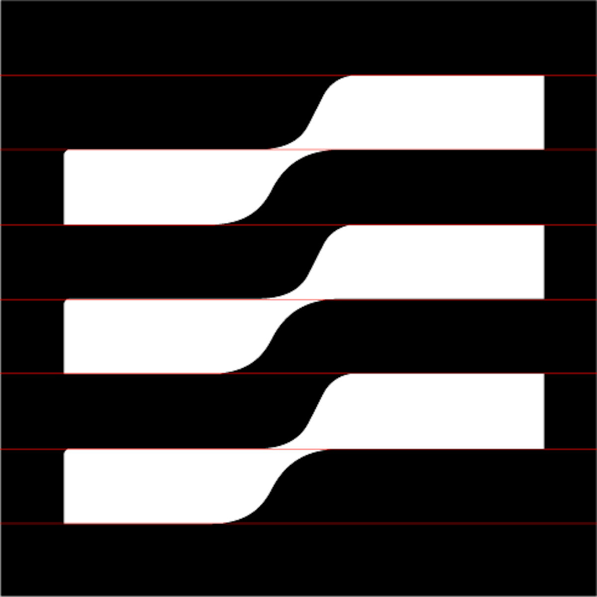
Logotype
—
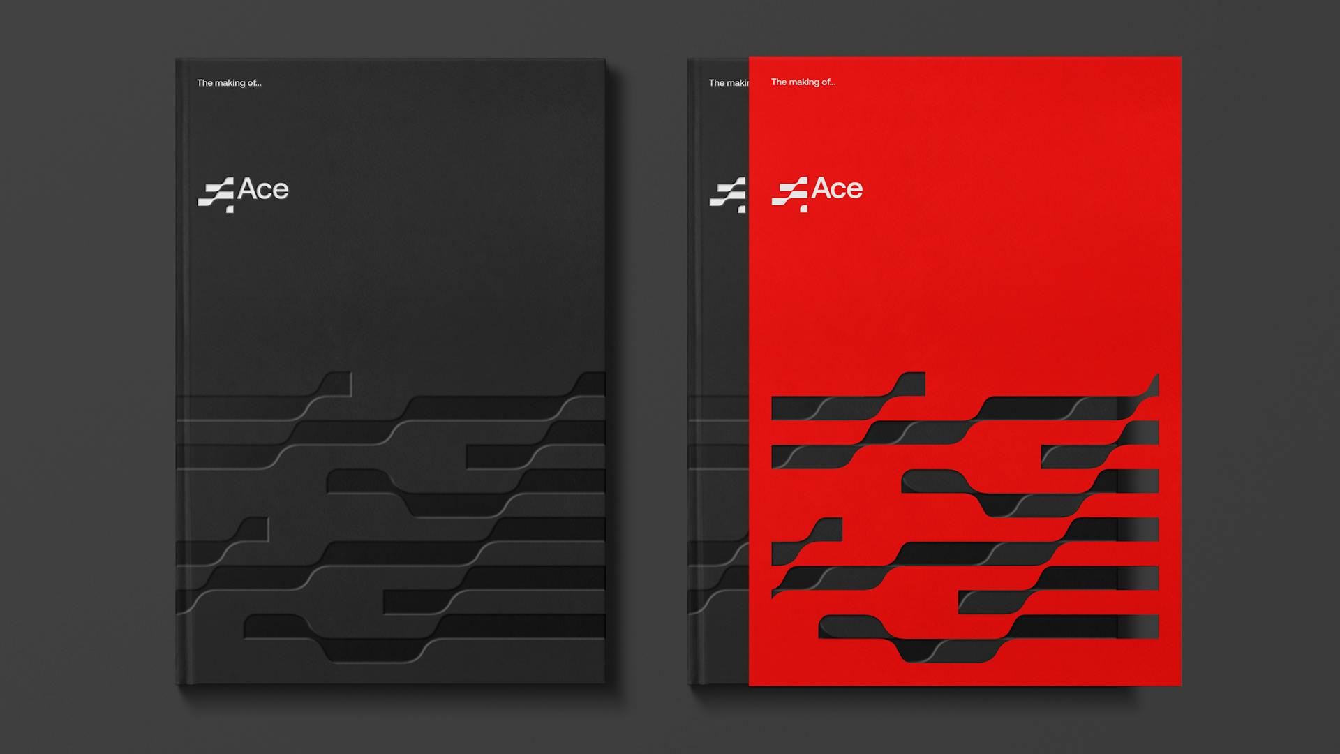
Having established the 'A' marque we built out the 'C' and 'E'. The logotype is designed to evolve and adapt with time, much like ACE's business vision. As the brand's profile grows the logotype can become more abstract, losing the vertical slithers that define the three separate letterforms.
Repeat pattern
—
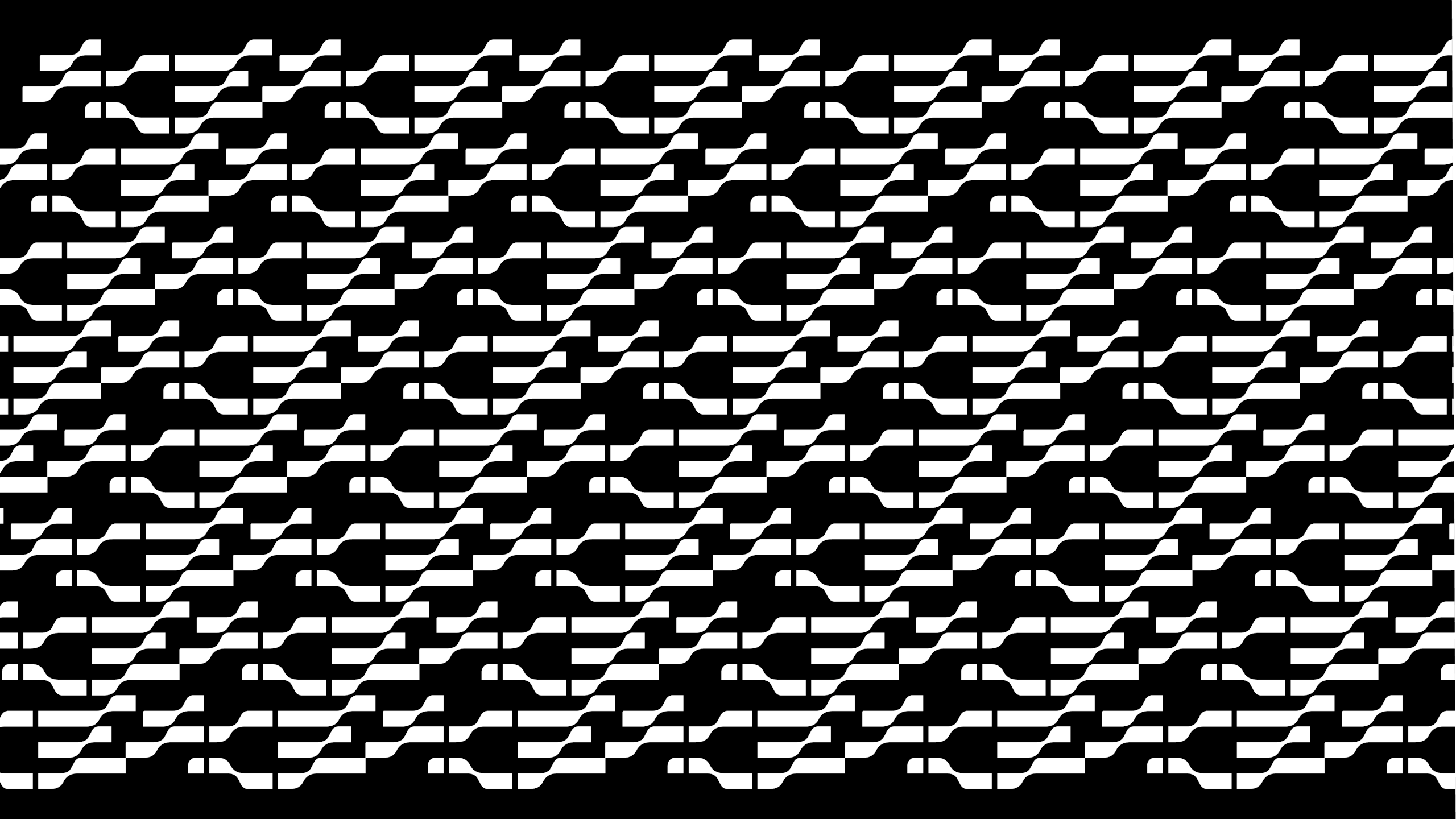
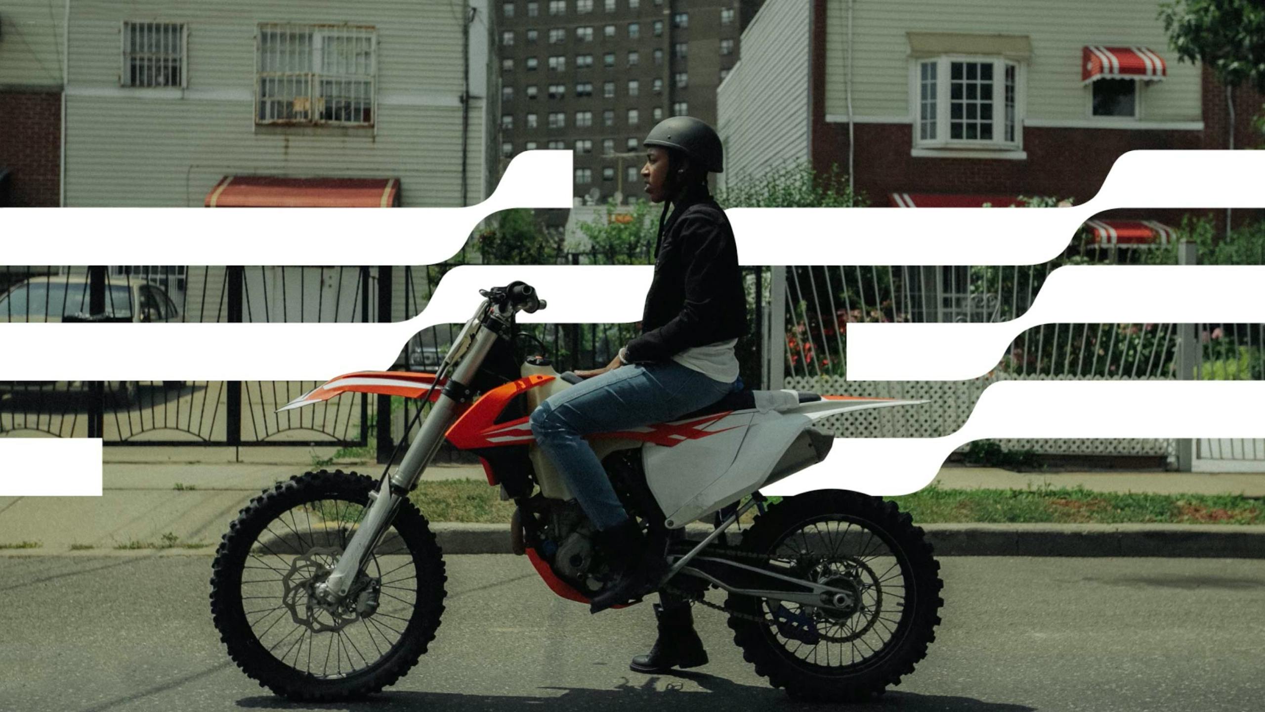
The fluid ribbon marque lends itself to a repeat pattern that introduces a heightened wave feeling. This presented us with a never ending canvas to use as a backdrop for typographical communication and lends itself to textile application.
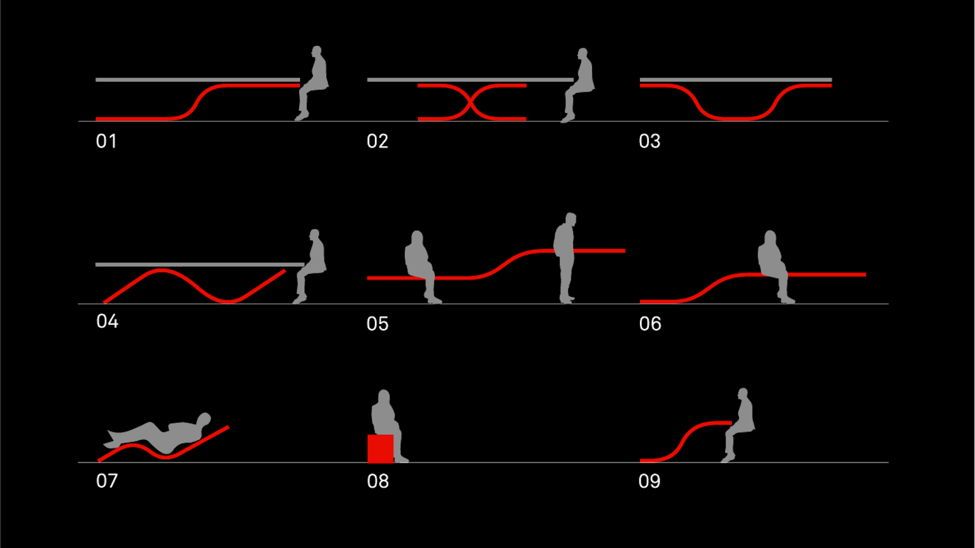
Golden thread
Our wave shaping all touch-points
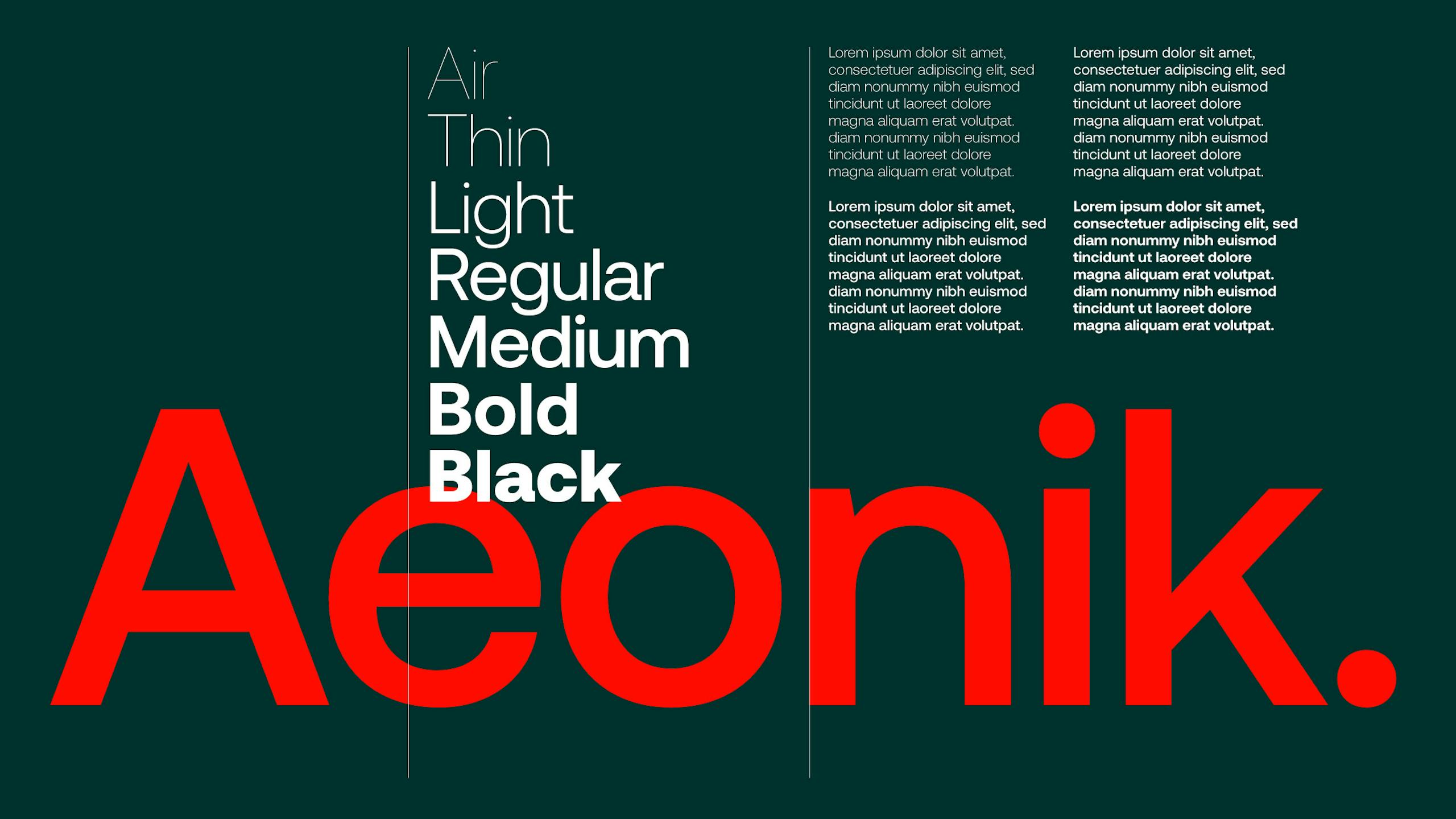
Typography
—
Aeonik from London based Co-Type Foundry was chosen as ACE's structural workhorse. Crafted with mechanical detail it has been conceived as a 'neo-grotesque with a geometric skeleton’, making it perfect for a timeless brand identity. Its letterforms also posses a linear and horizontal nature that makes it a great match for ACE's fluid and 'ribbon' like logotype.
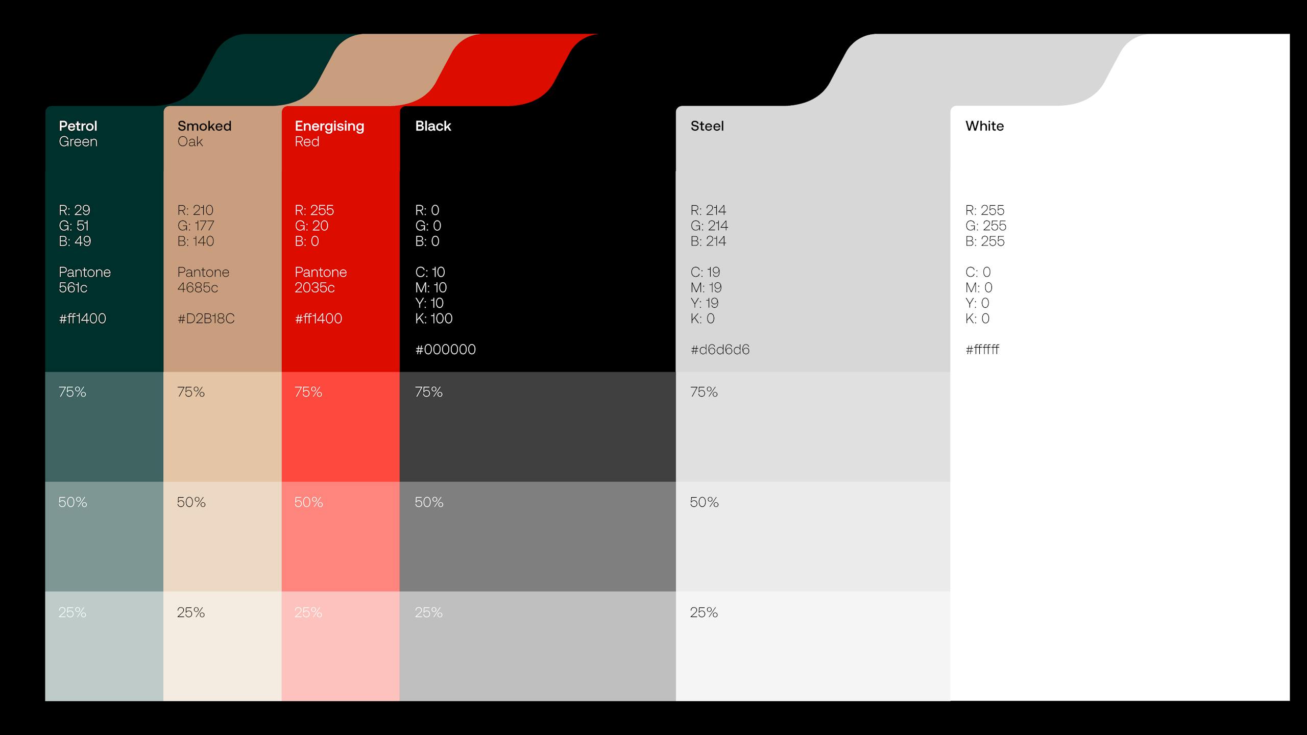
Colour palette
—
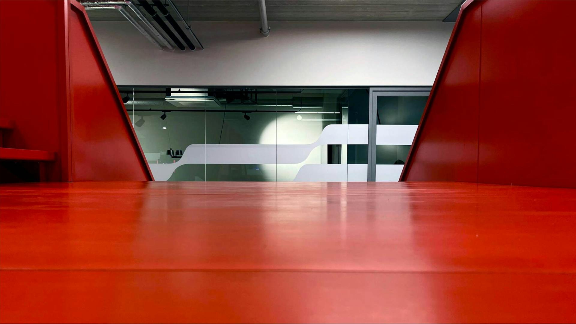
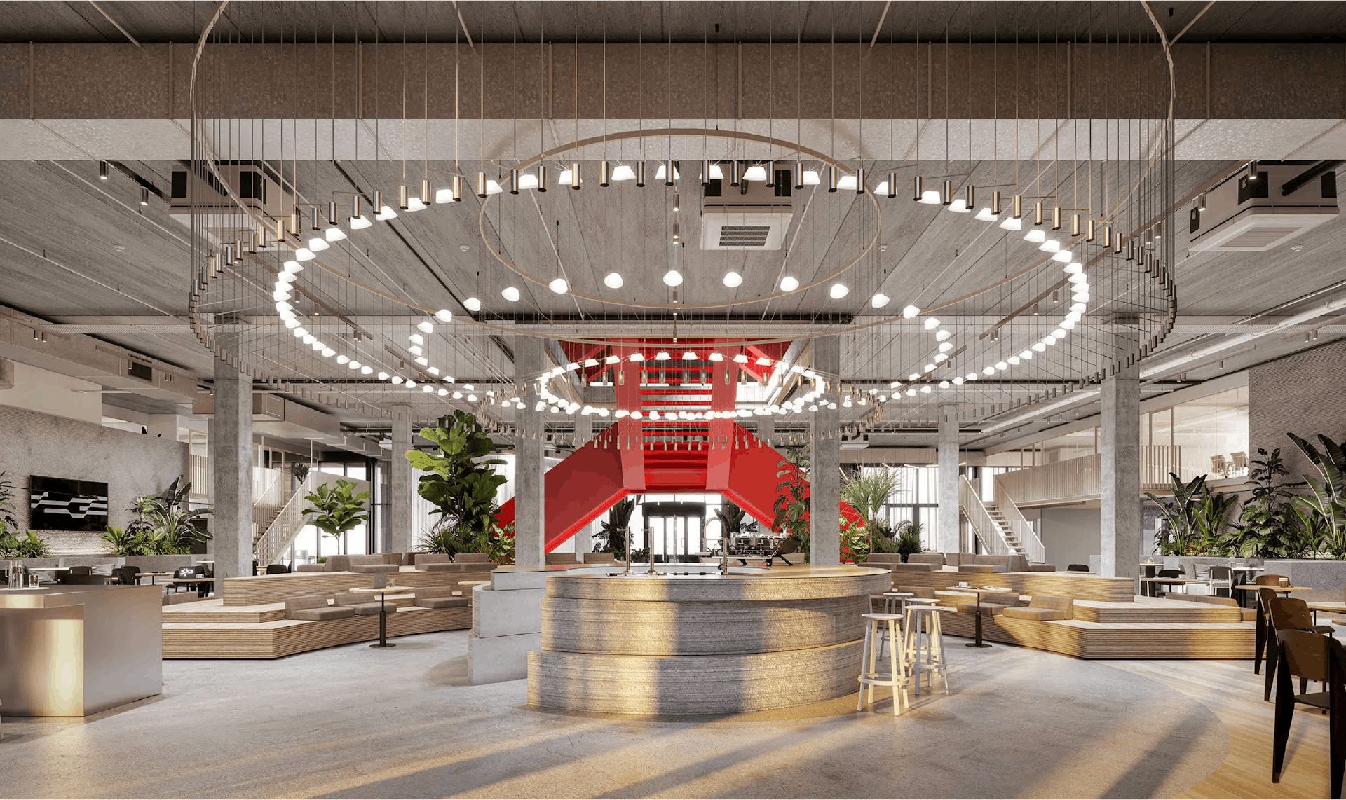
ACE's distinctive and unyielding use of colour plays an important role in its brand personality. At the core of the palette is 'Energising Red' – itself directly informed by ACE's core values, in this case (no clues) – 'energising'. RAL 2002 or PMS 2035 to any self respecting graphic designer, we established this colour early on in the process by selecting it to powder coat the 16,000KG steel staircase that rises up through the heart of ACE's HQ, unifying its cavernous spaces.
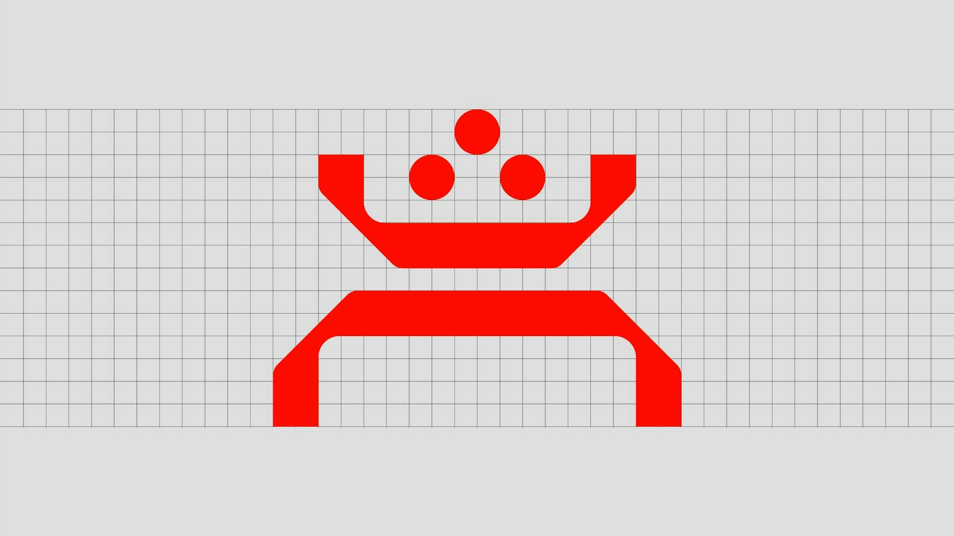
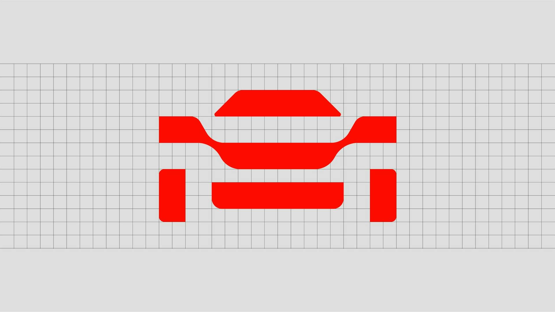
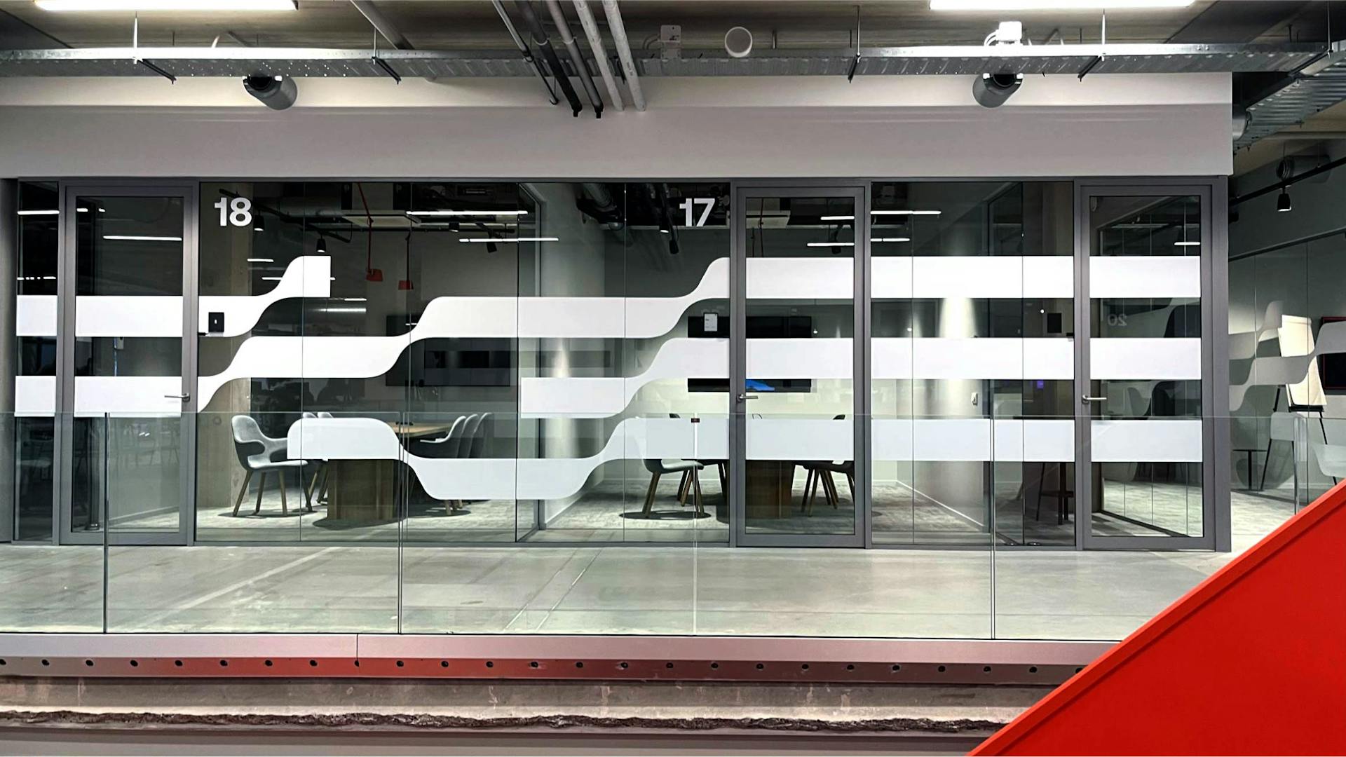
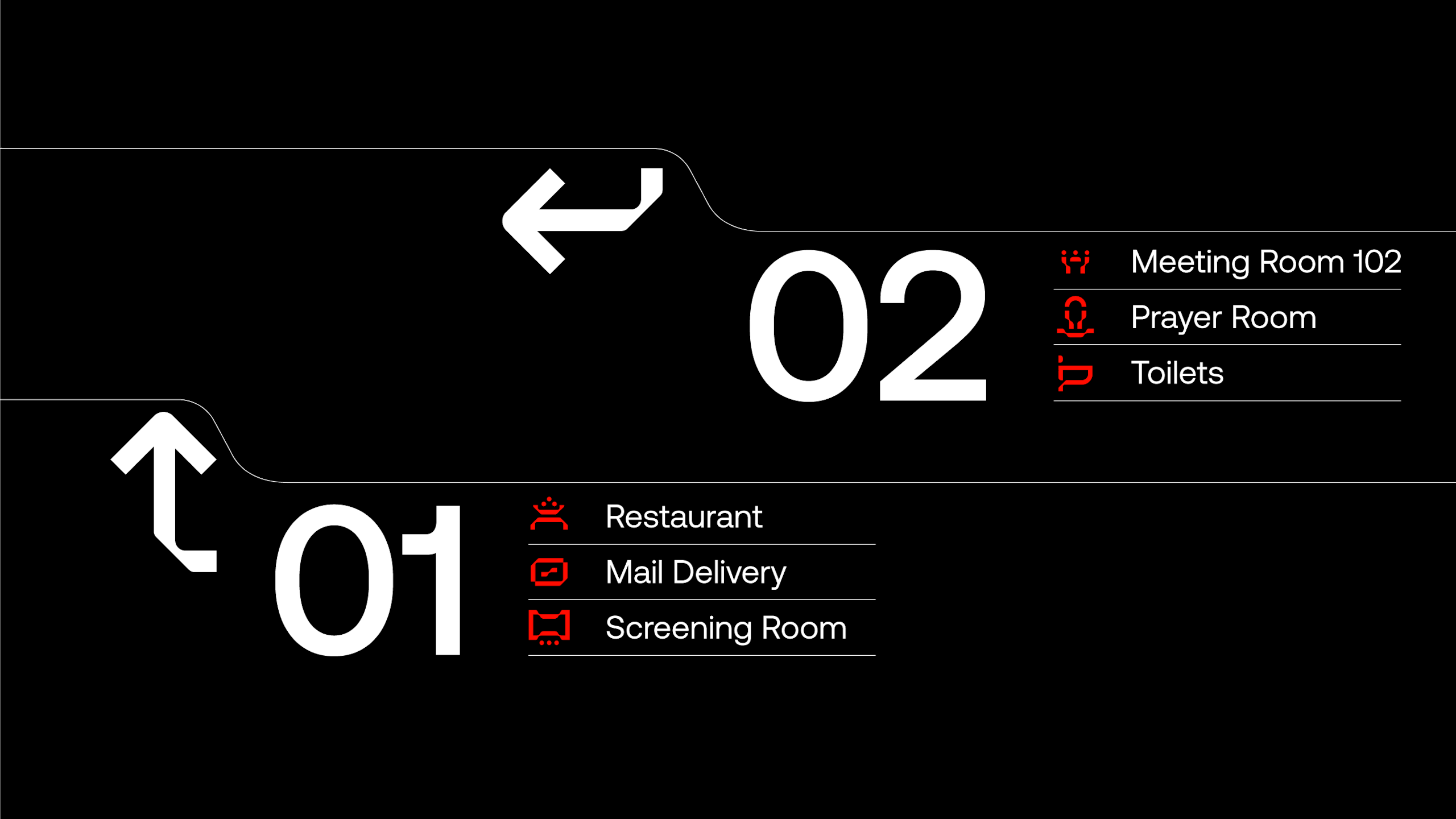
Iconography/Wayfinding
—
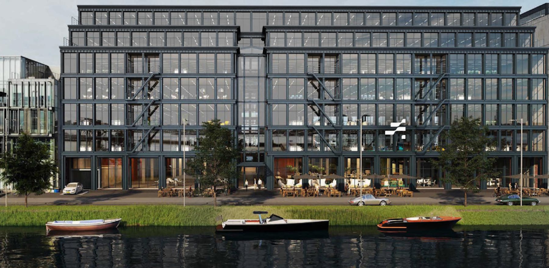
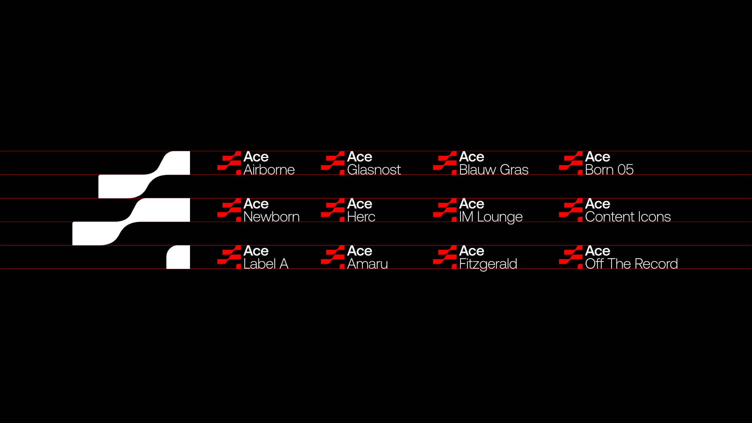
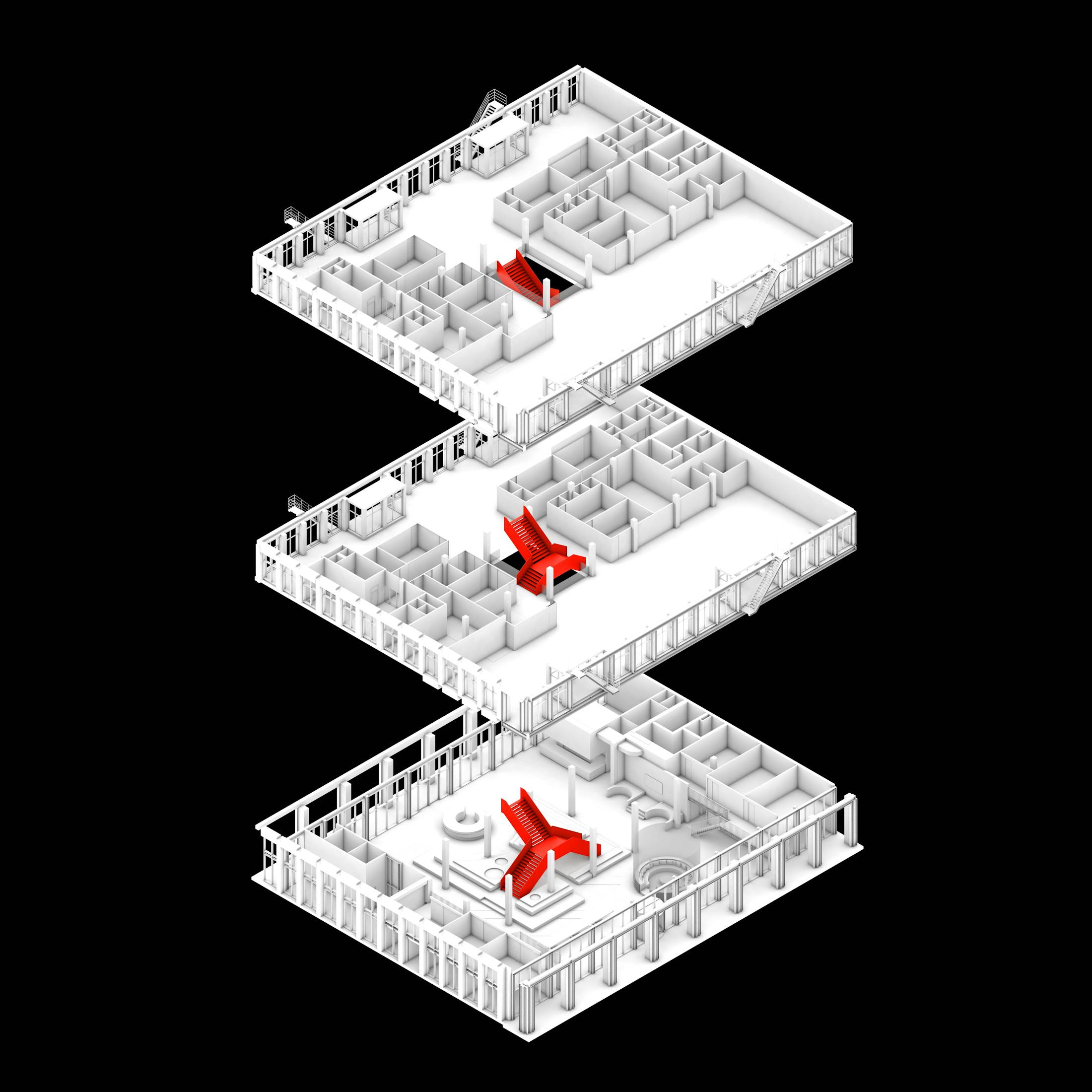
ACE's waterside HQ in Amsterdam's Western Docklands spreads over 4000sqm so it was imperative to create a wayfinding system for the space. At the heart of this is a series of 40 bespoke icons, all of which are constructed using the components that make up the ACE logotype. The wave is therefore subtly applied across all brand touch-points.
Interior architecture
—
Having established the strategy and core brand identity we sought to translate ACE's core values, 'Authentic', 'Cultural' and 'Energising', into the physical realm. Our starting point was to establish a central, solid sided, 'ribbon' staircase, powder coated in 'Energising Red'. This statement staircase is the focus of the ground floor and in time we'd like to think that ACE will become known as 'the building with the huge red staircase'.
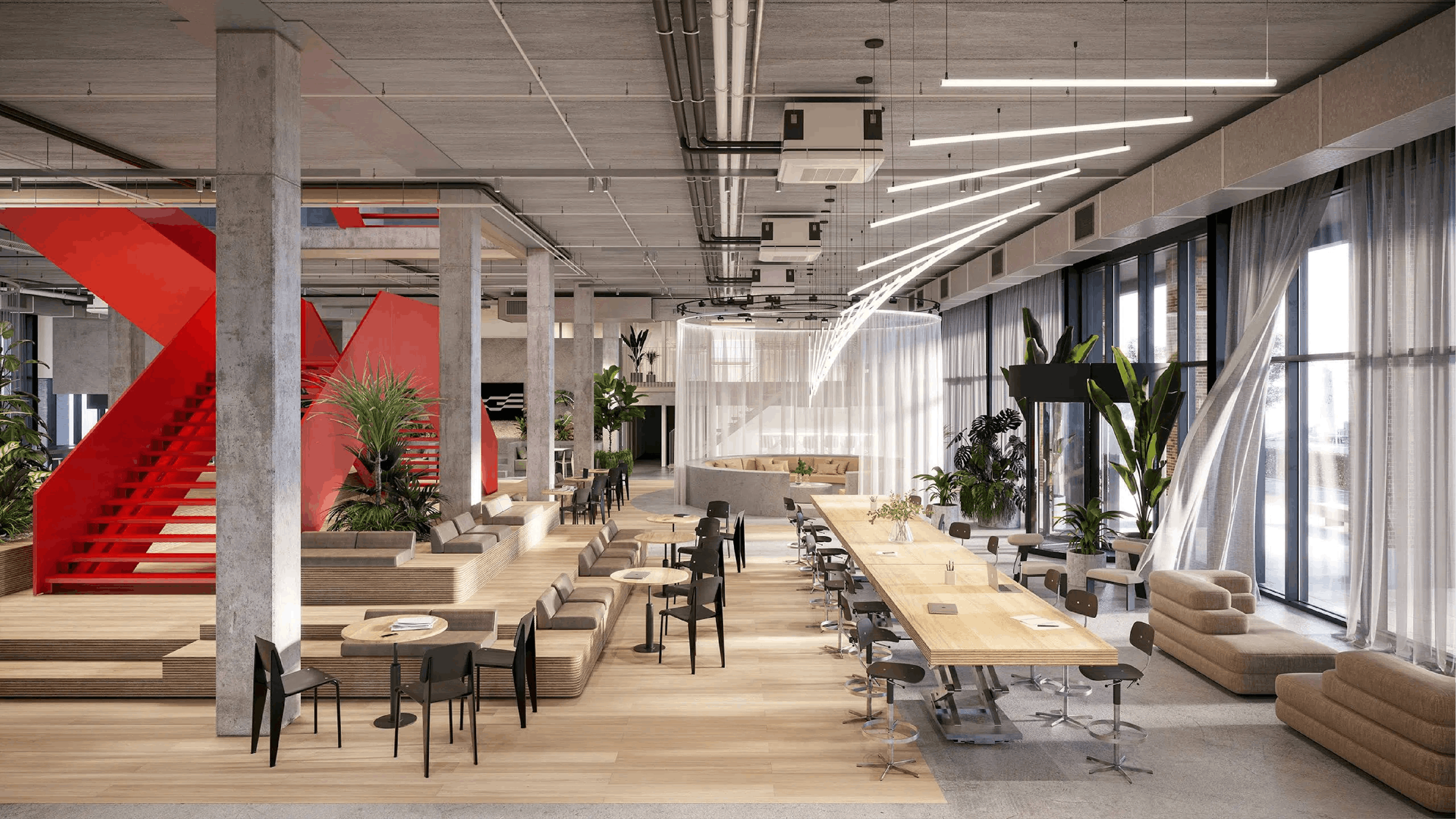
Hero pieces
Keen to celebrate the virtues of restraint we designed 5 x 'hero pieces' that matched the scale and ambition of the central staircase. The conversation pit, circular bar (and light sculpture), chef's table, scissor table and wooden seating podium are all big and monolithic in nature.
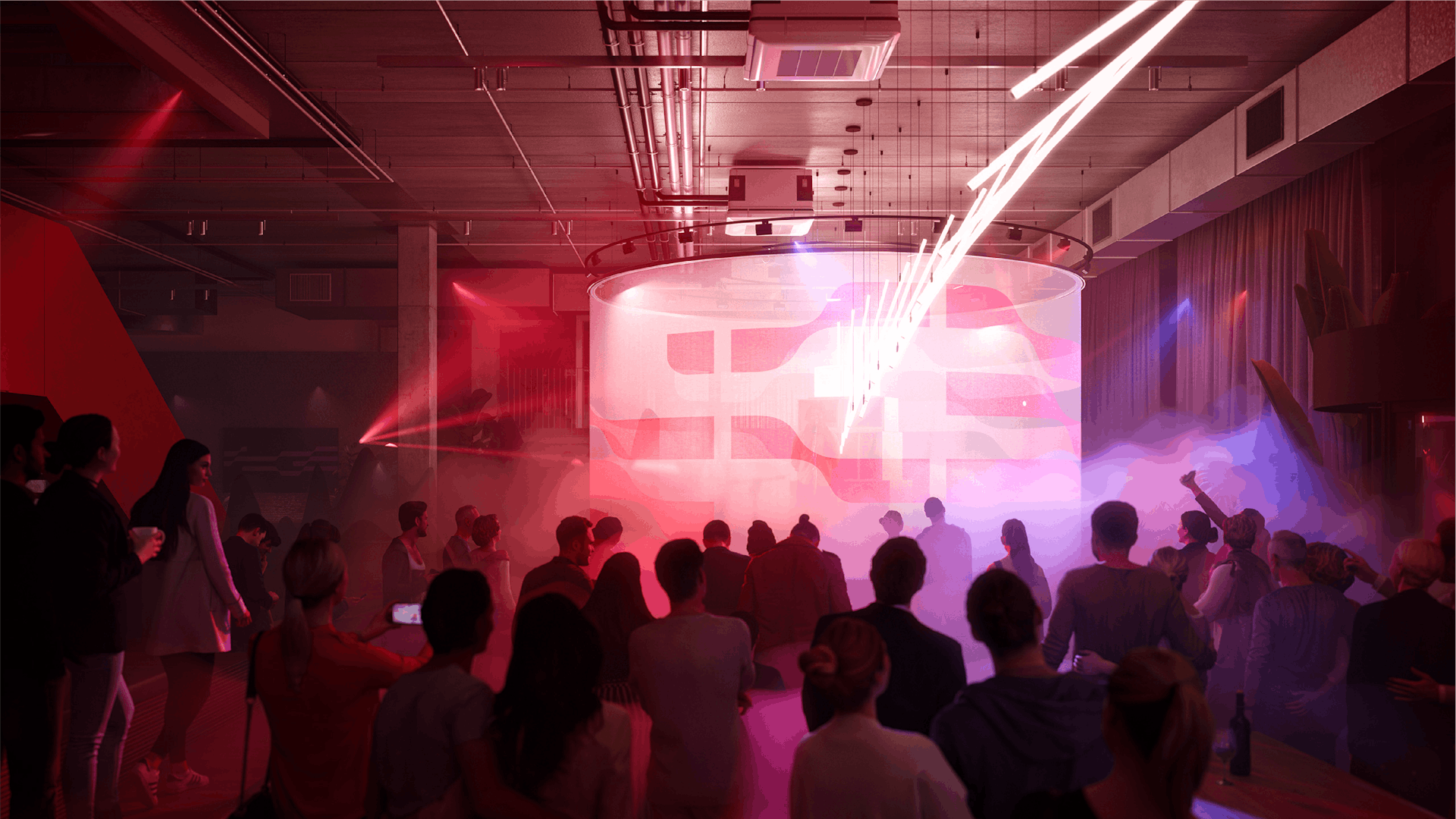
Club Ace
ACE's ground floor is a communal space where agency parties converge, create and socialise. It is also where clients and collaborators are welcomed. Our aim for this space was to remain authentic – in terms of design, material palette and furniture specification.
Collaboration
—
The brand strategy and subsequent identity set the foundation for the architecture of the new ACE headquarters. In collaboration with interior architects and designers, TANK, we created a place that will inspire a culture of positivity, creative energy and open-mindedness.
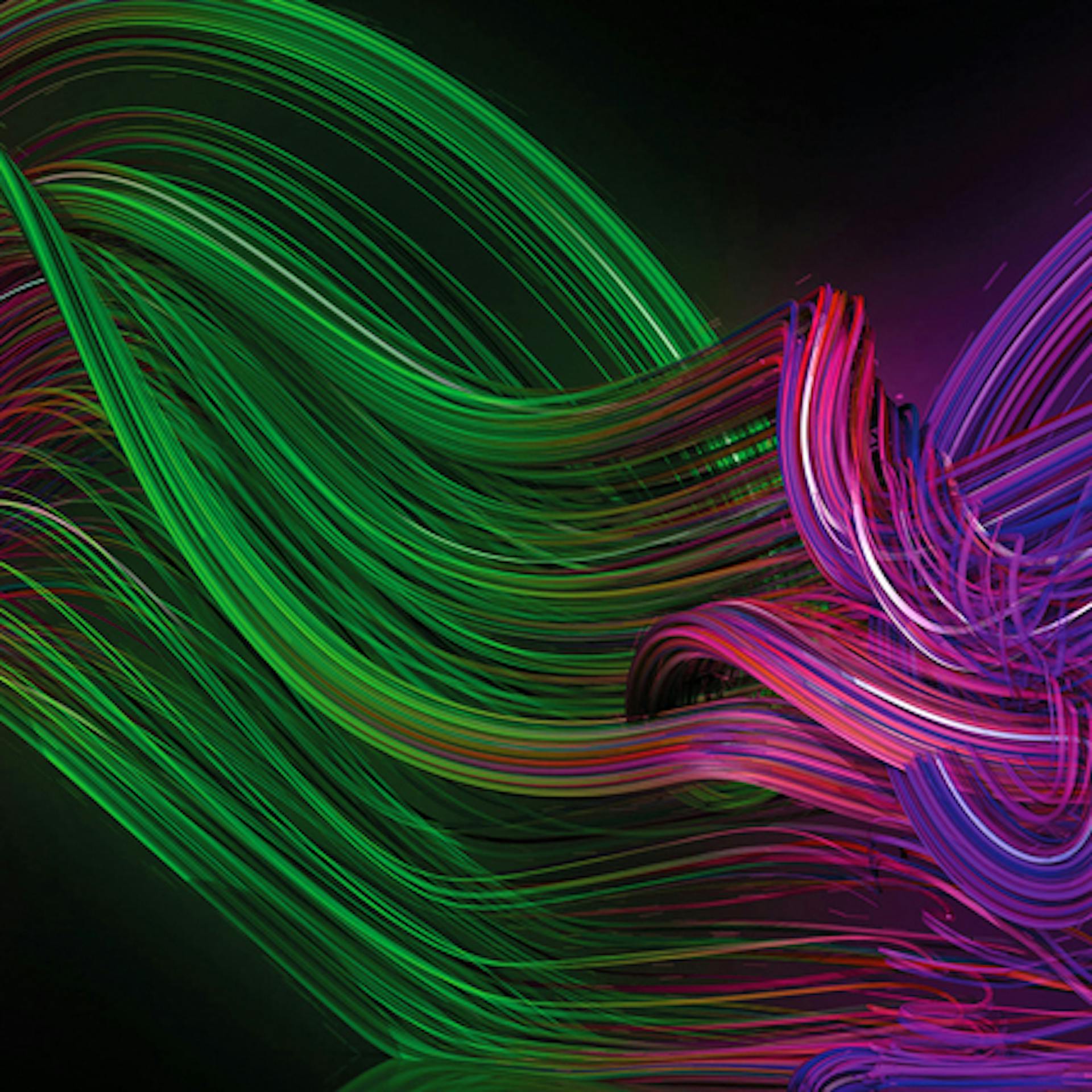
Motion design
—
'Making waves' through the creation of meaningful, culturally relevant and far reaching creative is a principle driver for ACE. We therefore felt it appropriate to reinterpret the 2D 'A' marque in 3D in order to explore its liquid expression.
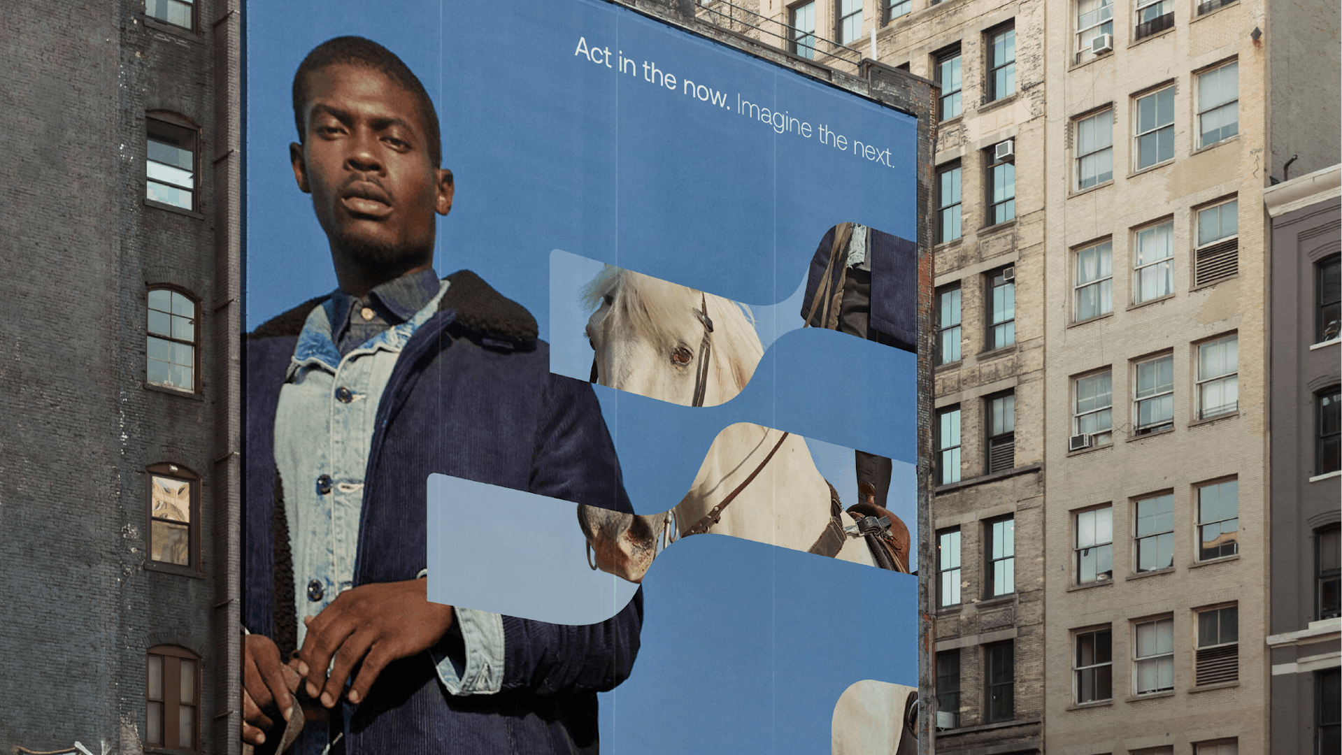
Photography
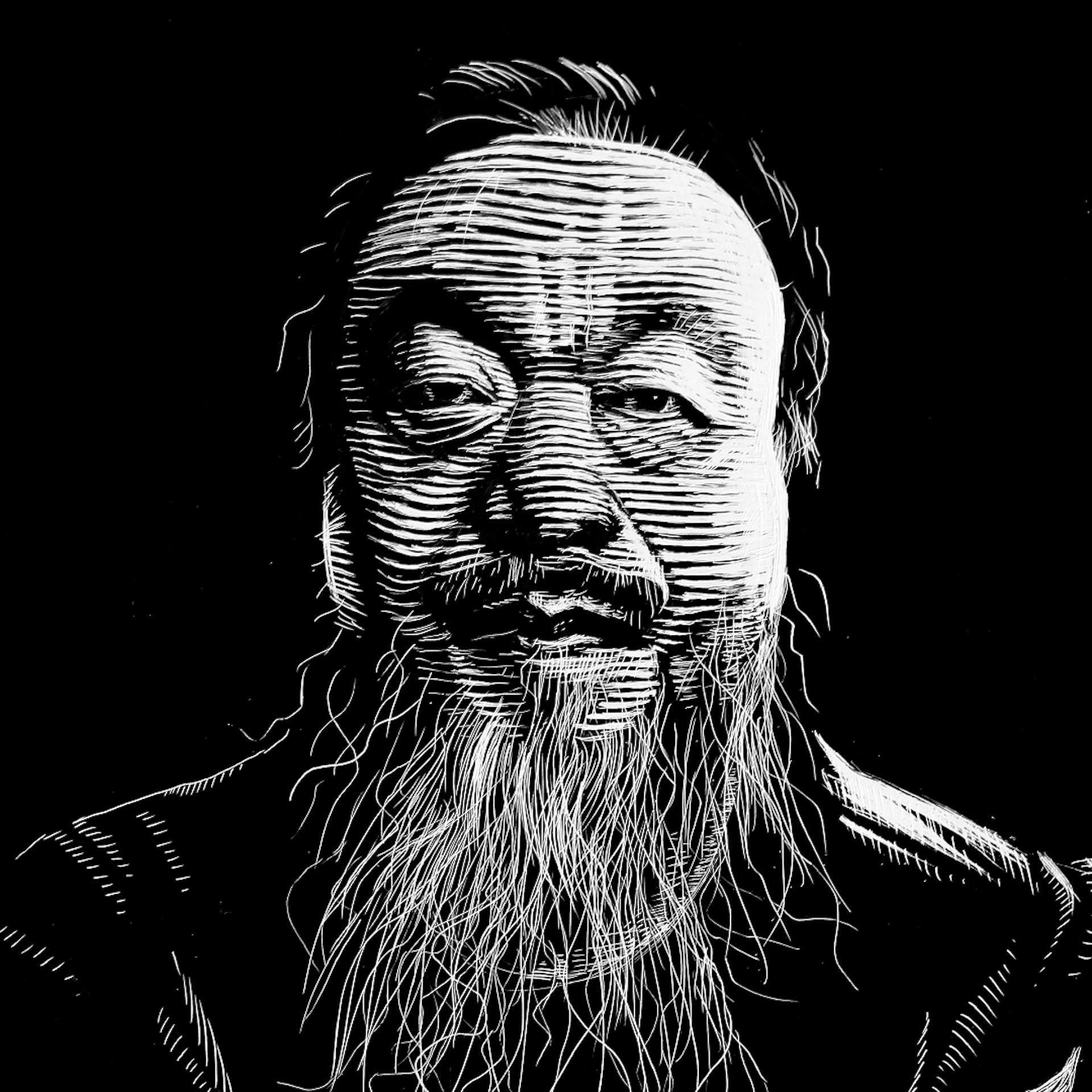
—
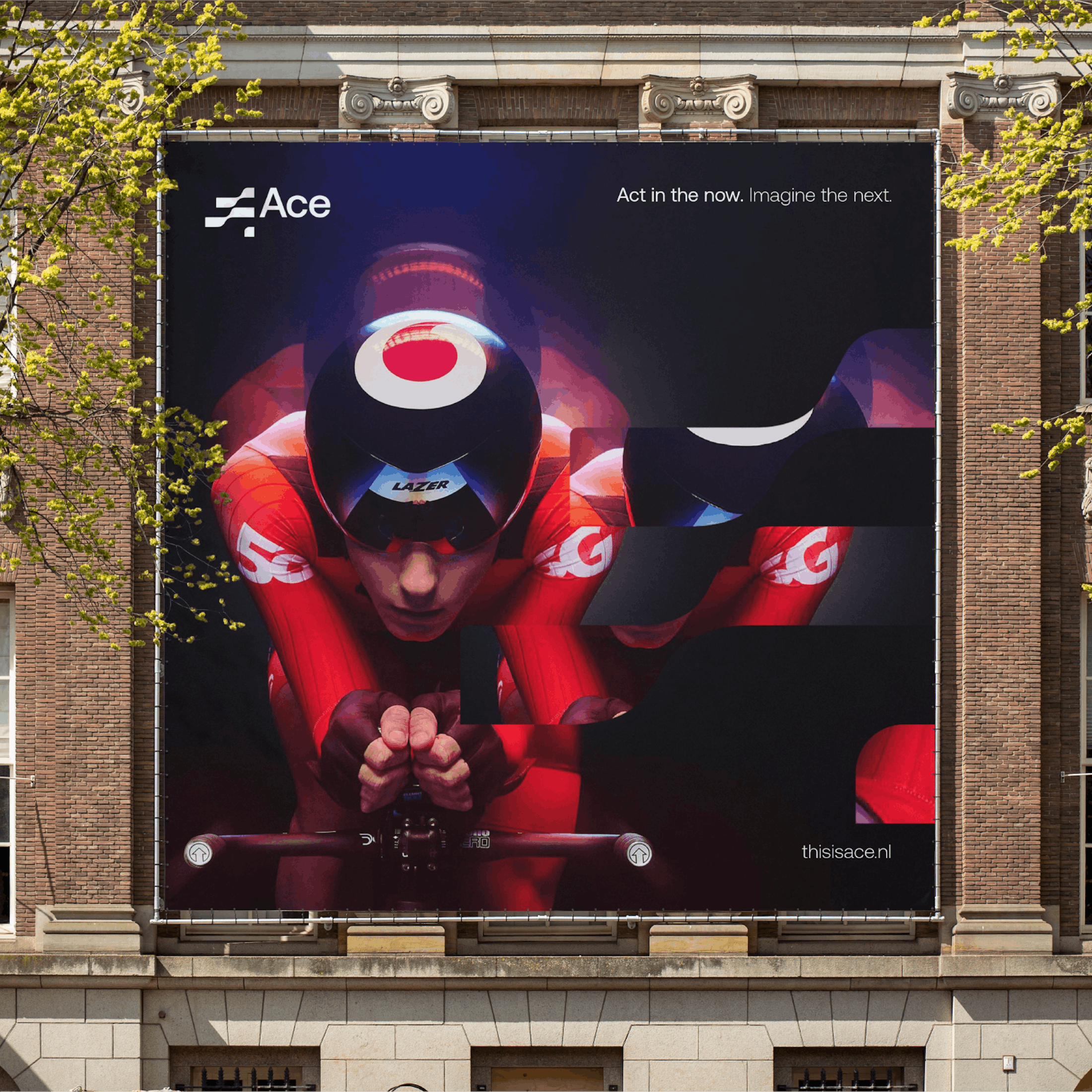
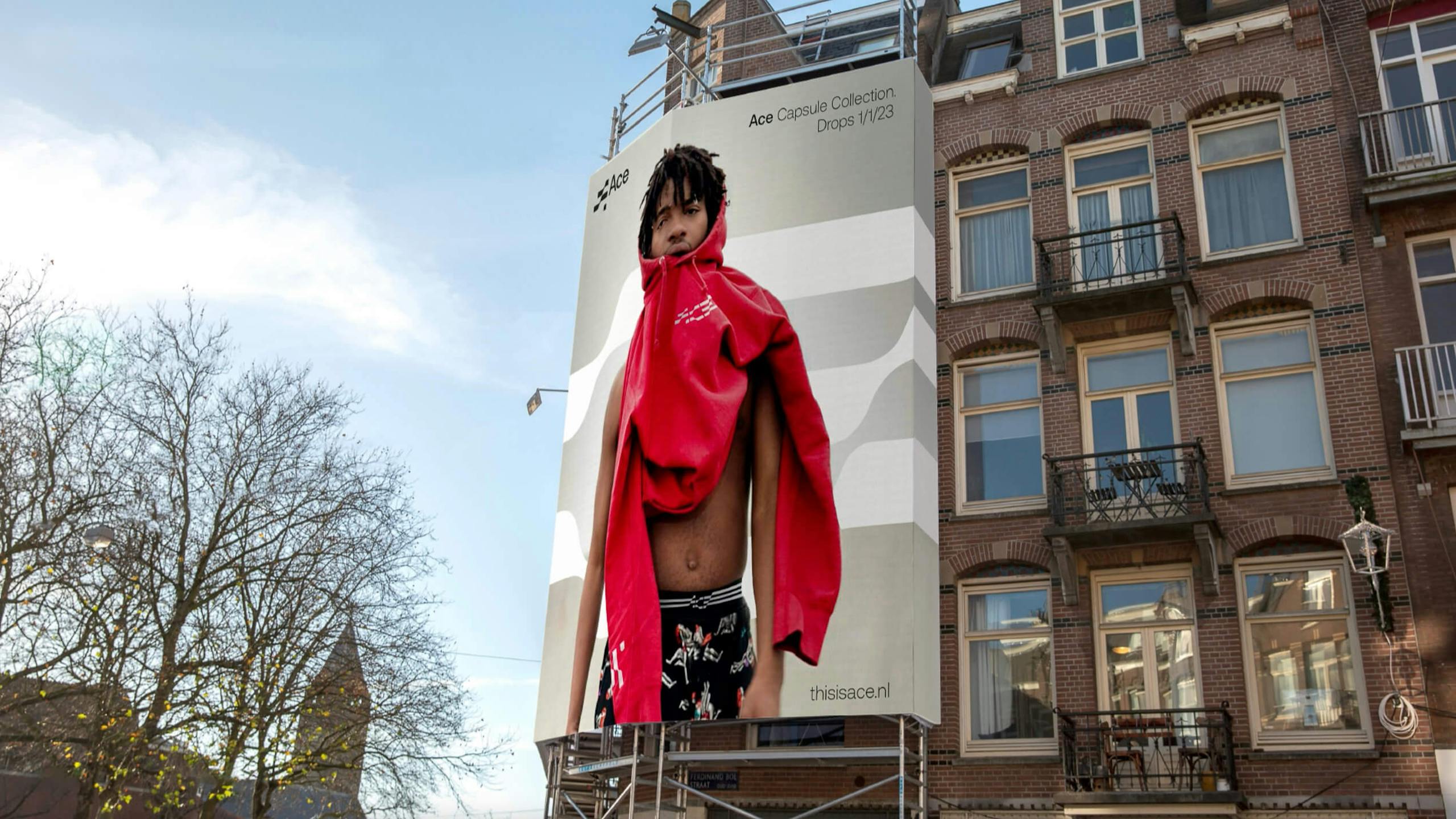
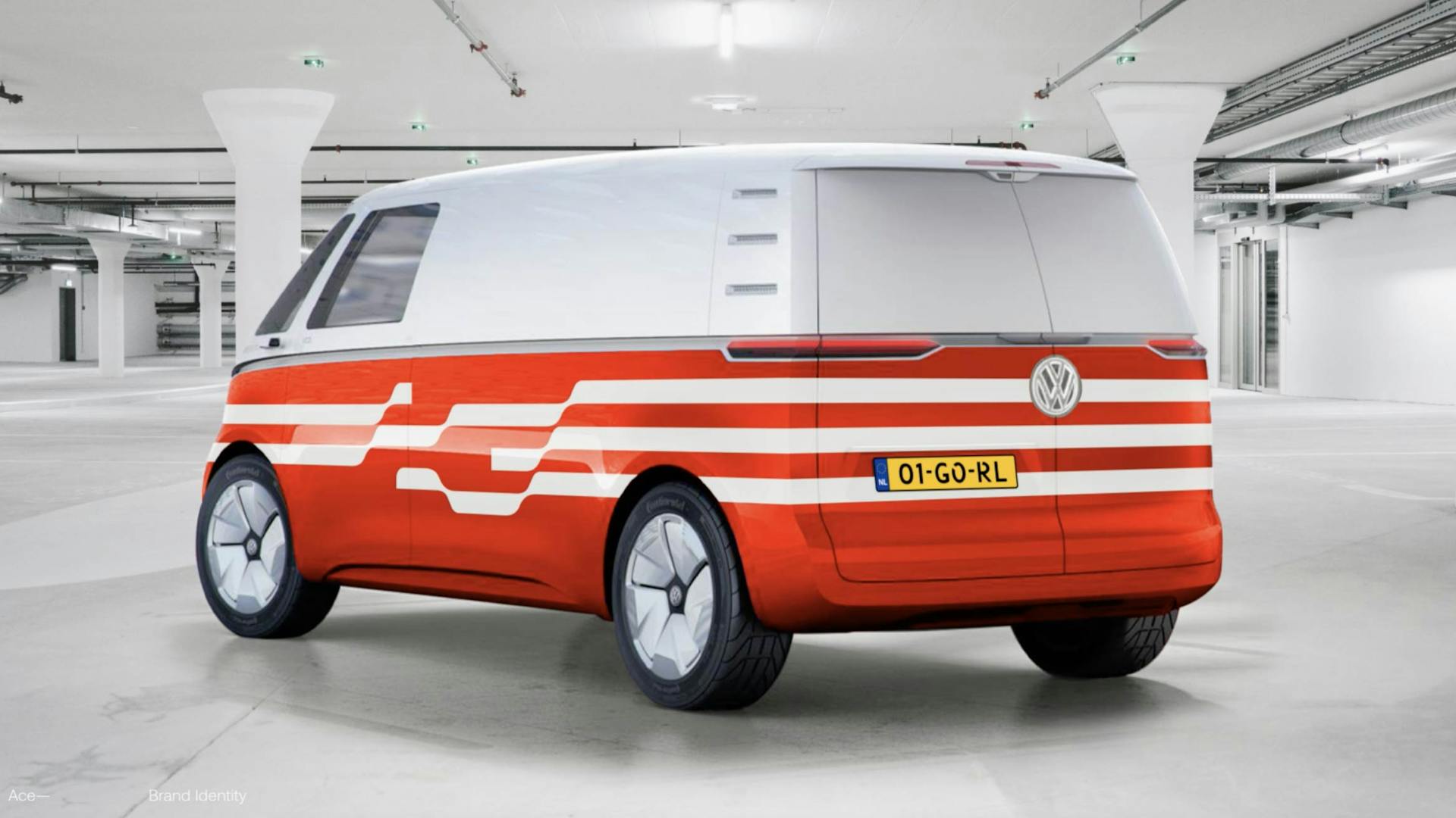
The photographic language of ACE is one that is a true representation of society. In front and behind the camera. ACE works with upcoming talent, from different backgrounds in order to encourage, inspire and promote individual expression.
Applications
—
Introducing the ACE Crypto; a cryptocurrency that allows the company to involve employees in its development and growth. ACE is the first agency group to launch its own cryptocurrency built on the blockchain. The self imposed brief? Don't make it look like a coin!
3D
—
A further 3D exploration of ACE's 'making waves' positioning statement resulted in extruded levels of the logotype, creating the notion of vertical waves. Retaining a monochromatic palette focuses the eye on the undulating construction of the typography.
Disciplines
Brand Identity,
Interior Design,
Creative Direction,
Motion Design,
Concept Creation,
Digital,