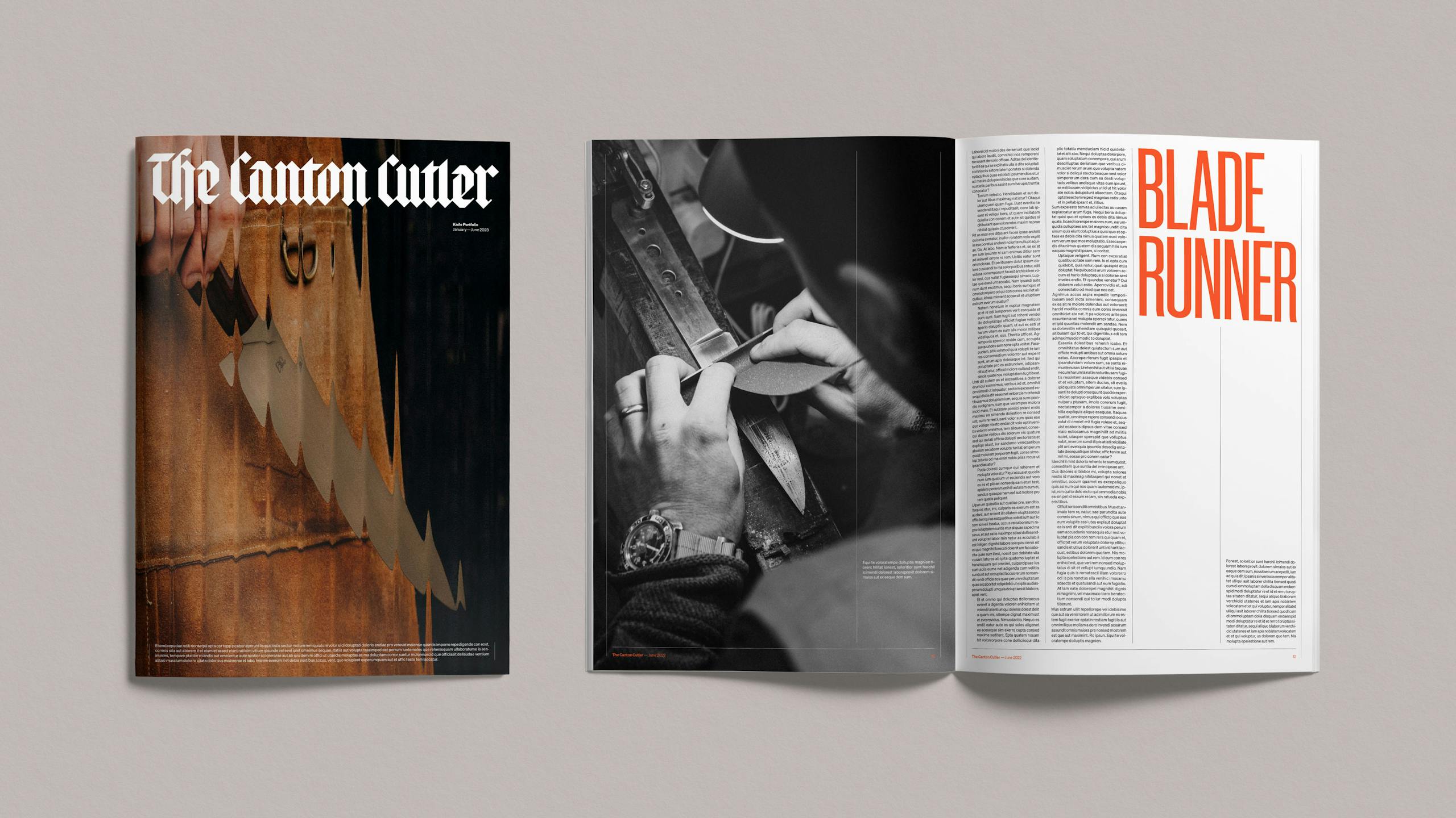
The Canton Cutler
Chop, Chop, Chop...
The Canton Cutler is a self taught bladesmith who specialises in creating bespoke knives for both kitchen and field. Our task was to create a multi-faceted brand that reflects the craft and precision that goes into every knife.

Brief—
To establish a brand identity for a self taught bladesmith who specialises in creating bespoke knives for both kitchen and field. An open minded collaboration with every customer leads to custom products with a focus on form, function, fit and finish. Our task was to create a multi-faceted brand that reflects the craft and precision that goes into every knife.
Approach—
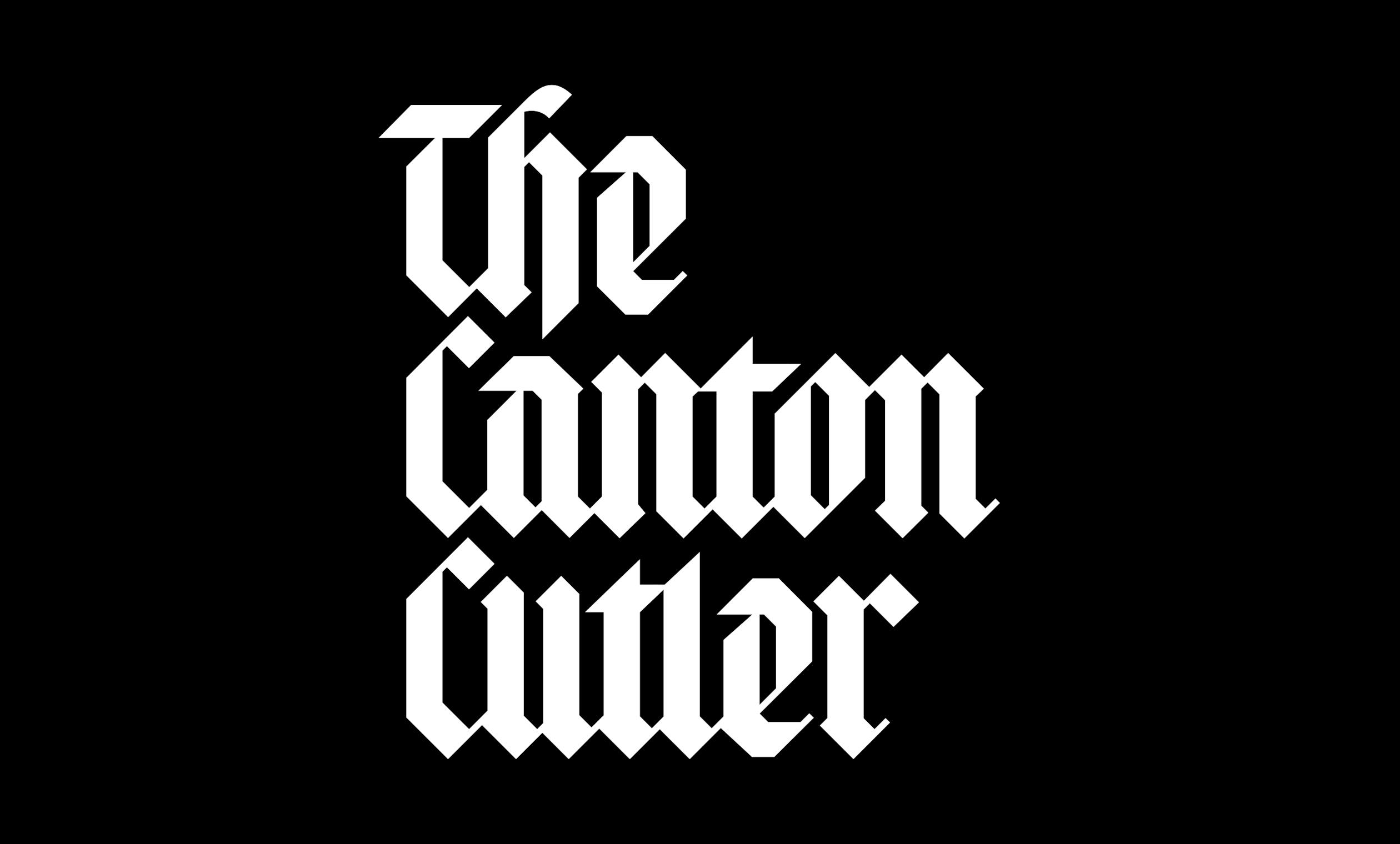
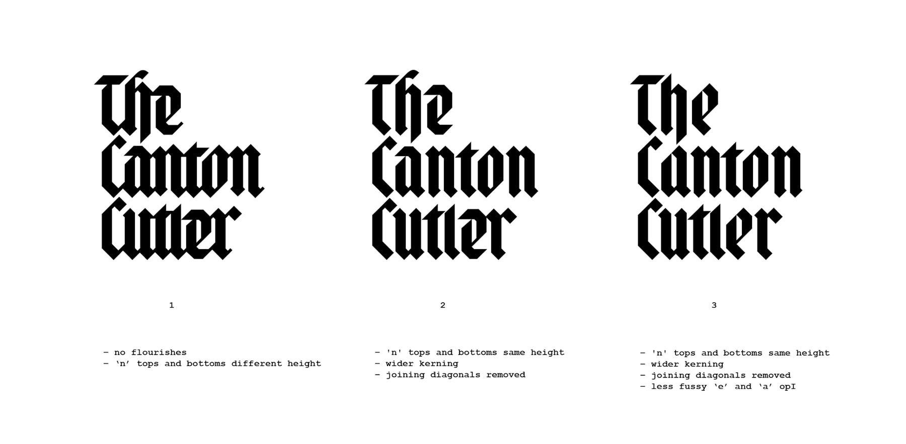
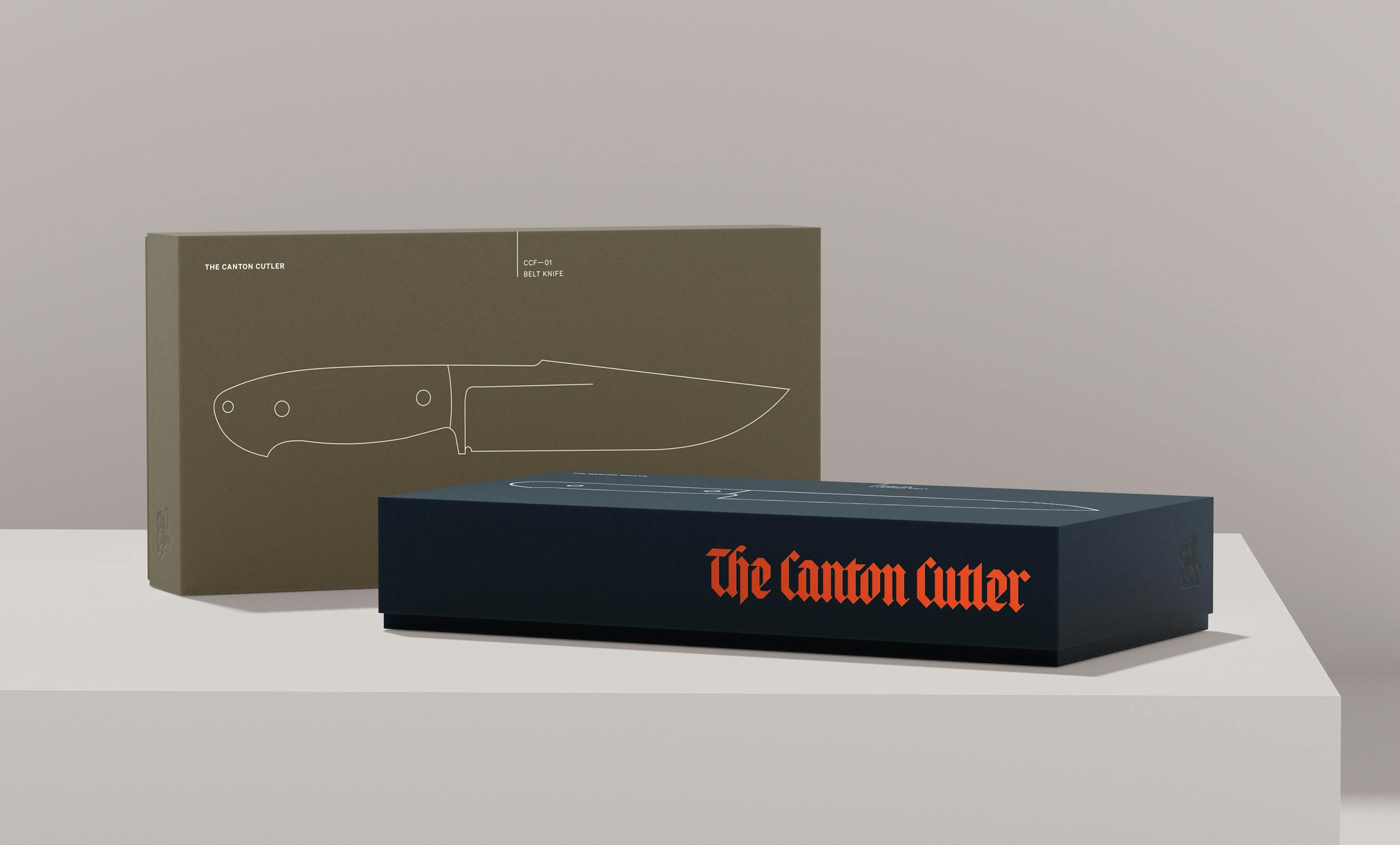
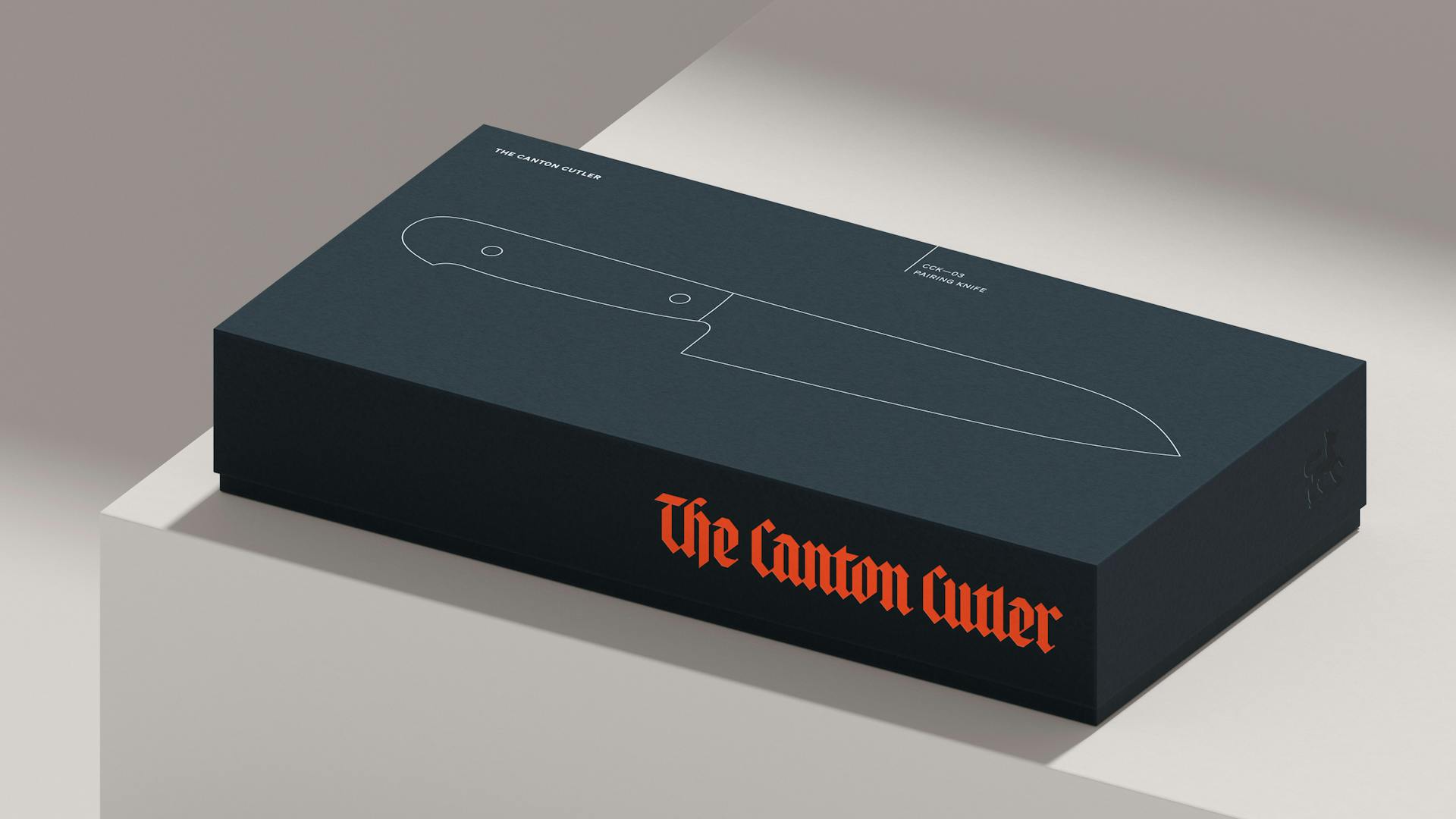
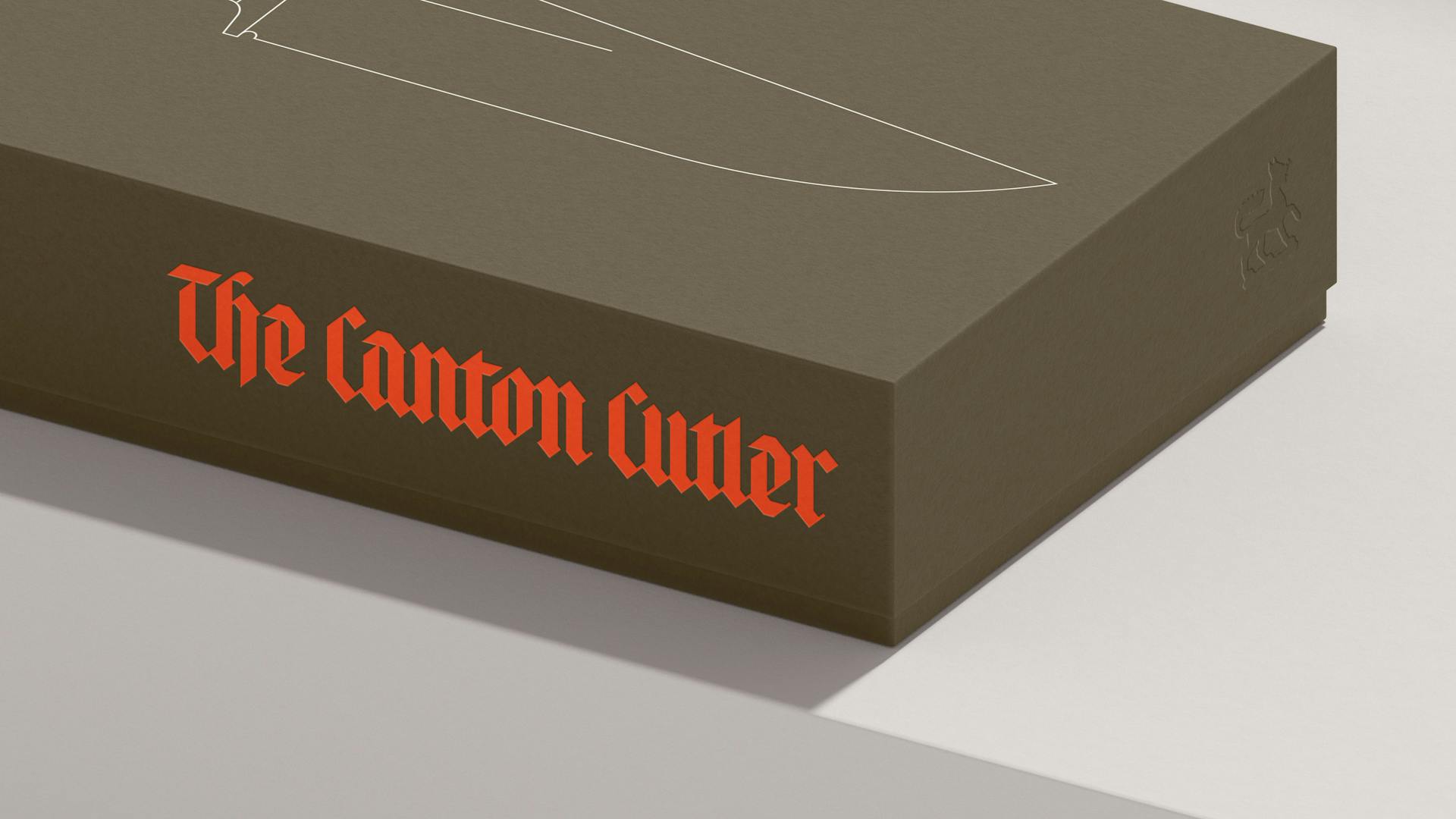
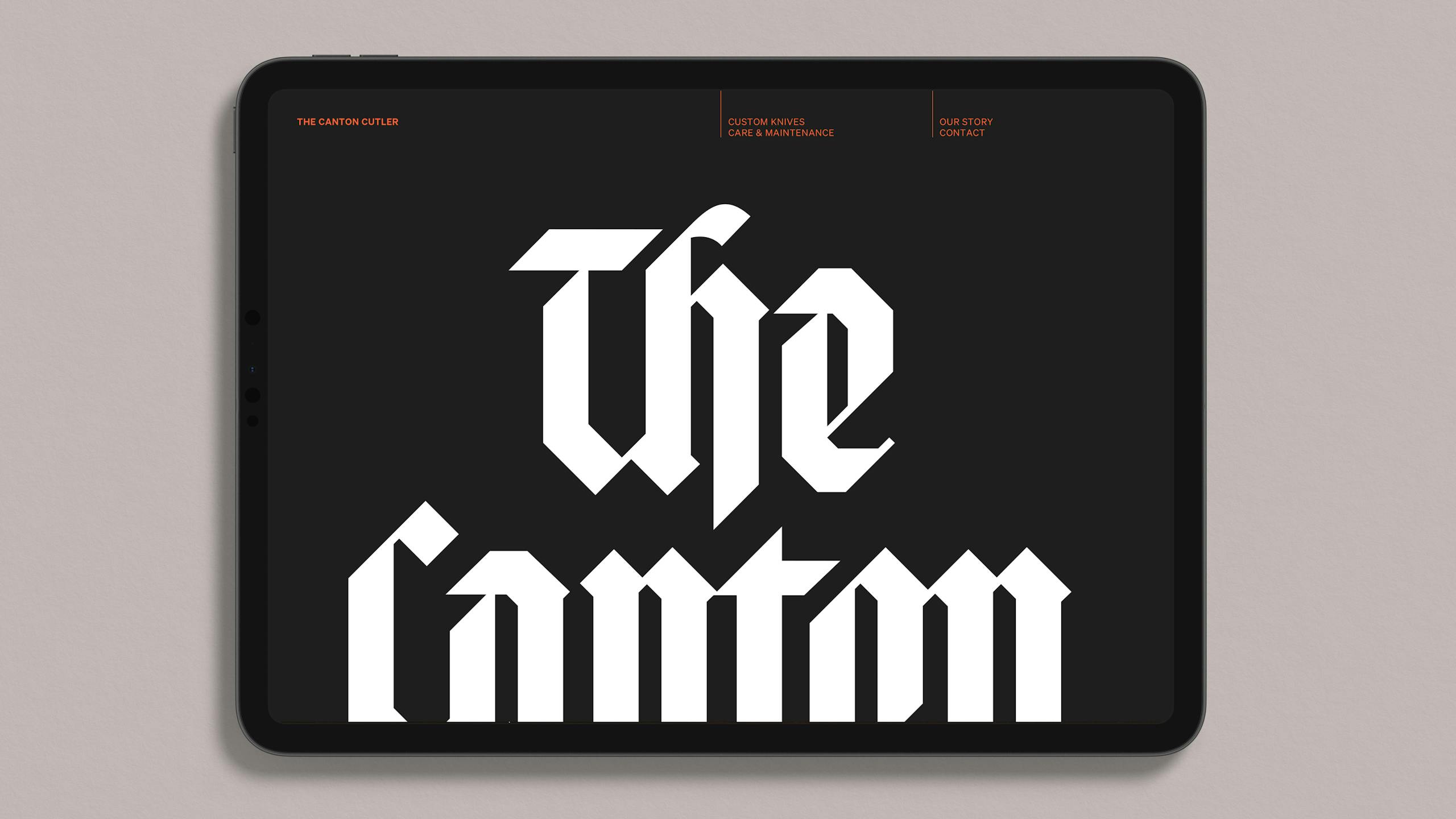
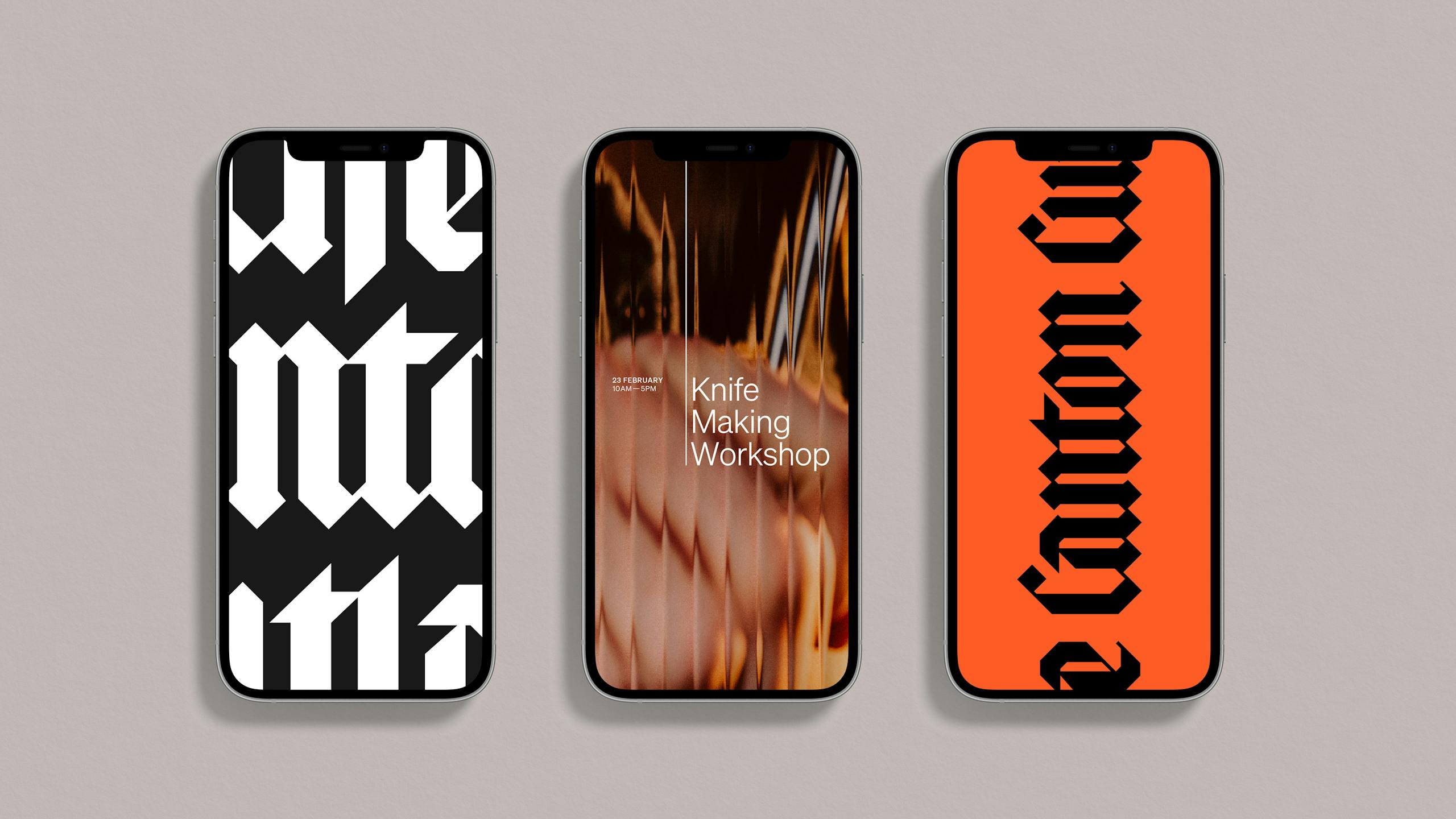
The Canton Cutler (TCC) tests all his knives before they leave the workshop by slicing a sheet of A3 paper whilst held upright. This became the inspiration for the wordmark, leading us to create a contemporary black letter logotype that reflects the sharpness and angularity of TCC's knives. This focus on craft is followed through with a hairline illustration style that sees a grounded 'Welsh-ness' offset with a touch of Japanese aesthetic.
Result—
What started as a side project looks set to become the main gig. Each TCC knife comes with a guarantee and free sharpening for life* As does our brand**
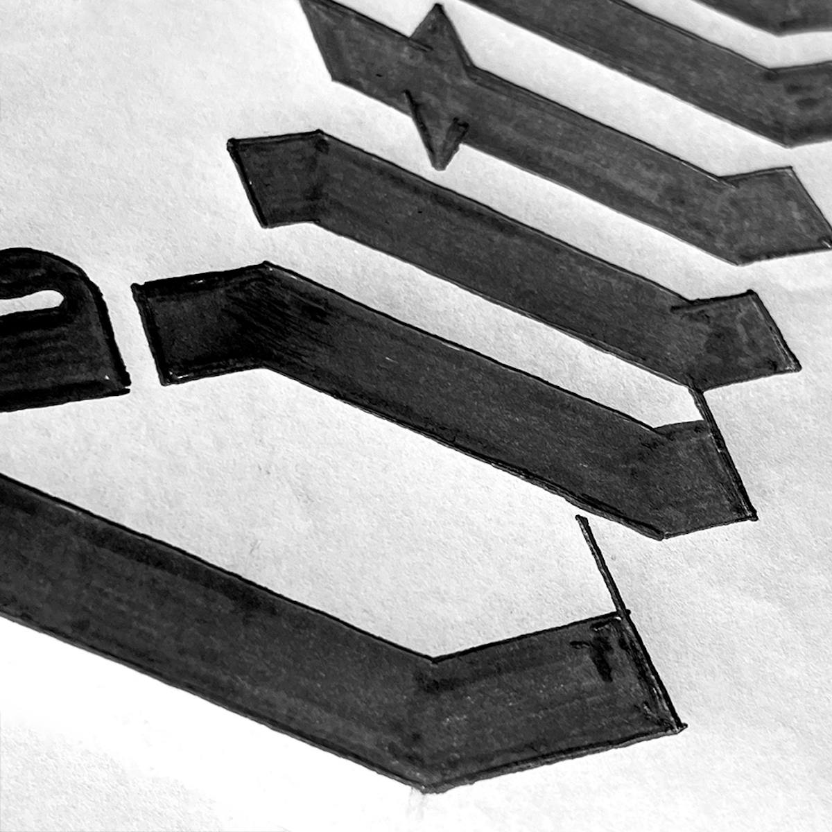
Initial type explorations
—

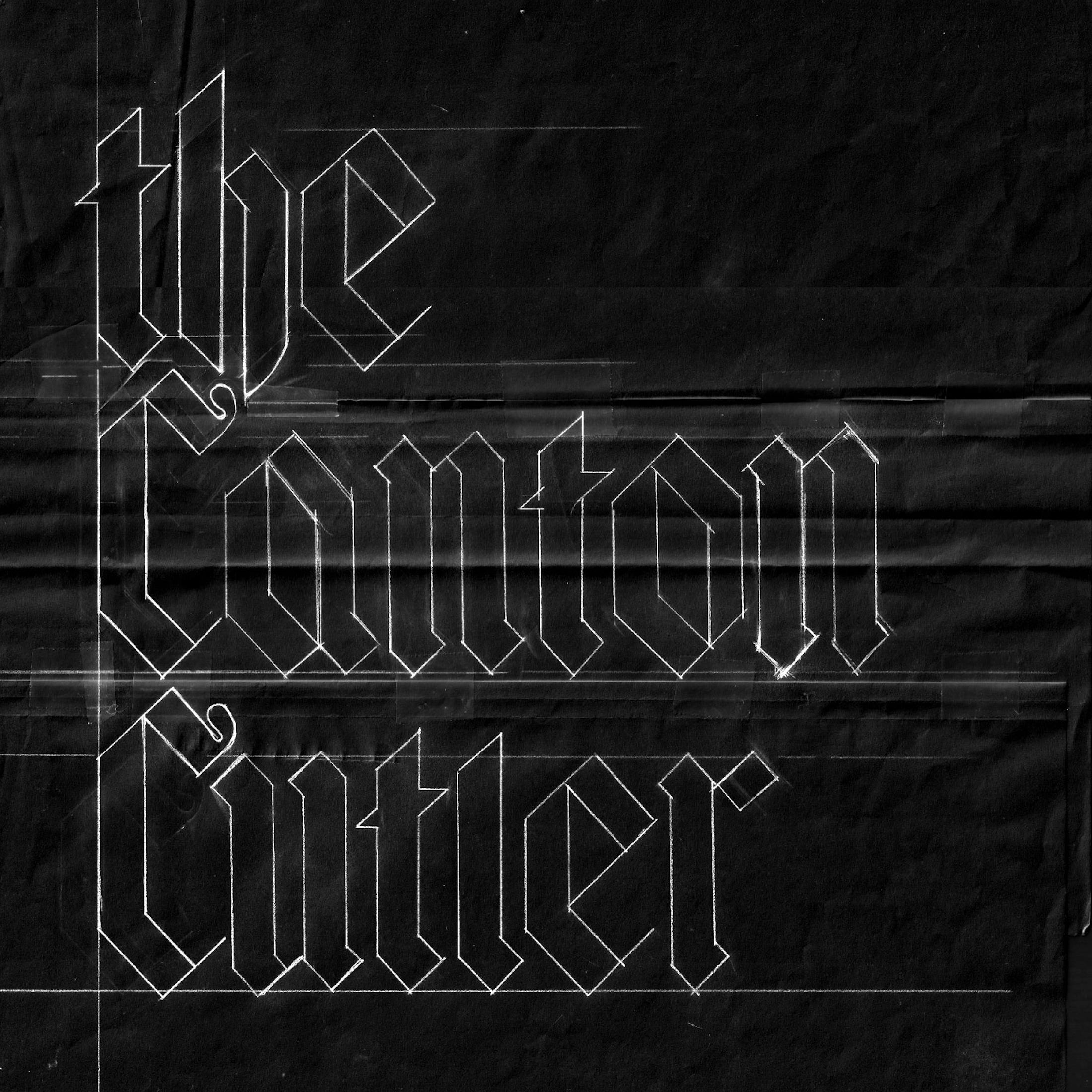
The wordmark
—
After roughing out some sketches to prove that a contemporary black letter could be an option we invited typographer and lettering artist Alisa Burzic on board. Having worked through many iterations Alisa created a logotype that truly reflects the sharpness and angularity of TCC's knives whilst retaining a pleasing pace and baked-in bounce.
Brand toolkit
—
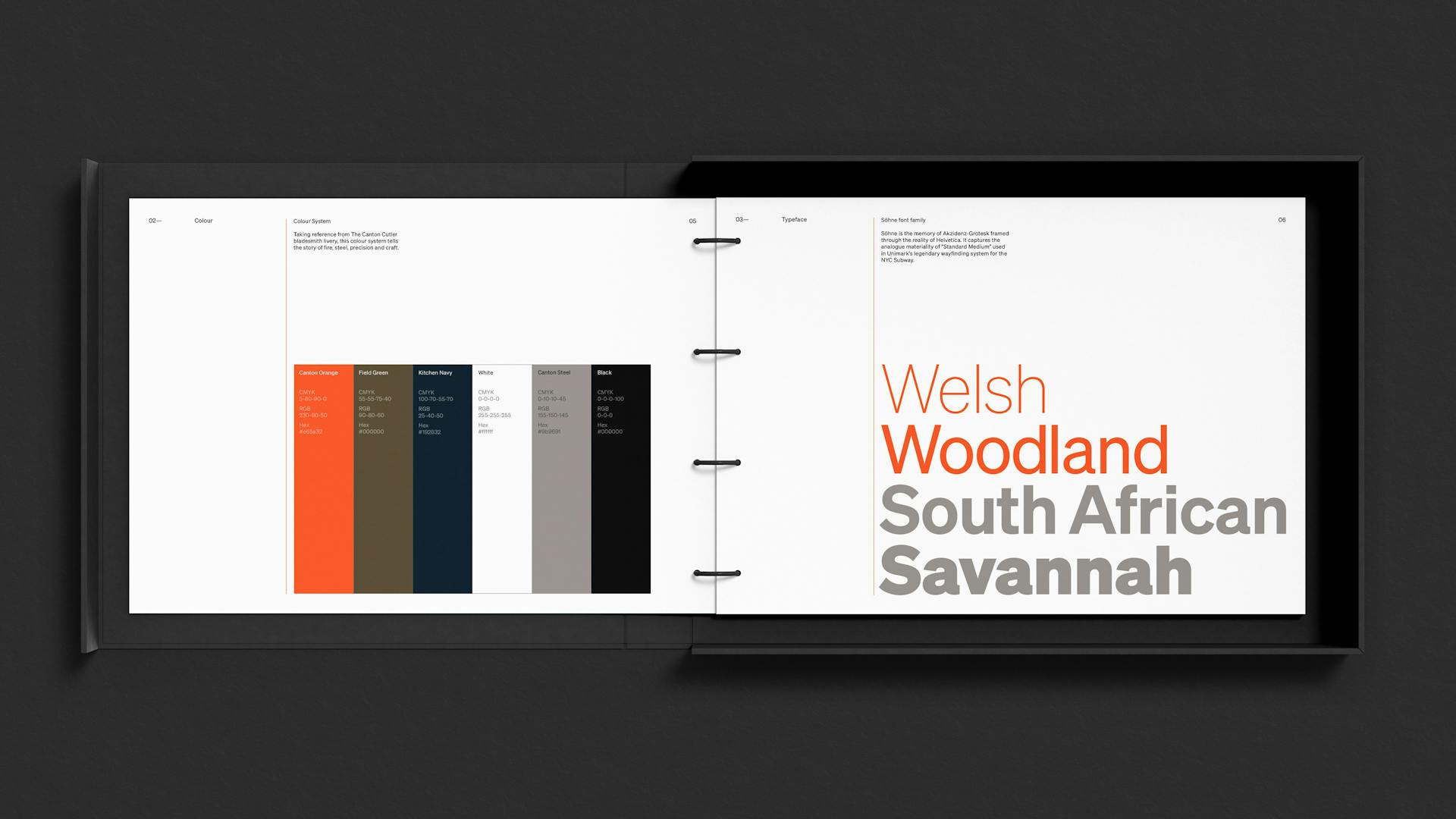
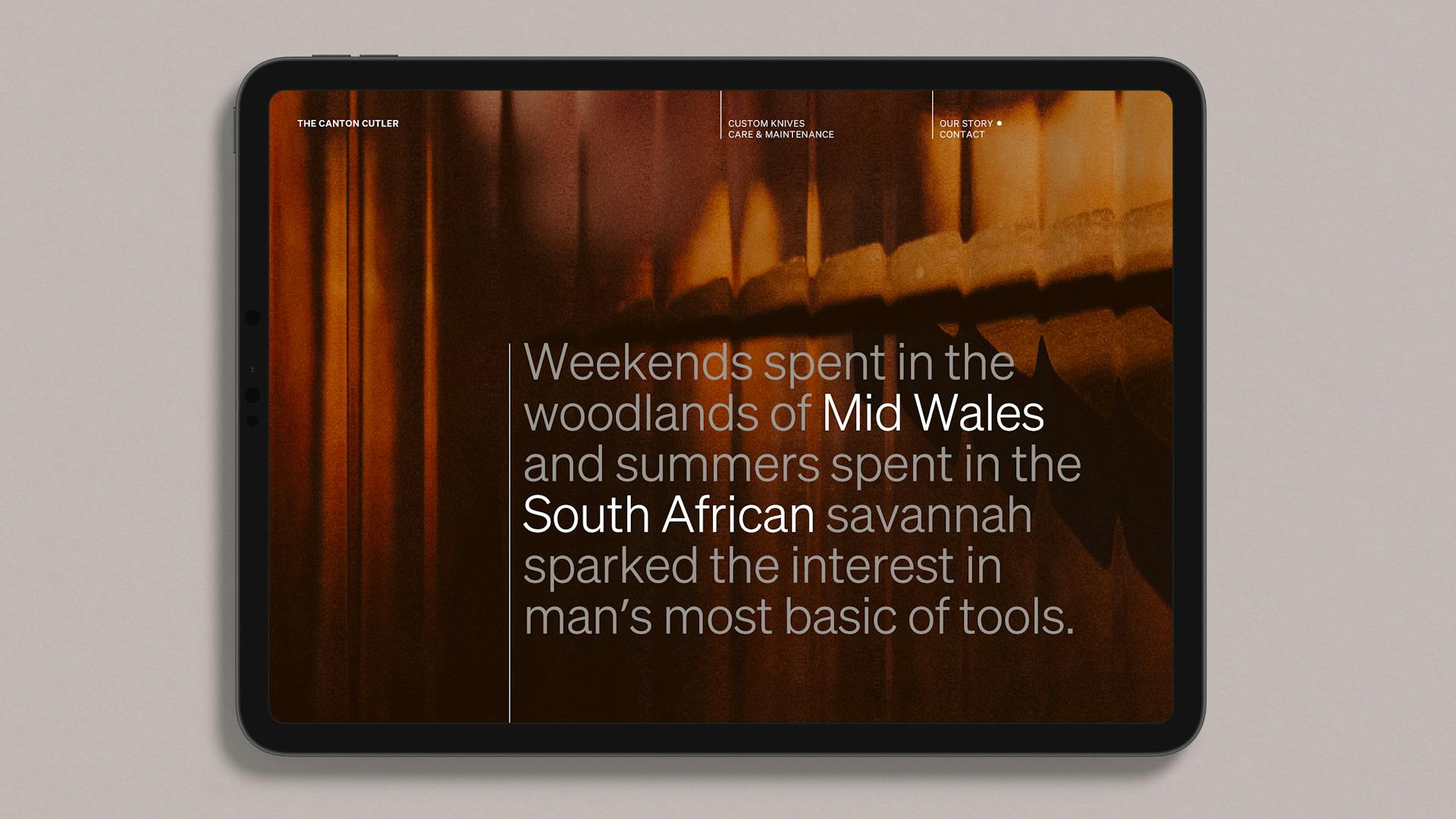
The colour palette is inspired by weekends spent in the woodlands of Mid Wales and Summers spent in the South African savannah, alongside the day-to-day choreographing of fire and steel with precision and craft.
Nomenclature
—
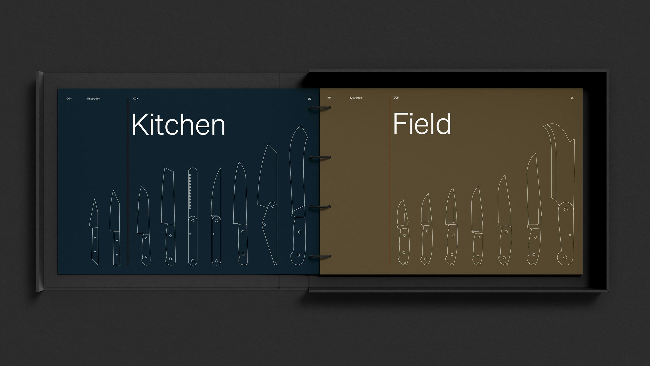
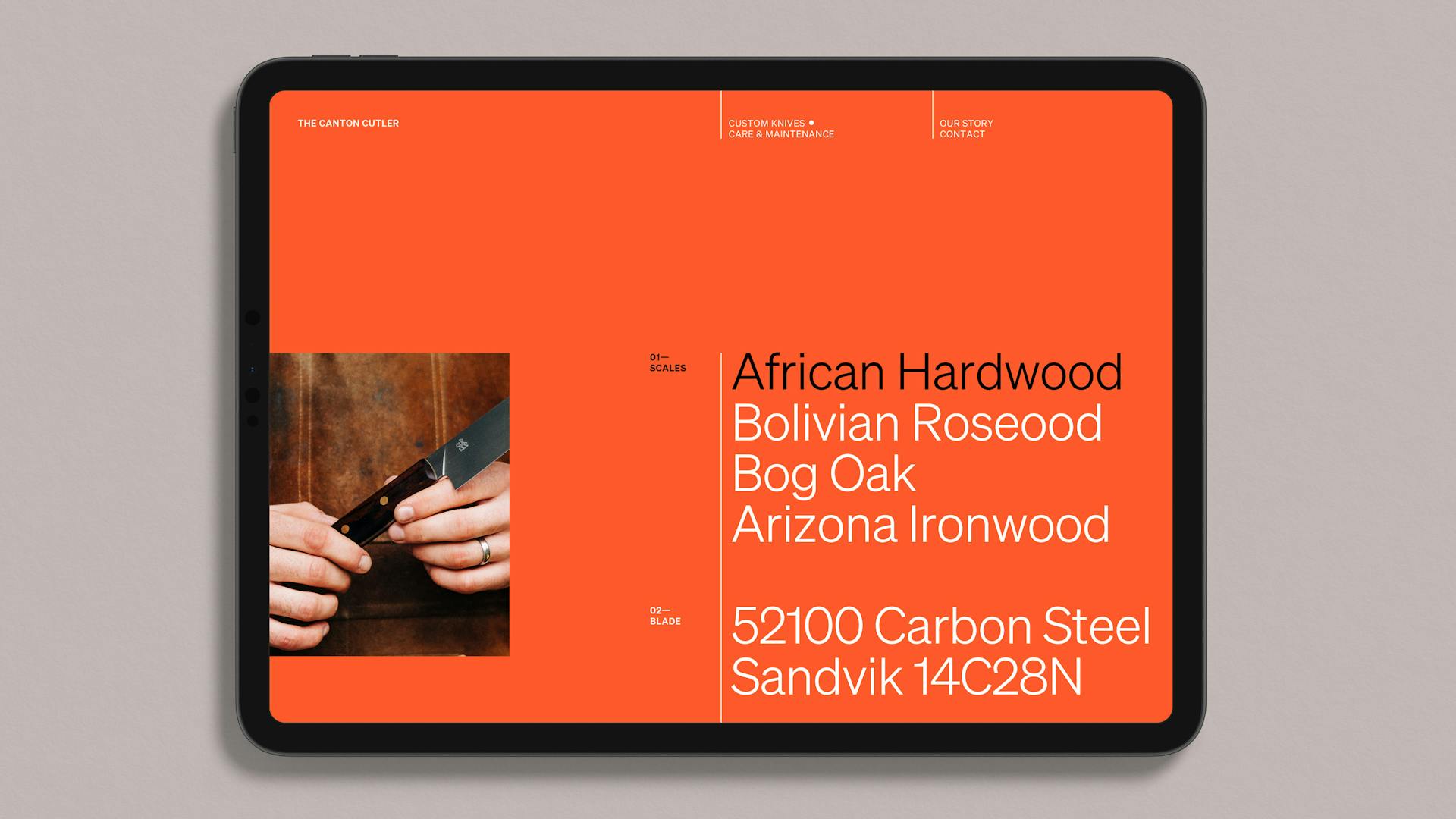
A simple naming system was developed that saw knives designed for the kitchen given the 'CCK' tag whilst their counterparts designed to be used in the field were given 'CCF' — with both acronyms followed by model numbers. The CCK range are assigned a rich navy for their packaging and the CCF range are assigned an olive green tone. All knives are then unified with a hairline illustration style that sees a grounded 'Welsh-ness' offset with a touch of Japanese aesthetic.
Typography
—
As a counterpoint to the hand drawn wordmark, 'Söhne' by New Zealand based type foundry Klim, was selected as TCC's primary font. 'Söhne' is the memory of Akzidenz-Grotesk framed through the reality of Helvetica.
Instagram templates
—
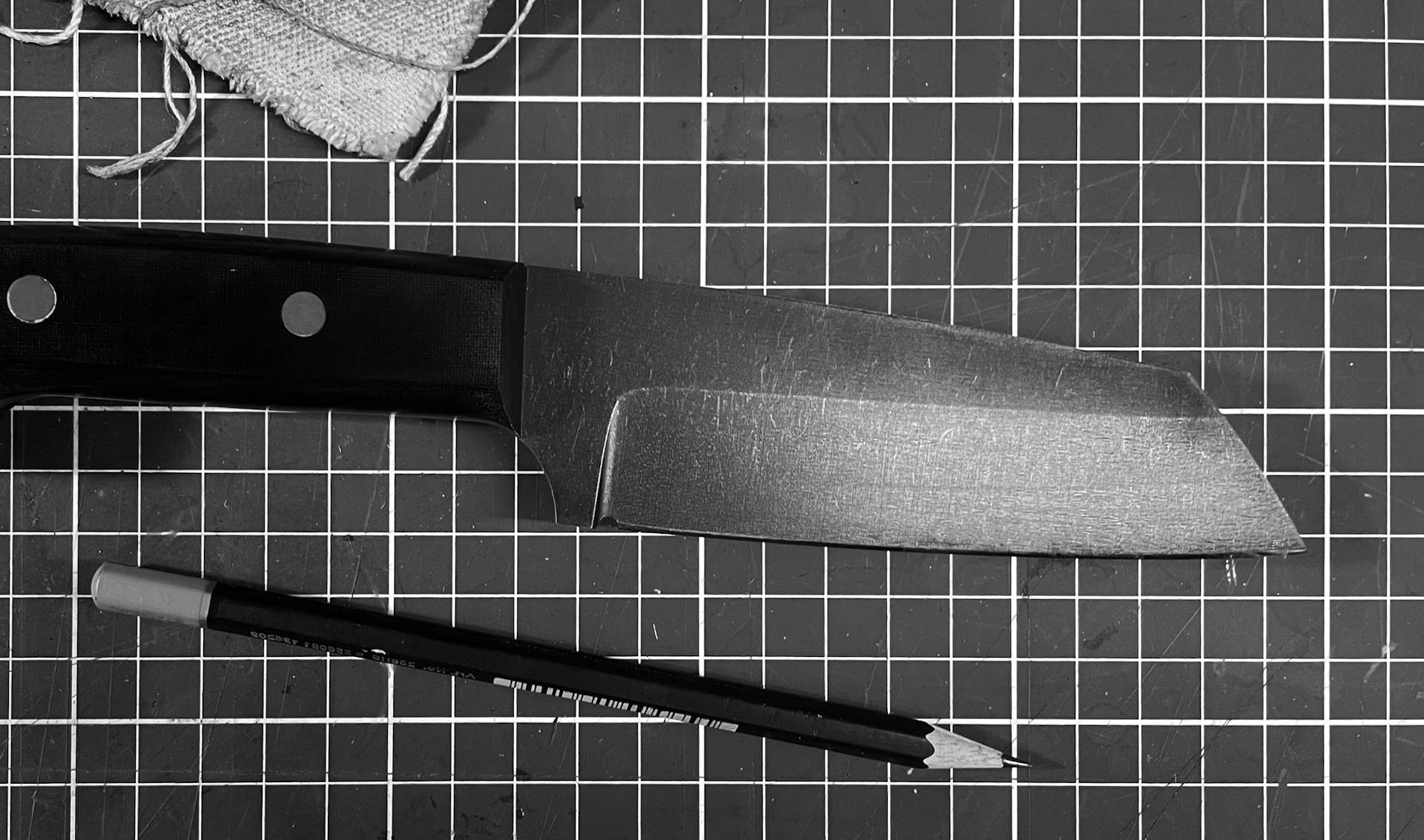
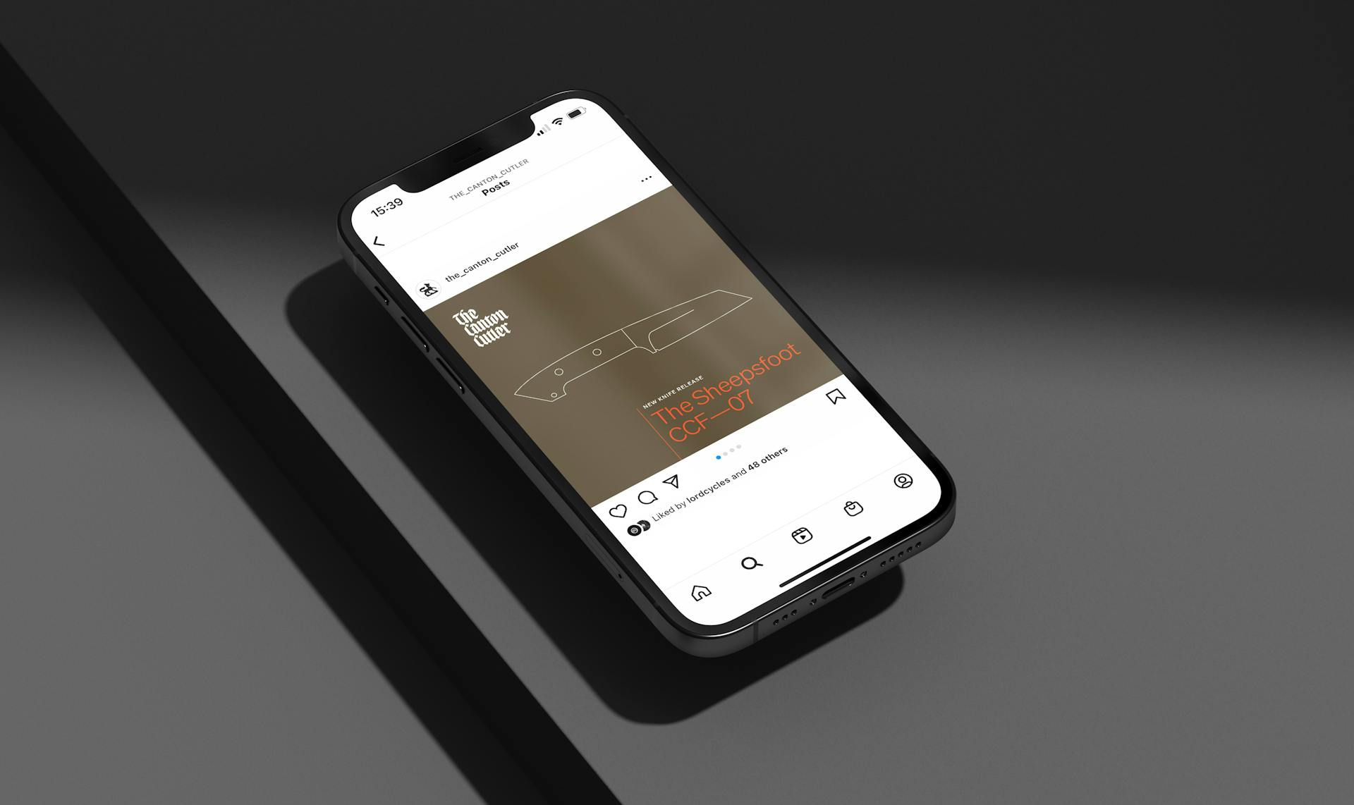
Image treatment
—
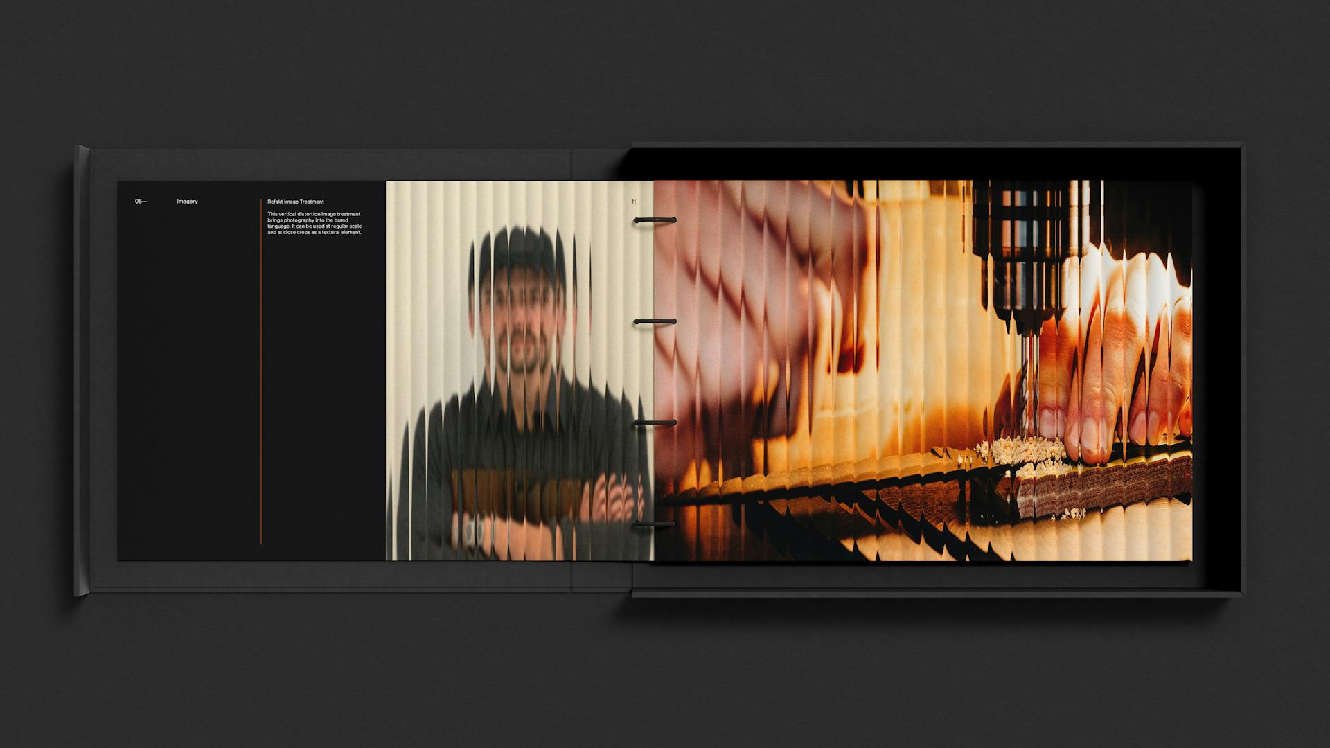
We were eager to carry the vertical bias that features so predominantly within the core wordmark across into the photography. This graphic language also links naturally to knife cuts. Hacking the 'Refract' Photoshop plug-in allowed us to slither and offset photographic imagery.
Disciplines
Typeface Design,
Creative Direction,
Packaging,
Brand Identity,
Photography,